A Guide to Parallax and Scroll-Based Animations
Step-by-step instructions for creating a parallax background effect with CSS only. Accessibility fallback and JS alternatives.
 ·
·
Join the DZone community and get the full member experience.
Join For FreeParallax animation can transform static web pages into immersive, interactive experiences. While traditional parallax relies on simple background image movement and tons of JavaScript code, scroll-based CSS animation opens up a world of creative possibilities with no JavaScript at all. In this guide, we’ll explore two distinct approaches:
- SVG block animation: Creating movement using SVG graphics for unique, customizable effects.
- Multi-image parallax background: Stacking and animating multiple image layers for a classic parallax illusion.
We'll walk through each technique step by step, compare their strengths and limitations, and offer practical tips for responsive design.
Part 1: SVG Block Animation
Scalable vector graphics (SVGs) are perfect for sharp, resolution-independent visuals. With CSS and JavaScript, you can animate SVG elements in response to user scrolling, creating effects like walking figures, moving clouds, or shifting landscapes.
Step 1: Create Your Scene
Start by designing SVG. For our example, I picked the stock layered SVG and cut it into the layers, creating single-layer SVGs.
Let's set up the scene first. Place layers and create static CSS.
Codepen - static content setup.
 <section class="content">
        <div class="layout-container layout-block">
            <p>
                some content there
            </p>
        </div>
    </section>
    <section class="hero">
        <div class="hero-block">
            <div class="hero-background">
                <div class="layer layer1">
                    svg1 there
                </div>
                <div class="layer layer2">
                    svg2 there
                </div>
                <div class="layer layer3">
                    svg3 there
                </div>
                <div class="layer layer4">
                    svg4 there
                </div>
                <div class="layer layer5">
                    svg5 there
                </div>
            </div>
            <div class="hero-content">
                <span class="emoji">✅</span>
                <h1>markup SVG</h1>
                <h2>images animation</h2>
            </div>
        </div>
    </section>
    <section>
        <div class="layout-container layout-block">
            <p>some more content</p>
        </div>
</section>Tip: Use SVG editors or design tools like Figma to create more complex shapes.
As I had quite big SVGs, I moved their declarations to a separate file. In real life, you could use the assets folder instead.
Step 2: Style the Container and SVG
.layout-block {
    position: relative;
    height: 50vh;
    min-height: 300px;
}

.hero-block {
    position: relative;
    height: 100vh;
    min-height: 400px;
    max-height: 70vw;
}

.hero {
    position: relative;
    background-color: white;
    animation: parallax linear;
}

.hero-background {
    top:0;
    left:0;
    width: 100%;
    height: 100%;
}

.hero-content {
    text-align: center;
    position: absolute;
    width: 100%;
    top: 25%;
}

.layer {
    display: flex;
    z-index: 0;
    position: absolute;
    height: 100%;
    width: 100%;
    bottom: 0;
    left: 0;
}Important: Avoid overflow: hidden on the container, as it can cut off animated SVG elements when they move outside the bounds.
Step 3: Add Scroll-Based Animation
Now, let’s move the SVG blocks horizontally as the user scrolls. Our goal looks approximately like this: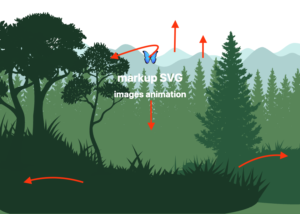
The old-fashioned way would look like the code below:
// DON'T DO THIS ❌
window.addEventListener('scroll', () => {
  const scrollY = window.scrollY;
  document.querySelector('.block').style.transform = `translateX(${scrollY * 0.5}px)`;
});
Now we're going to do the magic using CSS scroll-driven animation, which provides two new functions view() and scroll().
Let’s add an animation to the background pattern within each hero section to modify the background position using scroll() (see documentation).
.hero {
  animation: parallax linear;
  animation-timeline: scroll();
}

@keyframes parallax {
  from {
    top: 0;
  }
  to {
    top: -40%;
  }
}
Add an animation layer by moving the title down with view() (documentation).
.hero-content {
  top: 25%;
  animation: float-25-50 linear;
  animation-timeline: view(-100px);
}

@keyframes float-0-25 {
  from {
    top: 0;
  }
  to {
    top: 25%;
  }
}
Actually, there we can stop, and it will cover most cases for the parallax background. But let's step a bit further and play with the animation of layers.
.layer1 {
  opacity: 0.6;
  animation: parallax linear;
  animation-timeline: view();
  animation-range: 40vh 120%;
}

.layer2 {
  animation: parallax2 linear;
  animation-timeline: view();
  animation-range: 60vh 100%;
}

.layer3 {
  animation: parallax-bottom linear;
  animation-timeline: view();
  animation-range: 60vh 100%;
}

.layer4 {
  animation: float-right;
  animation-timeline: view();
  animation-range: 50vh 100%;
  /* will not work as max-width is set for parent*/
}

.layer5 {
  animation: float-left;
  animation-timeline: view();
  animation-range: 50vh 100%;
}

@keyframes parallax {
  from {
    top: 0;
  }
  to {
    top: -40%;
  }
}

@keyframes parallax2 {
  from {
    top: 0;
  }
  to {
    top: -20%;
  }
}

@keyframes parallax-bottom {
  from {
    top: 0;
  }
  to {
    top: 30%;
  }
}

@keyframes float-left {
  0% {
    left: 0;
  }
  100% {
    left: -40%;
  }
}

@keyframes float-right {
  0% {
    left: 0;
  }
  100% {
    left: 40%;
  }
}
Add a rotate animation for the icon.
.emoji {
  z-index: 0;
  display: inline-block;
  font-size: 50px;
  animation: rotate linear, orbit-out ease;
  animation-timeline: view();
  animation-range: 0% 80%, 80% 110%;
}

@keyframes rotate {
  0% {
    transform: rotate(200deg);
  }

  100% {
    transform: rotate(0deg);
  }
}
Add some extra styles. Play a bit. Here we are!
Check out the live demo on CodePen.
Step 4: Make It Responsive
SVGs can scale, but their container needs responsive handling:
- Use
width: 100vw;ormax-width: 100%;for the container. - Adjust
viewBoxand SVG dimensions. - Use
@mediaqueries to tweak height or layout on different devices.
Step 5: Limitations
- Overflow: If you need content clipped, consider a different animation method, as SVG transform animations are restricted by
overflow: hidden. - Repeatability: SVGs can’t be easily repeated as backgrounds like raster images.
- Performance: SVGs are efficient for simple shapes, but complex scenes may slow down rendering, especially on mobile.
Part 2: Multi-Image Parallax Background
There I decided to experiment wth background images. The idea is the same. Create a multilayer structure, and move the background in different directions to create a "walk" effect.
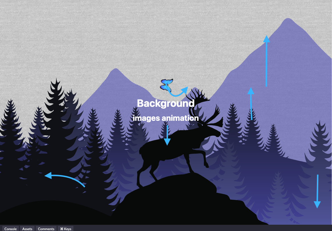
Step 1: Prepare Your Layers
Create separate images for each depth layer (background, midground, foreground). PNGs with transparency work well.
 <section class="hero bg-night">
    <div class="hero-block">
      <div class="hero-background">
        <div class="bg bg1">
        </div>
        <div class="bg bg2">
        </div>
        <div class="bg bg3">
        </div>
        <div class="bg bg4">
        </div>
      </div>
      <div class="hero-content">
        <span class="emoji">✅</span>
        <h1>Background </h1>
        <h2>images animation</h2>
      </div>
    </div>
  </section>
Step 2: Style the Layers
.bg {
  display: flex;
  z-index: 0;
  position: absolute;
  height: 100%;
  width: 100%;
  bottom: 0;
  left: 0;
  background-position: 0;
}

.bg1 {
  opacity: 0.6;
  background-image: url("https://raw.githubusercontent.com/h-labushkina/ccs-parallax-animation/609b4b41529f3d2aaf3d7e8be223e7376f793b23/svg/1.svg");
}

.bg2 {
  background-image: url("https://raw.githubusercontent.com/h-labushkina/ccs-parallax-animation/609b4b41529f3d2aaf3d7e8be223e7376f793b23/svg/2.svg");
}

.bg3 {
  background-image: url("https://raw.githubusercontent.com/h-labushkina/ccs-parallax-animation/609b4b41529f3d2aaf3d7e8be223e7376f793b23/svg/3.svg");
}

.bg4 {
  background-image: url("https://raw.githubusercontent.com/h-labushkina/ccs-parallax-animation/609b4b41529f3d2aaf3d7e8be223e7376f793b23/svg/5.svg");
}
Step 3: Add Animation
Now let's make it alive!
There we use animation-range to control animation speed from one side and for behavior, so mountains on the back start moving first, then in 20 more vh we add the next layer. Play with this range to make your animation perfect.
.bg1 {
  animation: parallax-bg linear; /* moves top */
  animation-timeline: view();
  animation-range: 40vh 120%;
}

.bg2 {
  animation: parallax2-bg linear; /* moves top */
  animation-timeline: view();
  animation-range: 60vh 100%;
}

.bg3 {
  animation: parallax-bottom-bg linear;
  animation-timeline: view();
  animation-range: 60vh 100%;
}

.bg4 {
  animation: float-left-bg; /* moves left */
  animation-timeline: view();
  animation-range: 20vh 120%;
}

@keyframes parallax-bg {
  from {
    background-position: 0;
  }
  to {
    background-position: 0 100%;
  }
}

@keyframes parallax2-bg {
  from {
    background-position: 0;
  }
  to {
    background-position: 0 70%;
  }
}

@keyframes parallax-bottom-bg {
  from {
    background-position: 0;
  }
  to {
    background-position: 0 -10%;
  }
}

@keyframes float-left-bg {
  0% {
    background-position: 0;
  }
  100% {
    background-position: 60% 0;
  }
}
Each layer moves at a different rate, creating depth.
Step 4: Responsive Design
- Use
@mediaqueries to adjust the background size for smaller screens. - Don't use
background-size: cover;as it will prevent vertical animation.
@media screen and (min-width: 1024px) and (max-width: 2024px) {
  .bg {
     background-size: 2024px;
  }
}
@media screen and (min-width: 768px) and (max-width: 1024px) {
  .bg {
    background-size: 1024px;
  }
}

@media screen and (max-width: 768px) {
  .bg {
    background-size: 70vh 70vh;
  }
Step 5: Troubleshooting and Limitations
- Image sizing: Large images can slow down loading. Compress and optimize all assets.
- Repeating: Image backgrounds can be repeated if desired, with
background-repeat: repeat;. - Responsiveness: Different screen ratios might crop or stretch images; test thoroughly.
- Don't use
background-size: cover;as it will prevent vertical animation.
Comparison: SVG vs. Multi-Image Parallax
| Feature | SVG Block Animation | Multi-Image Background |
|---|---|---|
| Custom Visuals | High (any shape, path, or style) | Limited to static images |
| Repeatability | Not supported | Supported with background-repeat |
| Overflow Handling | Limited (no overflow: hidden) | Not an issue |
| Responsiveness | Requires careful container scaling | Needs media queries |
| Performance | Great for simple SVGs | Depends on image size/count |
| Animation Control | Fine-grained (per element) | Layer-based |
| Browser Support | Excellent | Excellent |
Limited availability.
| Browser | animation-timeline / Scroll Animations |
|---|---|
| Chrome | ✅ (from 115) |
| Edge | ✅ (from 115) |
| Safari | ✅ (from 17.4) |
| Firefox | ❌ |
Final Thoughts
We’ve just taken a look at how the new CSS view() and scroll() functions work with animation-timeline to bring scroll-based animations to life — all without needing JavaScript. Instead of writing event listeners and math to track scroll position, you can now describe these effects right in your CSS, making things simpler and cleaner.
The example we built shows how easy it is to get smooth, responsive animations that react as you scroll down the page.
It’s a great way to keep your code tidy and take advantage of what modern browsers can do. If you’re ready to try out some scroll magic in your projects, definitely give these new CSS features a shot.
Explore further:
Opinions expressed by DZone contributors are their own.
Comments