Tutorial on Creating Cross-Browser Compatible HTML and CSS
As more and more sites are accessed from different devices all running different browsers, it's important to make sure your front-end displays properly on them all.
Join the DZone community and get the full member experience.
Join For FreeHow many times have you encountered a situation where a particular web page or complete website renders differently on different browsers? The situation becomes more complicated when the test is performed on browsers across different platforms and devices (Operating System – Linux, Windows, Android, iOS, etc.; Device Types – Desktops, Mobiles, Tablets, etc.). Hence, testing your website and web applications across various combinations of browsers, platforms, and devices is very critical for your business as any inconsistencies in the functionality could create a negative impression on user-experience and the business. The process of testing across different combinations is termed as ‘Cross-Browser Compatibility Test.
What Is Cross-Browser Testing?
Cross-browser testing is a process of verifying the functionality of a website or web application across a different combination of browsers, in order to maintain ‘consistency’ in the functionality and quality.
Cross-browser testing is applicable for customer-facing websites and web applications. In some cases, it is also applicable for sites that are used internally in an organization, e.g. ab intranet-based site that has email, ERP, and other common functionalities that are widely used in many organizations. Some developers limit the access to their web product, by permitting web browsers through a user agent. User agents are responsible for retrieving, rendering, and facilitating the end user interaction with the web content.
Why Cross Browser Testing Is Imperative
- If you are building a global product, i.e. consumers of your product also belong to emerging economies where there is still lower penetration of smartphones, there is a possibility that they might be using devices with an outdated version of the browser on their phone/tablet. Even on desktops, many users might be using an older version of their favorite browser and these browsers may not support the latest CSS, HTML5, and JavaScript features. This could result in the breakage of an important function on your website since these are the primary languages used in web development.
- There are a huge number of phones, tablets, and smart TVs from different OEMs and each caters to different customer segments. They would have different RAM, ROM configurations, and variable screen sizes. Your website/web app on a low-end smartphone should accommodate all these requirements in order to keep up with its usability factor.
- As per a report from WHO, there is an increasing number of users who use assistive technologies to access the web. You need to enable this user segment as well.
However, there lies a huge underlying challenge in testing your website/web app on a combination of different browsers and platforms. Hence, there should be a fallback mechanism for users who do not have the latest browsers so that they can still access the sub-functionalities/sub-features if the ‘core functionalities’ are accessible. While developing the product, you can detect the ‘browser type’ by checking the ‘user agent’ and based on the (browser type + browser version), come up with ‘stripped down features’ to accommodate the older version of the browser.
As a developer, it seems impossible to have your website/web app ‘fully functional’ across all the browsers as there would certainly be a ‘category of minuscule number of users’ who might be using a browser from a relatively new company (having less market share) or using a very old version of a popular browser. Hence, you need to ensure that your product is functional on ‘an acceptable number of web browsers’ and decide ‘the acceptable number of browsers’ after having a discussion with your product, development, and test teams.
Cross-Browser Testing Cycle
‘Testing’ is a very important phase as fewer bugs in the end-product results in a better user experience. Similar to a ‘unit test plan,’ you need to formulate a ‘test plan’ to carry out the cross-browser testing of your product based on the scale and complexity of the product. You cannot develop all the product functionalities for one particular browser family and then start tuning your source code to make it adaptable for other ‘acceptable browsers.’ Also, the overall complexity would increase if the overall scale of the product (either in terms of lines of code or number of users) is very large as you might end up spending a significant amount of time in code navigation.
It is not recommended to perform cross-browser testing at the end of the project, but it should be performed intermittently. Similar to the normal development process, you have to follow an iterative ‘development->test->fix’ cycle even for cross-browser testing.
Cross-browser issues could occur for a number of reasons, but a majority of the issues are due to problems caused by HTML/HTML5, CSS, and JavaScript. In the subsequent sections, we'll look into cross-browser compatibility issues in more detail and what can be done to avoid them.
Finding and Fixing Cross-Browser Compatibility Issues in CSS and HTML
Every developer has his/her own preferred IDE and other tools used for development and testing. Due to this, the code alignment and design on one IDE could differ from other IDEs. If there is a new member on the web development team who is using an IDE which does not do ‘error checking’ there is a probability that you might come across missing semicolons (;) and other syntax-errors. Hence, a complete code-walkthrough has to be done so that such errors are caught in the first review.
Based on your target customer segment, you should perform testing on the important features set on ‘popular’ modern browsers (Chrome, Firefox, etc.) and platforms (Desktop, Mobile – Android, iOS, etc.) before targeting cross-browser issues. As mentioned earlier, many bugs in CSS and HTML code can be avoided if your code is well-aligned, comments have been inserted at the right places, braces have been matched, etc. Before we look at code validators, we need to first understand DOCTYPE in HTML as it plays an important role in ensuring that the browser renders the content correctly. DOCTYPE in HTML is an instruction given to the web browser about the version of HTML used for the page, in order to render the web content appropriately. In HTML 4.01, declaration refers to DTD (Document Type Definition) as that version of HTML is based on SGML (Standard Generalized Markup Language). An example of DOCTYPE is below:
 <!DOCTYPE html>
 <!--[if IE 7]> <html class="ie ie7" lang="en-US"     itemscope     itemtype="http://schema.org/WebSite"     prefix="og: http://ogp.me/ns#">
 <![endif]-->
There are many ‘code validators’ that can help you figure out the issues in your code. An HTML code validator validates that the tags are closed and nested, the proper DOCTYPE has been used, and tags are used correctly. A CSS code validator validates whether there are any missing braces and that CSS property names and values have been used correctly.
Some of the common HTML code validators are given below:
- W3C Validation Markup Service – This is the most common service to validate HTML code. You can validate the code either by pointing to the URI (Universal Resource Identifier) or uploading the file containing the source code or directly inputting the code on their website. W3C Validation markup Service can be accessed here.
- JS Formatter – In case if you want to test your HTML code in real-time by ‘copying and pasting’ it into an online editor, you can use JS Formatter. Along with the validation of the HTML, you can also opt for formatting your unaligned source code. JS Formatter can be accessed here.
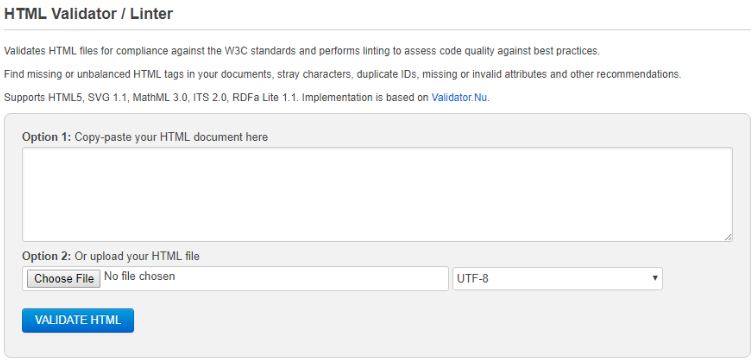
- Free Formatter – This free tool can be used to validate your HTML code for compliance with W3C standards and fixing issues to enhance the code quality. You have an option of pasting the HTML code in the input text-area provided on the site or uploading the HTML code on their validation server. Free Formatter can be accessed here.
 Along with validators, you can also use code linters that can point out programming errors along with eliminating warnings that occur due to bad programming practices. Some of the popular linters are given below.
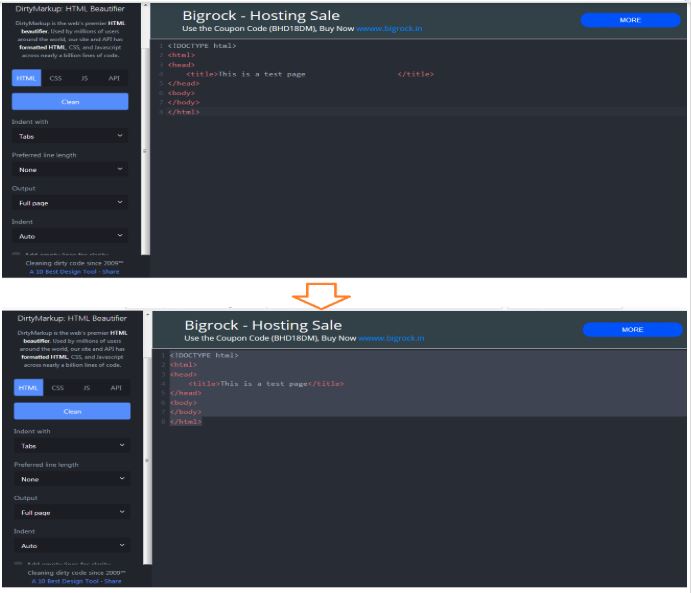
 - DirtyMarkup Formatter – This is a free tool used to clean up bad code for formatting, preferred line length, and indentation. Along with HTML code, DirtyMarkup Formatter can also be used for JS (JavaScript) and CSS code. DirtyMarkup Formatter can be accessed here. A sample output of non-intended code and formatted code in HTML is below.
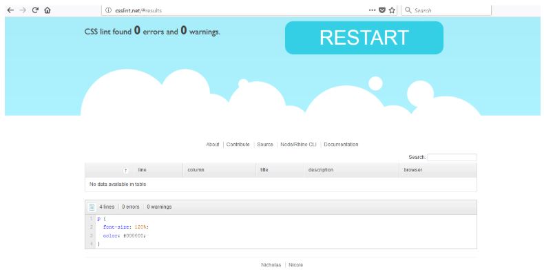
- CSS Lint – This linter is specifically used for linting CSS code. CSS Lint can be accessed here. An example is shown below.
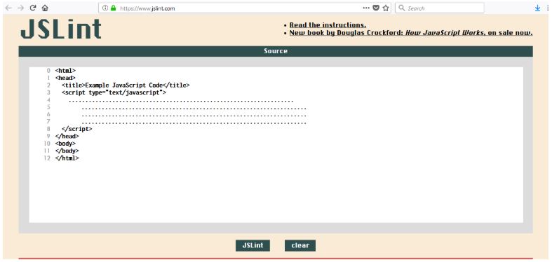
- JS Lint – This linter is specifically used for linting JS Code. JS Lint can be accessed here. An example is shown below.
Though these are some of the popular options, there might be cases where you might not prefer to upload the source code on ‘some server’ that does the job of code beautification and linting. Many IDEs have a variety of plugins that can ease the job of linting the source code. The Atom and Notepad++ linters are popular linter options for developers.
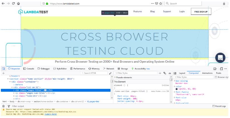
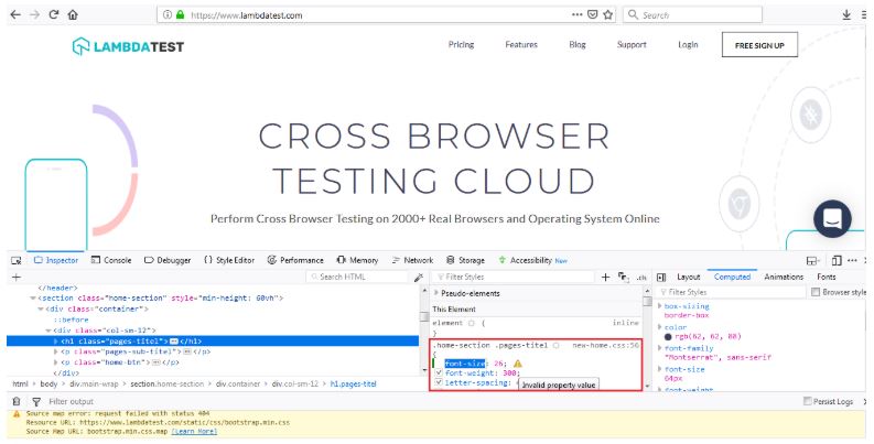
Developer/Inspector Tools in Browsers – Although linters and validators are effective in validating and linting source code, there are numerous cases where you might prefer to use the Developer Tools or Inspect Element options that are available in most popular browsers. In the example below, we try to change the font-size of the page title but end up using the wrong syntax. The issue is highlighted with a message ‘Invalid Property Value.’ If these tools are used effectively, they can help you in unearthing the bugs in your source code and also in doing reverse engineering.
Commonly Observed Cross-Browser Issues
You can observe issues with HTML and CSS when you start implementing features that use CSS prefixes. Many old browsers do not support the latest features like HTML5 Audio/Video, FlexBox, CSS Grids, etc. Older versions of Internet Explorer do not support many CSS functionalities like CSS3 selectors, CSS3 Colors, CSS Namespaces, etc. As a developer, you have to ensure that your website or web application works well on Internet Explorer since it is still a widely used browser (Source). The complete list of features that are supported on Internet Explorer is given here. Other common reasons why you might encounter cross-browser compatibility issues are mentioned below:
- Incompatibility of the browser with the operating system (OS).
- Minimal support for the latest features.
- Different implementations of JavaScript.
- A different implementation of browser features for handling the same functionality (for gaining more market share).
- Bugs in browsers.
- Issues with page alignment.
Ensuring that these functionalities are supported on old browsers is the responsibility of the developer as well as the tester. This target can be achieved by having a fallback mechanism for features implemented with CSS, HTML, or JavaScript in case your website is accessed from an old browser. You can make use of responsive CSS frameworks so your application will be mobile-ready along with being cross-browser compatible. Some renowned CSS frameworks are Bootstrap, Foundation, and Semantic UI.
We already know that consistency is the key to any successful UI design. However, with the abundant availability of browsers, keeping your website consistent becomes a challenge, as each browser has its own unique default CSS rendering rules set in accordance with the rendering engine. CSS reset stylesheets offer a helping hand to help us cope with the consistency challenge by forcing every browser to have the styling of each HTML element reset to void, limiting the number of cross-browser differences that the web app or website might have to face. It is considered a best practice to add a CSS reset at the very top of your stylesheet.
HTML and CSS Techniques for Cross-Browser Compatibility
Some HTML elements might not be recognized by old browsers; the good part is that these elements are treated as anonymous inline elements, i.e. something similar to comments in the source code. Some of the common methodologies to achieve cross-browser portability for HTML are given below:
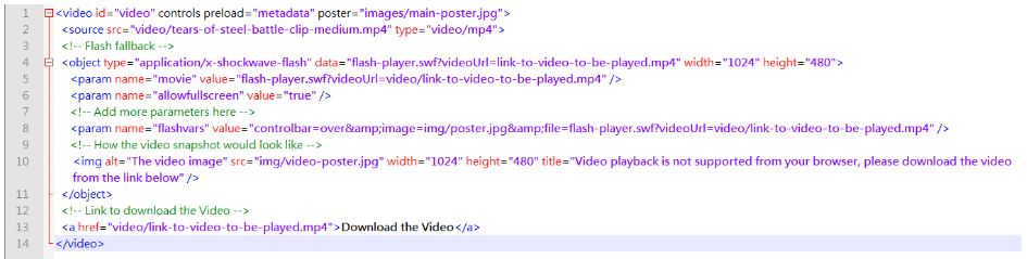
Implementation of Features in Display: block;
A good practice is to have the implementation using newer functionalities in a display: block;. This rule of thumb can also be applied to other HTML5 tags like audio, video, aside, etc. You also have the flexibility of adding the fallback mechanism in the opening tag (<) and closing tag (>). In the example below, the user has the option to download the video in case the browser is outdated and does not support Flash.
Vendor Specific Implementations of CSS
For the purpose of uniqueness, browser makers implement extensions to CSS specifications and in a majority of cases, these implementations are proprietary to the browser. Some of these features are also added for debugging and for testing out the features that are in an experimental phase. Keywords/property names begin with a dash (-) or an underscore (_). Hence, the format could be:
‘-‘ + vendor specific identifier + ‘-‘ + meaningful name
‘-‘ + vendor specific identifier + ‘-‘ + meaningful name
As per the W3C specification, any other CSS property name can never begin with an ‘_’ or ‘-‘ and this helps in differentiating normal CSS implementations from vendor-specific implementations. Some of the common ‘Vendor Extension Prefixes’ are below:
PREFIX |
BROWSER |
|---|---|
| -MS- | MICROSOFT INTERNET EXPLORER |
| MSO- | MICROSOFT OFFICE |
| -MOZ- | FIREFOX/MOZILLA FOUNDATION |
| -O- | OPERA SOFTWARE |
| -WEBKIT- | SAFARI, CHROME (AND OTHER WEBKIT-BASED BROWSERS) |
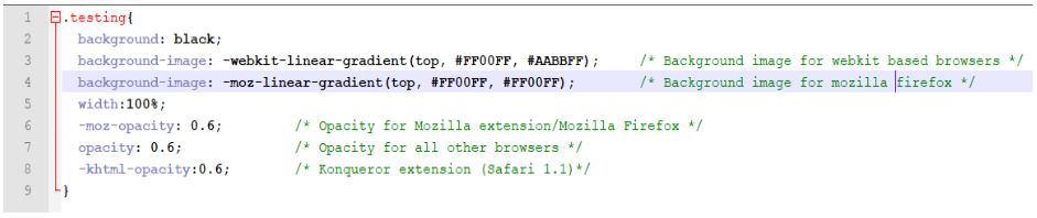
In the example below, CSS declarations for opacity levels are given for the Firefox browser and other browsers are mentioned separately. The same rule is also applied to the background-image property.
IE Conditional Comments
As mentioned earlier, Internet Explorer (IE) is still one of the dominant browsers, hence you need to ensure that your code works seamlessly on the different versions of IE. This is where IE Conditional Comments can be helpful to selectively apply HTML code for different IE versions.
Conditional comments can also be used to apply CSS rules with the help of conditional comment operators. Some of the conditional comment operators are below:
OPERATOR |
DESCRIPTION |
|---|---|
| IE | IT REPRESENTS INTERNET EXPLORER AND IF A NUMBER IS MENTIONED ALONGSIDE IT, IT REPRESENTS THE IE VERSION |
| LT | LESS THAN |
| LTE | LESS THAN OR EQUAL TO |
| GT | GREATER THAN |
| GTE | GREATER THAN OR EQUAL TO |
| TRUE, FALSE | EVALUATES TO TRUE AND FALSE RESPECTIVELY |
| & | AND OPERATOR |
| | | OR OPERATOR |
| ! | NOT OPERATOR |
| () | SUB-EXPRESSION OPERATOR |
For example, in case you want a piece of code to be executed only for IE version that equals 7, you can use the [if IE 10] expression.
<!--[if IE 10 ]>
<p>Code to be executed only for IE 10</p>
<![endif]-->
In case you need to execute code for IE 11 and versions above 11, you can do the following:
 <!-- Execute code for IE version greater than IE 11 -->
 <!--[if gte IE 11 ]>
 <p>Code to be executed by IE 11 and versions above IE 11</p>
 <![endif]-->
You could also include use different styles/CSS for different IE versions so that there is no breakage in the functionality.
Border Radius for Rounded Corners With Images
border-radius is a popular property to create rounded corners, either in boxes or images. This property which was introduced in CSS3 can be applied to any div, text box, or button; but it has limited browser support. This is particularly true for older versions of Internet Explorer. If this property is used in your CSS code, you need a fallback mechanism with images.

CSS3 Buttons With Fallback Images
Buttons are powerful web elements that are used as navigation items, page links, etc. and with CSS3, developers and designers can create buttons with different background, rounded corners, gradients, and other styling options. However, there are many browser versions that may not be able to render buttons with different styles. Similar to the border-radius property, developers need to have a fallback option with images when buttons are used. In the example below, we have two declarations of background-color: background-color: #ffff00; and background-color: rgba(255,255,0,1);.
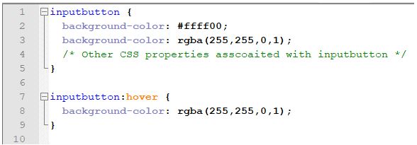
In the code that is shown above, there are two declarations of the background-color property. In the first declaration, the background color is declared in a hexadecimal format (#ffff00) and the second declaration has the color listed in the rgba (Red, Green, Blue, Alpha) format that is understood by the latest browsers. If a page that has this CSS code is accessed from an older browser, the declaration with the rgba format would not be applicable and it would be ignored, i.e. the background color would be applied from the property declared at with the hexadecimal format. On the other hand, if the code is accessed from a newer browser, the hexadecimal declaration would be over-ridden by the rgba declaration.
Media Queries for Devices With Variable Screen Sizes
Nowadays, consumers access web content from different types of devices like desktops, tablets, phones, etc. Along with different device types, developers also need to adapt their code to different screen sizes. This is why media queries – @media only and @media screen — were introduced in CSS3.
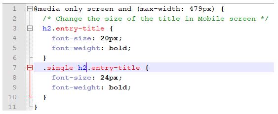
In the example shown above, the font size (for h2) would be limited to 20px if your CSS code is accessed from a device which has max-width of 479px. For devices that have screen-width more than 479px, the above code would not be executed and the default options for h2 would be applied.
Published at DZone with permission of Harshit Paul. See the original article here.
Opinions expressed by DZone contributors are their own.
Comments