Creating a Polar Chart to Measure Electromagnetic Field Strength
Learn how to create stunning JavaScript polar charts with TypeScript and Node.js. Follow along to learn how to visualize your data in a high-performance chart.
Join the DZone community and get the full member experience.
Join For FreeJavaScript polar charts, also known as radar charts, are a type of data visualization that displays multivariate data in a circular format.
These charts are often used to represent multivariate data sets in a way that allows for easy comparison between data points and quick identification of trends and patterns.
The use of polar charts in JavaScript has grown in popularity due to their versatility and ability to display complex data in an easily digestible format.
Within a polar chart, we can make use of two types of data:
- The radial coordinate (distance between poles).
- The angular coordinate (angle obtained from a fixed point).
In this article, I will provide you with a closer look at how to create a JavaScript polar chart for measuring electromagnetic field strength and we will make use of values of angles and amplitude of the spectrum from the angle.
Whether you’re a data analyst, developer, or simply someone looking at how to create your own JS application, you’re sure to find this tutorial informative and helpful.

Setting Up Our Template
1. To get started, please download the project template.
2. Open up the project in Visual Studio Code. You’ll see a file tree like this:

3. Now, open a new terminal and, as usual, in NodeJS projects, you’ll have to run the NPM Install command.
This would be everything for our initial setup. Let’s code.
CHART.ts
This file contains all the necessary algorithms and processes required to construct our polar chart, set up its animations, and arrange the data in an easily interpretable format. To get started:
1. Import the JSON data file. All the data will be encapsulated in the dataJson object:
import dataJson from './data.json'
2. Declare the constant lcjs that will refer to our @arction/lcjs library:
// Import LightningChartJS
const lcjs = require('@arction/lcjs')
3. Extract required classes from lcjs:
const {
    lightningChart,
    Themes
} = lcjs
4. Creating the chart object. The entire chart object will be created inside the [app] object. The [app] method will need a data object. We already have the data object (dataJson):
const app = (data) => {
    // Create a polar chart.
    const polar = lightningChart().Polar({
        theme: Themes.darkGold,
    })
        .setTitle('Electromagnetic field strength')
Below is a breakdown of the code:
setTitle: Text label that will be shown as the title of the chart.Polar: The polar chart type already exists in the LC library, and we just need to specify the type as a property of thelcjsclass.Theme: A collection of default implementations can be accessed by themes. The color scheme for the components must be defined at the time of creation and cannot be altered after the fact without first destroying the component and recreating it with the desired color theme.
5. Configuring the axes:
const radialAxis = polar.getRadialAxis()
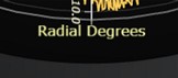
.setTitle('Radial Degrees')
const amplitudeAxis = polar.getAmplitudeAxis()
.setTitle('Field strength H (A/m)')getRadialAxis: We can get access to the radial axis of the polar chart (degrees), by using the[getRadialAxis]function. In this case, we can set the title of the axis, as shown:
getAmplitudeAxis: We can get access to the Amplitude axis of the polar chart, by using the[getAmplitudeAxis]function. We can set the title of the axis as in the next image:![Setting-axis-amplitude]()

Note: If you don’t specify a title for each axis, the “Degrees” and “Amplitude” titles will appear by default.
6. Create a series for each data set. In this function, we will create a series for each member in the JSON file:
const series = data.map(( info ) => {
        const { name } = info
        const polarAreaSeries = polar.addAreaSeries()
            .setName( name )
            .setConnectDataAutomaticallyEnabled(true)
            .setMouseInteractions(false)
            .setCursorResultTableFormatter((builder, series, angleDeg, amplitude, format) => builder
                .addRow(`${series.getName()}`)
                .addRow('Angle', '', `${Math.round(angleDeg)} °`)
                .addRow('Field strength', '', `${format(amplitude)} A/m`)
            )

        return polarAreaSeries
})setConnectionDataAutomaticallyEnabled: Set automatic connection of first and last data points enabled or not.setMouseInteractions: Set component mouse interactions enabled or disabled. Disabling mouse interactions means the objects below this component can interact with it.setCursorResultTableFormatter: Configure the formatting of the cursorResultTablewhen pointing at this series. The general syntax of configuringResultTableformatting is shared between all series types. You need to specify a callback function that receives aTableContentBuilder. The contents of the table are then set using methods of the table builder.
The additional values that are supplied to the callback function vary between different chart types. All polar series receive three extra parameters:
series: reference to the series itself.angleDeg: pointed data point angle as degrees.amplitude: pointed data point amplitude.
7. Animate series data with random static to simulate live sensor data:
let freezeData = false
    const updateData = () => {
        if (! freezeData)
            series.forEach((series, i) => {
                const polarPoints = data[i].data
                const polarPointsWithStatic = polarPoints.map( polarPoint => ({
                    angle: polarPoint.angle,
                    amplitude: polarPoint.amplitude + (Math.random() * 2 - 1) * 0.2
                }))
                series.setData(polarPointsWithStatic)
            })

        requestAnimationFrame(updateData)
    }
    updateData()
8. Freeze data animation while the mouse is on the Chart:
polar.onSeriesBackgroundMouseEnter(() => {
        freezeData = true
    })
    polar.onSeriesBackgroundMouseLeave(() => {
        freezeData = false
    })
9. Execute the entire app process, adding the data JSON as a parameter:
app(dataJson);NPM START
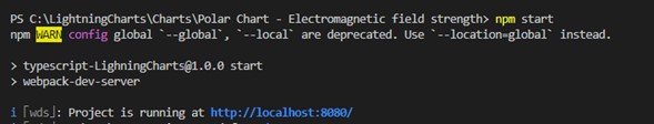
To visualize the chart application, run npmstart in the terminal to visualize the chart in a local server.

Final Words
In conclusion, JavaScript polar charts can be an extremely valuable tool for anyone looking to represent and analyze complex data sets. Polar charts offer a unique and intuitive way to understand and compare data points.
To get the most out of your polar chart, it is important to choose the right data to display, format the data appropriately, and utilize the right tools and libraries to create and customize your chart.
To create a polar chart that effectively communicates your data, consider using a high-performance visualization library.
The advantage of using a high-performance charting library is the wide range of customization options that can be used to create charts that are tailored to your specific needs.
If you need help with your code, leave a comment with your questions. Make sure to send any code snippets or screenshots and I’ll be glad to help.
See you in the next article!
Opinions expressed by DZone contributors are their own.
Comments