Data Analysis Using Google Cloud Data Studio
In this tutorial, take an in-depth look at Google Cloud Data Studio, a tool for transforming data into useful reports and data dashboards.
Join the DZone community and get the full member experience.
Join For FreeIntroduction
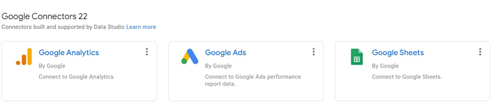
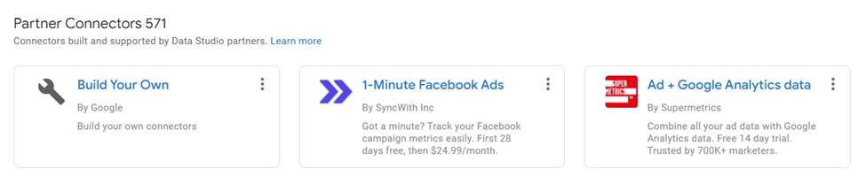
Google Cloud Data Studio is a tool for transforming data into useful reports and data dashboards. As of now, Google Data Studio has 22 inbuilt Google Connectors and 571 different Partner connectors which help in connecting data from BigQuery, Google Ads, Google Sheets, Cloud Spanner, Facebook Ads Data, Adobe Analytics, and many more.
Once the data is imported, reports and dashboards can be created by a simple drag and drop and using various filter options. Google Cloud Data Studio is out of the Google Cloud Platform, which is why it is completely free.
Accessing Data Studio
Since Data Studio is out of GCP, simply search "Google Cloud Data Studio" and open the first link or directly open the link “datastudio.google.com” on the browser.
This article focuses on analyzing the employee data with 5,000 records downloaded from here.
A few important columns in the sample data are:
- Name Prefix
- Age
- Gender
- Salary
- Place Name
- County
- State
- Region
- Year of Joining
- DOB
- Date of Joining
Analyzing Data
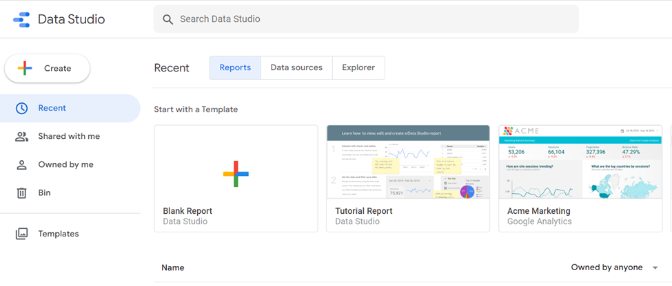
First, the data needs to be uploaded to Google Cloud Data Studio by clicking on the “Blank Report” option. Next, select the “File Upload” option, as the data exists on the local machine which requires an Upload to Data Studio.

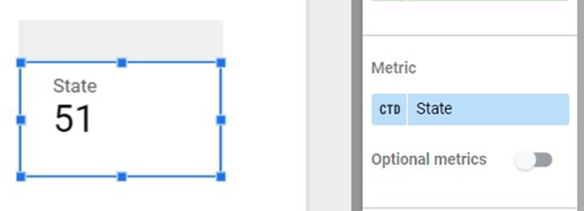
As soon as the file is uploaded, the Data Studio gives a default view on a random column and “Record Count” as a default metric. The sheet can be renamed and the default view can be removed. Data Studio gives us various chart options such as “Scoreboard,” “Table,” “Time Series,” “Bar,” and “Pie." To begin, the simplest chart can be selected, which is the “Scoreboard,” and by default, the “Scoreboard” returns the total number of records in a sheet.

Any column can be selected from the sheet in the right panel “DATA,” and the style can be modified using the “STYLE” option on the right panel.

Changing the metric “State” will return the total number of distinct States in the Employee Data.
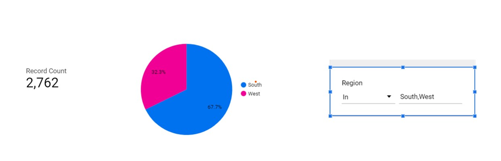
Just like with Scoreboard, "Pie Chart" can be used for showcasing percentages like profits from different countries, the number of employees from different countries, etc. In the Employee Data Analysis, we can use a pie chart to display the percent of employees belonging to different regions in the USA. In the Dimension section select “Region.”

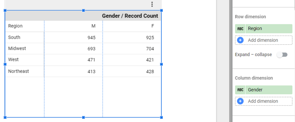
Pivot Table
Pivot tables help in organizing the data by multiple categories, such as breaking down regional "Gender/Record Count." Data Studio provides Row Dimension and Column Dimension options for data distribution. In the example below, the row dimension is "Region" and the column dimension is "Gender."
The grand total can be done both via rows and columns in Data Studio. The "Totals" section provides the option of displaying the grand total.
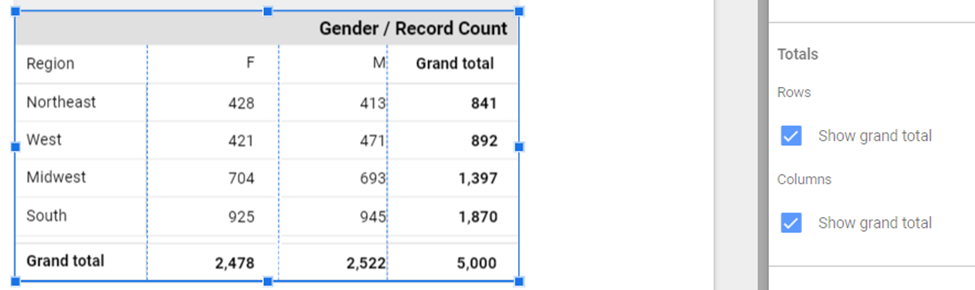
Data in the pivot table can be sorted in ascending/descending order.
![Pivot table data - ascending/descending]() Adding Controls
Adding Controls
 Adding Controls
Advance Filter
The Controls allow for filtering of the data or changing the display of the data in the report. The most important control is the “Advance Filter.” This filter helps in filtering the data based on fields and conditions. In the example of the Pie Chart where the chart is created based on the “Region” attribute, this data can be further filtered based on only the “South and West” region.
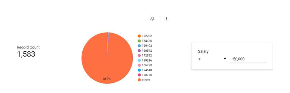
Another example below is filtering based on numeric columns, finding employees with Salaries greater than 150K.
List
Data Studio provides two List Options: “Fixed Size List” and “Drop Down List.” Drop Down displays the control in a drop-down combo box and Fixed Size control displays the data as a fixed-size box.
Drop Down

Fixed Size

Styling
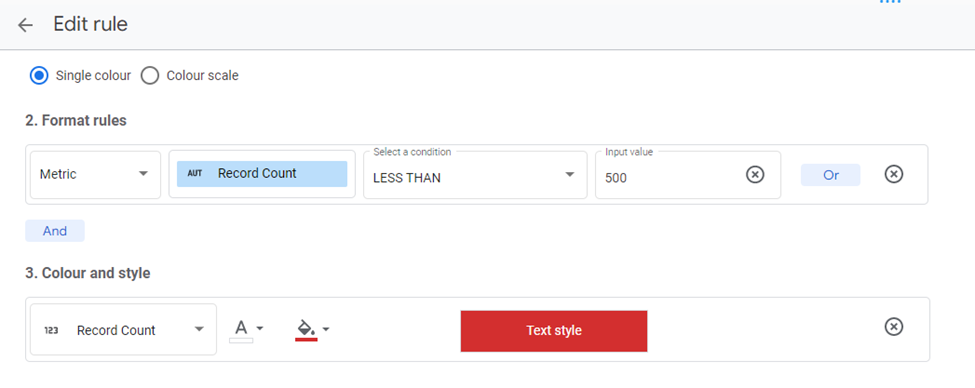
Data Studio exclusively provides the option of adding styles to the charts/tables, users can add Headers/Title, or style them as well. Data Studio also provides conditional styling options such as showing the row in red if the number is greater than the "x" value.
Let’s add some style to the pivot table example breaking down regional gender data distribution. To add style to the components, the user needs to change the defaults from the "STYLE" section.

In the example, we will show the Record Count value in red color when the value is less than 500.
Which results in the following:

Summary
Google Data Studio is a complete tool for proper data analysis by simple drag and drop, where no code data can be analyzed. It supports 571 partner connections and 22 Google connectors from which data can be imported easily and analyzed. The Dashboard updates in Data Studio are real-time, and above all, it’s a free tool for the most part. In order to integrate with some other external apps like Shopify or Coupler.io, use needs licensing. Reports prepared in Data Studio can be imported as PDF, and also it provides the option of adding themes and layouts.
Opinions expressed by DZone contributors are their own.
Comments