How to Extract Data Points From a Chart
I often see benchmark reports that show charts but don’t provide tables of numeric results. Fortunately, it’s usually possible to get approximate results without too much trouble.
Join the DZone community and get the full member experience.
Join For Freei often see benchmark reports that show charts but don’t provide tables of numeric results. some people will make the actual measurements available if asked, but i’ve been interested in analyzing many systems for which i can’t get numbers. fortunately, it’s usually possible to get approximate results without too much trouble. in this blog post i’ll show several ways to extract estimates of values from a chart image.
i’ll motivate the idea with a simple chart of a slide i saw at the recent pgconfsv conference on a keynote presentation. i was interested in the benchmark data (for citusdb , in this case) but i am sure they are busy and i haven’t gotten in touch with them yet about it. so i watched the youtube video of the keynote address, paused it when the slide was showing, and took a screenshot.

i’d like to use the universal scalability law to analyze the chart on the left and estimate how much of citusdb’s massively parallel processing is serialized. i am not an expert on it, but i believe it uses a postgresql node with a plugin as a query planner and router, sends queries to shards containing data, and combines the results to return them to the client. this is fairly standard scatter-gather processing. one of the big limiting factors for such a system is typically the query planning and the merging of the results. how much of the overall execution time does that take? the universal scalability law can help understand that. but to analyze the system, first i need its data.
let’s see how to get it.
doing it the hard way
i’m going to show you two hard ways to do this and suggest a couple of easier ways.
one is to use any photo editing software and a ruler or crop function to estimate the pixel center of the points on the chart. for example, here’s a screen capture of dragging from the bottom left of the image to the bottom left of the chart to get an x-y point for the intersection of the chart’s x and y axes. i’m using the default mac image editing program here, preview:
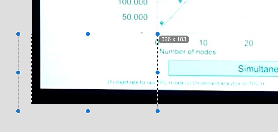
the result is x=326,y=183. do this repeatedly for all the points on the chart and then put the results into a spreadsheet, subtract the origin x and y from all the points, and normalize them relative to known points on the chart axes (which you should also measure) and you’ve got your results. here’s a screenshot of the spreadsheet i made to do this. the points i measured are in green and the results are in purple:
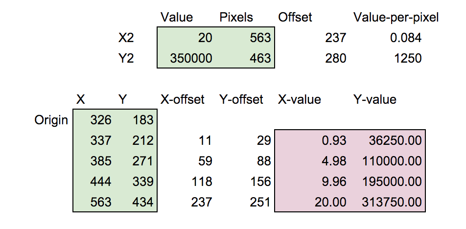
you may download the spreadsheet if you’d like to look at it. it’s quite clear from the chart’s context that the x-values should actually be 1, 5, 10 and 20 so those are easy corrections to make. using this technique i estimate the points as follows:
 1   36250
 5  110000
10  195000
20  313750
a similar technique is to use desmos . you can insert an image, set its dimensions equal to its pixel count, then create a table and use the gear menu to enable dragging on the table’s points, turning on the 4-way drag handles. then align points over the chart’s points, and you can read off the values from the table just as with the preview app:

one nice thing about this method is that you can then combine the image with any graphs you’re making. for example, i used this method to facetiously analyze the path of the eclipsing moon on a recent blog post.
easier ways
why use hard methods like that? i believe the hard ways are still valuable to know about. first of all, when you do it you get a firm grasp on the math and you’re tuned into what you’re working on (or i am, at least). second, sometimes when charts are skewed by, say, the camera’s perspective, you have to estimate where the points would fall if the skew were corrected.
that said, there are a few tools that are easier to use and produce good results. while searching online i found engauge , data thief , and . but the best one i’ve found so far is the free online web plot digitizer , which runs in the browser and produced quite good results for me. it allows very fine control over the placement of the points. the extracted points are:
 0.995104673   32858.00211
 5.070422535  108307.8542
10.07535128   196097.94
20.17810302   312738.7098
of course, the x-points should be set to 1, 5, 10, and 20 as before.
as a bonus, this app integrates with plotly , and can automatically send the resulting data points there for analysis. plotly is a tool i wasn’t aware of previously. i found it quite nice for this type of analysis and was able to quickly run a regression against the usl and estimate the coefficient of serialization at 4% and the coefficient of crosstalk at 0, which is very realistic for this type of system in my experience:

that was easy! easier than using rstudio, perhaps.
conclusions
using the techniques i showed in this article you can extract graph points from a variety of different images when you lack the source data. some of these techniques are easier to use on large datasets than others, and some are just more fun if you feel like doing things manually, but all can produce results good enough for many purposes.
if you’re curious about the analysis of citusdb, and what it means for it to have a coefficient of serialization (sigma) of about 4%, please read my introduction to the universal scalability law . if you’re like me, you’ll find it fascinating that such a model exists. (exercise for the reader: what’s the maximum speedup citusdb should be able to achieve as you add more nodes to it?)
Published at DZone with permission of B Jones. See the original article here.
Opinions expressed by DZone contributors are their own.
Comments