jQuery Mobile Tutorial: User Registration, Login and Logout Screens for the Meeting Room Booking App
Join the DZone community and get the full member experience.
Join For Freein this jquery mobile tutorial we will create the screens that will handle user registration, login and logout in a real-world meeting room booking application. this article is part of a series of mobile application development tutorials that i have been publishing on my blog jorgeramon.me.
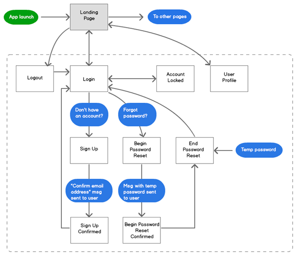
if you are new to this series, i recommend that you read its first part, as well as this mobile ui patterns article where i provide a flowchart describing the user registration, login and logout screens in a mobile application. we will use this chart as a guide for this article. here’s a screenshot:
in this part of the tutorial we will only create the static html for the screens. in future articles we will implement the programming logic that makes the pages work.
the first step we are going to take is to set up a jquery mobile project for the app.
how to set up a jquery mobile project
while you can use mobile sdks such as kendo ui mobile and intel xdk to create, debug and deploy jquery mobile apps, in this tutorial i will show you how to create a simple jquery mobile project without using the facilities provided by those sdks. i think that it’s important to understand how you can create this type of project from scratch, and how the different pieces in the project work together in an app.
the project’s directories and files
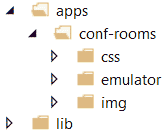
we need to pick a directory in our development workstations where we will place the project’s files. in my case i named that directory “apps”. in that directory, we will create a root directory for the application, which we will name “conf-rooms”. make sure that this directory is set up so it can be accessed from your local web server.
under “conf-rooms” we will create a “css” directory, where we will place the css assets of the project; and an “img” directory for the images that we will use.
at the same level of the “apps” directory, we will create a “lib” directory. this is where we will place the jquery mobile and any other libraries that our application will use. you also need to set up this directory so it can be accessed from your local web server.
on my workstation the directories look as depicted below:
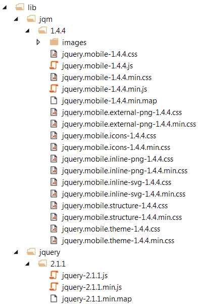
now is a good time to download the jquery mobile and jquery libraries from their respective websites, and place them in the “jqm” and “jquery” directories, all under the “lib” directory. this is how the files look on my workstation:
how jquery mobile works
a short overview of jquery mobile for those who aren’t very familiar with it yet. as its documentation clearly explains, jquery mobile is a unified user interface system with the following characteristics:
- it works seamlessly across all popular mobile device platforms.
- it uses jquery and jquery ui as its foundations.
- it has a lightweight codebase built on progressive enhancement.
- it has a flexible and easily themeable design.
an attribute that differentiates jquery mobile from other frameworks is that it targets a wide variety of mobile browsers. the reason this coverage is possible has to do with the way jquery mobile works.
jquery mobile works by applying css and javascript enhancements to html pages built with clean, semantic html. the usage of semantic html ensures compatibility with most web-enabled devices. the techniques applied by the framework to an html page, transform the semantic page into a rich and interactive experience. we call these changes progressive enhancements, as they are applied progressively to the page, taking advantage of the capabilities of the browser on the web-enabled device.
the enhancements result in pages that provide a great user experience on the latest mobile browsers and degrade gracefully on less capable browsers, without losing their intrinsic functionality.
in addition, the framework provides support for screen readers and other assistive technologies through a tight integration with the web accessibility initiative – accessible rich internet applications suite (wai-aria) technical specification.
creating the landing screen
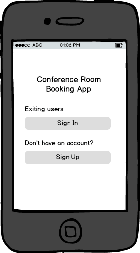
the first application that we will create is the landing screen. this screen will come up when users launch our application. as reflected in the flowchart at the beginning of this article, the landing screen is the door to all the areas of the app, and it requires that users log in before navigating any further.
in the “wireframes for signing in and signing up” section of the third part of this tutorial we created the following mockup for this screen.
let’s create an empty index.html file in the “conf-rooms” directory, and add a jquery mobile page template to the file as follows:
<!doctype html>
<html>
<head>
    <title>conference room booking app - welcome</title>
    <meta name="viewport" content="width=device-width, initial-scale=1">
    <link href="css/themes/1/conf-room1.min.css" rel="stylesheet" />
    <link href="css/themes/1/jquery.mobile.icons.min.css" rel="stylesheet" />
    <link href="../../lib/jqm/1.4.4/jquery.mobile.structure-1.4.4.min.css" rel="stylesheet" />
    <link href="css/app.css" rel="stylesheet" />
    <script src="../../lib/jquery/2.1.1/jquery-2.1.1.min.js"></script>
    <script src="../../lib/jqm/1.4.4/jquery.mobile-1.4.4.min.js"></script>
</head>

<body>
    <div data-role="page">
        <div data-role="header" data-theme="c">
            <h1>book it</h1>
        </div><!-- /header -->
        <div role="main" class="ui-content">
            <h2 class="mc-text-center">welcome!</h2>
            <p class="mc-top-margin-1-5"><b>existing users</b></p>
            <a href="sign-in.html" class="ui-btn ui-btn-b ui-corner-all">sign in</a>
            <p class="mc-top-margin-1-5"><b>don't have an account?</b></p>
            <a href="sign-up.html" class="ui-btn ui-btn-b ui-corner-all">sign up</a>
            <p></p>
        </div><!-- /content -->
    </div><!-- /page -->
</body>
</html>
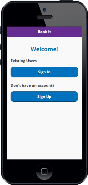
before we step through this code i want you to check out this file in a mobile browser or simulator. the result should look like this screenshot:
what do you think?
back in the index.html file, in the head section we have references to the jquery and jquery mobile libraries. double check that yours are pointing to the correct directories in your workstation.
how to use a custom theme in jquery mobile
now i want to direct your attention to the following lines:
<link href="css/themes/1/conf-room1.min.css" rel="stylesheet" />
<link href="css/themes/1/jquery.mobile.icons.min.css" rel="stylesheet" />
<link href="../../lib/jqm/1.4.4/jquery.mobile.structure-1.4.4.min.css" rel="stylesheet" />
these lines mean that we are using a custom jquery mobile theme that resides in the “conf-room1.min.css” file. i created this file using jquery mobile’s theme roller . we will use this theme to give our app a look different than the standard jquery mobile themes.
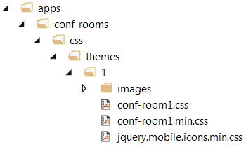
you can download the theme using this link . after downloading the zipped theme files, we will go to the “css” directory, create a “css/themes/1″ directory and place the unzipped theme files there. when done, the “css” directory should look like this:
in the head section of the index.html file we also have this code:
<link href="css/app.css" rel="stylesheet" />
app.css is the css file where we will place any additional custom styles that we will use in the app. for the moment, we will add the following code to the “app.css” file:
/* change html headers color */
h1,h2,h3,h4,h5 {
    color:#0071bc;
}
h2.mc-text-danger,
h3.mc-text-danger  {
    color:red;
}

/* change border radius of icon buttons */
.ui-btn-icon-notext.ui-corner-all {
    -webkit-border-radius: .3125em;
    border-radius: .3125em;
}
/* change color of jquery mobile page headers */
.ui-title {
    color:#fff;
}
/* center-aligned text */
.mc-text-center {
    text-align:center;
}
/* top margin for some elements */
.mc-top-margin-1-5 {
    margin-top:1.5em;
}
these are just a few cosmetic changes that will enhance the look of the app. notice that i prefixed non-jquerymobile classes with the characters “mc-” to avoid potential collisions with jquerymobile’s classes.
the remaining lines in the head section of index.html are the references to the jquery and jquery mobile libraries. as i suggested earlier, make sure that yours are pointing to the correct directories in your project.
let’s move on to the body section of the “index.html file”. there you will find the standard jquery mobile page template with a header and main divs:
<div data-role="page">
    <div data-role="header" data-theme="c">
        <h1>book it</h1>
    </div><!-- /header -->
    <div role="main" class="ui-content">
        <h2 class="mc-text-center">welcome!</h2>
        <p class="mc-top-margin-1-5"><b>existing users</b></p>
        <a href="sign-in.html" class="ui-btn ui-btn-b ui-corner-all">sign in</a>
        <p class="mc-top-margin-1-5"><b>don't have an account?</b></p>
        <a href="sign-up.html" class="ui-btn ui-btn-b ui-corner-all">sign up</a>
        <p></p>
    </div><!-- /content -->
</div><!-- /page -->
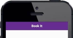
we have decorated the “header” div with the data-theme=”c” attribute, which gives it the nice purple background color that we defined in the custom theme:
in the “main” div we are using a couple of links to the sign in and sign up screens respectively. the links point to the sign-in.html and sing-up.html files that we will create in a few minutes.
these links are decorated with the jquery mobile ui-btn, ui-btn-b and ui-corner-all classes, which make them look like buttons:
this is all we need to do in the lading page for the moment. let’s move on to the log in screen.
creating a log in screen with jquery mobile
here’s the log in screen’s mockup that we built in the third part of this tutorial :
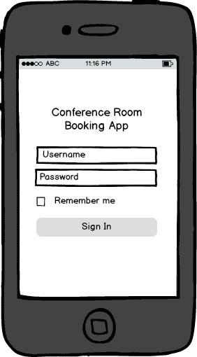
we will use the log in screen to capture the user’s credentials and validate them against the application’s user accounts database. if validation succeeds, we will direct users to a “main menu” scree that we will create in an upcoming tutorial.
let’s create an empty sign-in.html file in the project’s directory. in the file, we will write the following code:
<!doctype html>
<html>
<head>
    <title>conference room booking app - sign in</title>
    <meta name="viewport" content="width=device-width, initial-scale=1">
    <link href="css/themes/1/conf-room1.min.css" rel="stylesheet" />
    <link href="css/themes/1/jquery.mobile.icons.min.css" rel="stylesheet" />
    <link href="../../lib/jqm/1.4.4/jquery.mobile.structure-1.4.4.min.css" rel="stylesheet" />
    <link href="css/app.css" rel="stylesheet" />
    <script src="../../lib/jquery/2.1.1/jquery-2.1.1.min.js"></script>
    <script src="../../lib/jqm/1.4.4/jquery.mobile-1.4.4.min.js"></script>
</head>

<body>
    <div data-role="page">
        <div data-role="header" data-theme="c">
            <h1>book it</h1>
        </div><!-- /header -->
        <div role="main" class="ui-content">
            <h3>sign in</h3>
            <label for="txt-email">email address</label>
            <input type="text" name="txt-email" id="txt-email" value="">
            <label for="txt-password">password</label>
            <input type="password" name="txt-password" id="txt-password" value="">
            <fieldset data-role="controlgroup">
                <input type="checkbox" name="chck-rememberme" id="chck-rememberme" checked="">
                <label for="chck-rememberme">remember me</label>
            </fieldset>
            <a href="#dlg-invalid-credentials" data-rel="popup" data-transition="pop" data-position-to="window" id="btn-submit" class="ui-btn ui-btn-b ui-corner-all mc-top-margin-1-5">submit</a>
            <p class="mc-top-margin-1-5"><a href="begin-password-reset.html">can't access your account?</a></p>
            <div data-role="popup" id="dlg-invalid-credentials" data-dismissible="false" style="max-width:400px;">
                <div role="main" class="ui-content">
                    <h3 class="mc-text-danger">login failed</h3>
                    <p>did you enter the right credentials?</p>
                    <div class="mc-text-center"><a href="#" data-rel="back" class="ui-btn ui-corner-all ui-shadow ui-btn-b mc-top-margin-1-5">ok</a></div>
                </div>
            </div>
        </div><!-- /content -->
    </div><!-- /page -->
</body>
</html>
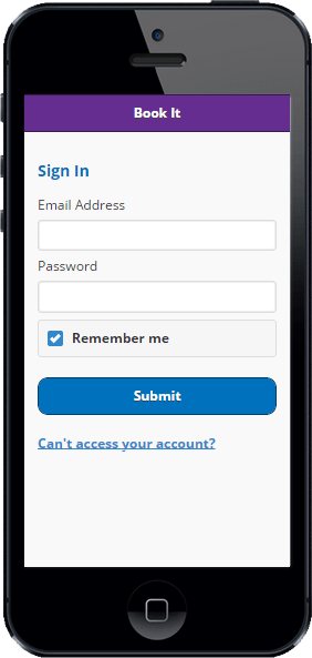
if you open this sign-in.html with a mobile browser or emulator, you will see something like this:
the head section of the html document is similar to the index.html file we created a few minutes ago, with the exception of the document’s title. no need to explain much there.
in the “main” section of the jquery mobile page that wee added to the file, we dropped a few controls that will allow us to capture the user’s email and password, along with a checkbox that will let us know when the user wants the app to remember their credentials:
<h3>sign in</h3>
<label for="txt-email">email address</label>
<input type="text" name="txt-email" id="txt-email" value="">
<label for="txt-password">password</label>
<input type="password" name="txt-password" id="txt-password" value="">
<fieldset data-role="controlgroup">
    <input type="checkbox" name="chck-rememberme" id="chck-rememberme" checked="">
    <label for="chck-rememberme">remember me</label>
</fieldset>
<a href="#dlg-invalid-credentials" data-rel="popup" data-transition="pop" data-position-to="window" id="btn-submit" class="ui-btn ui-btn-b ui-corner-all mc-top-margin-1-5">submit</a>
<p class="mc-top-margin-1-5"><a href="begin-password-reset.html">can't access your account?</a></p>
we also added a link that will allow users to initiate the password reset process if they have problems logging in.
you will also notice that the “submit” link points to the “dlg-invalid-credentials” anchor defined in the same jquery mobile page. this link is decorated with the data-rel=”popup”, data-transition=”pop” and data-position-to=”window” attributes. when we do this, we are telling jquery mobile to open the link to the element with id=”dlg-invalid-credentials” as a popup dialog, using a “pop” transition, and center the element relative to the document’s window. here’s the html for the popup:
<div data-role="popup" id="dlg-invalid-credentials" data-dismissible="false" style="max-width:400px;">
    <div role="main" class="ui-content">
        <h3 class="mc-text-danger">login failed</h3>
        <p>did you enter the right credentials?</p>
        <div class="mc-text-center"><a href="#" data-rel="back" class="ui-btn ui-corner-all ui-shadow ui-btn-b mc-top-margin-1-5">ok</a></div>
    </div>
</div>
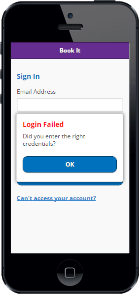
notice that the “dlg-invalid-credentials” div is decorated with the data-rel=”popup” attribute, signaling to jquery mobile to apply popup styles to this div. if you click or tap the “submit” button, you will see the “invalid credentials” popup:
one last thing on this screen. we have the popup linked directly to the “submit” button for testing purposes. in an upcoming part of this tutorial we will add programming logic that will activate the popup only when the login fails.
for the moment we are only concerned with creating the html code for the pages and making sure that the jquery mobile enhancements work on them.
creating an account locked screen with jquery mobile
many business applications use an account locked feature as a measure to increase the app’s security. we will use this feature in our app, and this means that we need to create an account locked screen. the purpose of the screen is to notify the user that their account is locked. we will define under which conditions an account will be locked through programming logic that we will add in an upcoming chapter of this tutorial.
let’s create an empty account-locked.html file, and drop the following code in it:
<!doctype html>
<html>
<head>
    <title>conference room booking app - account locked</title>
    <meta name="viewport" content="width=device-width, initial-scale=1">
    <link href="css/themes/1/conf-room1.min.css" rel="stylesheet" />
    <link href="css/themes/1/jquery.mobile.icons.min.css" rel="stylesheet" />
    <link href="../../lib/jqm/1.4.4/jquery.mobile.structure-1.4.4.min.css" rel="stylesheet" />
    <link href="css/app.css" rel="stylesheet" />
    <script src="../../lib/jquery/2.1.1/jquery-2.1.1.min.js"></script>
    <script src="../../lib/jqm/1.4.4/jquery.mobile-1.4.4.min.js"></script>
</head>

<body>
    <div data-role="page">
        <div data-role="header" data-theme="c">
            <a href="sign-in.html" data-rel="back" class="ui-btn-left ui-btn  ui-btn-icon-notext ui-corner-all ui-icon-back">back</a>
            <h1>app name</h1>
        </div><!-- /header -->
        <div role="main" class="ui-content">
            <h2 class="mc-text-danger">your account is locked</h2>
        <p>please contact the <a href="mailto:">helpdesk</a> to resolve this issue.</p>
        </div><!-- /content -->
    </div><!-- /page -->
</body>
</html>
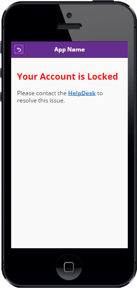
the file should look like the screenshot below when viewed with a mobile browser or emulator:
the html code for this screen is very similar to that in the prior two screens, with the exception of one element that i want you to pay attention to:
<div data-role="header" data-theme="c">
    <a href="sign-in.html" data-rel="back" class="ui-btn-left ui-btn  ui-btn-icon-notext ui-corner-all ui-icon-back">back</a>
    <h1>app name</h1>
</div><!-- /header -->
the header section of the jquery mobile page we just created contains a link to the sign-in.html file. when we decorate it with the ui-btn-left, ui-btn, ui-btn-icon-notext, ui-corner-all and ui-icon-back classes, we are giving the link the appearance of a toolbar button, just like this:
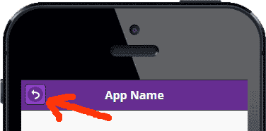
the data-rel=”back” attribute causes any taps on the anchor to mimic a “back button”, going back one history entry and ignoring the anchor’s default href.
you can read more about navigation and linking on jquery mobile by visiting jquery mobile’s navigation documentation. you should also visit the jquery mobile buttons guide to learn about how to create buttons.
creating a sign up page with jquery mobile
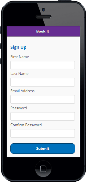
when users tap on the landing screen’s “sign up” button, they will open the sign up screen. this is where we will capture the user’s personal information so we can create an account for them.
remember that our mockup of the sign up screen looks like this:
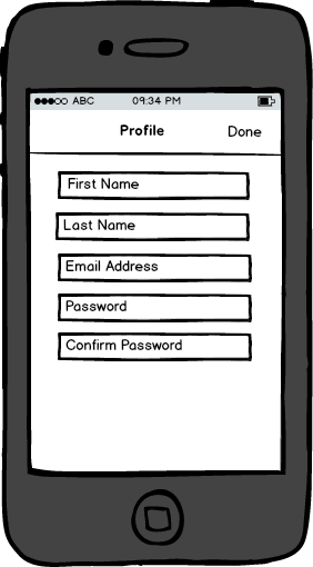
let’s create an empty sign-up.html file and add the following code to it:
<!doctype html>
<html>
<head>
    <title>conference room booking app - sign up</title>
    <meta name="viewport" content="width=device-width, initial-scale=1">
    <link href="css/themes/1/conf-room1.min.css" rel="stylesheet" />
    <link href="css/themes/1/jquery.mobile.icons.min.css" rel="stylesheet" />
    <link href="../../lib/jqm/1.4.4/jquery.mobile.structure-1.4.4.min.css" rel="stylesheet" />
    <link href="css/app.css" rel="stylesheet" />
    <script src="../../lib/jquery/2.1.1/jquery-2.1.1.min.js"></script>
    <script src="../../lib/jqm/1.4.4/jquery.mobile-1.4.4.min.js"></script>
</head>

<body>
<div data-role="page">
    <div data-role="header" data-theme="c">
        <h1>book it</h1>
    </div><!-- /header -->
    <div role="main" class="ui-content">
        <h3>sign up</h3>
        <label for="txt-first-name">first name</label>
        <input type="text" name="txt-first-name" id="txt-first-name" value="">
        <label for="txt-last-name">last name</label>
        <input type="text" name="txt-last-name" id="txt-last-name" value="">
        <label for="txt-email">email address</label>
        <input type="text" name="txt-email" id="txt-email" value="">
        <label for="txt-password">password</label>
        <input type="password" name="txt-password" id="txt-password" value="">
        <label for="txt-password-confirm">confirm password</label>
        <input type="password" name="txt-password-confirm" id="txt-password-confirm" value="">
        <a href="#dlg-sign-up-sent" data-rel="popup" data-transition="pop" data-position-to="window" id="btn-submit" class="ui-btn ui-btn-b ui-corner-all mc-top-margin-1-5">submit</a>
        <div data-role="popup" id="dlg-sign-up-sent" data-dismissible="false" style="max-width:400px;">
            <div data-role="header">
                <h1>almost done...</h1>
            </div>
            <div role="main" class="ui-content">
                <h3>confirm your email address</h3>
                <p>we sent you an email with instructions on how to confirm your email address. please check your inbox and follow the instructions in the email.</p>
                <div class="mc-text-center"><a href="sign-in.html" class="ui-btn ui-corner-all ui-shadow ui-btn-b mc-top-margin-1-5">ok</a></div>

            </div>
        </div>
    </div><!-- /content -->
</div><!-- /page -->

</body>
</html>
the file should look as depicted below when you open it with a mobile browser or emulator:
the only difference with the mockup is that we are using a “submit” button at the bottom of the screen, instead of a “done” button in the toolbar. when you examine the html code, you will find that the “submit” button is wired to the “dlg-sign-up-sent” popup:
<div data-role="popup" id="dlg-sign-up-sent" data-dismissible="false" style="max-width:400px;">
    <div data-role="header">
        <h1>almost done...</h1>
    </div>
    <div role="main" class="ui-content">
        <h3>confirm your email address</h3>
        <p>we sent you an email with instructions on how to confirm your email address. please check your inbox and follow the instructions in the email.</p>
        <div class="mc-text-center"><a href="sign-in.html" class="ui-btn ui-corner-all ui-shadow ui-btn-b mc-top-margin-1-5">ok</a></div>

    </div>
</div>
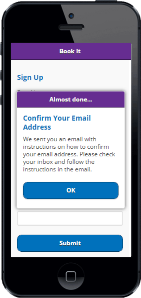
if you tap on the button, the popup will become visible:
we will use this popup to notify the users that we have sent them a message asking them to confirm their email address. the message will contain a link to a webpage where users will need to re-enter the email address used to create their account in the app. with this step we are trying to make sure that it was is a human with a valid email inbox who created the account.
back in the popup’s html code, notice how the “ok” button links back to the sign in screen. you should be able to confirm that this link works when you tap the button.
creating a password reset screen with jquery mobile
the app’s landing screen has a “can’t access your account?” link that helps user initiate the password reset workflow of the app. the first step of this workflow is to present the “begin password reset” screen to the user. we will use this screen to capture the user’s email address. if we find this email address in the user accounts database of the app, we will email the user a provisional password. next, we will activate the “end password reset” screen, where the user will need to enter the provisional password and a new password of their choosing. the picture below illustrates this process.
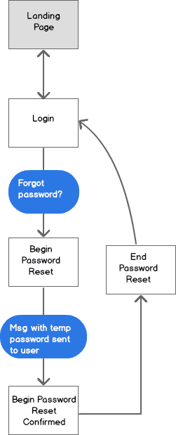
let’s create an empty begin-password-reset.html file in the project’s directory. we will write the following code int the file:
<!doctype html>
<html>
<head>
    <title>conference room booking app - password reset</title>
    <meta name="viewport" content="width=device-width, initial-scale=1">
    <link href="css/themes/1/conf-room1.min.css" rel="stylesheet" />
    <link href="css/themes/1/jquery.mobile.icons.min.css" rel="stylesheet" />
    <link href="../../lib/jqm/1.4.4/jquery.mobile.structure-1.4.4.min.css" rel="stylesheet" />
    <link href="css/app.css" rel="stylesheet" />
    <script src="../../lib/jquery/2.1.1/jquery-2.1.1.min.js"></script>
    <script src="../../lib/jqm/1.4.4/jquery.mobile-1.4.4.min.js"></script>
</head>

<body>
    <div data-role="page">
        <div data-role="header" data-theme="c">
            <h1>book it</h1>
        </div><!-- /header -->
        <div role="main" class="ui-content">
            <h3>password reset</h3>
            <label for="txt-email">enter your email address</label>
            <input type="text" name="txt-email" id="txt-email" value="">
            <a href="#dlg-pwd-reset-sent" data-rel="popup" data-transition="pop" data-position-to="window" id="btn-submit" class="ui-btn ui-btn-b ui-corner-all mc-top-margin-1-5">submit</a>
            <div data-role="popup" id="dlg-pwd-reset-sent" data-dismissible="false" style="max-width:400px;">
                <div data-role="header">
                    <h1>password reset</h1>
                </div>
                <div role="main" class="ui-content">
                    <h3>check your inbox</h3>
                    <p>we sent you an email with instructions on how to reset your password. please check your inbox and follow the instructions in the email.</p>
                    <div class="mc-text-center"><a href="end-password-reset.html" class="ui-btn ui-corner-all ui-shadow ui-btn-b mc-top-margin-1-5">ok</a></div>
                </div>
            </div>
        </div><!-- /content -->
    </div><!-- /page -->
</body>
</html>
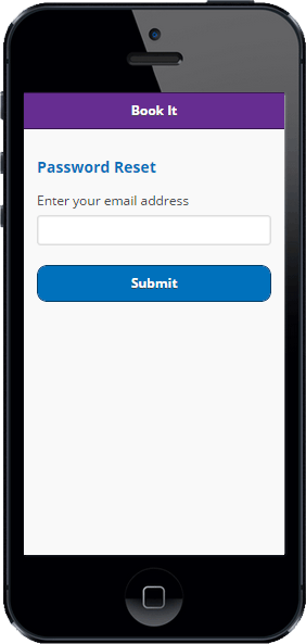
this is how the screen should look when viewed on a mobile browser or emulator:
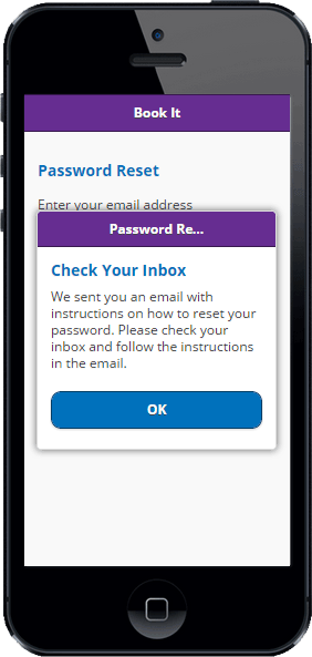
there is nothing new in the html code of this screen. we wired the “submit” button so when a user taps it, the embedded “dlg-pwd-reset-sent” popup will become active:
we did this for testing purposes. remember that we will add the programming logic that activates these popups in upcoming chapters of this tutorial.
when a user taps the popup’s “ok” button, the application will navigate to the “end password reset” screen, which we will create next.
the end password reset screen
this is the screen where the user will enter the provisional password we sent them via email, along with a new password of their choosing. to create this screen we will add an empty “end-password-reset.html” file to the project. here’s the code that goes in the file:
<!doctype html>
<html>
<head>
    <title>conference room booking app - password reset</title>
    <meta name="viewport" content="width=device-width, initial-scale=1">
    <link href="css/themes/1/conf-room1.min.css" rel="stylesheet" />
    <link href="css/themes/1/jquery.mobile.icons.min.css" rel="stylesheet" />
    <link href="../../lib/jqm/1.4.4/jquery.mobile.structure-1.4.4.min.css" rel="stylesheet" />
    <link href="css/app.css" rel="stylesheet" />
    <script src="../../lib/jquery/2.1.1/jquery-2.1.1.min.js"></script>
    <script src="../../lib/jqm/1.4.4/jquery.mobile-1.4.4.min.js"></script>
</head>

<body>
    <div data-role="page">
        <div data-role="header" data-theme="c">
            <h1>book it</h1>
        </div><!-- /header -->
        <div role="main" class="ui-content">
            <h3>reset password</h3>
            <label for="txt-tmp-password">provisional password</label>
            <input type="password" name="txt-tmp-password" id="txt-tmp-password" value="">
            <label for="txt-new-password">new password</label>
            <input type="password" name="txt-new-password" id="txt-new-password" value="">
            <label for="txt-new-password-confirm">confirm new password</label>
            <input type="password" name="txt-new-password-confirm" id="txt-new-password-confirm" value="">
            <a href="#dlg-pwd-changed" data-rel="popup" data-transition="pop" data-position-to="window" id="btn-submit" class="ui-btn ui-btn-b ui-corner-all mc-top-margin-1-5">submit</a>
            <div data-role="popup" id="dlg-pwd-changed" data-dismissible="false" style="max-width:400px;">
                <div data-role="header">
                    <h1>done</h1>
                </div>
                <div role="main" class="ui-content">
                    <p>your password was changed.</p>
                    <div class="mc-text-center"><a href="sign-in.html" class="ui-btn ui-corner-all ui-shadow ui-btn-b mc-top-margin-1-5">ok</a></div>

                </div>
            </div>
        </div><!-- /content -->
    </div><!-- /page -->

</body>
</html>
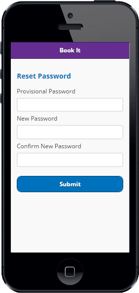
the screen should look like the picture below when viewed with a mobile browser or emulator:
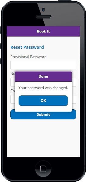
we wired the “submit” button so it activates the embedded “dlg-pwd-changed” popup:
this popup simply tells the user that their password was changed. tapping the “ok” button will make the app navigate back to the sign in screen, where the user can sign in with the new password.
summary and next steps
this concludes our first phase of work on the user registration, login and logout screens of the jquery mobile version of the app. i will emphasize again that in this phase we are not adding programming logic to the screens. we are simply creating a jquery mobile page for each screen and making sure that the visual elements within the screens adhere to the mockups that we created in previous chapters of this tutorial, as well as to the ui patterns flowchart that i mentioned at the beginning of this article.
while we’ve made significant progress with the app at this point, it’s fair to say that we are just getting started. we are still missing the programming for this article’s screens, as well as the jquery mobile pages and programming for the screens that will allow users to browse and reserve meeting rooms, which is why we created the app in the first place.
in the next chapter of this tutorial we will get started with the programming of the user profile screens we just created. don’t forget to sign up for my mailing list so you can be among the first to know when i publish the next update.
stay tuned
don’t miss any articles. get new articles and updates sent free to your inbox.
Published at DZone with permission of Jorge Ramon, DZone MVB. See the original article here.
Opinions expressed by DZone contributors are their own.

Comments