Top Responsive Testing Tools
Learn about the types of Responsive Web Design testing and 11 of the best tools for testing different aspects of your users' web experience.
Join the DZone community and get the full member experience.
Join For FreeWe interact with multiple devices like mobile, desktop/laptop, tablet, etc. and come across huge amounts of web content every day. All these devices vary in resolution and screen size and each of these should render web pages correctly on all screen sizes.
The primary focus of Responsive Web Design (RWD) is to cater a consistent browsing experience to its users no matter what device is being used. It aims to provide the seamless experience of scrolling, browsing, and navigating regardless of screen sizes.
But how do we achieve this?
Responsive design gives you the flexibility to beautifully display web content on different screen sizes. While performing responsive web testing, your main focus is on the layout and appearance of the web application you are testing. The web application should render the page correctly in all resolutions the user uses. But the problem, is how to test this?
The number of devices at our disposal has grown astronomically. This is great for the user, but a nightmare to designers and testers. These amazing testing tools effectively ensure that websites are optimized for all devices.
Responsive testing is done in two different ways:
Browser-based tool: An example is Viewport Resize, a browser-based tool that checks the responsiveness of your website by changing the viewport based on device size and resolution.
Stand-alone tool/app: Here you need to enter your device URL to find the responsiveness of the web content in your device.
9 Common Responsive Website Checks
Does the page load properly? Surprised? Don't be. Sometimes, when you test the responsiveness of your page on different screen sizes, you would find the page doesn’t load properly on some device.
Attractive user interaction? Not all web pages are responsive in nature. This brings down the beauty of the page when you are on various devices. Make sure your websites are responsive for amazing user interaction.
Is it optimized for other devices as well? Responsive testing ensures that web content is responsive on all the screen sizes. Keep a note of this.
Is the tappable area suitable and responsive? There’s nothing more irritating than tapping the tappable area or clicking on hyperlinks and nothing happens. Target this aspect and make sure the device responds accordingly.
Does the text remain aligned on all types of devices? You may need to mark certain text elements differently across devices.
How do the font size and type respond on other devices? Fonts bring a whole new world of problems. Make sure every word is easily readable on all devices.
What is the image placement and size? This is the most common problem encountered when you go from one screen size to another if the application is not responsive. Make sure all images are rendered properly and do not overlap with the text regardless of screen sizes.
Is navigation easy? Navigating is an easy task if the web page adjusts itself to the screen size; otherwise, it can be quite frustrating if the device is not well optimized.
Are there any JavaScript errors? Keeping such early-level problems in check will curb many advanced-level problems.
Responsive Testing Tools
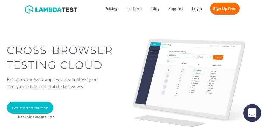
LambdaTest: This is a cross-browser testing tool which allows users to test more than 22,000 browser, mobile, and OS combinations. You get a separate tab for Responsive testing under Visual UI Test, where you can see the responsiveness of your site on varied devices and screen sizes.
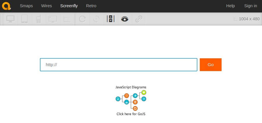
Screenfly: Just type in your web page’s URL, select the device type and screen size, and see how your page responds on all those devices. Featured devices include desktops, tablets, smartphones, and televisions.
Am I responsive?: I feel this is a tool for quick screenshots rather than a tool for testing. It only supports viewport sizes for Apple devices. Enter the URL in the input field, click go, and see the responsiveness of your device.

Responsinator: It is as simple as can be. Responsinator helps developers and designers get an idea of how their site will work on most popular devices. Just enter the URL you want to test and see how the page is rendered on some generic screens. It also checks that the website is optimized for all devices.

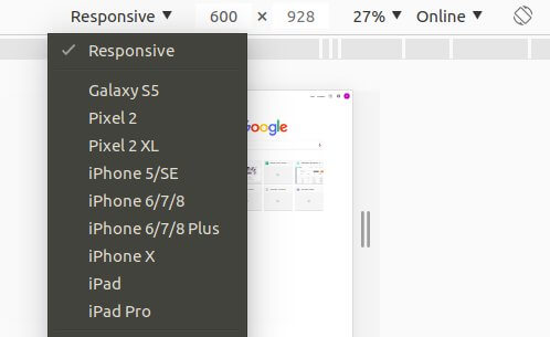
Google DevTools Device Mode: Google provides one of the simplest ways to simulate mobile devices within Chrome. Using this tool, you can see how your device appears across various screen sizes.
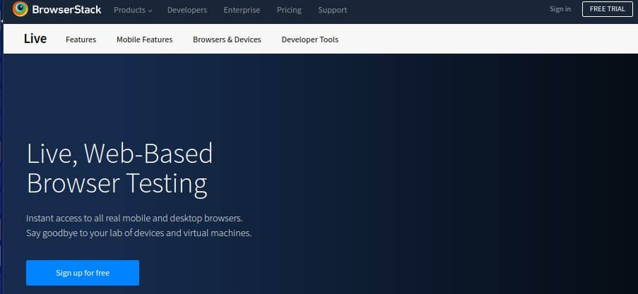
Browserstack: Browserstack provides more than 1,000 desktop and mobile browsers for full-featured testing. It allows users to test their website live and perform automated mobile app testing on real iOS and Android devices.
CrossBrowserTesting: The biggest competitor of Browser Stack is CBT, which allows more than 1,500 browsers and devices for testing purpose.

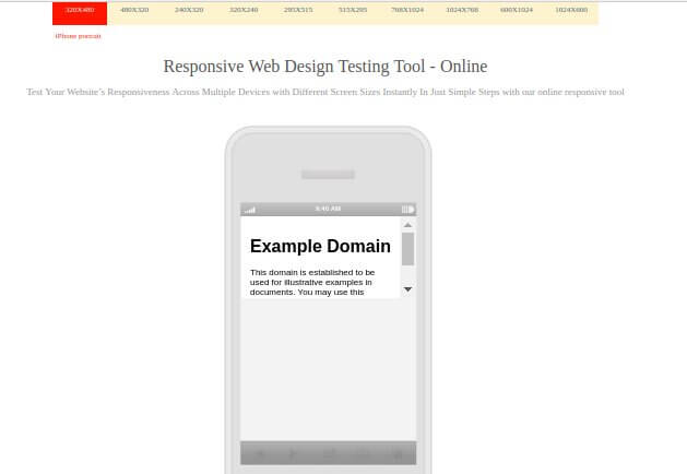
Websiteresponsivetest: When you visit this page for testing the responsiveness of your site, you need to feed it the URL and click "Go." The tool displays the web content on different devices and screen sizes.
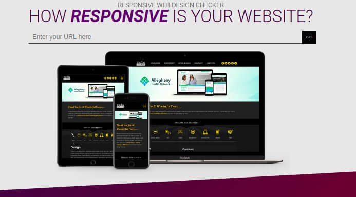
Responsive Design Checker: This tool caters to three main categories: tablet, phone, and desktop. Out of these, it offers various screen sizes and resolutions for each device and tests the responsiveness of your page.
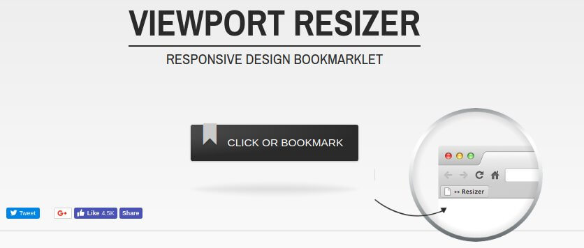
ViewPort Resizer: This is a web-based tool which comes as a browser bookmarklet and can be used with any of the latest web browsers.
Opinions expressed by DZone contributors are their own.
Comments