Unifying Data Into a Single Source of Truth for Cumul.io With Panoply.io
In this article, we walk through using a tool like Panoply.io to prepare data for an analytics layer with Cumul.io.
Join the DZone community and get the full member experience.
Join For FreeIntroduction
Being someone who works in the field of data visualization, I have seen my colleagues have 'the talk' with customers about data preparation all too often. It's a common pain point for anyone who needs a layer of analytics and visualizations for the data they’ve accumulated. It’s perfectly normal to arrive at this stage only to notice that data is distributed across different places, they don’t match in some cases, and overall look messy.
Luckily, there are plenty of tools to help unify and clean data in a meaningful way. In this article, I've decided to demonstrate how such a tool would work together with a data visualization tool. I've decided to use Cumul.io (get a free trial) as my data visualization technology, and Panoply.io (get a free trial) as our data modeling tool.
In this article, I’ll go through a simple demo of how you can use Panoply to prepare your data. But before we get into that, let me give you some idea as to why you might want to start thinking about your data before you start a visualization step.
Why?
Creating a performant data model before adding your visualization layer allows you to make sure you model is built in such a way that it is:
- Reusable and easy for your designers to implement dashboards and visualizations with.
- Decoupled from your analytics and visualizations layer. Ultimately, this reduces the complexity for your designers. By decoupling complex JOINs, data cleaning steps from within your data visualization tool, your designers can make sure they focus on building dashboards.
- Performant to your specific dashboard needs.
- Lastly and possibly most importantly, a single source of truth for your data would allow you to ensure consistency by avoiding error-prone duplicates.
Ultimately, when there’s a need for an analytics/visualization layer, you most probably already have the data you want to analyze somewhere. Before you start creating dashboards using this data, a good idea is to start thinking about how that data might need to be re-modeled to achieve the insights you require. This is not an easy step. In most cases, it requires a deeper technical understanding of the existent data and an idea of how it should be re-modeled to meet the requirements.
A Common Scenario
For example, a common scenario is one where different sets of databases are managed or have been accumulated by different teams for various reasons. But you soon realize that you need to bring these databases together in some way, in order to achieve the analytics and visualizations you need. You may also need to clean the data, making sure there are no errors or duplicates, and a number of other requirements depending on your use case.
When you come to the stage of thinking about these requirements, a good practice to consider is to make sure you have a single source of truth. This means you refer to one source, rather than risking having multiple versions of the same data. This may cause crashes and confusion. A data warehousing tool such as Panoply.io is a great way to achieve this. You can also have a look at this article on the importance of single source of truth, by Panoply!
How?
In this article, I will show you an example of how I achieved a simple level of data modeling on distributed data sources with Panoply. I won’t be going into extreme levels of complexity (there are so many levels/types/layers to what ‘data modeling’ can be). However, it should give you an idea of what you can achieve with Panoply before getting into the data visualization step. I’ll walk through some of the most common problems you may have with messy data. Finally, I’ll show you how to connect data from Panoply to Cumul.io to be used in your dashboards.
The Data
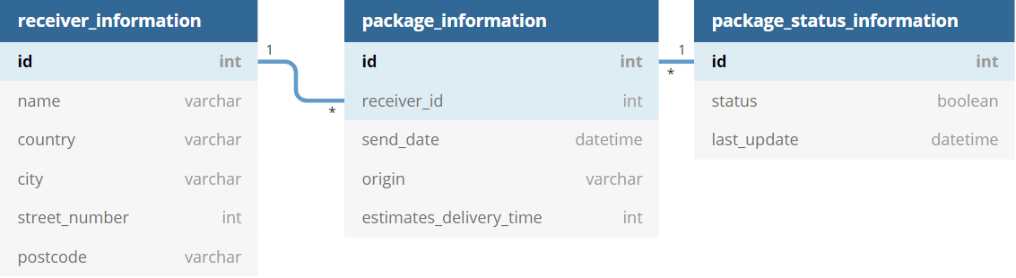
Let’s imagine it’s the holiday season. It’s the time of year where home deliveries for gifts are probably the highest, and probably also the time with the most delays. Let’s say we work at a logistics company that is arranging the deliveries (or, ya know, we’re Santa). There’s a team (of elves) that has info on people and their addresses. Another is keeping track of each package’s status (if it’s delivered or not). The third team has info on how long the expected delivery date will be for each package, when and where it was sent from.
This year, we had the genius idea to build an analytics layer so that we can see where the delays were (if any), how many deliveries we had, and between what countries. We have all the information we need with the information each team has. However, the problem is that the data is dispersed in different tables, we need to combine them in some way. Not only that, but one team has decided they’ll use MongoDB, the other Postgres, and the other is just using Google Sheets.
The data here is purely for demonstration purposes! For example, you probably wouldn’t choose to use Google Sheets for the type of data described below, but let’s say you did for argument's sake. Let’s have a look at what these tables might look like:
Receiver Information in MongoDB
| id | name | country | city | street number | postcode |
| ... | ... | ... | ... | ... | ... |
| 41 | "Una" | "Indonesia" | "Bokong Timur" | 9222 | "" |
| 42 | "Aila" | "Portugal" | "Bicesse" | 94686 | "2645-168" |
| 43 | "Amil" | "Kazakhstan" | "Ognevka" | 439 | "" |
| ... | ... | ... | ... | ... | ... |
Package Information in Google Sheets
| id | reciver_id | send_date | origin | estimated_delivery_time(days) |
| 1 | 67 | 12/28/2020 | "Indonesia" | 6 |
| 2 | 41 | 12/8/2020 | "China" | 10 |
| 3 | 49 | 11/20/2020 | "China" | 15 |
| 4 | 52 | 12/5/2020 | "Vietnam" | 10 |
| 5 | 27 | 12/19/2020 | "Kosovo" | 2 |
| ... | ... | ... | ... | ... |
Package Status Information in Postgres
| id | status | last_update |
| 1 | false | 01/18/2021 |
| 2 | false | 01/12/2021 |
| 3 | true | 12/30/2020 |
| 4 | false | 01/30/2021 |
| 5 | false | 12/12/2020 |
| ... | ... | ... |
The Relation
The first thing you could note here is that some fields relate to each other across the different tables. For example, the id fields in the Package Status and Package Information tables, and the receiver_id field in Package Information and id in Receiver Information. This is good if an agreement was reached during the creation of these tables. In that case, it means these ids refer to the same thing in each. So, if you will need this type of identification of your data, it will be worth thinking about early on. In the example here, you can imagine receiver_id in the Package Information field refers to the person of the same id in the Receiver Information table.
Setup in Panoply
Collect the Data
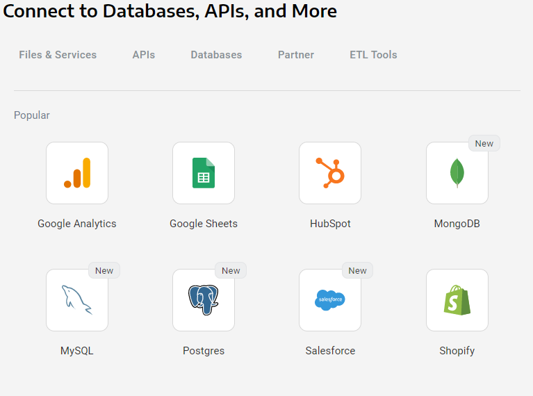
The first thing we can do is collect your data into Panoply. In the Data Sources tab, you will see an option to Add Data source:
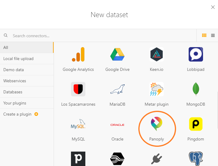
If we, for example, pick MongoDB as our data source, we will be asked to fill in some information about our database and select which Collection we want to collect data from. In our case, the team is collecting data on receivers in MongoDB. So this will look like the following:

In Panoply, you can collect data from a number of resources in much the same way. So, we will do the same for our data that’s in Postgres and Google Sheets. Your Panoply data warehouse will be continuously updated for the data you wish to collect within it, so you don’t have to worry about consistency across Panoply and your databases. It provides you a single source where you can manage all of your distributed data in one place.
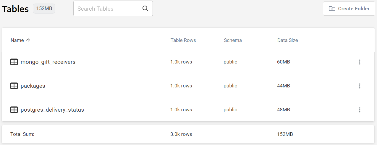
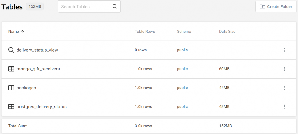
Once you’ve defined all of your data sources in Panoply, you will be able to see them in your Tables tab. In our case, we’ve collected data from 3 different sources:
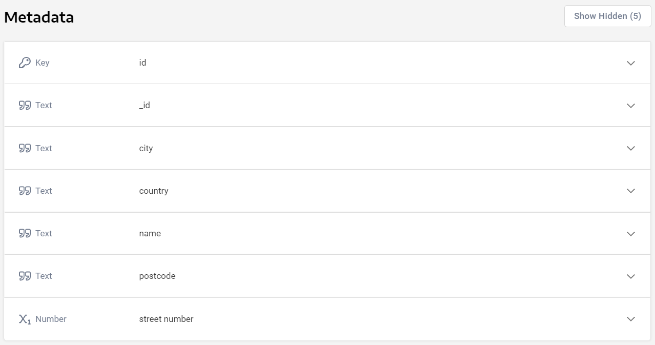
Furthermore, you will be able to preview the data and make sure the data types for the fields are what you intend them to be, and edit them if required:
Join Tables
So far, I’ve talked about how you can use Panoply as a single source of data for a scenario where the data is all over the place (literally). But what I haven’t talked about is possibly the most interesting part of this tool. That is, how it allows you to easily relate this data to one another, in order to create views with an astonishingly simple interface. Our aim here is to create a logistics dashboard that will show us the delays for package deliveries over the holiday period. We want to achieve the following dashboard:
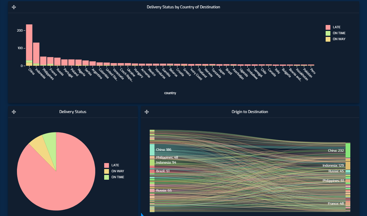
Granted, the dashboard paints a pretty grim picture for the holiday season delivery statuses (we used mockaroo to mock the data, and this was what the roll of the dice determined). Although given my own luck with gift arrivals for my family this year, this wouldn’t surprise me in reality. Back to the dashboard; we want to be able to see the distribution of late deliveries per country of destination, and we want to be able to see the origin to destination of packages. This dashboard, when filtered on China as the destination would look like the following, tells us that most of its deliveries were from within the country:

To achieve this we can answer two simple questions and create Joins based on their answer:
What Are the Relations Between the Existing Tables?
We need to tell where a package originated from, where it’s heading to and what its latest known status is. The Package Information table contains the origin of the package and id of the receiver. But with the id of the receiver, we could check the Receiver Information table and find out where the package is headed, as this table contains the address of the receiver. Finally, we could do the same with the package id and check its status in the Package Status Information table.
What Data Does the Dashboard Need?
The dashboard we want to create tells us we are definitely going to need country names based on the dashboard we want to create, but street numbers and postcodes are possibly unnecessary. Similarly, we can disregard names of receivers too!
Now, we can use the Panoply Workbench to create a new View by creating Joins with these tables.
Create the SQL Query
A join can be achieved by running a simple SQL query, and telling it which fields we want to include and which fields are equivalent to each other across the tables you want to join. In this case, our SQL query looks like the following, and is Saved As ‘delivery_status_view’ :
xxxxxxxxxx
SELECT
packages.estimated_delivery_time,
packages.origin,
packages.receiver_id,
packages.send_date,
postgres_delivery_status.package_id,
postgres_delivery_status.status,
postgres_delivery_status.last_update,
mongo_gift_receivers.id,
mongo_gift_receivers.country
FROM
(
(
packages
JOIN postgres_delivery_status ON (
(
postgres_delivery_status.package_id = packages.package_id
)
)
)
JOIN mongo_gift_receivers ON (
(
mongo_gift_receivers.id = packages.receiver_id
)
)
);
An important thing to note here: while the first join is a ONE to ONE join, the second is a ONE to MANY join. Here, we have implemented our view by using (INNER) JOINs. Although the view you create in your workbench can be created with the specific type of JOIN you may need.
This will result in a new entry in our Tables tab:
Import the Data Into Cumul.io
The only thing you would have to do now is to connect this view as your data source in Cumul.io. Luckily, Cumul.io has a connector to Panoply which means you simply have to select Panoply as your New Dataset and select the view you created:

Cumul.io
Of course, once you have imported data into Cumul.io, you can enhance the dataset to the specific needs of the dashboard. There are multiple options available, such as creating derived columns or linking two datasets once we have imported the data into Cumul.io.
Derived Columns
In the example above, the dataset has the sending times, last update times, and the statuses of the packages. For the dashboard to include ‘LATE’, ‘ON TIME’, and ‘ON WAY’ statuses, we create a derived column in the dataset editor. For this, we ‘Add Formula’ and define the condition and column name:

This derived column can now be used in dashboards as a usual field. Here, we use this column to display the stacked column charts that display the distribution of delivery statuses by country.

Linking Datasets
As mentioned above, linking datasets is also possible in Cumul.io. Although an important thing to note is that these are available for MANY to ONE relations (LEFT JOIN). So, for more complex relations between datasets, it’s a good idea to model this at an earlier stage. For more information on these links, you can have a look at our ‘Important when linking datasets’ Academy Article.
An example of how we may use this functionality in our demo would be to include the Topography of countries. In that way, we can use a map to display number of deliveries per country. The dataset as it stands does not have the Topography information that the Choropleth map needs. But, there is another dataset available in Cumul.io called ‘World Countries’ which we could use to link our dataset to.
Keep in mind that the columns we link should be equivalent to each other. The value from the column on the left (Master Table) will be used to LOOKUP the correct row on the right (Lookup Table). In this case, we can link the ‘country’ field to the ‘Name’ field:

Now, we can use the Choropleth map to see how many deliveries each country received by using the ‘Topography’ field for Geography:
Resources
Published at DZone with permission of Tuana Çelik. See the original article here.
Opinions expressed by DZone contributors are their own.
Comments