DZone
Thanks for visiting DZone today,
Edit Profile
  • Manage Email Subscriptions
  • How to Post to DZone
  • Article Submission Guidelines
Sign Out View Profile
  • Post an Article
  • Manage My Drafts
Over 2 million developers have joined DZone.
Log In / Join
Please enter at least three characters to search
Refcards Trend Reports
Events Video Library
Refcards
Trend Reports

Events

View Events Video Library

Zones

Culture and Methodologies Agile Career Development Methodologies Team Management
Data Engineering AI/ML Big Data Data Databases IoT
Software Design and Architecture Cloud Architecture Containers Integration Microservices Performance Security
Coding Frameworks Java JavaScript Languages Tools
Testing, Deployment, and Maintenance Deployment DevOps and CI/CD Maintenance Monitoring and Observability Testing, Tools, and Frameworks
Culture and Methodologies
Agile Career Development Methodologies Team Management
Data Engineering
AI/ML Big Data Data Databases IoT
Software Design and Architecture
Cloud Architecture Containers Integration Microservices Performance Security
Coding
Frameworks Java JavaScript Languages Tools
Testing, Deployment, and Maintenance
Deployment DevOps and CI/CD Maintenance Monitoring and Observability Testing, Tools, and Frameworks

Modernize your data layer. Learn how to design cloud-native database architectures to meet the evolving demands of AI and GenAI workkloads.

Secure your stack and shape the future! Help dev teams across the globe navigate their software supply chain security challenges.

Releasing software shouldn't be stressful or risky. Learn how to leverage progressive delivery techniques to ensure safer deployments.

Avoid machine learning mistakes and boost model performance! Discover key ML patterns, anti-patterns, data strategies, and more.

  1. DZone
  2. Refcards
  3. Practical Data Mining with Python
refcard cover
Refcard #183

Practical Data Mining with Python

Discovering and Visualizing Patterns with Python

Covers the tools used in practical Data Mining for finding and describing structural patterns in data using Python.

Download Refcard
Free PDF for Easy Reference
refcard cover

Written By

author avatar Giuseppe Vettigli
Developer, Research National Council
Table of Contents
► Introduction ► Data Importing and Visualization ► Classification ► Clustering ► Regression ► Correlation ► Dimensionality Reduction ► Networks Mining ► Other resources
Section 1

Introduction

by: Giuseppe Vettigli

Data mining is the extraction of implicit, previously unknown, and potentially useful information from data. It is applied in a wide range of domains and its techniques have become fundamental for several applications.

This Refcard is about the tools used in practical Data Mining for finding and describing structural patterns in data using Python. In recent years, Python has become more and more used for the development of data centric applications thanks to the support of a large scientific computing community and to the increasing number of libraries available for data analysis. In particular, we will see how to:

  • Import and visualize data
  • Classify and cluster data
  • Discover relationships in the data using regression and correlation measures
  • Reduce the dimensionality of the data in order to compress and visualize the information it brings
  • Analyze structured data

Each topic will be covered by code examples based on four of the major Python libraries for data analysis and manipulation: numpy, matplotlib,sklearn and networkx.

Section 2

Data Importing and Visualization

Usually, the first step of a data analysis consists of obtaining the data and loading the data into our work environment. We can easily download data using the following Python capability:

1
import urllib2
2
url = 'http://aima.cs.berkeley.edu/data/iris.csv'
3
u = urllib2.urlopen(url)
4
localFile = open('iris.csv'', 'w')
5
localFile.write(u.read())
6
localFile.close()

In the snippet above we used the library urllib2 to access a file on the website of the University of Berkley and saved it to the disk using the methods of the File object provided by the standard library. The file contains the iris dataset, which is a multivariate dataset that consists of 50 samples from each of three species of Iris flowers (Iris setosa, Iris virginica and Iris versicolor). Each sample has four features (or variables) that are the length and the width of sepal and petal, in centimeters.

The dataset is stored in the CSV (comma separated values) format. It is convenient to parse the CSV file and store the information that it contains using a more appropriate data structure. The dataset has 5 rows. The first 4 rows contain the values of the features while the last row represents the class of the samples. The CSV can be easily parsed using the function genfromtxt of the numpy library:

5
1
from numpy import genfromtxt, zeros
2
# read the first 4 columns
3
data = genfromtxt('iris.csv',delimiter=',',usecols=(0,1,2,3)) 
4
# read the fifth column
5
target = genfromtxt('iris.csv',delimiter=',',usecols=(4),dtype=str) 

In the example above we created a matrix with the features and a vector that contains the classes. We can confirm the size of our dataset looking at the shape of the data structures we loaded:

​x
1
print data.shape
2
​
3
(150, 4)
4
​
5
print target.shape
6
​
7
(150,)
8
​

We can also know how many classes we have and their names:

2
1
print set(target) # build a collection of unique elements
2
set(['setosa', 'versicolor', 'virginica'])

An important task when working with new data is to try to understand what information the data contains and how it is structured. Visualization helps us explore this information graphically in such a way to gain understanding and insight into the data.

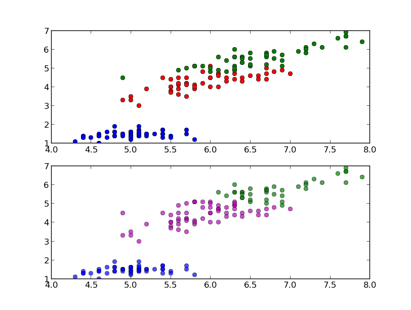
Using the plotting capabilities of the pylab library (which is an interface to matplotlib) we can build a bi-dimensional scatter plot which enables us to analyze two dimensions of the dataset plotting the values of a feature against the values of another one:

5
1
from pylab import plot, show
2
plot(data[target=='setosa',0],data[target=='setosa',2],'bo')
3
plot(data[target=='versicolor',0],data[target=='versicolor',2],'ro')
4
plot(data[target=='virginica',0],data[target=='virginica',2],'go')
5
show()

This snippet uses the first and the third dimension (sepal length and sepal width) and the result is shown in the following figure:

Graph 1

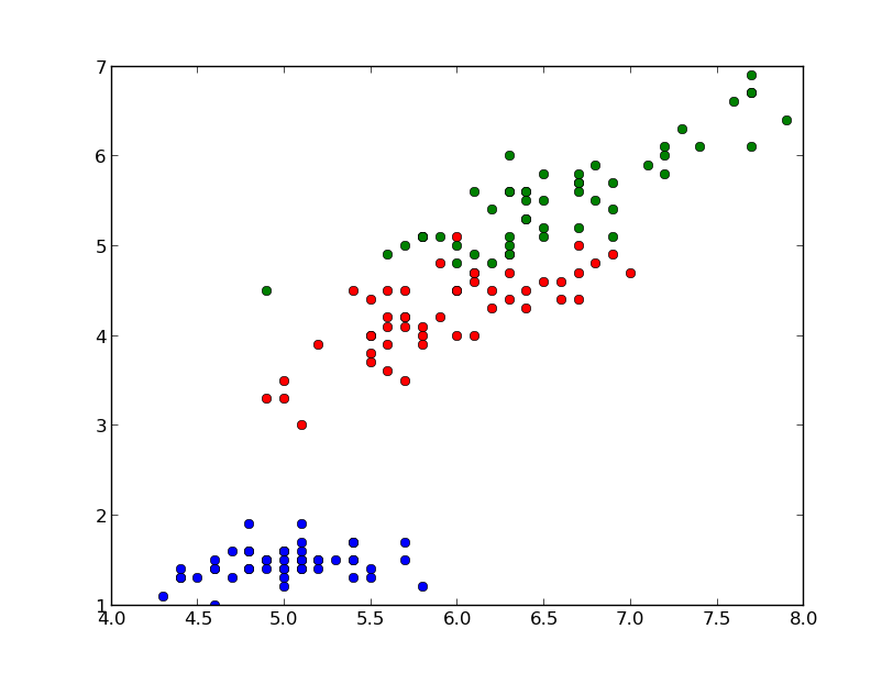
In the graph we have 150 points and their color represents the class; the blue points represent the samples that belong to the specie setosa, the red ones represent versicolor and the green ones represent virginica.

Another common way to look at data is to plot the histogram of the single features. In this case, since the data is divided into three classes, we can compare the distributions of the feature we are examining for each class. With the following code we can plot the distribution of the first feature of our data (sepal length) for each class:

17
1
from pylab import figure, subplot, hist, xlim, show
2
xmin = min(data[:,0])
3
xmax = max(data[:,0])
4
figure()
5
subplot(411) # distribution of the setosa class (1st, on the top)
6
hist(data[target=='setosa',0],color='b',alpha=.7)
7
xlim(xmin,xmax)
8
subplot(412) # distribution of the versicolor class (2nd)
9
hist(data[target=='versicolor',0],color='r',alpha=.7)
10
xlim(xmin,xmax)
11
subplot(413) # distribution of the virginica class (3rd)
12
hist(data[target=='virginica',0],color='g',alpha=.7)
13
xlim(xmin,xmax)
14
subplot(414) # global histogram (4th, on the bottom)
15
hist(data[:,0],color='y',alpha=.7)
16
xlim(xmin,xmax)
17
show()

The result should be as follows:

Graph 2

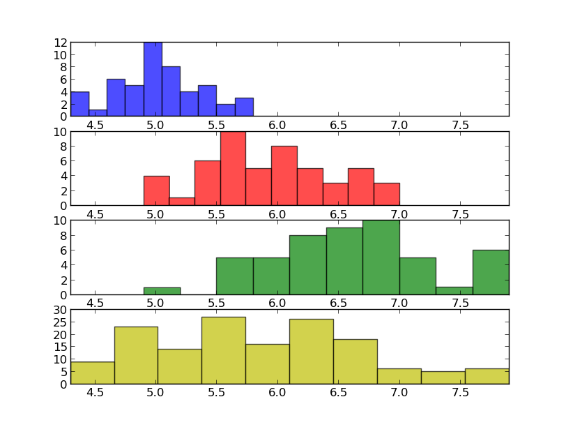
Looking at the histograms above we can understand some characteristics that could help us to tell apart the data according to the classes we have. For example, we can observe that, on average, the Iris setosa flowers have a smaller sepal length compared to the Iris virginica.

Section 3

Classification

Classification is a data mining function that assigns samples in a dataset to target classes. The models that implement this function are called classifiers. There are two basic steps to using a classifier: training and classification. Training is the process of taking data that is known to belong to specified classes and creating a classifier on the basis of that known data. Classification is the process of taking a classifier built with such a training dataset and running it on unknown data to determine class membership for the unknown samples.

The library sklearn contains the implementation of many models for classification and in this section we will see how to use the Gaussian Naive Bayes in order to identify iris flowers as either setosa, versicolor or virginica using the dataset we loaded in the first section. To this end we convert the vector of strings that contain the class into integers:

4
1
t = zeros(len(target))
2
t[target == 'setosa'] = 1
3
t[target == 'versicolor'] = 2
4
t[target == 'virginica'] = 3

Now we are ready to instantiate and train our classifier:

3
1
from sklearn.naive_bayes import GaussianNB
2
classifier = GaussianNB()
3
classifier.fit(data,t) # training on the iris dataset

The classification can be done with the predict method and it is easy to test it with one of the sample:

7
1
print classifier.predict(data[0])
2
​
3
[ 1.]
4
​
5
print t[0]
6
​
7
1

In this case the predicted class is equal to the correct one (setosa), but it is important to evaluate the classifier on a wider range of samples and to test it with data not used in the training process. To this end we split the data into train set and test set, picking samples at random from the original dataset. We will use the first set to train the classifier and the second one to test the classifier. The function train_test_split can do this for us:

3
1
from sklearn import cross_validation
2
train, test, t_train, t_test = cross_validation.train_test_split(data, t, …
3
test_size=0.4, random_state=0)

The dataset have been split and the size of the test is 40% of the size of the original as specified with the parameter test_size. With this data we can again train the classifier and print its accuracy:

4
1
classifier.fit(train,t_train) # train
2
print classifier.score(test,t_test) # test
3
​
4
0.93333333333333335

In this case we have 93% accuracy. The accuracy of a classifier is given by the number of correctly classified samples divided by the total number of samples classified. In other words, it means that it is the proportion of the total number of predictions that were correct.

Another tool to estimate the performance of a classifier is the confusion matrix. In this matrix each column represents the instances in a predicted class, while each row represents the instances in an actual class. Using the module metrics it is pretty easy to compute and print the matrix:

6
1
from sklearn.metrics import confusion_matrix
2
print confusion_matrix(classifier.predict(test),t_test)
3
​
4
[[16  0  0]
5
[ 0 23  3]
6
[ 0  0 18]]

In this confusion matrix we can see that all the Iris setosa and virginica flowers were classified correctly but, of the 26 actual Iris versicolor flowers, the system predicted that three were virginica. If we keep in mind that all the correct guesses are located in the diagonal of the table, it is easy to visually inspect the table for errors, since they are represented by the non-zero values outside of the diagonal.

A function that gives us a complete report on the performance of the classifier is also available:

9
1
from sklearn.metrics import classification_report
2
print classification_report(classifier.predict(test), t_test, target_names=['setosa', 'versicolor', 'virginica'])
3
            precision    recall  f1-score   support
4
​
5
    setosa       1.00      1.00      1.00        16
6
versicolor       1.00      0.85      0.92        27
7
 virginica       0.81      1.00      0.89        17
8
​
9
avg / total       0.95      0.93      0.93        60

Here is a summary of the measures used by the report:

  • Precision: the proportion of the predicted positive cases that were correct
  • Recall (or also true positive rate): the proportion of positive cases that were correctly identified
  • F1-Score: the harmonic mean of precision and recall

The support is just the number of elements of the given class used for the test. However, splitting the data, we reduce the number of samples that can be used for the training, and the results of the evaluation may depend on a particular random choice for the pair (train set, test set). To actually evaluate a classifier and compare it with other ones, we have to use a more sophisticated evaluation model like Cross Validation. The idea behind the model is simple: the data is split into train and test sets several consecutive times and the averaged value of the prediction scores obtained with the different sets is the evaluation of the classifier. This time, sklearn provides us a function to run the model:

6
1
from sklearn.cross_validation import cross_val_score
2
# cross validation with 6 iterations 
3
scores = cross_val_score(classifier, data, t, cv=6)
4
print scores
5
​
6
[ 0.84  0.96  1.    1.    1.    0.96]

As we can see, the output of this implementation is a vector that contains the accuracy obtained with each iteration of the model. We can easily compute the mean accuracy as follows:

4
1
from numpy import mean
2
print mean(scores)
3
​
4
0.96
Section 4

Clustering

Often we don't have labels attached to the data that tell us the class of the samples; we have to analyze the data in order to group them on the basis of a similarity criteria where groups (or clusters) are sets of similar samples. This kind of analysis is called unsupervised data analysis. One of the most famous clustering tools is the k-means algorithm, which we can run as follows:

3
1
from sklearn.cluster import KMeans 
2
kmeans = KMeans(k=3, init='random') # initialization
3
kmeans.fit(data) # actual execution

The snippet above runs the algorithm and groups the data in 3 clusters (as specified by the parameter k). Now we can use the model to assign each sample to one of the clusters:

1
1
c = kmeans.predict(data)

And we can evaluate the results of clustering, comparing it with the labels that we already have using the completeness and the homogeneity score:

11
1
from sklearn.metrics import completeness_score, homogeneity_score
2
print completeness_score(t,c)
3
​
4
​
5
0.7649861514489815
6
​
7
​
8
print homogeneity_score(t,c)
9
​
10
​
11
0.7514854021988338

The completeness score approaches 1 when most of the data points that are members of a given class are elements of the same cluster while the homogeneity score approaches 1 when all the clusters contain almost only data points that are member of a single class.

We can also visualize the result of the clustering and compare the assignments with the real labels visually:

10
1
figure()
2
subplot(211) # top figure with the real classes
3
plot(data[t==1,0],data[t==1,2],'bo')
4
plot(data[t==2,0],data[t==2,2],'ro')
5
plot(data[t==3,0],data[t==3,2],'go')
6
subplot(212) # bottom figure with classes assigned automatically
7
plot(data[c==1,0],data[tt==1,2],'bo',alpha=.7)
8
plot(data[c==2,0],data[tt==2,2],'go',alpha=.7)
9
plot(data[c==0,0],data[tt==0,2],'mo',alpha=.7)
10
show()

The following graph shows the result:

Graph 3

Observing the graph we see that the cluster in the bottom left corner has been completely indentified by k-means while the two clusters on the top have been identified with some errors.

Section 5

Regression

Regression is a method for investigating functional relationships among variables that can be used to make predictions. Consider the case where we have two variables, one is considered to be explanatory, and the other is considered to be a dependent. We want to describe the relationship between the variables using a model; when this relationship is expressed with a line we have the linear regression.

In order to apply the linear regression we build a synthetic dataset composed as described above:

3
1
from numpy.random import rand
2
x = rand(40,1) # explanatory variable
3
y = x*x*x+rand(40,1)/5 # depentend variable

Now we can use the LinearRegression model that we found in the module sklear.linear_model. This model calculates the best-fitting line for the observed data by minimizing the sum of the squares of the vertical deviations from each data point to the line. The usage is similar to the other models implemented in sklearn that we have seen before:

3
1
from sklearn.linear_model import LinearRegression
2
linreg = LinearRegression()
3
linreg.fit(x,y)

And we can plot this line over the actual data points to evaluate the result:

4
1
from numpy import linspace, matrix
2
xx = linspace(0,1,40)
3
plot(x,y,'o',xx,linreg.predict(matrix(xx).T),'--r')
4
show()

The plot should be as follows:

Graph 4

In this graph we can observe that the line goes through the center of our data and enables us to identify the increasing trend.

We can also quantify how the model fits the original data using the mean squared error:

4
1
from sklearn.metrics import mean_squared_error
2
print mean_squared_error(linreg.predict(x),y)
3
​
4
0.01093512327489268

This metric measures the expected squared distance between the prediction and the true data. It is 0 when the prediction is perfect.

Section 6

Correlation

We study the correlation to understand whether and how strongly pairs of variables are related. This kind of analysis helps us in locating the critically important variables on which others depend. The best correlation measure is the Pearson product-moment correlation coefficient. It's obtained by dividing the covariance of the two variables by the product of their standard deviations. We can compute this index between each pair of variables for the iris dataset as follows:

8
1
from numpy import corrcoef
2
corr = corrcoef(data.T) # .T gives the transpose
3
print corr
4
​
5
[[ 1.         -0.10936925  0.87175416  0.81795363]
6
 [-0.10936925  1.         -0.4205161  -0.35654409]
7
 [ 0.87175416 -0.4205161   1.          0.9627571 ]
8
 [ 0.81795363 -0.35654409  0.9627571   1.        ]]

The function corrcoef returns a symmetric matrix of correlation coefficients calculated from an input matrix in which rows are variables and columns are observations. Each element of the matrix represents the correlation between two variables.

Correlation is positive when the values increase together. It is negative when one value decreases as the other increases. In particular we have that 1 is a perfect positive correlation, 0 is no correlation and -1 is a perfect negative correlation.

When the number of variables grows we can conveniently visualize the correlation matrix using a pseudocolor plot:

8
1
from pylab import pcolor, colorbar, xticks, yticks
2
from numpy import arrange
3
pcolor(corr)
4
colorbar() # add
5
# arranging the names of the variables on the axis
6
xticks(arange(0.5,4.5),['sepal length',  'sepal width', 'petal length', 'petal width'],rotation=-20)
7
yticks(arange(0.5,4.5),['sepal length',  'sepal width', 'petal length', 'petal width'],rotation=-20)
8
show()

The following image shows the result:

Graph 5

Looking at the color bar on the right of the figure, we can associate the color on the plot to a numerical value. In this case red is associated with high values of positive correlation and we can see that the strongest correlation in our dataset is between the variables "petal width" and "petal length."

Section 7

Dimensionality Reduction

In the first section we saw how to visualize two dimensions of the iris dataset. With that method alone, we have a view of only a part of the dataset. Since the maximum number of dimensions that we can plot at the same time is 3, to have a global view of the data it's necessary to embed the whole data in a number of dimensions that we can visualize. This embedding process is called dimensionality reduction. One of the most famous techniques for dimensionality reduction is the Principal Component Analysis (PCA). This technique transforms the variables of our data into an equal or smaller number of uncorrelated variables called principal components (PCs).

This time, sklearn provides us all we need to perform our analysis:

2
1
from sklearn.decomposition import PCA
2
pca = PCA(n_components=2)

In the snippet above we instantiated a PCA object which we can use to compute the first two PCs. The transform is computed as follows:

1
1
pcad = pca.fit_transform(data)

And we can plot the result as usual:

4
1
plot(pcad[target=='setosa',0],pcad[target=='setosa',1],'bo')
2
plot(pcad[target=='versicolor',0],pcad[target=='versicolor',1],'ro')
3
plot(pcad[target=='virginica',0],pcad[target=='virginica',1],'go')
4
show()

The result is as follows:

Graph 6

We notice that the figure above is similar to the one proposed in the first section, but this time the separation between the versicolor specie (in red) and the virginica specie (in green) is more clear.

The PCA projects the data into a space where the variance is maximized and we can determine how much information is stored in the PCs looking at the variance ratio:

2
1
print pca.explained_variance_ratio_
2
[ 0.92461621  0.05301557]

Now we know that the first PC accounts for 92% of the information of the original dataset while the second one accounts for the remaining 5%. We can also print how much information we lost during the transformation process:

2
1
print 1-sum(pca.explained_variance_ratio_)
2
0.0223682249752

In this case we lost 2% of the information.

At this point, we can apply the inverse transformation to get the original data back:

1
1
data_inv = pca.inverse_transform(pcad)

Arguably, the inverse transformation doesn't give us exactly the original data due to the loss of information. We can estimate how much the result of the inverse is likely to the original data as follows:

3
1
print abs(sum(sum(data - data_inv)))
2
​
3
2.8421709430404007e-14

We have that the difference between the original data and the approximation computed with the inverse transform is close to zero. It's interesting to note how much information we can preserve by varying the number of principal components:

4
1
for i in range(1,5):
2
    pca = PCA(n_components=i)
3
    pca.fit(data)
4
    print sum(pca.explained_variance_ratio_) * 100,'%'

The output of this snippet is the following:

4
1
92.4616207174 %
2
97.7631775025 %
3
99.481691455 %
4
100.0 %

The more PCs we use the more the information is preserved, but this analysis helps us to understand how many components we can use to save a certain amount of information. For example, from the output of the snippet above we can see that on the Iris dataset we can save almost 100% of the information just by using three PCs.

Section 8

Networks Mining

Often, the data that we have to analyze is structured in the form of networks, for example our data could describe the friendships between a group of facebook users or the coauthorships of papers between scientists. Here, the objects to study are described by nodes and by edges that describe connections between them.

In this section we will see the basic steps for the analysis of this kind of data using networkx, which is a library that helps us in the creation, the manipulation and the study of the networks. In particular, we will see how to use a centrality measure in order to build a meaningful visualization of the data and how to find a group of nodes where the connections are dense.

Using networkx, we can easily import the most common formats used for the description of structured data:

1
1
G = nx.read_gml('lesmiserables.gml',relabel=True)

In the code above we imported the coappearance network of characters in the novel Les Miserables, freely available at https://gephi.org/datasets/lesmiserables.gml.zip, in the GML format. We can also visualize the loaded network with the following command:

1
1
nx.draw(G,node_size=0,edge_color='b',alpha=.2,font_size=7)

The result should be as follows:

Network

In this network each node represents a character of the novel and the connection between two characters represents the coappearance in the same chapter. It's easy to see that the graph is not really helpful. Most of the details of the network are still hidden and it's impossible to understand which are the most important nodes. In order to gain some insights about our data we can study the degree of the nodes. The degree of a node is considered one of the simplest centrality measures and it consists of the number of connections a node has. We can summarize the degrees distribution of a network looking at its maximum, minimum, median, first quartile and third quartile:

12
1
deg = nx.degree(G)
2
from numpy import percentile, mean, median
3
print min(deg.values())
4
print percentile(deg.values(),25) # computes the 1st quartile
5
print median(deg.values())
6
print percentile(deg.values(),75) # computes the 3rd quartile
7
print max(deg.values())10 
8
1
9
2.0
10
6.0
11
10.0
12
36

From this analysis we can decide to observe only the nodes with a degree higher than 10. In order to display only those nodes we can create a new graph with only the nodes that we want to visualize:

6
1
Gt = G.copy()
2
dn = nx.degree(Gt)
3
for n in Gt.nodes():
4
 if dn[n] <= 10:
5
  Gt.remove_node(n)
6
nx.draw(Gt,node_size=0,edge_color='b',alpha=.2,font_size=12)

The image below shows the result:

Net Pruned

This time the graph is more readable. It makes us able to observe the most relevant characters and their relationships.

It is also interesting to study the network through the identification of its cliques. A clique is a group where a node is connected to all the other ones and a maximal clique is a clique that is not a subset of any other clique in the network. We can find the all maximal cliques of the our network as follows:

2
1
from networkx import find_cliques
2
cliques = list(find_cliques(G))

And we can print the biggest clique with the following command:

2
1
print max(cliques, key=lambda l: len(l))
2
[u'Joly', u'Gavroche', u'Bahorel', u'Enjolras', u'Courfeyrac', u'Bossuet', u'Combeferre', u'Feuilly', u'Prouvaire', u'Grantaire']

We can see that most of the names in the list are the same of the cluster of nodes on the right of the graph.

Section 9

Other resources

  • IPython and IPython notebook, an interactive shell the Python which also provides an amazing browser based interface. [http://ipython.org/]
  • NLTK, Natural Language Toolkit, suite of modules, data and documentation for research and development in natural language processing. [http://nltk.org/]
  • OpenCV, one of the most important libraries for image processing and computer vision. [http://opencv.willowgarage.com/]
  • Pandas, provides fast, flexible, and expressive data structures designed to make working with "relational" or "labeled" data both easy and intuitive. [http://pandas.pydata.org/]
  • Scipy, it is build on top of numpy and provides a huge collection of algorithms and facilities for advanced math, signal processing, optimization and statistics. [http://www.scipy.org/]
  • Statsmodels, extensive list of descriptive statistics, statistical tests, plotting functions, and result statistics are for different types of data and each estimator. [http://statsmodels.sourceforge.net/]

Like This Refcard? Read More From DZone

related article thumbnail

DZone Article

20 Database Design Best Practices
related article thumbnail

DZone Article

Web Scraping Tutorial: Using Python to Find Cheap Flights!
related article thumbnail

DZone Article

Revolutionizing Financial Monitoring: Building a Team Dashboard With OpenObserve
related article thumbnail

DZone Article

Power BI Embedded Analytics — Part 2: Power BI Embedded Overview
related refcard thumbnail

Free DZone Refcard

Open-Source Data Management Practices and Patterns
related refcard thumbnail

Free DZone Refcard

Real-Time Data Architecture Patterns
related refcard thumbnail

Free DZone Refcard

Getting Started With Real-Time Analytics
related refcard thumbnail

Free DZone Refcard

Getting Started With Apache Iceberg

ABOUT US

  • About DZone
  • Support and feedback
  • Community research
  • Sitemap

ADVERTISE

  • Advertise with DZone

CONTRIBUTE ON DZONE

  • Article Submission Guidelines
  • Become a Contributor
  • Core Program
  • Visit the Writers' Zone

LEGAL

  • Terms of Service
  • Privacy Policy

CONTACT US

  • 3343 Perimeter Hill Drive
  • Suite 100
  • Nashville, TN 37211
  • support@dzone.com

Let's be friends: