DZone
Thanks for visiting DZone today,
Edit Profile
  • Manage Email Subscriptions
  • How to Post to DZone
  • Article Submission Guidelines
Sign Out View Profile
  • Post an Article
  • Manage My Drafts
Over 2 million developers have joined DZone.
Log In / Join
Please enter at least three characters to search
Refcards Trend Reports
Events Video Library
Refcards
Trend Reports

Events

View Events Video Library

Zones

Culture and Methodologies Agile Career Development Methodologies Team Management
Data Engineering AI/ML Big Data Data Databases IoT
Software Design and Architecture Cloud Architecture Containers Integration Microservices Performance Security
Coding Frameworks Java JavaScript Languages Tools
Testing, Deployment, and Maintenance Deployment DevOps and CI/CD Maintenance Monitoring and Observability Testing, Tools, and Frameworks
Culture and Methodologies
Agile Career Development Methodologies Team Management
Data Engineering
AI/ML Big Data Data Databases IoT
Software Design and Architecture
Cloud Architecture Containers Integration Microservices Performance Security
Coding
Frameworks Java JavaScript Languages Tools
Testing, Deployment, and Maintenance
Deployment DevOps and CI/CD Maintenance Monitoring and Observability Testing, Tools, and Frameworks

Modernize your data layer. Learn how to design cloud-native database architectures to meet the evolving demands of AI and GenAI workkloads.

Secure your stack and shape the future! Help dev teams across the globe navigate their software supply chain security challenges.

Releasing software shouldn't be stressful or risky. Learn how to leverage progressive delivery techniques to ensure safer deployments.

Avoid machine learning mistakes and boost model performance! Discover key ML patterns, anti-patterns, data strategies, and more.

  1. DZone
  2. Refcards
  3. Introduction to Docker Monitoring
refcard cover
Refcard #236

Introduction to Docker Monitoring

Making Microservices a Reality

Docker has rapidly evolved into a production-ready infrastructure platform, promising flexible and scalable delivery of software to end users. This Refcard looks into the challenges that containers (or black boxes) present in DevOps, explores architectural models for monitoring containers, and investigates pros and cons of Docker monitoring and troubleshooting options. It also covers a complex, real-world example with Sysdig Cloud to understand what to monitor and how.

Download Refcard
Free PDF for Easy Reference
refcard cover

Written By

author avatar Eric Carter
Director, Product Management, Sysdig
author avatar Apurva Dave
VP Marketing, Sysdig
Table of Contents
► Overview ► The Docker Monitoring Challenge ► Architectural Models for Monitoring Containers ► Docker Monitoring and Troubleshooting Options ► Docker Stats API ► Docker Monitoring : cAdvisor + Prometheus + Grafana ► Docker Monitoring and Deep Troubleshooting With Sysdig ► Real-World Examples: What to Monitor, Why, and How ► Monitoring Java Networking Data ► Conclusion
Section 1

Overview

Docker has rapidly evolved into a production-ready infrastructure platform, promising flexible and scalable delivery of software to end users. Its architectural model changes the dynamics of monitoring and requires a new approach to gain visibility and insight into application performance and health.

This Refcard looks into the challenges that Docker containers and Kubernetes present in DevOps, explores architectural models for monitoring containers, and investigates pros and cons of Docker monitoring and troubleshooting options. It also covers a complex, real-world example with Sysdig to understand what to monitor and how.

Section 2

The Docker Monitoring Challenge

Containers have gained prominence as the building blocks of microservices. The speed, portability, and isolation of containers made it easy for developers to embrace a microservice model. There’s been a lot written on the benefits of containers, so we won’t recount it all here.

Containers are black boxes to most systems that live around them. That’s incredibly useful for development, enabling a high level of portability from Dev through Prod, from developer laptop to cloud. But when it comes to operating, monitoring, and troubleshooting a service, black boxes make common activities harder, leading us to wonder: What’s running in the container? How is the application code performing? Is it spitting out important custom metrics? From a DevOps perspective, you need to have deep visibility inside containers rather than just knowing that some containers exist.

Image title

The typical process for instrumentation in a non-containerized environment — an agent that lives in the user space of a host or VM — doesn’t work particularly well for containers. That’s because containers benefit from being small, isolated processes with as few dependencies as possible. If you deploy the agent outside of the container, the agent cannot easily see into the container to monitor the activity in the container. It will also require complex, brittle, and insecure networking among containers. If you deploy the agent inside the container, you have to modify each container to add the agent and deploy N agents for N containers. This increases dependencies and makes image management more difficult. And at scale, running thousands of monitoring agents for even a modestly sized deployment is an expensive use of resources.

Section 3

Architectural Models for Monitoring Containers

Models for collecting instrumented data from containers do not stray too far afield from the past and can generally be broken down into push and pull models. Push models have an agent that actively pushes metrics out to a central collection facility; pull models periodically query the monitoring target for the desired information.

As mentioned above, the most standard approach to infrastructure monitoring in a VM-based world is a push-based agent living in the user space. Two potential alternative solutions arise for containers: 1) ask your developers to instrument their code directly and push that data to a central collection point, or 2) leverage a transparent form of push-based instrumentation to see all application and container activity on your hosts.

Image title

There is an additional, advanced topic that I’ll touch on briefly in this Refcard: Docker containers are often aggregated and orchestrated into services. Orchestration systems like Kubernetes provide additional metadata that can be used to better monitor Docker containers. We will see an example later on of using Docker and Kubernetes labels to assist in service-level monitoring.

Let’s now put some of this into practice with some common, open-source-based ways of gleaning metrics from Docker.

Section 4

Docker Monitoring and Troubleshooting Options

There are, of course, a lot of commercial tools available that monitor Docker in various ways. For your purposes in getting started, it’s more useful to focus on open-source Docker monitoring options. Not only will you be able to roll your sleeves up right away but you’ll also get a better understanding of the primitives that underpin Docker.

Open-Source Tool Description Pros & Cons
Docker Stats API Poll basic metrics directly from Docker Engine. Basic stats output from CLI. No aggregation or visualization.
cAdvisor Google-provided agent that graphs one-minute data from the Docker Stats API. Limited time-frame, limited metrics.
Prometheus and Time-series databases Category of products like Prometheus, InfluxDB, and Graphite that can store metrics data. Good for historical trending. Requires you to set up a database and glue together ingestion, DB, and visualization.
Sysdig Container-focused Linux troubleshooting and monitoring tool. Useful for deep troubleshooting and historical captures but doesn’t provide historical trending on its own.
Section 5

Docker Stats API

Docker has one unified API, and in fact all commands you’d run from a CLI simply tap into that endpoint (https://docs.docker.com/engine/reference/api/docker_remote_api/). For example, if you have a host running Docker, `docker ps` returns this, which is just a reformatting of API data.

Image title

To show this, let’s query the API via `curl` and ask for all containers running. For brevity, we’re showing the JSON blob below for just one container and we prettied up the JSON.

1
curl --unix-socket /var/run/docker.sock http:/ containers/json | python -m json.tool


Now, let’s apply this API to our monitoring needs. The `/stats/` endpoint gives you streaming output of a wide selection of resource-oriented metrics for your containers. Let’s get the available Docker stats for just one container:

3
1
curl --unix-socket /var/run/docker.sock 
2
http:/containers/8a9973a456b3/stats
3
,"system\_cpu\_usage":266670930000000,"throttling\ data":},"cpu\_stats":,"system\_cpu\_ usage":266671910000000,"throttling\_ data":},"memory\_stats":{"usage":27516928,"max\_ usage":31395840,"stats":{"active anon":17494016,"active\_ file":5144576,"cache":10022912,

Not pretty, but an awful lot of metrics for us to work with!

If you wanted a one-shot set of metrics instead of streaming, use the stream=false   option:

2
1
curl --unix-socket /var/run/docker.sock
2
http:/containers/8a9973a456b3/stats?stream=false


Section 6

Docker Monitoring : cAdvisor + Prometheus + Grafana

As you’ve probably guessed, the Docker API is useful to get started but likely not the only thing you need to robustly monitor your applications running in containers. The API is limiting in two ways: 1) it doesn’t allow you to perform time-based trending and analysis, and 2) it doesn’t give you the ability to do deep analysis on application- or system-level data. Let’s attack these problems with cAdvisor, Prometheus, and Sysdig.

cAdvisor is a simple server that taps the Docker API and provides one minute of historical data in one-second increments. It’s a useful way to visualize what’s going on at a high level with your Docker containers on a given host. cAdvisor simply requires one container per host that you’d like to visualize.

3
1
sudo docker run \
2
--volume=/:/rootfs:ro \ --volume=/var/run:/var/run:rw \ --volume=/sys:/sys:ro \ --volume=/var/lib/docker/:/var/lib/docker:ro \ --publish=8080:8080 \
3
--detach=true \ --name=cadvisor \ google/cadvisor:latest

cAdvisor is now running (in the background) on http://localhost:8080. The setup includes directories with Docker state cAdvisor needs to observe. Accessing the interface gives you this:

Image title

Trending Historical Data With Prometheus

If you are looking to historically graph this data, you could also route data from cAdvisor to numerous time series datastores via plugins, described here. Prometheus is the most popular within the cloud-native community. Prometheus can use cAdvisor as well as a community of exporters to simplify the process of collecting data from hosts, containers, and applications. Prometheus, like other time series databases, will require you to manage a backend as well as tie an open-source visualization engine on top, like Grafana. Doing so will allow you to produce something like this:

Image title

In most of these cases, however, these tools are still limited to basic application metrics as well as underlying resource utilization information like CPU, memory, and network data. What if we wanted to get deeper — to not only monitor resource usage but also processes, files, ports, and more?

Section 7

Docker Monitoring and Deep Troubleshooting With Sysdig

That’s where another open-source tool, Sysdig, comes into play. It’s a Linux visibility tool with powerful command line options that allow you to control what to look at and display it. You can also use Sysdig Inspect, an electron-based open-source desktop application, for an easier way to start. Sysdig also has the concept of chisels, which are pre-defined modules that simplify common actions.

Once you install Sysdig as a process or a container on your machine, it sees every process, every network action, and every file action on the host. You can use Sysdig “live” or view any amount of historical data via a system capture file.

As a next step, we can take a look at the total CPU usage of each running container:

8
1
\$ sudo sysdig -c topcontainers\_cpu
2
CPU% container.name 
3
---------------------------------------------------- 
4
90.13% mysql
5
15.93%  wordpress1
6
7.27% haproxy
7
3.46% wordpress2
8
...

This tells us which containers are consuming the machine’s CPU. What if we want to observe the CPU usage of a single process, but don’t know which container the process belongs to? Before answering this question, let me introduce the -pc   (or  -pcontainer) command line switch. This switch tells Sysdig that we are requesting container context in the output.

For instance, Sysdig offers a chisel called  topprocs_cpu , which we can use to see the top processes in terms of CPU usage. Invoking this chisel in conjunction with -pc  will add information about which container each process belongs to.

1
1
\$ sudo sysdig -pc -c topprocs\_cpu

As you can see, this includes details such as both the external and the internal PID and the container name.

Keep in mind that -pc  will add container context to many of the command lines that you use, including the vanilla Sysdig output.

By the way, you can do all of these actions live or create a “capture” of historical data. Captures are specified by:

1
1
$ sysdig –w myfile.scap

And then analysis works exactly the same. With a capture, you can also use Sysdig Inspect, which doesn’t have the power of the command line but the simplicity of a GUI:

Image title

Now, continuing: What if we want to zoom into a single container and only see the processes running inside it? It’s just a matter of using the same topprocs_cpu   chisel, but this time with a filter:

6
1
$ sudo sysdig -pc -c topprocs\_cpu container. name=client
2
CPU% Process container.name
3
----------------------------------------------
4
02.69% bash client
5
31.04%curl client
6
0.74% sleep client

Compared to docker top  and friends, this filtering functionality gives us the flexibility to decide which containers we see. For example, this command line shows processes from all the WordPress containers:

7
1
$ sudo sysdig -pc -c topprocs_cpu container.name contains wordpress
2
CPU% Process container.name 
3
--------------------------------------------------
4
6.38% apache2 wordpress3
5
7.37% apache2 wordpress2
6
5.89% apache2 wordpress4
7
6.96% apache2wordpress1

So, to recap, we can:

  • See every process running in each container including internal and external PIDs.
  • Dig down into individual containers.
  • Filter to any set of containers using simple, intuitive filters.

…all without installing a single thing inside each container. Now, let’s move on to the network, where things get even more interesting.

We can see network utilization broken up by process:

23
1
sudo sysdig -pc -c topprocs\_net\
2
Bytes Process Host\_pid Container\_pid container.name 
3
----------------------------------------------------
4
72.06KB haproxy 738513
5
haproxy\
6
56.96KB docker.io 17757039
7
host\
8
44.45KB mysqld 699591
9
mysql\
10
44.45KB mysqld 699599
11
mysql\
12
29.36KB apache2 7893124
13
wordpress1\
14
29.36KB apache2 26895126
15
wordpress4\
16
29.36KB apache2 26622131
17
wordpress2\
18
29.36KB apache2 27935132
19
wordpress3\
20
29.36KB apache2 27306125
21
wordpress4\
22
22.23KB mysqld 699590
23
mysql\


Note how this includes the internal PID and the container name of the processes that are causing most network activity, which is useful if we need to attach to the container to fix stuff. We can also see the top connections on this machine:

17
1
sudo sysdig -pc -c topconns\
2
Bytes container.name Proto Conn 
3
--------------------------------------------------- 
4
22.23KB wordpress3 tcp 
5
172.17.0.5:46955->172.17.0.2:3306
6
22.23KB wordpress1 tcp 
7
172.17.0.3:47244->172.17.0.2:3306
8
22.23KB mysql tcp 
9
172.17.0.5:46971->172.17.0.2:3306
10
22.23KB mysql tcp 
11
172.17.0.3:47244->172.17.0.2:3306
12
22.23KB wordpress2 tcp 
13
172.17.0.4:55780->172.17.0.2:3306
14
22.23KB mysql tcp 
15
172.17.0.4:55780->172.17.0.2:3306
16
14.21KB host tcp 
17
127.0.0.1:60149->127.0.0.1:80


This command line shows the top files in terms of file I/O and tells you which container they belong to:

13
1
\$ sudo sysdig -pc -c topfiles\_bytes\
2
Bytes container.name Filename 
3
---------------------------------------------------
4
63.21KB mysql/tmp/\#sql\_1\_0.MYI\
5
6.50KB client /lib/x86\_64-linux-gnu/libc.so.6\
6
3.25KB client  /lib/x86\_64-linux-gnu/libpthread.so.0\
7
3.25KB client /usr/lib/x86\_64-linux-/lib/x86\_64-linux-gnu/libgcrypt.so.11\
8
3.25KB client /usr/lib/x86\_64-linux-gnu/libwind.so.0\
9
3.25KB client /usr/lib/x86\_64-linux-gnu/libgssapi\_krb5.so.2\ 
10
3.25KB client /usr/lib/x86\_64-linux-gnu/liblber-2.4.so.2\ 
11
3.25KB client /lib/x86\_64-linux-gnu/libssl.so.1.0.0\
12
3.25KB client /usr/lib/x86\_64-linux-gnu/libheimbase.so.1\ 
13
3.25KB client /lib/x86\_64-linux-gnu/libcrypt.so.1


Naturally, there is a lot more you can do with a tool like this, but this should be a sufficient start to put our knowledge to work in some real-life examples.

Section 8

Real-World Examples: What to Monitor, Why, and How

We’ve done some of the basics, so now, it’s time to take the training wheels off. Let’s take a look at some more complex, real-world metrics you should pay attention to. We’ll show you the metrics and talk about why they’re important and what they might mean. For this section, we’ve visualized the data using Sysdig Monitor, the commercial version of Sysdig that’s designed to aggregate data across many hosts and display within a web UI. You could do the following examples via Prometheus or any of the open-source time-series databases, provided you’re collecting the correct information.

Visualizing CPU Shares and Quota

For those of you used to monitoring in a VM-based world, you’re likely familiar with the concepts of CPU allocation, stolen CPU, and greedy VMs. Those same issues apply with containers, except they are magnified significantly. Because you may be packing containers densely on a machine, and because workloads are typically much more dynamic than in VM-based environments, you may encounter significantly more resource conflict if you’re not carefully monitoring and managing allocation. Let’s focus on CPU, as it’s a bit more complex than memory.

Let’s start by visualizing CPU shares. Imagine a host with one core and three containers using as much CPU as possible. We assign 1,024 shares to one container and 512 shares to the other two. This is what we get:

Image title

Image title

First is using 2x the Host CPU than the others because it has 2x the shares. All of them are using 100% of CPU shares assigned. But what happens if the Third does not need any CPU at all?

Image title

The amount of unused shares is given to others relative to their weight. So, if Third is not using any of its CPU shares, First and Second instead are using 140% of CPU shares. In general, it’s okay to consume more shares than originally allocated because the kernel tries not to waste CPU.

A percentage of shares used that’s consistently over 100 means we are not allocating enough resources to our services. The implication in the example above is that First and Second were able to consume much more CPU than they were originally allocated. If either of those were, for example, a web server, it likely means we are allocating less CPU than it needs to complete current user requests (that’s not a good situation). If either were a batch processing job, it means that the job can use more CPU to finish faster (good, but maybe not critical).

Visualizing CPU Quota

Giving processes the maximum available CPU may not always be what you want. If your cluster is multi-tenant, or if you just need a safe ceiling for an unpredictable application, you might like to implement a hard limit on CPU utilization. The Linux kernel supports absolute CPU limits with CPU quotas. You assign a quota in milliseconds relative to a period, and the process will be able to spend on CPU only that fraction of time in a period.

For example, let’s consider the same case as above, now with a quota of 50ms/100ms for First and 25ms/100ms for Second and Third:

Image title

The result is the same as with shares. The difference occurs when Third does not use the CPU allocated to it.

Image title

Now, instead of giving CPU to other containers, the kernel is enforcing the absolute quota given. The total CPU usage we will see reported for the host will be 75%.

Section 9

Monitoring Java Networking Data

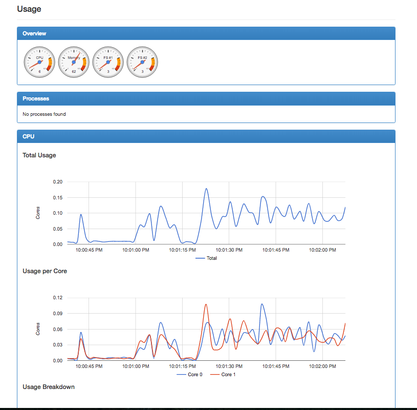
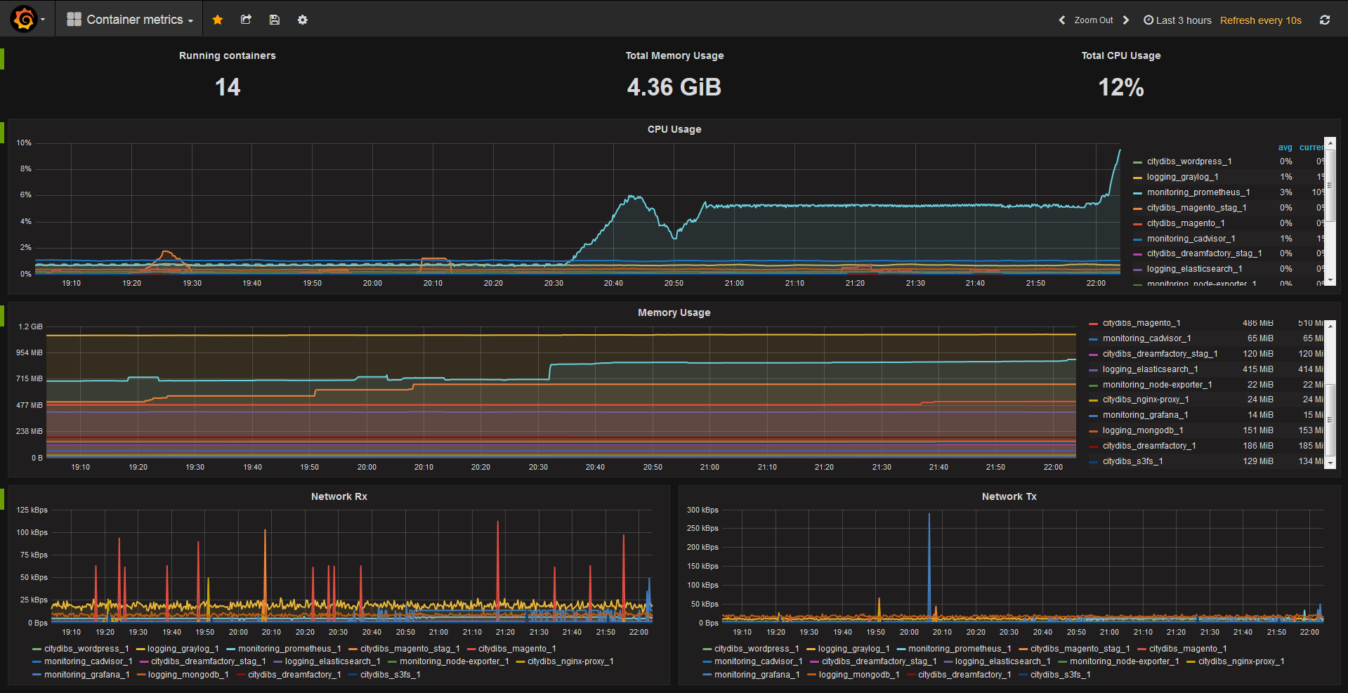
Regardless of your platform, some things don’t change… and that’s certainly true when it comes to networking data. Especially with Docker in the mix, networking can become more complex and communication patterns can become more convoluted. It’s important to keep track of basic information, e.g. how much data a container is consuming and emitting.

This type of data collection requires something more full-featured than the Docker API, so instead, you could collect this type of information from open-source Sysdig. Let’s look at some basic network data for a set of containers, each running the same Java application:

Image title

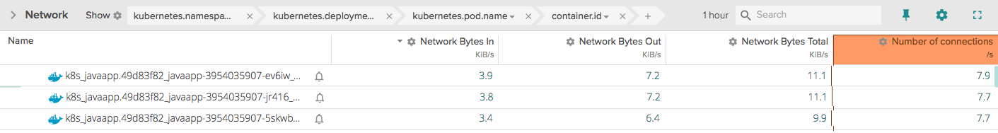
As you can see, there is some slight variation between the containers. If, however, we see an extreme variation, we may want to investigate further.

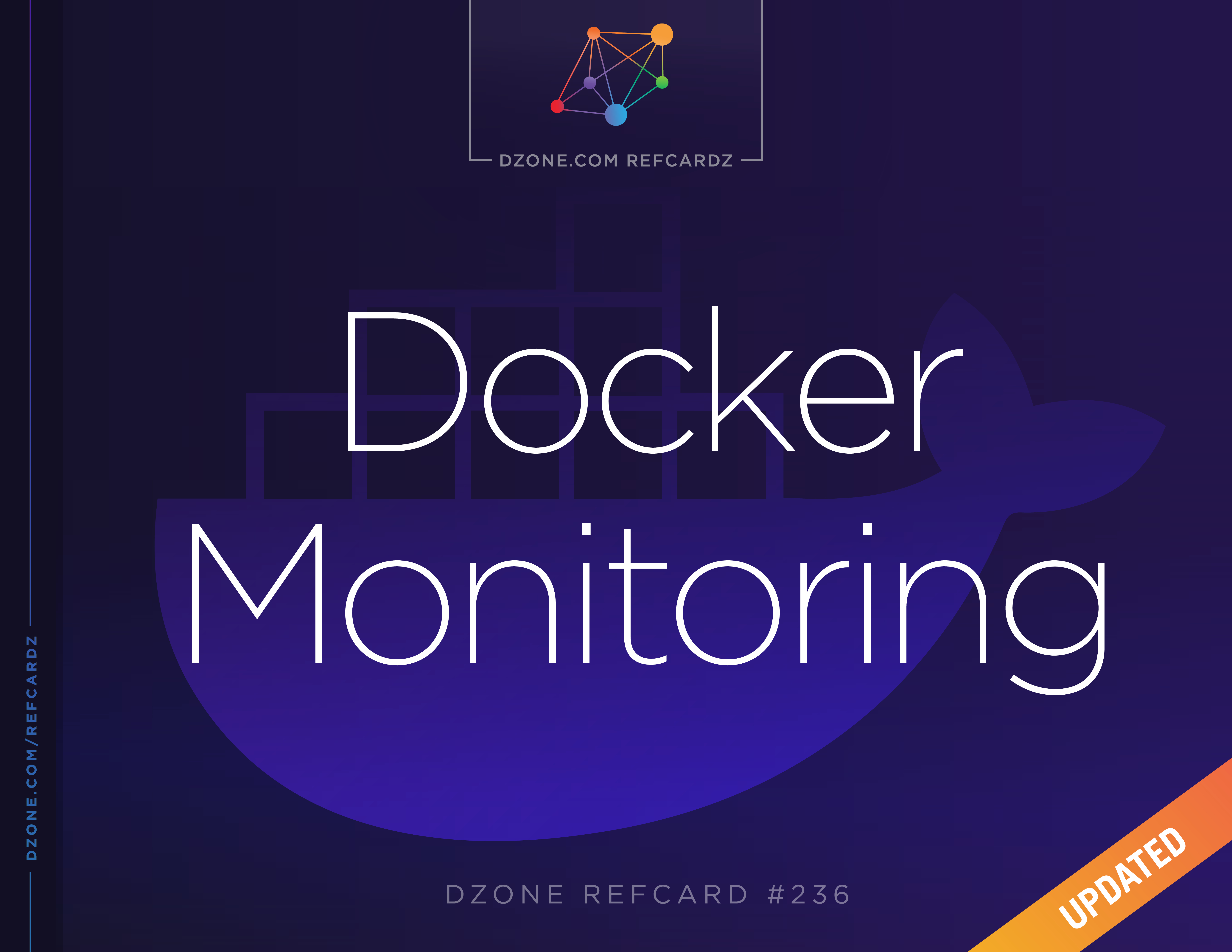
At the same time, since these containers are each running the same Java application, it may be more useful to consider them a “service” and see how they are performing in aggregate. This leads up to our last example.

From Container to Microservice Data With Labels

Docker and Kubernetes provide “labels.” These are much like they sound — additional, contextual information is applied on a per-container basis. They are unstructured and non-hierarchical, though basic tags in Kubernetes do have a hierarchy. As such, you can use them to broadly identify subcategories of your containers. All the containers of a given service could carry the same label, non-standard containers could carry another label, and different versions of software could have yet another label. If you’re a filer and an organizer, labels will be heaven for you.

So, what can we do with a label? Well, the first thing is that we can aggregate data. From the example above, let’s suppose we applied the label “javaapp” to our containers. Now, when we show our network data, we see something much simpler:

Image title

One line — that’s it. In this case, we’re showing the average network data across the containers, but you could easily calculate anything that helps you better understand the performance of this collection of containers.

But let’s go a little further with labels, network data, and the “top connections” example we showed in the open-source section.

Using this information and an appropriate visualization, we can do more than create a table of network data: we can actually create a map of our services, the containers that make them up, and who they are communicating with. Here, we can see the aggregated Java service orchestrated by Kubernetes, the individual containers that make up the service, and (in a more complete view) the other services in your environment that the Java service communicates with. Note that this is a little more advanced than the other examples, and the visualization in particular may require some coding in D3 or something similar if you want to stay fully open-source.

Image title

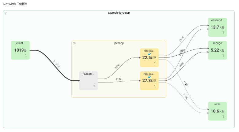
Here, we see a few different things: Our “javaapp” consists of two containers (yellow) and a service called “javaapp” (gray), which is just an abstraction created by whoever is routing requests to those containers. We see each of the Java app containers communicating with a Cassandra service, a Mongo service, and a Redis service, and presumably, those are made up of containers, as well (hidden here to avoid too much complexity).

This view helps us in a few different ways:

  • We quickly can understand the logical composition of our application.
  • We can aggregate containers into higher-level services.
  • We can easily see communication patterns among containers.
  • We may be able to easily spot outliers or anomalies.
Section 10

Conclusion

In this Refcard, we’ve walked from first principles using the Docker Stats API all the way up to more complex analysis of system performance in a Kubernetes-orchestrated environment. We’ve used data sources such as cAdvisor, Prometheus, and Sysdig to analyze real-world use cases such as greedy containers or mapping network communication.

As you can see, Docker monitoring can start very simply but grows complex as you actually take containers into production. Get experience early and then grow your monitoring sophistication to what your environment requires.

Like This Refcard? Read More From DZone

related article thumbnail

DZone Article

Monitoring Docker Containers — Docker Stats, cAdvisor, Universal Control Plane
related article thumbnail

DZone Article

AI-Based Threat Detection in Cloud Security
related article thumbnail

DZone Article

Is Agile Right for Every Project? When To Use It and When To Avoid It
related article thumbnail

DZone Article

Blue Skies Ahead: An AI Case Study on LLM Use for a Graph Theory Related Application
related refcard thumbnail

Free DZone Refcard

Full-Stack Observability Essentials
related refcard thumbnail

Free DZone Refcard

Getting Started With Log Management
related refcard thumbnail

Free DZone Refcard

Observability Maturity Model
related refcard thumbnail

Free DZone Refcard

Getting Started With OpenTelemetry

ABOUT US

  • About DZone
  • Support and feedback
  • Community research
  • Sitemap

ADVERTISE

  • Advertise with DZone

CONTRIBUTE ON DZONE

  • Article Submission Guidelines
  • Become a Contributor
  • Core Program
  • Visit the Writers' Zone

LEGAL

  • Terms of Service
  • Privacy Policy

CONTACT US

  • 3343 Perimeter Hill Drive
  • Suite 100
  • Nashville, TN 37211
  • support@dzone.com

Let's be friends: