DZone
Thanks for visiting DZone today,
Edit Profile
  • Manage Email Subscriptions
  • How to Post to DZone
  • Article Submission Guidelines
Sign Out View Profile
  • Post an Article
  • Manage My Drafts
Over 2 million developers have joined DZone.
Log In / Join
Please enter at least three characters to search
Refcards Trend Reports
Events Video Library
Refcards
Trend Reports

Events

View Events Video Library

Zones

Culture and Methodologies Agile Career Development Methodologies Team Management
Data Engineering AI/ML Big Data Data Databases IoT
Software Design and Architecture Cloud Architecture Containers Integration Microservices Performance Security
Coding Frameworks Java JavaScript Languages Tools
Testing, Deployment, and Maintenance Deployment DevOps and CI/CD Maintenance Monitoring and Observability Testing, Tools, and Frameworks
Culture and Methodologies
Agile Career Development Methodologies Team Management
Data Engineering
AI/ML Big Data Data Databases IoT
Software Design and Architecture
Cloud Architecture Containers Integration Microservices Performance Security
Coding
Frameworks Java JavaScript Languages Tools
Testing, Deployment, and Maintenance
Deployment DevOps and CI/CD Maintenance Monitoring and Observability Testing, Tools, and Frameworks

Modernize your data layer. Learn how to design cloud-native database architectures to meet the evolving demands of AI and GenAI workkloads.

Secure your stack and shape the future! Help dev teams across the globe navigate their software supply chain security challenges.

Releasing software shouldn't be stressful or risky. Learn how to leverage progressive delivery techniques to ensure safer deployments.

Avoid machine learning mistakes and boost model performance! Discover key ML patterns, anti-patterns, data strategies, and more.

  1. DZone
  2. Refcards
  3. JavaServer Faces 2.0
refcard cover
Refcard #058

JavaServer Faces 2.0

The JSF Expression Language

Provides summaries of the tags and attributes needed for JSF programming, a summary of the JSF expression language, and a list of code snippets for common operations.

Download Refcard
Free PDF for Easy Reference
refcard cover

Written By

author avatar Cay Horstmann
Professor, SJSU
Table of Contents
► JSF Overview ► Development Process ► Lifecycle ► The JSF Expression Language ► JSF Core Tags ► JSF HTML Tags
Section 1

JSF Overview

By Cay Horstmann

JavaServer Faces (JSF) is the “official” component-based view technology in the Java EE web tier. JSF includes a set of predefined UI components, an event-driven programming model, and the ability to add third-party components. JSF is designed to be extensible, easy to use, and toolable. This refcard describes JSF 2.0.

Section 2

Development Process

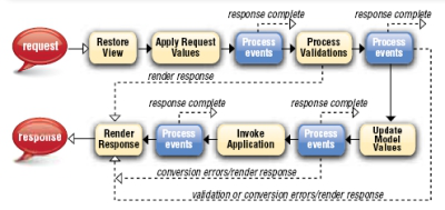
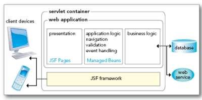
A developer specifies JSF components in JSF pages, combining JSF component tags with HTML and CSS for styling. Components are linked with managed beans—Java classes that contain presentation logic and connect to business logic and persistence backends.

JSF framework

In JSF 2.0, it is recommended that you use the facelets format for your pages:

​x
1
​
2
<?xml version=”1.0” encoding=”UTF-8”?>
3
<!DOCTYPE html PUBLIC “-//W3C//DTD XHTML 1.0 Strict//EN”
4
  “http://www.w3.org/TR/xhtml1/DTD/xhtml1-strict.dtd”>
5
<html xmlns=”http://www.w3.org/1999/xhtml”
6
  xmlns:f=”http://java.sun.com/jsf/core”
7
  xmlns:h=”http://java.sun.com/jsf/html”
8
  xmlns:ui=”http://java.sun.com/jsf/facelets”>
9
  <h:head>...</h:head>
10
  <h:body>
11
   <h:form>
12
       ...
13
   </h:form>
14
  </h:body>
15
</html>
16
​

These common tasks give you a crash course into using JSF.

Text Field

Code 1

page.xhtml

3
1
​
2
<h:inputText value=”#{bean1.luckyNumber}”>
3
​

WEB-INF/classes/com/corejsf/SampleBean.java

9
1
​
2
@ManagedBean(name=”bean1”)
3
@SessionScoped
4
public class SampleBean {
5
   public int getLuckyNumber() { ... }
6
   public void setLuckyNumber(int value) { ... }
7
   ...
8
}
9
​

Button

Press Button

page.xhtml

3
1
​
2
<h:commandButton value=”press me” action=”#{bean1.login}”/>
3
​

WEB-INF/classes/com/corejsf/SampleBean.java

11
1
​
2
@ManagedBean(name=”bean1”)
3
@SessionScoped
4
public class SampleBean {
5
   public String login() {
6
     if (...) return “success”; else return “error”;
7
   }
8
...
9
}
10
​
11
​

The outcomes success and error can be mapped to pages in faces-config.xml. if no mapping is specified, the page /success.xhtml or /error.xhtml is displayed.

Radio Buttons

Radio Button

page.xhtml

5
1
​
2
<h:selectOneRadio value=”#{form.condiment}>
3
<f:selectItems value=”#{form.items}”/>
4
</h:selectOneRadio>
5
​

WEB-INF/classes/com/corejsf/SampleBean.java

15
1
​
2
public class SampleBean {
3
  private static Map<String, Object> items;
4
  static {
5
    items = new LinkedHashMap<String, Object>();
6
    items.put(“Cheese”, 1); // label, value
7
    items.put(“Pickle”, 2);
8
    ...
9
  }
10
  public Map<String, Object> getItems() { return items; }
11
  public int getCondiment() { ... }
12
  public void setCondiment(int value) { ... }
13
  ...
14
}
15
​

JBoss Studio2.0_5.jpg

Validation and Conversion

Page-level validation and conversion:

8
1
​
2
<h:inputText value=”#{bean1.amount}” required=”true”>
3
  <f:validateDoubleRange maximum=”1000”/>
4
</h:inputText>
5
<h:outputText value=”#{bean1.amount}”>
6
  <f:convertNumber type=”currency”/>
7
</h:outputText>
8
​

The number is displayed with currency symbol and group separator: $1,000.00

Using the Bean Validation Framework (JSR 303) 2.0

5
1
​
2
public class SampleBean {
3
  @Max(1000) private BigDecimal amount;
4
}
5
​

Error Messages

Error Message

5
1
​
2
<h:outputText value=”Amount”/>
3
<h:inputText id=”amount” label=”Amount” value=”#{payment.amount}”/>
4
<h:message for=”amount”/>
5
​

Resources and Styles

page.xhtml

5
1
​
2
<h:outputStylesheet library=”css” name=”styles.css” target=”head”/>
3
...
4
<h:outputText value=”#{msgs.goodbye}!” styleClass=”greeting”>
5
​

faces-config.xml

8
1
​
2
<application>
3
  <resource-bundle>
4
    <base-name>com.corejsf.messages</base-name>
5
    <var>msgs</var>
6
  </resource-bundle>
7
</application>
8
​

WEB-INF/classes/com/corejsf/messages.properties

3
1
​
2
goodbye=Goodbye
3
​

WEB-INF/classes/com/corejsf/messages_de.properties

3
1
​
2
goodbye=Auf Wiedersehen
3
​

resources/css/styles.css

7
1
​
2
.greeting {
3
  font-style: italic;
4
  font-size: 1.5em;
5
  color: #eee;
6
}
7
​

Table with links

Table With Links

18
1
​
2
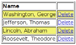
<h:dataTable value=”#{bean1.entries}” var=”row” styleClass=”table”
3
  rowClasses=”even,odd”>
4
  lt;h:column>
5
    <f:facet name=”header”>
6
      <h:outputText value=”Name”/>
7
    </f:facet>
8
    <h:outputText value=”#{row.name}”/>
9
  </h:column>
10
  <h:column>
11
    <h:commandLink value=”Delete” action=”#{bean1.deleteAction}”
12
      immediate=”true”>
13
      <f:setPropertyActionListener target=”#{bean1.idToDelete}”
14
        value=”#{row.id}”/>
15
    </h:commandLink>
16
  </h:column>
17
</h:dataTable>
18
​

WEB-INF/classes/com/corejsf/SampleBean.java

12
1
​
2
public class SampleBean {
3
  private int idToDelete;
4
  public void setIdToDelete(int value) { idToDelete = value; }
5
  public String deleteAction() {
6
    // delete the entry whose id is idToDelete
7
    return null;
8
  }
9
  public List<Entry> getEntries() { ... }
10
  ...
11
}
12
​

Ajax 2.0

5
1
​
2
<h:commandButton value=”Update”>
3
  <f:ajax execute=”
4
</h:commandButton>
5
​
Section 3

Lifecycle

lifecycle

Section 4

The JSF Expression Language

An EL expression is a sequence of literal strings and expressions of the form base[expr1][expr2]... As in JavaScript, you can write base.identifier instead of base[‘identifier’] or base[“identifier”]. The base is one of the names in the table below or a bean name.

header A Map of HTTP header parameters, containing only the first value for each name
headerValues A Map of HTTP header parameters, yielding a String[] array of all values for a given name
param A Map of HTTP request parameters, containing only the first value for each name
paramValues A Map of HTTP request parameters, yielding a String[] array of all values for a given name
cookie A Map of the cookie names and values of the current request
initParam A Map of the initialization parameters of this web application
requestScope,
sessionScope,
applicationScope,
viewScope 2.0
A map of all attributes in the given scope
facesContext The FacesContext instance of this request
view The UIViewRoot instance of this request
component 2.0 The current component
cc 2.0
resource 2.0 Use resource[‘library:name’] to access a resource

Value expression: a reference to a bean property or an entry in a map, list or array. Examples:

userBean.name calls getName or setName on the userBean object pizza.choices[var] calls pizza.getChoices().get(var) or pizza.getChoices().put(var, ...)

Method expression: a reference to a method and the object on which it is to be invoked. Example:
userBean.login calls the login method on the userBean object when it is invoked. 2.0: Method expressions can contain parameters: userBean.login(‘order page’)

In JSF, EL expressions are enclosed in #{...} to indicate deferred evaluation. The expression is stored as a string and evaluated when needed. In contrast, JSP uses immediate evaluation, indicated by ${...} delimiters.

2.0: EL expressions can contain JSTL functions

fn:contains(str, substr),
fn:containsIgnoreCase(str, substr)
fn:startsWith(str, substr)
fn:endsWith(str, substr)
fn:length(str)
fn:indexOf(str)
fn:join(strArray, separator)
fn:split(str, separator)
fn:substring(str, start, pastEnd)
fn:substringAfter(str, separator)
fn:substringBefore(str, separator)
fn:replace(str, substr,
replacement)
fn:toLowerCase(str)
fn:toUpperCase(str)
fn:trim()
fn:escapeXml()
Section 5

JSF Core Tags

Tag Description/Attributes
f:facet Adds a facet to a component - name: the name of this facet
f:attribute Adds an attribute to a component - name, value: the name and value of the attribute to set
f:param
3
1
Constructs a parameter child component
2
- name: An optional name for this parameter component.
3
- value:The value stored in this component.
f:actionListener f:valueChangeListener
2
1
Adds an action listener or value change listener to a component
2
- type: The name of the listener class
f:propertyAction Listener 1.2
4
1
Adds an action listener to a component that sets a bean property
2
to a given value
3
- target: The bean property to set when the action event occurs
4
- value: The value to set it to
f:phaseListener 1.2
2
1
Adds a phase listener to this page
2
- type: The name of the listener class
f:event 2.0
6
1
Adds a system event listener to a component
2
- name: One of preRenderComponent, postAddToView,
3
  preValidate, postValidate
4
- listenter: A method expression of the type
5
  void (ComponentSystemEvent) throws
6
  AbortProcessingException
f:converter
2
1
Adds an arbitrary converter to a component
2
- convertedId: The ID of the converter
f:convertDateTime
9
1
Adds a datetime converter to a component
2
- type: date (default), time, or both
3
- dateStyle, timeStyle: default, short, medium, long or full
4
- pattern: Formatting pattern, as defined in java.text.
5
  SimpleDateFormat
6
- locale: Locale whose preferences are to be used for parsing
7
  and formatting
8
- timeZone: Time zone to use for parsing and formatting
9
  (Default: UTC)
f:convertNumber
17
1
Adds a number converter to a component
2
- type: number (default), currency , or percent
3
- pattern: Formatting pattern, as defined in java.text.
4
  DecimalFormat
5
- minIntegerDigits, maxIntegerDigits,
6
  minFractionDigits, maxFractionDigits: Minimum,
7
  maximum number of digits in the integer and fractional part
8
- integerOnly: True if only the integer part is parsed (default:
9
  false)
10
- groupingUsed: True if grouping separators are used (default:
11
  true)
12
- locale: Locale whose preferences are to be used for parsing
13
  and formatting
14
- currencyCode: ISO 4217 currency code to use when
15
  converting currency values
16
- currencySymbol: Currency symbol to use when converting
17
  currency values
f:validator
2
1
Adds a validator to a component
2
- validatorID: The ID of the validator
f:validateDoubleRange,
f:validateLongRange,
f:validateLength
3
1
Validates a double or long value, or the length of a string
2
- minimum, maximum: the minimum and maximum of the valid
3
  range
f:validateRequired 2.0 Sets the required attribute of the enclosing component
f:validateBean 2.0
2
1
Specify validation groups for the Bean Validation Framework
2
(JSR 303)
f:loadBundle
3
1
Loads a resource bundle, stores properties as a Map
2
- basename: the resource bundle name
3
- value: The name of the variable that is bound to the bundle map
f:selectItem
12
1
Specifies an item for a select one or select many component
2
- binding, id: Basic attributes
3
- itemDescription: Description used by tools only
4
- itemDisabled: false (default) to show the value
5
- itemLabel: Text shown by the item
6
- itemValue: Item’s value, which is passed to the server as a
7
  request parameter
8
- value: Value expression that points to a SelectItem instance
9
- escape: true (default) if special characters should be converted
10
  to HTML entities
11
- noSelectionOption 2.0: true if this item is the “no selection
12
  option”
f:selectItems
13
1
Specifies items for a select one or select many component
2
- value: Value expression that points to a SelectItem, an array
3
  or Collection, or a Map mapping labels to values.
4
- var 2.0: Variable name used in value expressions when
5
  traversing an array or collection of non-SelectItem elements
6
- itemLabel 2.0, itemValue 2.0, itemDescription 2.0,
7
  itemDisabled 2.0, itemLabelEscaped 2.0: Item label,
8
  value, description, disabled and escaped flags for each item in
9
  an array or collection of non-SelectItem elements. Use the
10
  variable name defined in var.
11
- noSelectionOption 2.0: Value expression that yields the “no
12
  selection option” item or string that equals the value of the “no
13
  selection option” item
f:ajax 2.0
9
1
Enables Ajax behavior
2
- execute, render: Lists of component IDs for processing in the
3
  “execute” and “render” lifecycle phases
4
- event: JavaScript event that triggers behavior. Default: click
5
  for buttons and links, change for input components
6
- immediate: If true, generated events are broadcast during
7
  “Apply Request Values” phase instead of “Invoke Application”
8
- listener: Method binding of type void (AjaxBehaviorEvent)
9
- onevent, onerror: JavaScript handlers for events/errors
f:viewParam 2.0 Defines a “view parameter” that can be initialized with a request
parameter
-name, value: the name of the parameter to set
-binding, converter, id, required, value, validator,
valueChangeListener: basic attributes
f:metadata 2.0 Holds view parameters. May hold other metadata in the future
Section 6

JSF HTML Tags

Tag Description
h:head 2.0,h:body 2.0,
h:form
HTML head, body, form
h:outputStylesheet 2.0,
h:outputScript 2.0
Produces a style sheet or script
h:inputText Single-line text input control.

code8.1

h:inputTextArea Multiline text input control.

code8.1

h:inputSecret Password input control.

inputTextArea

h:inputHidden Hidden field
h:outputLabel Label for another
component for
accessibility
h:outputLink HTML anchor.

code8.2

h:outputFormat Like outputText, but
formats compound
messages
h:outputText Single-line text output.
h:commandButton,
h:button 2.0
Button: submit, reset, or pushbutton.

press me

h:commandLink, h:link 2.0 Link that acts like a
pushbutton.

register

h:message Displays the most recent
message for a component

Recent Message

h:messages Displays all messages
h:grapicImage Displays an image

Image Display

h:selectOneListbox Single-select listbox

Listbox

h:selectOneMenu Single-select menu

Menu Select

h:selectOneRadio Set of radio buttons

Radio Button Select

h:selectBooleanCheckbox Checkbox

Checkbox

h:selectManyCheckbox Set of checkboxes

Checkboxes

h:selectManyListbox Multiselect listbox

Multiselect Listbox

h:selectManyMenu Multiselect menu

Multiselect Menu

h:panelGrid HTML table
h:panelGroup Two or more components
that are laid out as one
h:dataTable A feature-rich table
component
h:column Column in a data table

Basic Attributes

id Identifier for a component
binding Reference to the component that can be used in a backing bean
rendered A boolean; false suppresses rendering
value A component’s value, typically a value binding
valueVhangeListener A method expression of the type void (ValueChangeEvent)
converter, validator Converter or validator class name
required A boolean; if true, requires a value to be entered in the associated field

Attributes for h:body and h:form

Attribute Description
binding, id, rendered Basic attributes
dir, lang, style, styleClass, target, title
h:form only: accept, acceptcharset, enctype
HTML 4.0 attributes
(acceptcharset corresponds
to HTML accept-charset,
styleClass corresponds to
HTML class)
onclick, ondblclick, onkeydown, onkeypress,
onkeyup, onmousedown, onmousemove, onmouseout,
onmouseover
h:body only: onload, onunload
h:form only: onblur, onchange, onfocus,
onreset, onsubmit
DHTML events

Attributes for h:inputText, h:inputSecret,
h:inputTextarea, and h:inputHidden

Code

Attribute Description
cols For h:inputTextarea only—number of columns
immediate Process validation early in the life cycle
redisplay For h:inputSecret only—when true, the input field’s value is redisplayed when the web page is reloaded
required Require input in the component when the form is submitted
rows For h:inputTextarea only—number of rows
binding, converter, id, rendered, required, value, validator, valueChangeListener Basic attributes
accesskey, alt, dir,
disabled, lang, maxlength,
readonly, size, style,
styleClasstabindex, title
HTML 4.0 pass-through attributes—alt, maxlength, and size do not apply to h:inputTextarea. None apply to h:inputHidden
onblur, onchange, onclick,
ondblclick, onfocus,
onkeydown, onkeypress,
onkeyup, onmousedown,
onmousemove, onmouseout,
onmouseover, onselect
DHTML events. None apply to h:inputHidden

Attributes for h:outputText and h:outputFormat

Attribute Description
escape If set to true, escapes <, >, and & characters. Default value is true
Basic attributes
style, title HTML 4.0

Attributes for h:outputLabel

Attribute Description
for The ID of the component to be labeled.
binding, converter, id, rendered, value Basic attributes

Attributes for h:graphicImage

cloud

Attribute Description
library 2.0, name 2.0 The resource library (subdirectory of resources) and file name (in that subdirectory)
binding, id, rendered, value Basic attributes
alt, dir, height, ismap, lang,
longdesc, style, styleClass, title,
url, usemap, width
HTML 4.0
onblur, onchange, onclick,
ondblclick, onfocus, onkeydown,
onkeypress, onkeyup, onmousedown,
onmousemove, onmouseout,
onmouseover, onmouseup
DHTML events

Attributes for h:commandButton and h:commandLink

press me

Attribute Description
action (command tags) Navigation outcome string or method expression of type String ()
outcome 2.0 (non-command tags) Value expression yielding the navigation outcome
fragment 2.0 (non-command tags) Fragment to be appended to URL. Don’t include the # separator
actionListener Method expression of type void (ActionEvent)
charset For h:commandLink only—The character encoding of the linked reference
image (button tags) For h:commandButton only—A context-relative path to an image displayed in a button. If you specify this attribute, the HTML input’s type will be image
immediate A boolean. If false (the default), actions and action listeners are invoked at the end of the request life cycle; if true, actions and action listeners are invoked at the beginning of the life cycle
type For h:commandButton: The type of the generated input element: button, submit, or reset. The default, unless you specify the image attribute, is submit. For h:commandLink and h:link: The content type of the linked resource; for example, text/html, image/gif, or audio/basic
value The label displayed by the button or link
binding, id, rendered Basic attributes
accesskey, dir, disabled (h:commandButton only), lang, readonly, style, styleClass, tabindex, title
link tags only: charset, coords, hreflang, rel, rev, shape, target
HTML 4.0
onblur, onclick, ondblclick,
onfocus, onkeydown, onkeypress,
onkeyup, onmousedown, onmousemove,
onmouseout, onmouseover,
onmouseup
DHTML events

Attributes for h:outputLink

Java Anchor

Attribute Description
accesskey, binding, converter, id, lang, rendered, value Basic attributes
charset, coords, dir, hreflang, lang, rel, rev, shape, style, styleClass, tabindex, target, title, type HTML 4.0
onblur, onchange, onclick, ondblclick, onfocus, onkeydown, onkeypress, onkeyup, onmousedown, onmousemove, onmouseout, onmouseover, onmouseup DHTML events

Attributes for: h:selectBooleanCheckbox,
h:selectManyCheckbox, h:selectOneRadio,
h:selectOneListbox, h:selectManyListbox,
h:selectOneMenu, h:selectManyMenu

Boolean Checkbox

Attribute Description
enabledClass, disabledClass CSS class for enabled/disabled elements— h:selectOneRadio and h:selectManyCheckbox only
selectedClass 2.0,
unselectedClass 2.0
CSS class for selected/unselected elements— h:selectManyCheckbox only
layout Specification for how elements are laid out: lineDirection (horizontal) or pageDirection (vertical)—h:selectOneRadio and h:selectManyCheckbox only
collectionType 2.0 selectMany tags only: the name of a collection class such as java.util.TreeSet
hideNoSelectionOption 2.0 Hide item marked as “no selection option”
binding, converter, id, immediate, required, rendered, validator, value, valueChangeListener Basic attributes
accesskey, border, dir, disabled, lang, readonly, style, styleClass, size, tabindex, title HTML 4.0—border only for h:selectOneRadio and h:selectManyCheckbox, size only for h:selectOneListbox and h:selectManyListbox.
onblur, onchange, onclick,
ondblclick, onfocus, onkeydown,
onkeypress, onkeyup, onmousedown,
onmousemove, onmouseout,
onmouseover, onmouseup, onselect
DHTML events

Attributes for h:message and h:messages

Boolean Checkbox

Attribute Description
for The ID of the component whose message is displayed— applicable only to h:message
errorClass, fatalClass, infoClass, warnClass CSS class applied to error/fatal/information/warning messages
errorStyle, fatalStyle, infoStyle, warnStyle CSS style applied to error/fatal/information/warning messages
globalOnly Instruction to display only global messages—h:messages only. Default: false
layout Specification for message layout: table or list— h:messages only
showDetail A boolean that determines whether message details are shown. Defaults are false for h:messages, true for h:message.
showSummary A boolean that determines whether message summaries are shown. Defaults are true for h:messages, false for h:message.
tooltip A boolean that determines whether message details are rendered in a tooltip; the tooltip is only rendered if showDetail and showSummary are true
binding, id, rendered Basic attributes
style, styleClass, title HTML 4.0

Attributes for h:panelGrid

Attribute Description
bgcolor Background color for the table
border Width of the table’s border
cellpadding Padding around table cells
cellspacing Spacing between table cells
columns Number of columns in the table
frame frame Specification for sides of the frame surrounding
the table that are to be drawn; valid values: none,
above, below, hsides, vsides, lhs, rhs, box, border
headerClass, footerClass CSS class for the table header/footer
rowClasses, columnClasses Comma-separated list of CSS classes for rows/columns
rules Specification for lines drawn between cells; valid values: groups, rows, columns, all
summary Summary of the table’s purpose and structure used for non-visual feedback such as speech
binding, id, rendered, value Basic attributes
dir, lang, style, styleClass, title, width HTML 4.0
onclick, ondblclick,
onkeydown, onkeypress,
onkeyup, onmousedown,
onmousemove, onmouseout,
onmouseover, onmouseup
DHTML events

Attributes for h:panelGroup

Attribute Description
binding, id, rendered Basic attributes
style, styleClass HTML 4.0

Attributes for h:dataTable

Attribute Description
bgcolor Background color for the table
border Width of the table’s border
cellpadding Padding around table cells
cellspacing Spacing between table cells
first index of the first row shown in the table
frame Specification for sides of the frame surrounding the table should be drawn; valid values: none, above, below, hsides, vsides, lhs, rhs, box, border
headerClass, footerClass CSS class for the table header/footer
rowClasses, columnClasses comma-separated list of CSS classes for rows/columns
rules Specification for lines drawn between cells; valid values: groups, rows, columns, all
summary summary of the table’s purpose and structure used for non-visual feedback such as speech
var The name of the variable created by the data table that represents the current item in the value
binding, id, rendered,
value
Basic attributes
dir, lang, style, styleClass, title, width HTML 4.0
onclick, ondblclick,
onkeydown, onkeypress,
onkeyup, onmousedown,
onmousemove, onmouseout,
onmouseover, onmouseup
DHTML events

Attributes for h:column

Attribute Description
headerClass 1.2,
footerClass 1.2
CSS class for the column’s header/footer
binding, id, rendered Basic attributes
Attribute Description
ui:define Give a name to content for use in a template
-name: the name of the content
ui:insert If a name is given, insert named content if defined or use the child elements otherwise. If no name is given, insert the content of the tag invoking the template -name: the name of the content
ui:composition Produces content from a template after processing child elements (typically ui:define tags) Everything outside the ui:composition tag is ignored -template: the template file, relative to the current page
ui:component Like ui:composition, but makes a JSF component -binding, id: basic attributes
ui:decorate, ui:fragment Like ui:composition, ui:
ui:include Include plain XHTML, or a file with a ui:composition or ui:component tag -src: the file to include, relative to the current page
ui:param Define a parameter to be used in an included file or template -name: parameter name -value: a value expression (can yield an arbitrary object)
ui:repeat Repeats the enclosed elements
  • value: a List, array, ResultSet, or object
  • offset, step, size: starting intex, step size, ending index of the iteration
  • var: variable name to access the current element
  • varStatus: variable name to access the iteration status, with integer properties begin, end, index, step and Boolean properties even, odd, first, last
ui:debug Shows debug info when CTRL+SHIFT+a key is pressed
  • hotkey: the key to press (default d)
  • rendered: true (default) to activate
ui:remove Do not include the contents (useful for comments or temporarily deactivating a part of a page)

Like This Refcard? Read More From DZone

related article thumbnail

DZone Article

ChartistJSF: A Responsive Chart Library for Java Server Faces (JSF) Apps
related article thumbnail

DZone Article

Why is Tomcat a Webserver and not an Application Server?
related article thumbnail

DZone Article

How to Convert XLS to XLSX in Java
related article thumbnail

DZone Article

Automatic Code Transformation With OpenRewrite
related refcard thumbnail

Free DZone Refcard

Java Application Containerization and Deployment
related refcard thumbnail

Free DZone Refcard

Introduction to Cloud-Native Java
related refcard thumbnail

Free DZone Refcard

Java 15
related refcard thumbnail

Free DZone Refcard

Java 14

ABOUT US

  • About DZone
  • Support and feedback
  • Community research
  • Sitemap

ADVERTISE

  • Advertise with DZone

CONTRIBUTE ON DZONE

  • Article Submission Guidelines
  • Become a Contributor
  • Core Program
  • Visit the Writers' Zone

LEGAL

  • Terms of Service
  • Privacy Policy

CONTACT US

  • 3343 Perimeter Hill Drive
  • Suite 100
  • Nashville, TN 37211
  • support@dzone.com

Let's be friends: