How to Build a Data Dashboard Prototype With Generative AI
This article is a tutorial that shows how to build a data dashboard to visualize book reading data taken from goodreads.com.
Join the DZone community and get the full member experience.
Join For FreeThis article is a tutorial that shows how to build a data dashboard to visualize book reading data taken from Goodreads. It uses a low-code approach to prototype the dashboard using natural language prompts to an open-source tool, Vizro-AI, which generates Plotly charts that can be added to a template dashboard.
You'll see how to iterate prompts to build three charts then add the prompts to a Notebook to generate an interactive dashboard. Finally, the generated dashboard code is added to a shared project that can be tweaked to improve the prototype. It's still not complete and can definitely be extended and improved upon. Let me know in the comments if you try it out!
The dataset for this project was reading data from my personal Goodreads account; it can be downloaded from my GitHub repo. If you use Goodreads, you can export your data in CSV format, substitute it for the dataset provided, and explore it with the code for this tutorial.
Before I started the project, I filtered the dataset to retain only books with an ISBN since that can be used with Google Books API to retrieve additional data about a book, such as the cover graphics and detailed category information. This project doesn't take advantage of the Books API, but by including ISBN data in the dataset, there is scope to extend the prototype project in the future, which is one of the potential extensions I mentioned above.
OpenAI
Parts of this tutorial use OpenAI models through Vizro-AI. To run through those steps yourself, you must have an OpenAI account with paid-for credits available. None of the free accounts will suffice. You may check the OpenAI models and pricing on their website. The latter parts of the tutorial take the generated code and work with that, and you don't need a key for those.
Note: Before using a generative AI model, please review OpenAI's guidelines on risk mitigation to understand potential model limitations and best practices. See the OpenAI site for more details on responsible usage.
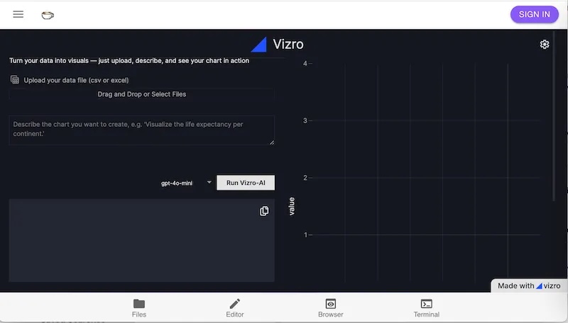
Chart Generation With Vizro-AI
In the first step, I use a hosted version of Vizro-AI, found at https://py.cafe/app/vizro-official/vizro-ai-charts. To see it for yourself, navigate to the site, which looks as follows:
Settings
The link will open with a settings pane where you can set the API key for your chosen vendor. At the time of writing, you can use OpenAI, Anthropic, Mistral, or xAI:
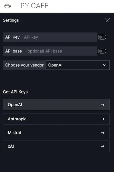
To return to these settings at any time, you'll notice a cog icon at the top right-hand corner to access them.
Once the API key is set, return to the main screen and upload the data for the project, which is stored here. Now, you can use Vizro-AI to build some charts by iterating text to form effective prompts.
Chart 1: Books Timeline
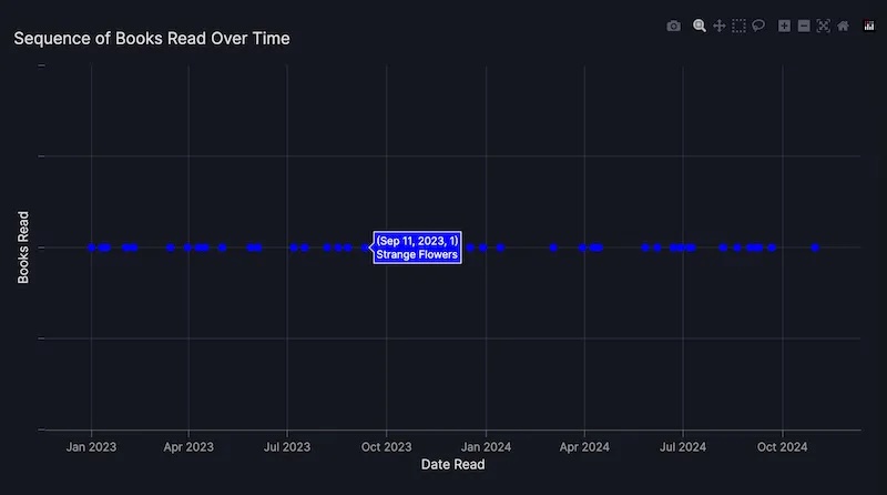
To ask Vizro-AI to build a chart, describe what you want to see. The first chart should show an ordered horizontal timeline to illustrate the sequence of reading the books.
Plot a chart with the title "Sequence of reading" . It is a scatter chart. Use the x axis to show the date a book was read. Plot it at y=1.
The plot looks as follows:
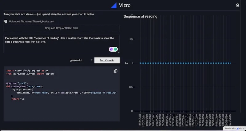
It's not perfect! Hovering over each point gave the date the book was read, but not the title of the book, although this could be achieved by tweaking the prompt to ask explicitly for particular fields in the hover text. You'll also notice that the points are spaced evenly rather than proportionately.
The code to generate the plot is shown underneath the prompt. Here it is for easy access (also as a gist):
import plotly.graph_objects as go
from vizro.models.types import capture

@capture("graph")
def custom_chart(data_frame):
fig = go.Figure()
fig.add_trace(go.Scatter(x=data_frame["Date Read"], y=[1] * len(data_frame), mode="markers"))
fig.update_layout(title="Sequence of reading", xaxis_title="Date Read", yaxis_title="Y=1")
return fig
Chart 2: Reading Velocity
The second chart should plot the cumulative total of pages read and the cumulative total of books read per year. The prompt took a few iterations to refine:
Plot a chart with the title "Pages and Book totals" .
It shows the cumulative total number of pages read by summing the
Number of Pages of each book read in each year, using the Date Read data.
Plot date on the x axis and the number of pages on the y axis
using a scale on the left hand side of the chart.Superimpose a bar chart showing the total books read for each year,
taking data from the Date Read column.
Show the total books read using the right hand side of the chart,
which can be a different scale to the y axis shown on the left hand side.
The Plotly code generated with gpt-4-turbo was as follows (also as a gist):
import pandas as pd
import plotly.graph_objects as go
from plotly.subplots import make_subplots
from vizro.models.types import capture


@capture("graph")
def custom_chart(data_frame):
    # Convert Date Read to datetime
    data_frame["Date Read"] = pd.to_datetime(data_frame["Date Read"], dayfirst=True)

    # Group by year and sum pages
    pages_per_year = data_frame.groupby(data_frame["Date Read"].dt.year)["Number of Pages"].sum().cumsum()

    # Count books per year
    books_per_year = data_frame.groupby(data_frame["Date Read"].dt.year).size()

    # Create subplot
    fig = make_subplots(specs=[[{"secondary_y": True}]])

    # Add line for cumulative pages
    fig.add_trace(
        go.Scatter(
            x=pages_per_year.index,
            y=pages_per_year,
            mode="lines",
            name="Cumulative Pages",
        ),
        secondary_y=False,
    )

    # Add bar for books count
    fig.add_trace(
        go.Bar(x=books_per_year.index, y=books_per_year, name="Total Books"),
        secondary_y=True,
    )

    # Set y-axes titles
    fig.update_yaxes(title_text="Cumulative Pages", secondary_y=False)
    fig.update_yaxes(title_text="Total Books", secondary_y=True)

    # Set layout
    fig.update_layout(title="Pages and Book totals", xaxis_title="Year", showlegend=True)

    return fig
The chart could be improved by bringing the line graph on top of the bar chart, but varying the prompt to make this explicit did not have the desired results:
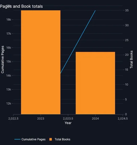
Chart 3: Reviews Comparison
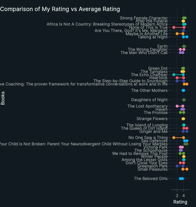
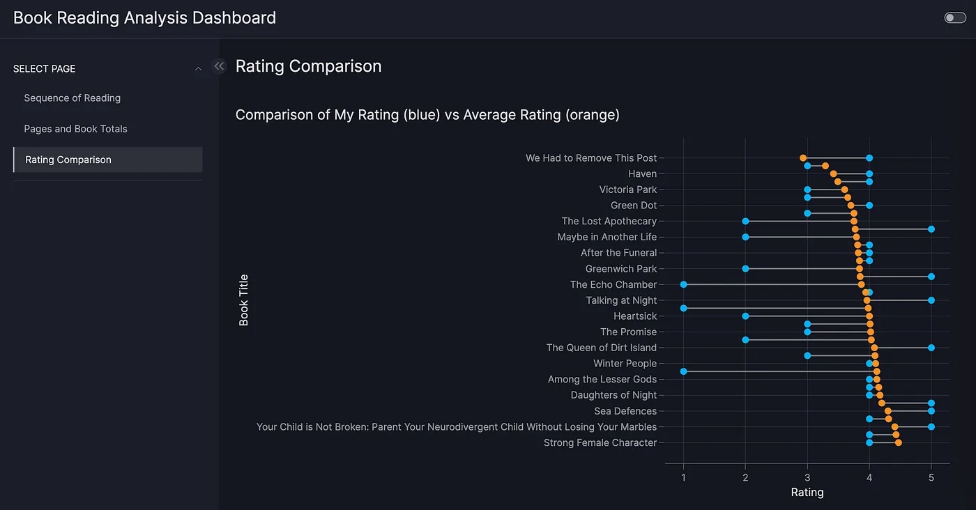
The third chart should illustrate the difference between the rating the Goodreads reader assigned a book and the average rating across the Goodreads community. This prompt took a degree of iteration and needed me to specify how to draw the lines between the points, which is a key learning when using generative AI: your results will vary from run to run. The type of chart ("dumbbell") was given explicitly to guide the chart creation.
For each row, create a dumbbell chart to show the difference between My Rating and Average Rating for each book. Use shapes to add the horizontal lines between markers. Omit the legend. Don't show any row where My Rating is 0.
Here's the code generated (also as a gist):
import plotly.graph_objects as go
from vizro.models.types import capture


@capture("graph")
def custom_chart(data_frame):
    # Filter out rows where 'My Rating' is 0
    df_filtered = data_frame[data_frame["My Rating"] != 0]

    # Create a blank figure
    fig = go.Figure()

    # Add dumbbell lines and markers for each book
    for index, row in df_filtered.iterrows():
        fig.add_trace(
            go.Scatter(
                x=[row["My Rating"], row["Average Rating"]],
                y=[index, index],
                mode="markers+lines",
                marker=dict(size=10),
                line=dict(width=2),
                name=row["Title"],
                showlegend=False,
            )
        )

    # Update layout
    fig.update_layout(
        title="Comparison of My Rating vs Average Rating",
        xaxis_title="Rating",
        yaxis_title="Books",
        yaxis=dict(
            tickmode="array",
            tickvals=list(df_filtered.index),
            ticktext=df_filtered["Title"],
        ),
    )
    return fig
The plot looks as follows:
Dashboard Generation With Vizro-AI
Set Up a Jupyter Notebook
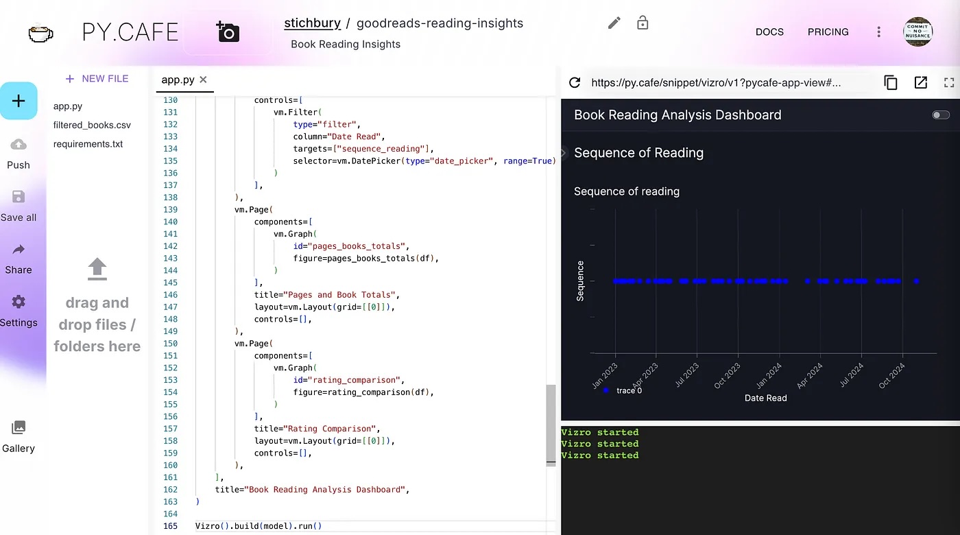
At this point, I have prototypes for three Plotly charts for the Goodreads data. To display these as an interactive dashboard, I need some additional code, and Vizro-AI can generate this for me, but not through the application hosted on PyCafe (at the time of writing). I'll use a Jupyter Notebook instead.
Before running the Notebook code, set up Vizro-AI inside a virtual environment with Python 3.10 or later. Install the package with pip install vizro_ai.
You need to give Vizro-AI your API key to access OpenAI by adding it to your environment so the code you write in the next step can access it to successfully call OpenAI. There are some straightforward instructions in the OpenAI docs, and the process is also covered in Vizro's LLM setup guide.
Build a Dashboard
Now open a Jupyter Notebook to submit a single prompt that combines the three prompts listed above, with some small edits to ask for a dashboard that has three pages: one for each chart.
The following shows the code (also available as a gist) to make the request to Vizro-AI to build and display the dashboard. The data manipulation has been omitted, but the full Notebook is available for download from my repo:
user_question = """
Create a dashboard with 3 pages, one for each chart.
On the first page, plot a chart with the title "Sequence of reading" .
It is a scatter chart. Use the x axis to show the date a book was read. Plot it at y=1.
On the second page, lot a chart with the title "Pages and Book totals" .
It shows the cumulative total number of pages read by summing the Number of Pages of each book read in each year, using the Date Read data.
Plot date on the x axis and the number of pages on the y axis using a scale on the left hand side of the chart.
Superimpose a bar chart showing the total books read for each year, taking data from the Date Read column.
Show the total books read using the right hand side of the chart which can be a different scale to the y axis shown on the left hand side.
On the third page, for each row, create a dumbbell chart to show the difference between My Rating and Average Rating for each book.
Use shapes to add the horizontal lines between markers. Omit the legend. Don't show any row where My Rating is 0.
"""

result = vizro_ai.dashboard([df_cleaned], user_question, return_elements=True)
Vizro().build(result.dashboard).run(port=8006)
print(result.code)
Using gpt-4-turbo, Vizro-AI generates a set of Plotly chart codes and the necessary Vizro support code to build a dashboard. The generated code is displayed as output in the Notebook with the dashboard, although the dashboard is better viewed at http://localhost:8006/.
Add Dashboard Interactivity
To make the Vizro dashboards more interactive, I'll ask Vizro-AI to add the code for a control. As a simple example, let's extend the prompt to ask for a date picker control to modify the time period displayed for the Date Read column and change the scale on the x-axis of the first chart.
user_question = """
Create a dashboard with 3 pages, one for each chart.

On the first page, plot a chart with the title "Sequence of reading" .
It is a scatter chart. Use the x axis to show the date a book was read. Plot it at y=1.

+ Add a date picker filter so the user can adjust the range of dates for the Date Read on the x axis.

On the second page, plot a chart with the title "Pages and Book totals" .
It shows the cumulative total number of pages read by summing the Number of Pages of each book read in each year, using the Date Read data.
Plot date on the x axis and the number of pages on the y axis using a scale on the left hand side of the chart.
Superimpose a bar chart showing the total books read for each year, taking data from the Date Read column.

Show the total books read using the right hand side of the chart which can be a different scale to the y axis shown on the left hand side.

On the third page, for each row, create a dumbbell chart to show the difference between My Rating and Average Rating for each book.
Use shapes to add the horizontal lines between markers. Omit the legend. Don't show any row where My Rating is 0.
"""
Get the Notebook
You can see the code output in the Notebook stored on GitHub, and I'll reproduce it in the next section below. You can also generate similar output by running it yourself, although it will not necessarily be identical because of the variability of results returned from generative AI.
The charts Vizro-AI generated were similar to those created by the PyCafe host above, although the first chart was improved. The books are spaced proportionately to the date I read them, and the hover text includes the book title as well as the date read without an explicit request to do so.
Now I have a Notebook with code to call Vizro-AI to build a prototype Vizro dashboard with a set of three pages and three charts, plus a control to filter the view.
Because the code generated by Vizro-AI can vary from run to run, and calling OpenAI each time a dashboard is needed can get costly, it makes sense to convert the generated code into its own project. So, I have transferred the generated code from the output of Vizro-AI in the Notebook into a PyCafe project.
There are three changes to the Notebook code needed for it to run on PyCafe:
- Add
from vizro import Vizroto the imports list - Add
Vizro().build(model).run()at the end of the code block - Uncomment the data manager code and replace it with the code needed to access the
filtered_books.csvdataset.
More About PyCafe
If you've not used it before, PyCafe is a free platform to create and share Python web applications, like Vizro dashboards, as well as Streamlit and Dash applications, through a web browser. It grew out of a need to share Solara code snippets, and communicate with users, and was launched in June this year. It's based on the open-source Pyodide project.
Prototype Summary
To get to this point, I used Vizro-AI to generate a set of charts by iterating prompts. I then converted the successful prompts to build a Vizro dashboard using Vizro-AI in a Notebook using a few lines of support code. Finally, I converted the generated Python to a PyCafe project with a few additional lines of support code, removing the dependency on OpenAI in doing so, and making the project easier to share.
It's true that the code generated by Vizro-AI does not make a perfect dashboard, but it has been very easy to get it to a reasonable prototype. Let's look at a few improvements to the Plotly code to further improve the charts, as shown below in a separate PyCafe project.
Improvements to Generated Code
In this version of the dashboard, the first chart that shows the sequence of books read has been modified to improve the information supplied when hovering over a point, and the opacity of the points has been altered to make it more attractive. The control has been changed to a slider for the Date Read field.
In the second chart to show the cumulative total of pages and books read, the line chart has been explicitly plotted on top of the bar chart.
In the third chart that shows the rating comparison, the color scheme has been updated to make it clearer which is the My Rating value compared to the Average Rating.
Follow this link to try out the dashboard in full app mode.
Published at DZone with permission of Jo Stichbury. See the original article here.
Opinions expressed by DZone contributors are their own.
Comments