

Building a Card Layout Using CSS Subgrid
In this article, learn how to build a responsive 4-card grid layout with CSS Grid and Subgrid, aligning inner content step by step with a live example.
 ·
·
Join the DZone community and get the full member experience.
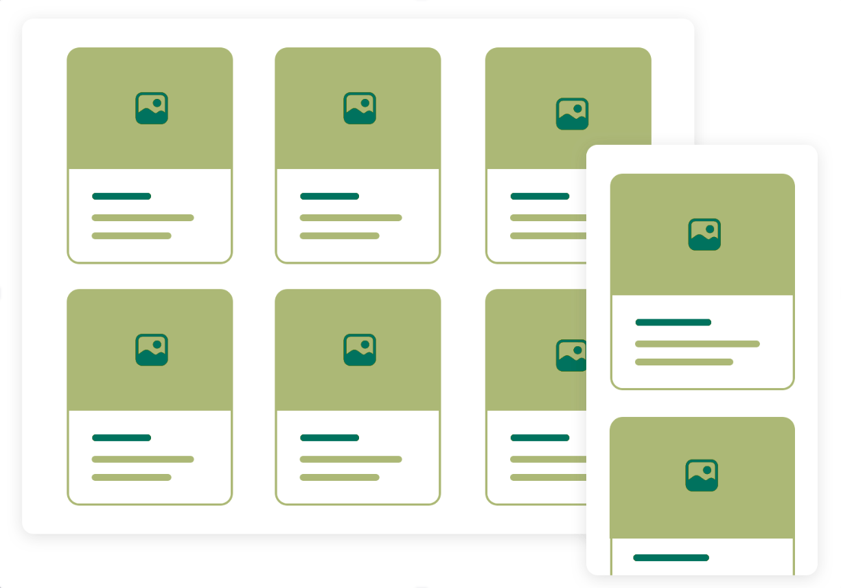
Join For FreeCreating clean, well-aligned card layouts is a common task in web development. In this tutorial, I’ll walk you through building a grid of four cards per row. Each card contains several content blocks — a title, image, price, bullet point list, and a call-to-action (CTA) button — aligned horizontally within the card using CSS Grid and the powerful CSS Subgrid feature.
What You’ll Build
- A card grid layout (max of 4 cards per row).
- Each card contains multiple content blocks aligned horizontally.
- Use of CSS Grid for the overall layout.
- Use of CSS Subgrid for inner alignment of content inside each card.
Why Use CSS Subgrid?
CSS Subgrid is a relatively new feature that allows a nested grid to inherit the track sizing of its parent grid. This means you can align inner content perfectly with the outer grid without manually calculating or duplicating track sizes.
Without subgrid, aligning content inside cards can become complicated, requiring extra wrappers, fixed widths, or tricky flexbox tricks. Subgrid simplifies this by letting inner grids “follow” the outer grid’s structure.
Steps-by-Step Guide
Step 1: Set Up the HTML Structure
Let’s start with a simple HTML structure for the card grid:
<div class="card-grid">
  <div class="card">
    <div class="title">Card Title 1</div>
    <div class="image">[Image]</div>
    <div class="description">description to be here</div>
    <ul class="ingredients">
      <li>Ingredient 1</li>
      <li>Ingredient 2</li>
    </ul>
    <div>
      <button class="cta">Buy Now</button>
    <div>
  </div>
  <!-- Repeat .card for other cards -->
</div>
And some base styles for our card:
.image {
  background: #eee;
  height: 200px;
  overflow: hidden;
  display: flex;
}

.description {
  color: gray;
}

.ingredients {
  list-style: disc inside;
  padding: 0;
  margin: 0;
}

.cta {
  margin-top: 10px;
  padding: 8px 12px;
  background-color: #007bff;
  color: white;
  border: none;
  border-radius: 4px;
  cursor: pointer;
  width: 100%;
}
Below, we will use api.sampleapis.com to get some random dummy data. So our template will look like the following:
const App = () => {
  const [data, setData] = useState([]);
  const getData = async () => {
    try {
      const resp = await fetch("https://api.sampleapis.com/coffee/hot");
      const json = await resp.json();
      setData(json);
    } catch (err) {
      setData(err.message);
    }
  };

  useEffect(() => {
    getData();
  }, []);

  return (
    <div class="card-grid">
      {data?.map((i) => (
        <div class="card" key={i.title}>
          <h3 class="title">{i.title}</h3>
          <div class="image">
            <img src={i.image} />
          </div>
          <div class="description">{i.description}</div>
          <ul class="ingredients">
            {i.ingredients.map((j) => (
              <li key={j}>{j}</li>
            ))}
          </ul>
          <div>
            <button class="cta">Buy Now</button>
          </div>
        </div>
      ))}
    </div>
  );
};
Step 2: Create the Outer Grid (Card Grid)
We want 4 cards in a row, so we’ll define a grid with 4 columns:
.card-grid {
  display: grid;
  grid-template-columns: repeat(4, 1fr);
  gap: 20px;
  padding: 20px;
}
This creates a 4-column grid with equal-width columns and some spacing between cards.
Step 3: Define the Card Layout Using Subgrid
Inside each card, we want the content blocks (title, image, description, ingredients, CTA) to align horizontally, matching the columns of the outer grid. This is where subgrid shines.
Outer Grid Row and Column Tracks
- 4 columns for the cards
- We want the inner content aligned according to these columns
Inner Card Grid
.card {
  display: grid;
  grid-template-rows: subgrid;
  grid-row: span 5 / span 5;
  gap: 10px;

  padding: 15px;
  border: 1px solid #ccc;
  border-radius: 8px;
}
Here, grid-template-rows: subgrid; tells the card to inherit the row track sizes from the parent .card-grid. This means the content inside each card aligns exactly with the columns of the outer grid. Now, it is important to specify how many rows the subgrid should take from the parent grid, in our case, we have 5 blocks to align (title, image, description, ingredients, CTA), so set grid-row to span 5 / span 5;
Step 4: Place Content Inside the Card Grid
Let's add base styles to our card so it looks less ugly. The nice thing there is that we should not specify anything for child blocks, as they are already aligned — each takes a row and stacks vertically.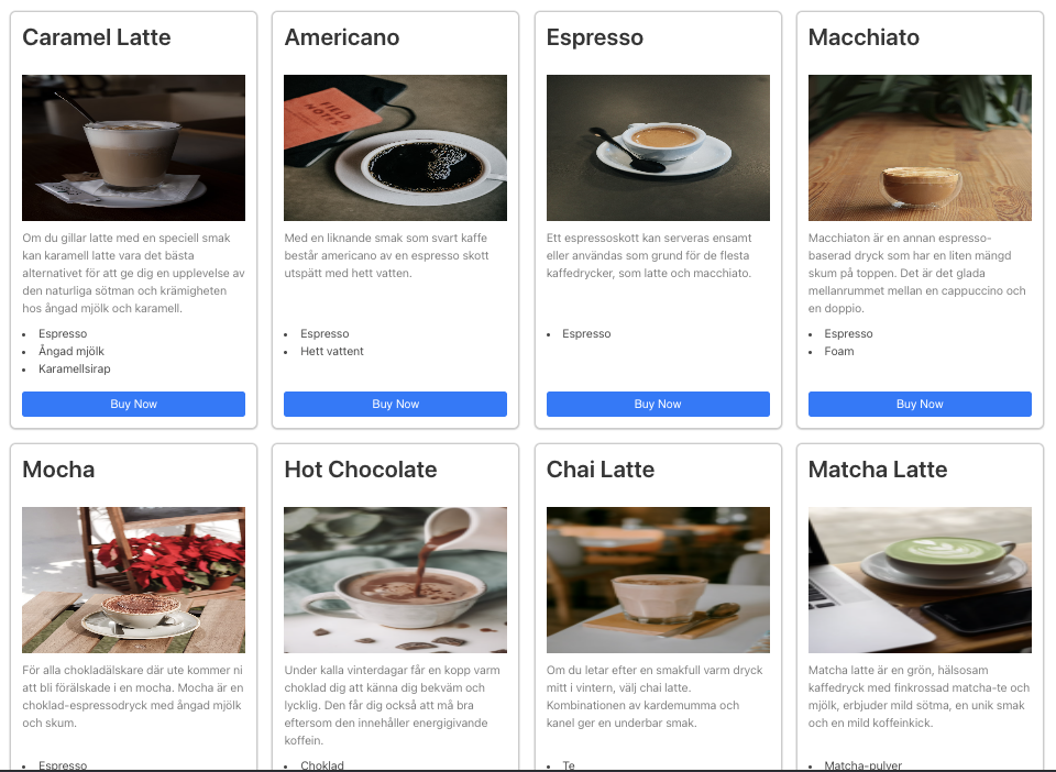
Step 5: Final Touches and Responsive Design
You can add media queries to make the grid responsive for smaller screens by reducing the number of columns or stacking cards vertically.
For example:
@media (max-width: 768px) {
  .card-grid {
    grid-template-columns: repeat(2, 1fr);
  }
}

@media (max-width: 480px) {
  .card-grid {
    grid-template-columns: 1fr;
  }
}
Or you could make a responsive design using grid props without using media queries by updating the grid template:
.card-grid {
  display: grid;
  grid-template-columns: repeat(auto-fit, minmax(320px, 1fr));
  gap: 20px;
  padding: 20px;
}
Using this solution, you set the minimum card width, and the grid determines itself how many cards it should render in a row, depending on the grid wrapper size.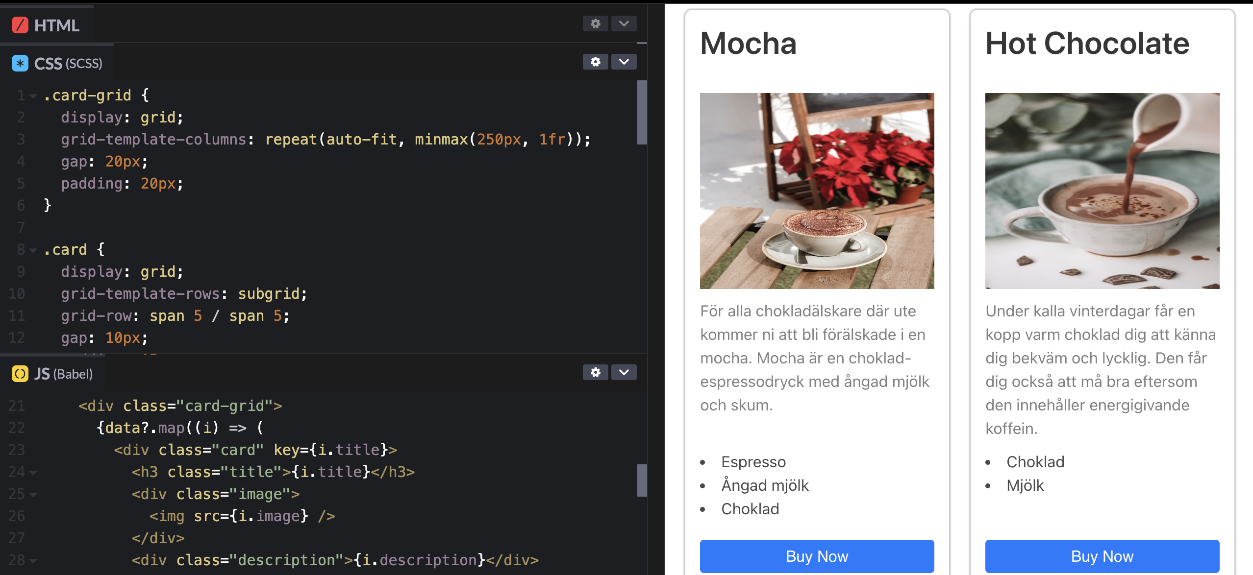
To see this in action, check out this CodePen example with dummy cards and CSS subgrid usage.
Summary
- Use CSS Grid to create a responsive card grid.
- Use CSS Subgrid inside each card to align content blocks horizontally based on the outer grid columns.
- Assign each content block to specific grid columns for neat alignment.
- Subgrid simplifies layout maintenance and ensures consistent alignment.
CSS Subgrid is a powerful tool for complex layouts, and I hope this tutorial helps you leverage it to build clean, maintainable card grids with ease!
Opinions expressed by DZone contributors are their own.
Comments