Comparing Test Results in JMeter
Comparing test results with a new JMeter plugin to help you "gauge" the improvement or degradation brought along by the second version of the application.
Join the DZone community and get the full member experience.
Join For FreeIntroduction
As performance testers, we are often asked to compare the difference in the performance between two versions of an application. Whatever the changes made in the second version (i.e., usage of new libraries, change of technological stack, etc.), ultimately, the business wants to know if the second version is better (or worst) and by how much.
This article discusses two solutions, including one based on a new JMeter plugin to help you "gauge" the improvement or degradation brought along by the second version of the application.
Response Times Percentiles
Usually, to compare results, performance testers have turned to the Summary Statistics and looked for the difference between the means (or medians) of the results. Though this is a straightforward approach, it does not help you see the whole picture of the differences between the test runs. For example, a 100ms difference between the means may be a huge difference for averages in the hundreds of milliseconds or it may be insignificant for averages in seconds. 10% may be a huge difference for a test with a small dispersion but it may be insignificant for a test with a huge dispersion.
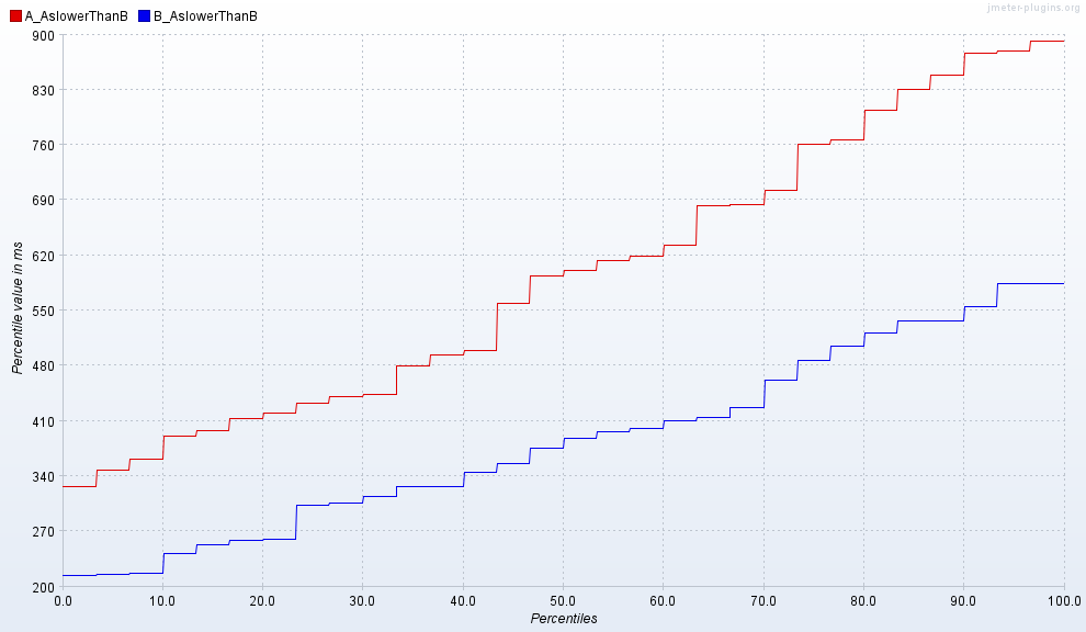
To view the differences in their globality, it is much better to use the Response Times Percentiles plugin which generates graphs that will help you compare the quantiles of the two test runs for instance. To compare the two distributions in one graph, you can merge the results of both runs in one file using the Merge Results plugin and then import the merged file into the Response Times Percentiles plugin.
Below is an example of percentiles response times charts between two test runs where the second version B is faster than the first version A:

With these graphs, you should be careful with the extreme quantiles (<= 0.1 or >= 0.9) as these quantiles can be very unstable. It is better to describe the difference for the "main" part of the distributions, i.e., the [0.1-0.9] quantile interval. Alternatively, I recommend to parse the initial results for outliers with the Right Tail Outlier Detector plugin and then run the analysis on the trimmed results.
You may need some time to get used to the Response Times Percentiles charts and learn how to extract information from them quickly. They are also hard to specify acceptable/unacceptable thresholds. The effect size resolves these problems.
Results Comparator plugin using Cohen's d
The effect size is just the absolute difference normalized by the dispersion of the distributions. They report the differences using abstract units that have the same meaning for all kinds of distributions.
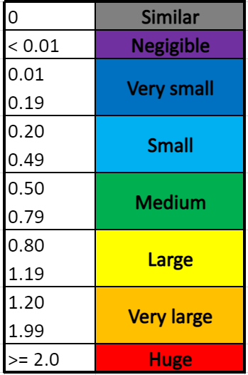
One of the most popular methods to express the effect size is Cohen's d. It is defined as the difference between two means divided by a standard deviation for the data. The table below describes the magnitudes of d as initially suggested by Cohen and expanded by Sawilowsky's rule of thumb:

The new JMeter Results Comparator plugin will compute Cohen's d of the samplers in two test result files and report them in a table together with a column describing the magnitude of the difference based on the above table as well as the direction of the movement (increase or decrease).
Below is an example of the table generated by the plugin:

Highlighted in blue is the line matching the Response Times Percentiles chart given at the beginning of the article: you can now see that there is a "Very large decrease" of the response times in version B, with the mean going down to 384ms from 593ms. This conclusion was not evident to take from the percentiles data!
Now, you may have a mix of gains and losses in the second version. How do you decide then which version is the best in such a situation? To help you make the call, the plugin will compute a Cohen's d across all the averages (average of averages) and give you a global score in the "OVERALL AVERAGE" line. In the example above, you can see that despite the "Very large decrease" in the response times of the "AslowerThanB" sampler, version B offers just a "Small decrease" advantage globally. This is because it is suffering from a "Huge increase" in the response times of the "AfasterThanB" sampler.
The plugin offers the option to export the table into a csv file should you wish to import the findings into your test report.
But as already stated earlier, to avoid biases in the calculation of Cohen's d, we recommend removing outliers in the initial test results first and then use the cleansed results for your performance analysis.
Opinions expressed by DZone contributors are their own.

Comments