CSS Grid Solution to the Problems of Float and Flexbox
This article examines the use of CSS Grid and explains how it can be used in comparison to other tools when developing a website layout.
Join the DZone community and get the full member experience.
Join For FreeBefore going on to explain what CSS Grid is and what it is for, I will explain the current state of the tools we have when developing a layout for our website.
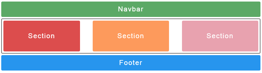
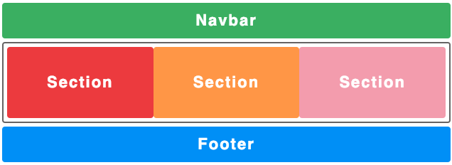
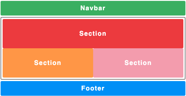
Let’s suppose we want to create the following layout:
We should use an HTML with each necessary section, for example:
<body>
<nav>Navbar</nav>
<main class="container">
<section class="left">Section</section>
<section class="center">Section</section>
<section class="right">Section</section>
</main>
<footer>Footer</footer>
</body>
Using this HTML we will add the styles using float, flexbox, and CSS grid.
Float
When using float we are facing some of the main problems of creating a layout, since the float property is not designed to create out layouts, despite being used for that. As mentioned in the float specification, the use of float is limited to specifying that an element will float to the right or to the left of the container and the rest of its content will float around it. However, the use of floats to position elements in our layout can lead to a series of strange bugs that require “hacks” to solve them, as mentioned in this post about floats. To achieve the following layout, we should use a CSS like this (I have only added the necessary CSS, in the previous link the complete code appears):
xxxxxxxxxx
.container {
text-align: center; /* necesario para la class .center */
}
.container:after {
content: "";
display: table;
clear: both;
}
.left {
float: left;
}
.center {
margin: 0 auto;
display: inline-block;
}
.right {
float: right;
}
Just by looking at the resulting CSS, we can see how we need to apply “patches” to center the .center class and use clearfix hack to prevent the .container class from losing its size by having its children as floating elements.
To deal with all these hacks needed when designing, flexbox emerged, which provides a significant improvement over float.
Flexbox
Flexbox allows you to create out layouts that adapt to the size of the screen and that free us from the disadvantages of using float, such as the adjustment of our elements in certain screen sizes. Despite this, one of the disadvantages of Flexbox is that it only allows us to organize our elements horizontally or vertically, but not both at the same time, which greatly limits our possibilities. To create the following layout we should use a CSS like this:
xxxxxxxxxx
.container {
display: flex;
justify-content: space-between;
}
.left {
background-color: #dc4d4d;
}
.center {
background-color: yellow;
}
.right {
background-color: #e8a2af;
}
In the previous code, we see how it is no longer necessary to specify anything in our three columns, we simply modify the properties of the class .container and we can place our elements comfortably. Despite not being appreciated in this example, and as mentioned above, Flexbox works very well in a single direction either vertical or horizontal, but if we want to work in a layout positioning element in both directions we face another common problem, not only in Flexbox but also using floats.
Using Unnecessary Tags
Another disadvantage when using both Flexbox and float is the fact that we have to group our elements in boxes, since we need a specific group of elements to be positioned together in the same area. In the case of Flexbox, assuming that we are working in a horizontal layout we should group all the elements we want vertically into a new parent tag, which will contain all the elements to be positioned vertically and specify the vertical direction there. Doing this forces us to add unnecessary HTML tags that do not provide any semantic value.
xxxxxxxxxx
<body>
<nav></nav>
<main class="container">
<section class="left"></section>
<section class="center"></section>
<section class="right"></section>
<div class="container container--vertical">
<section class="first"></section>
<section class="second"></section>
...
</div>
</main>
<footer></footer>
</body>
In the previous example we can see how we need to add a new <div> to encapsulate the elements that we want to position vertically and despite being a single extra element, this large scale can lead us to have hundreds of tags without any semantic value, so that we would have a complex html without semantics.
CSS Grid Solution
To solve the problems when using float or Flexbox appears CSS Grid, which does not force us to use “hacks” to achieve the expected behavior of our CSS and offers the possibility of designing a layout in both directions without the need to add extra and unnecessary elements to achieve it. Another advantage of using grid, and perhaps one of the most important, is the fact that it manages to separate our HTML from the CSS, we no longer need to modify or adapt our HTML to behave well with our CSS, with grid we get that HTML just be what it should be, markup.
CSS Grid
Given that most browsers support CSS grid, it has become an option to be taken into account more and more likely to replace Flexbox, which is its most recent competitor.
The main concepts of CSS grid are very similar to Flexbox: we have a container that includes a series of elements on which grid properties are applied.
We will start to apply the display property: grid to our .container, which will indicate that our container is a grid, but by not specifying anything else it will simply stack the divs one on top of the other.
xxxxxxxxxx
.container {
display: grid;
}
grid-template-columns and grid-template-rows
Now we will specify the form of our layout. Since we want three columns and a single row, we will use the properties grid-template-columns and grid-template-rows, to which we pass the value we want for each of our rows or columns.
xxxxxxxxxx
.container {
display: grid;
grid-template-columns: 33.33% 33.33% 33.33%;
grid-template-rows: 100%;
}
grid-column and grid-row
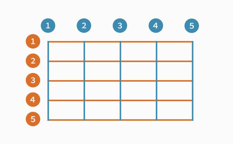
We will continue positioning the elements: for this we can use the grid-column and grid-row properties. Assigning the beginning and end of this, for example, grid-column-start and grid-column-end, we can define in which line our columns and rows begin and end. This gives us a lot of flexibility when it comes to creating layouts, and in turn is a very simple tool to use. In the following image we will see how the lines are distributed, starting with the 1 (most browsers show a grid if we inspect an element with a grid display, which helps differentiate these lines):
xxxxxxxxxx
.container {
...
grid-template-rows: 100px 100px; /* Usamos 100px como tamaño de las rows ya que es nuestro height fixo para secciones */
}
.left {
grid-column-start: 1;
grid-column-end: 3;
/* también se puede resumir como grid-column: 1/3 */
}
repeat(), fr and grid-gap
Now we will start creating more elaborate layouts. To begin with, we will use the unit ab abbreviation of fraction that takes the assigned value from the total available space of the container. This unit is very useful as it prevents us from unnecessary calculations. We will also use the repeat () function that accepts the number of times to repeat as the first parameter and a value as the second parameter. Using this function will prevent us from repeating the columns or rows as for example grid-template-rows: 1fr 1fr 1fr.... Finally, we will use the grid-gap property, which is the abbreviation of grid-row-gapy grid-column- gap, in this order, we can assign a general value for both or a specific value to each one.
xxxxxxxxxx
.container {
...
grid-template-column: repeat(3, 1fr);
grid-template-row: repeat(3, auto);
grid-gap: 8px;
}
grid-template-areas
Added this, we will use one of the most useful and innovative properties of CSS grid, the property grid-template-areas. This allows us to define a “scheme” in which we can define which element we want in each cell of our grid. To each of the elements we will assign a grid-area property, which will be the name of the area we want to use. We have defined that we have 3 columns and 3 rows, so our template will be like this:
xxxxxxxxxx
.container {
...
grid-template-areas:
"f f f"
"s s s"
"t t t";
}
.left {
...
grid-area: f
}
.center {
...
grid-area: s
}
.right {
...
grid-area: t
}
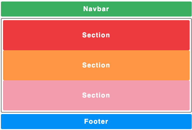
Being able to design our layout, apart from being very fast and intuitive, allows us to completely modify the structure of the HTML without having to touch any of it, which is known as source order independence. Imagine that we want to change the layout for mobile:
xxxxxxxxxx
screen and (max-width: 640px) {
.container {
...
grid-template-areas:
"t t t"
"s s s"
"f f f";
}
}
Simply with this change in our CSS we have modified our entire layout completely, something that is impossible to do without CSS grid.
This incredible property allows us to modify our layouts very quickly, allowing us to create simple mockups very fast and we can move different elements of our layout to see how we like them more.
xxxxxxxxxx
.container {
...
grid-template-areas:
"t . f"
"t s s"
"t s s";
}
.section {
// height: 100px;
}
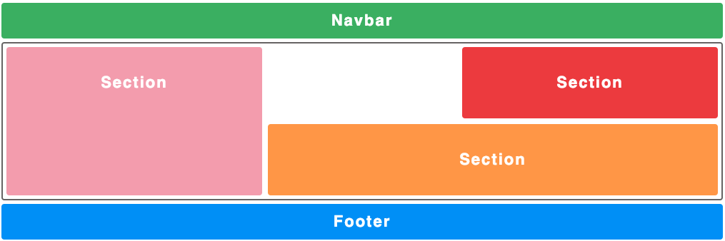
I added a link to codepen in which I could modify the property grid-template-areas and thus be able to see how the layout changes.
When to Use CSS Grid
As we have already said, Flexbox opts for an approach based on single-direction containers while CSS grid opts for a bidirectional layout. As a result of this, Flexbox is better suited for the use of components, since most of the content of a component is usually in one direction since it is usually small-scale content, whereas if we require a more complex layout, with varying directions, we would use CSS grid.
It is also necessary to take into account the support of both browsers, because if we want to support IE browsers we should opt for Flexbox, since having more use has polyfills adapted for IE.
Published at DZone with permission of Arnau Silvestre. See the original article here.
Opinions expressed by DZone contributors are their own.
Comments