Data Visualization Using Python
A step-by-step guide to visualize forex data using Python via TraderMade's API.
Join the DZone community and get the full member experience.
Join For FreeThis tutorial is for beginners, and it guides you through the practical process of visualizing forex data, considering the least or no knowledge of Python. Let us have an overview of the libraries and setup we will use before we begin.
You can quickly manipulate the data, including converting and storing it in various forms using pandas, an open-source Python library. For convenience, we will use the Jupyter Notebook, an open-source web app for creating documents and programming different languages. This tutorial shows you how to obtain, change, and store forex data from JSON API and explores pandas, Jupyter Notebook, and DataFrame during this process.
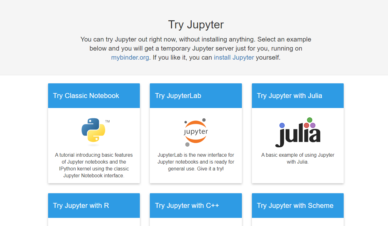
Navigate to https://jupyter.org/try in your browser. Then, select the “Classic Notebook” link as shown here:
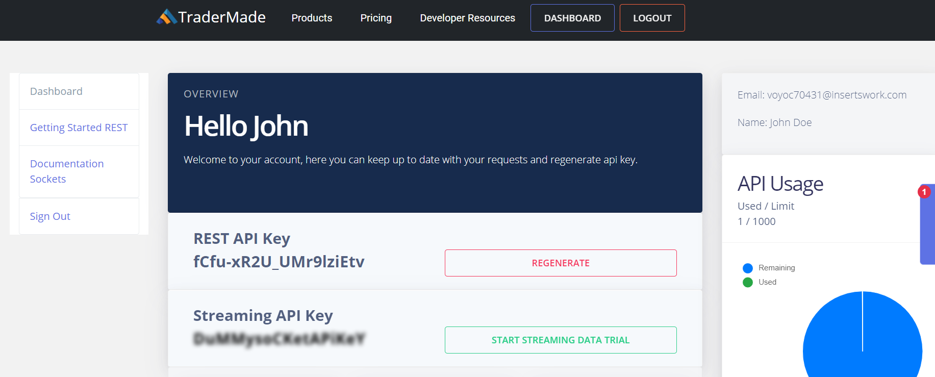
Hold for a few moments till a Jupyter Notebook launches for you in the browser. As you start the notebook, you can get an API key from https://tradermade.com/signup. Open this link in another tab and sign up for free. You get 1000 requests free in a month. Please register an account, and you will find the API key under the myAccount page. Note it down securely.
As you have the API key now, you can get started with the procedure.
To begin with, click on the scissor sign thrice. You can see that third from the left under the ‘Edit’ tab. It clears the initial welcome content, and you can start to code.
It’s Time To Write Some Code
Write the following code in the next cell and click the ‘Run’ button:
import pandas as pdThe command above imports the Pandas Data Frame to use in your notebook. You can get additional information about pandas at https://pandas.pydata.org/.
You can type or copy the following variables in the next cell for setting up. Through these variables, you will pass in the data request. You would need to substitute your API key precisely.
currency = "EURUSD"
api_key = “paste your api key here”
start_date = "2019-10-01"
end_date= "2019-10-30"
format = "records"
fields = "ohlc"
Now, you need to copy the following code in the next cell. The first line of code sends a request to the data server and formats the JSON response in a Pandas Dataframe. The second line of code is for setting the index for the data to the date field. That’s why you can see that in the date order. While the third line of code, “df,” brings the output data frame in a presentable format.
df =
pd.read_json("https://marketdata.tradermade.com/api/v1/pandasDF?currency="+currency+"&api_key="+api_key+"&start_date="+start_date+"&end_date="+end_date+"&format="+format+"&fields="+fields)
df = df.set_index("date")
df
Please copy-paste the code, substitute your API key, and run the program, and you will get the following output. The program requests the data from the server, converts the response into Pandas Dataframe format, and presents the output data in a tabular form.

You get the data for the period specified in a data frame, identical to a table. The best thing about Pandas is the ability to manipulate data. It can also store it in various readable and presentable formats.
Let’s take a look at some basic commands before we deep-dive:
df.head() - This command provides us with the initial 5 lines of data.
df.tail() - This command gives the last 5 lines of data.
Plotting the Data as a Line Chart
It is easy to plot a line chart. Use the df.plot(kind=’line’) command to get the following:
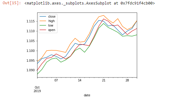
You can visualize the data set using the above command. After this, we will use a feature in Excel to calculate the 5-day moving average:
df['5_day_MA'] =  df.close.rolling(5).mean()
df['5_day_volatility'] = df.close.rolling(5).std()
df = df.dropna()
df.head(10)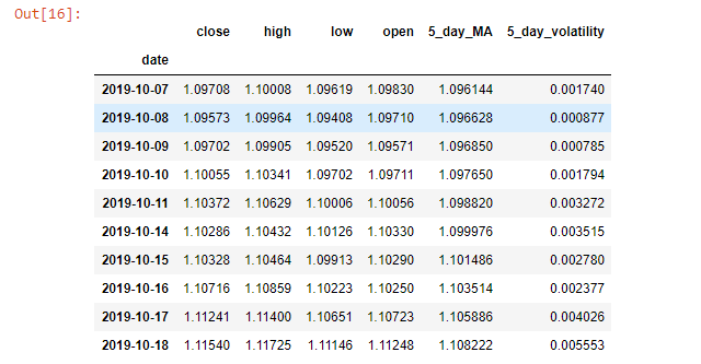
You can observe that the dropna() function drops N/A values. Eventually, we need 5 close days values to calculate the first moving average. The data set we took starts from 07/10/2019. With the help of the plotting function, we can see if the current data we extracted shows increasing or decreasing volatility.
df["5_day_volatility"].plot(title="EURUSD Volatility")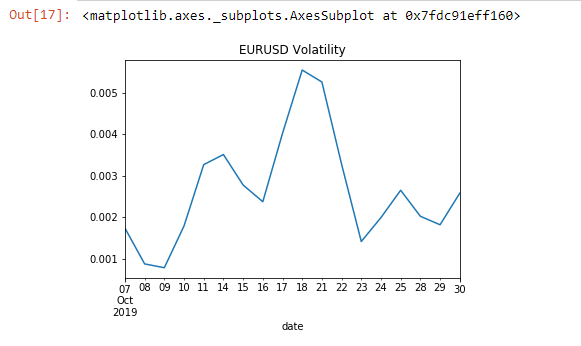
Till here, we have seen working on a single data set. Now, let’s utilize the API for a comparison between two currencies:
currency = "EURUSD,GBPUSD"
fields = "close"
df = pd.read_json("https://marketdata.tradermade.com/api/v1/pandasDF?currency="+currency+"&api_key="+api_key+"&start_date="+start_date+
"&end_date="+end_date+"&format="+format+"&fields="+fields)
df = df.set_index("date")
df.head()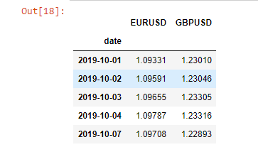
Initially, we will calculate the percentage change for the currencies. Then we can assess the correlation between these two currencies. Finally, we will plot it.
df = df.pct_change(periods=1)
df = df.dropna()
df.corr()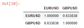
Using the above function, we can see the daily correlation between EURUSD and GBPUSD for the complete data set. Then, we can see the changes in this relationship over time.
df["EURUSD_GBPUSD"] = df["EURUSD"].rolling(window=5).corr(other= df["GBPUSD"])
df = df.dropna()
df["EURUSD_GBPUSD"].plot(title="5 day correlation between EURUSD and GBPUSD")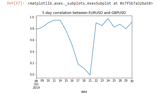
You can see the change in the correlation between the 15th to the 21st of October. You can also save the data in CSV or JSON format by using the following code:
df.to_json(‘mydata.json’)
df.to_csv(‘mydata.csv’)
You can see the available data by clicking File > Open > myfile.json. Similarly, by clicking File > Download, you can download the data.
Published at DZone with permission of Rahul Khanna. See the original article here.
Opinions expressed by DZone contributors are their own.
Comments