Having (More) Fun Creating Components with the Lightning Design System for React
Check out how easy it is to create a custom component using the Lightning Design System for React and some very detailed blueprints
 CORE
·
CORE
·
Join the DZone community and get the full member experience.
Join For FreeIn “Having Fun with the Lightning Design System for React”, I created a React application using the Lightning Design Framework for React, quickly adding several components in order to provide an impressive user experience.
The image below demonstrates what I was able to create in less than an hour on a rainy Sunday afternoon:
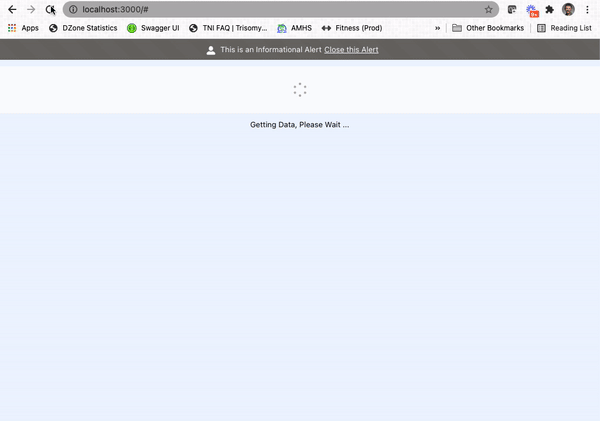
In this article, I’ll improve upon the approach I employed while waiting for data to be retrieved from my fictional service.
The Spinner Is Great, But …
The Lightning Design Framework for React provides several ways to communicate to the user that some action is still processing. I’ve always enjoyed the look and feel of the spinner and was glad to see it made available by the Salesforce Engineering team.
In my case, I like to provide additional information to the user to communicate “why” the spinner is active. I mean, is the spinner active because the system is still retrieving data? Or has something unexpected happened, and now things are in a stuck state?
Without providing context alongside the spinner, it is hard for the customer to know how long the spinner should … well, you know … spin.
In the illustration above, you can see the “Getting Data, Please Wait …” text below the spinner. In my case, the expectation is that the spinner would only spin long enough to retrieve data.
Since the out-of-the-box spinner does not include the option to display text, I ended up using the following code for the original design:
{this.state.showSpinner &&
<div style={{marginTop: 10, position: 'relative', height: '5rem'}}>
  <Spinner
    size="small"
    variant="base"
    assistiveText={{label: 'Getting Data, Please Wait ...'}}
  />
</div>
}

{this.state.showSpinner &&
<div style={{marginTop: 10}}>Getting Data, Please Wait ... </div>
}
The result code above included showing the spinner when the this.state.showSpinner property is true, but also required showing another <div> to contain the text message I wanted to communicate to the user.
This works but requires two separate elements to be used every time the spinner needs to include text.
I knew that there must be a better way.
Diving into the Blueprints
The Salesforce Engineering team not only provides the Lightning Design Framework for React, but they also expose the component blueprints which drive the design of those components. Component blueprints are framework agnostic, accessible HTML and CSS—used to create components in conjunction with implementation guidelines.
With the spinner component, for example, the blueprint provides everything needed to create the spinner using basic HTML and CSS:
<div class="demo-only demo-only_viewport" style="height:6rem;position:relative">
  <div role="status" class="slds-spinner slds-spinner_medium">
    <span class="slds-assistive-text">Loading</span>
    <div class="slds-spinner__dot-a"></div>
    <div class="slds-spinner__dot-b"></div>
  </div>
</div>
Now, I can use this information to create a custom component from the core blueprint documentation.
Creating a Custom Component
For my use case, I would like to include a text message below the spinner while active in order to communicate information related to the spinner.
In the section above, I found the spinner blueprint code I planned to use and decided to create a React component to group the objects together.
Within IntelliJ, I created a new file called SpinnerWithDescription.js which contains the following information:
function SpinnerWithDescription(props) {
    return (
        <div className="slds-m-top_medium">
            <div className="slds-align_absolute-center slds-p-top_medium">
                <Spinner size="small"
                         variant="base"
                         assistiveText={{ label: props.description }}
                         isInline={true}
                         hasContainer={false} />
            </div>
            <div>
                <p className="slds-text-font_monospace">{props.description}</p>
            </div>
        </div>
    );
}

export default SpinnerWithDescription;
With my approach, the code from the original spinner component becomes part of the React component, along with a simple paragraph of text - providing the information I wish to display below the spinner. Now, to use this new component anywhere in my React application, I just need to include a single line of code:
<SpinnerWithDescription description=”some message goes here”/>I can also pass the description from another value stored in the current state:
<SpinnerWithDescription description={this.state.loadingMessage}/>With this approach, any updates needed to the SpinnerWithDescription component can be made once without impacting components using the shared logic.
Along the Way, I Discovered Style
While looking at the blueprints, I noticed the presence of style-focused classes, which include the “slds” prefix. Just like how the 1980’s retailer, Chess King, helped transform my personal style from jeans and t-shirts to fancy pants and skinny ties, the “slds” style classes quickly transformed my user experience into something classier.
Instead of using items like ...
style={{marginTop: 10}}... I used the margins style documentation to employ the Salesforce style classes which were ready and available:
slds-m-top_smallNow I can avoid the tedious exercise of finding the right number of pixels for my margins and have a consistent user experience in my app, but leveraging classes with the “slds-m” prefix - which are focused on setting margins.
Stop Hiding the Application Title
In my original design, the alert component would appear above the application title, which was not an ideal user experience. Using the “slds” style classes, title was refactored as shown below:
<div className="slds-text-heading_large slds-p-top_xx-large">
    Some Music Service
</div>
The “slds-p” prefix focuses on padding and the “top_xx-large” suffix provides an ideal amount of spacing to no longer hide any part of the application title when the alert component is being displayed.
Changing the Spinner Font
I also decided to use a mono-spaced font for the spinner text—also already available as part of the framework—by including the following class:
slds-text-font_monospaceMy New Design
With the new component and styling in place, this is how my updated React application looks in action:
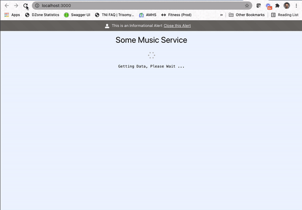
While the changes are subtle, there are no longer any special rules to communicate when using the spinner.
This new custom component can even become an official component in the Lightning Design System for React by following the steps outlined here.
Conclusion
Starting in 2021, I have been trying to live by the following mission statement, which I feel can apply to any IT professional:
“Focus your time on delivering features/functionality which extends the value of your intellectual property. Leverage frameworks, products, and services for everything else.”
- J. Vester
In this article, not only did I leverage the existing Lightning Design System for React, but I introduced simple HTML code to create a new component that avoids having to maintain the knowledge to always include text with the spinner. This, of course, will cut down on correcting the code when a feature developer forgets this rule or is a new developer on the project.
The Salesforce Engineering team has not only provided excellent components to use out of the box, but the team also included the blueprint documentation which allows feature developers to expand and potentially even contribute to the design-system-react repository.
All of these efforts fall in line with my personal mission statement.
If you are interested in the source code for this article, simply navigate to the following repository on GitLab:
https://gitlab.com/johnjvester/having-fun-with-the-lightning-design-system
Have a really great day!
Opinions expressed by DZone contributors are their own.
Comments