How to Add Responsive Design to React Native Apps
Join the DZone community and get the full member experience.
Join For FreeNative application developers put a lot of effort into making engaging and stable apps that are supported on multiple devices. This means that Android developers have to make sure that their apps are supported on hundreds of devices. iOS developers also need to support their apps on a growing number of devices.
React Native enables developers to develop apps that can run both on iOS and Android. The problem is that the number of devices they need to support now is doubled. One particular problem is making the app responsive. There is no such thing as CSS media queries in React Native. React Native developers need to scale all of their layouts to make the app responsive on smartphones, tablets, and other devices.
Problems With Responsive Layout in React Native
React Native developers make their apps work on one-dimensional devices as a default. As a result, the app looks distorted on devices with different dimensions because different devices have different pixel ratios. React Native style properties accept either Density-Independent Pixels (DP) or percentage.
Independent Pixels
A density-independent pixel is a unit of length that enables mobile apps to scale across different screen sizes. DPs are not the classic screen pixels. Rather, DPs are mathematically calculated through the following equation: DP=PX/ScaleFactor.
PX is the number of classic screen pixels, and the scaling factor indicates how much the pixels should be enlarged.
React Native developers can scale DP values to screens of different sizes only if they have the same resolution. The problem is that there are hundreds of different devices and most of them have screens with different resolutions.
Percentage
Most web development frameworks use percentage values to design different layouts. However, React Native style properties like border-radius and border-width do not accept percentage value. Properties that do accept percentage include maxWidth, minWidth, margin and height.
5 Tips for Creating Responsive Layouts for React Native Apps
The following tips will help you develop responsive React Native apps on a massive range of devices.
1. Layout With Flexbox
Flexbox is a method for laying out one-dimensional items in rows or columns. Flexbox enables developers to keep layout proportions on different screen sizes. Flexbox properties use single numbers to divide the screen space between elements. For example, a screen that shows boxes of different colors, as shown in the image below.
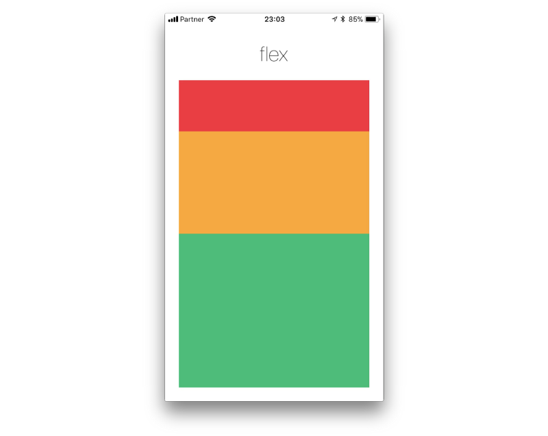
The red box is defined as flex: 1, the yellow box is flex: 2, the green box is flex: 3. This means that the red box gets 1/6 of the screen, the yellow gets 2/6, and the green gets 3/6.
Main Flexbox properties include:
Flex direction—controls the direction or the main axis of the content layout. You can layout the content in a row or in a column. The default direction is a column because of the nature of mobile device screens.
Justify content—describes the position of content along the main axis. You can align the content to the right-left of the center of the main axis. You can also determine the space between content components.
Align items—aligns content on the cross axis, as opposed to justifyContent that aligns on the main axis.
2. Aspect Ratio
Aspect ratio describes the relationship between the width and the height of an image. Aspect ratio is usually expressed as two numbers separated by a colon, like 16:9. Aspect ratio is a non-standard property available only in React Native, and not in CSS. The aspect ratio property controls the size of undefined element dimensions.
For example, you can use the aspectRatio property to adjust images to screen size when your images extend beyond the screen dimensions. You do not need to know the actual width and height of the image, just set the aspect ratio to 1:1. Your images will take all available screen width, without extending beyond the dimensions.
3. Screen Dimensions
React Native does not provide properties that can identify the device type or screen size when you work with different layouts. The solution is to use the Dimensions API. The syntax for obtaining the dimensions of a screen is:
import { Dimensions } from 'react-native';
const {width, height} = Dimensions.get(‘window');
After obtaining the size of the screen, you can set breakpoints for layout changes. You can also define different styles to components or hide some parts of the screen.
4. Detect the Platform
The platform module in React Native detects if the app is running on Android or iOS. Developers can use this module to implement platform-specific code. For example, the code below will show the text “My device is Apple” when the app runs on iOS.
xxxxxxxxxx
platform.OS === 'ios' ? <Text>My device is Apple</Text> : <Text>My device is Android</Text>
The platform module is also useful when you want to define the size of an image for specific devices. For example, the code below defines the height of an image for iOS devices.
xxxxxxxxxx
height: Platform.OS === 'ios' ? 300 : 100,
aspectRatio: 1
5. Device Screen Orientation
Many apps can work in landscape and portrait mode. Sometimes, the layout can change drastically when you flip the device. Therefore, you have to ensure that the layout does not break when changing orientation.
The React Native Dimensions library can dynamically detect device screen orientation changes. The library provides an addEventListener method that is triggered when the screen orientation changes.
Conclusion
This article reviewed responsive layouts challenges in React Native apps and provided solutions for making your responsive layouts much easier. Responsiveness solutions include techniques like Flexbox, dimensions, and aspect ratio properties. In addition, you can detect the device platform and screen orientation to adjust your app to different screen sizes.
Published at DZone with permission of Gilad David Maayan. See the original article here.
Opinions expressed by DZone contributors are their own.
Comments