How to Create Column Charts With JavaScript
Column charts make it easy to compare values by category. In this tutorial, you'll learn how to easily create them in different variations, from basic to stacked, using JavaScript.
Join the DZone community and get the full member experience.
Join For FreeWith data everywhere around, we should know how to graphically represent it to better (and faster) understand what it tells us. One of the most common data visualization techniques is column charts, and I want to show you how you can easily create interactive ones using JavaScript.
A column chart is a simple yet powerful way to display data when you need to compare values. From this tutorial, you will learn to make its different variations — basic single-series, multi-series, stacked, and 100% stacked column graphs — and apply effective customizations in a few more lines of JS code.
As a cricket fan, I thoroughly watched the ICC Men’s T20 World Cup held last month in Australia. I decided to use some data related to the championship for illustrative visualizations. JavaScript column charts built throughout this tutorial will let us look into the batting statistics and, more precisely, the number of runs scored by the top 10 batsmen at the tournament. Let’s have fun learning!
1. Basic JS Column Chart
A basic JavaScript column chart can be built very easily in just four steps. Let me show you what is to be done in each of these steps, along with explaining every line of code that I will write.
- Create a container.
- Include script files.
- Prepare data.
- Write a visualization code.
A. Create a Container
First of all, you need to set up a place for your chart.
If you already have a web page where you want to put it, open your HTML file, and if not, create one from scratch. Then add a block-level HTML element and give it an ID. Also, set its width, height, and other styling parameters to suit your requirements.
I have created a very basic HTML page, added a <div> element with the “container” id, and specified its width and height as 100% so that the resulting JS-based column chart fills the whole page:
<html>
  <head>
    <title>JavaScript Column Chart</title>
    <style type="text/css">
      html, body, #container {
        width: 100%; height: 100%; margin: 0; padding: 0;
      }
    </style>
  </head>
  <body>
    <div id="container"></div>
  </body>
</html>
B. Include Script Files
The easiest way to quickly create an interactive chart for the web is to use one of the existing JavaScript charting libraries. They are sets of pre-written charting code, which makes it possible to build data visualizations with minimal additional coding efforts.
The steps for creating a column chart are basically the same regardless of the specific library. Whichever you opt for, include it in your web page by referencing its JavaScript file(s) in the <script> tag in the <head> section. Then add another <script> tag anywhere in the <head> or <body> section — it’s where the column charting code will be placed.
In this tutorial, to illustrate the process, I will be using one called AnyChart. It is a lightweight JS charting library with detailed documentation and many examples, free for non-commercial purposes. So, I include its base module:
<html>
  <head>
    <title>JavaScript Column Chart</title>
    <style type="text/css">
      html, body, #container {
        width: 100%; height: 100%; margin: 0; padding: 0;
      }
    </style>
  </head>
  <body>
    <div id="container"></div>
  </body>
</html>
C. Prepare Data
Next, prepare the data you want to visualize in a column chart.
I collected the total runs statistics for the ICC Men's T20 World Cup’s top 10 scorers from ESPNcricinfo and collated them in a simple JavaScript multidimensional array. (Of course, you may use a different data format like JSON, XML, CSV, and so on.)
[
  ["Virat Kohli", "296", "India"],
  ["Max O'Dowd", "242", "Netherlands"],
  ["Suryakumar Yadav", "239", "India"],
  ["JD Butler", "225", "England"],
  ["Kusal Mendis", "223", "Sri Lanka"],
  ["Sikandar Raza", "219", "Zimbabwe"],
  ["Pathum Nissanka", "214", "Sri Lanka"],
  ["AD Hales", "212", "England"],
  ["Lorkan Tucker", "204", "Ireland"],
  ["Glenn Phillips", "201", "New Zealand"]
]
D. Write a Visualization Code
The ground is set, the players are ready, the toss is done, and now it is time for the match to begin! Creating a column chart with a JS charting library is like hitting a sixer in cricket — less effort and more reward. Let me show you how to get it up and running by writing a few lines of JavaScript code.
The first thing that I do is add the anychart.onDocumentReady() function inside my <script> tag in the <body> section. Everything else will go into this function.
<script>
  anychart.onDocumentReady(function() {
    // The following JS code to create a column chart.
  });
</script>
Then I create a JS column chart instance using the inbuilt function and add a series with the prepared data.
// create a column chart
var chart = anychart.column();

// create a data series
var series = chart.column([
  ["Virat Kohli", "296", "India"],
  ["Max O'Dowd", "242", "Netherlands"],
  ["Suryakumar Yadav", "239", "India"],
  ["JD Butler", "225", "England"],
  ["Kusal Mendis", "223", "Sri Lanka"],
  ["Sikandar Raza", "219", "Zimbabwe"],
  ["Pathum Nissanka", "214", "Sri Lanka"],
  ["AD Hales", "212", "England"],
  ["Lorkan Tucker", "204", "Ireland"],
  ["Glenn Phillips", "201", "New Zealand"]
]);
It is always a good practice to add titles to the axes and chart itself to make it obvious what is represented. Let’s set these:
// add axis titles
chart.xAxis().title("Batsman");
chart.yAxis().title("Number of runs");

// add a chart title
chart.title("Top 10 Run Scorers at ICC Men's T20 World Cup 2022");
Lastly, I set the container element — here’s where its ID is needed — and make the resulting column chart visualization appear.
// set the container element
chart.container("container");

// display the chart
chart.draw();
Just in case, here’s how the entire JS code within the <script> tag currently looks:
anychart.onDocumentReady(function () {

  // create a column chart
  var chart = anychart.column();

  // create a data series
  var series = chart.column([
    ["Virat Kohli", "296", "India"],
    ["Max O'Dowd", "242", "Netherlands"],
    ["Suryakumar Yadav", "239", "India"],
    ["JD Butler", "225", "England"],
    ["Kusal Mendis", "223", "Sri Lanka"],
    ["Sikandar Raza", "219", "Zimbabwe"],
    ["Pathum Nissanka", "214", "Sri Lanka"],
    ["AD Hales", "212", "England"],
    ["Lorkan Tucker", "204", "Ireland"],
    ["Glenn Phillips", "201", "New Zealand"]
  ]);

  // add axis titles
  chart.xAxis().title("Batsman");
  chart.yAxis().title("Number of runs");

  // add a chart title
  chart.title("Top 10 Run Scorers at ICC Men's T20 World Cup 2022");

  // set the container element
  chart.container("container");

  // display the chart
  chart.draw();

});
Result 1: Column Chart
Voilà! A functional basic JavaScript column chart is done! You can find the interactive version of this diagram with the full source code on Playground.
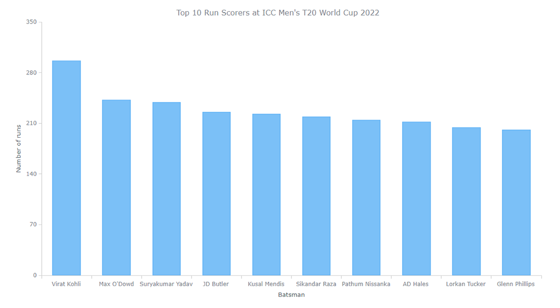
Column charts are designed to facilitate comparisons. Here, I can see how Virat Kohli is quite ahead of the pack, with the rest near each other.
But it’s just the beginning! Now I also wonder how each of these players scored those runs. More precisely, I want to find out how many runs out of the total are scored by hitting a six, a four, or by running between the wickets. A multi-series column chart or a stacked column chart would perfectly represent that.
So, let’s dive deeper into column charting in JS, and I will show you how to make both and then beautify the entire visualization!
2. Basic JS Multi-Series Column Chart
Just like a single-series column chart, a multi-series column chart can be made using JavaScript quickly and easily. Actually, the base remains the same, and you just need to change the data.
Add Multi-Series Data
Instead of totals, let’s add the number of runs scored by hitting (1) sixes, (2) fours, and (3) running between the wickets for each of the top 10 scorers. I take this data from the same source, ESPNcricinfo, and create a data set:
var dataSet = anychart.data.set([
  ["Virat Kohli", "India", "148", "100", "48"],
  ["Max O'Dowd", "Netherlands", "106", "88", "48"],
  ["Suryakumar Yadav", "India", "81", "104", "54"],
  ["JD Butler", "England", "87", "96", "42"],
  ["Kusal Mendis", "Sri Lanka", "95", "68", "60"],
  ["Sikandar Raza", "Zimbabwe", "89", "64", "66"],
  ["Pathum Nissanka", "Sri Lanka", "114", "52", "48"],
  ["AD Hales", "England", "76", "76", "60"],
  ["Lorkan Tucker", "Ireland", "104", "76", "24"],
  ["Glenn Phillips", "New Zealand", "77", "76", "48"]
]);
Map the Data
Next, it is necessary to map this data to the three series, each indicating a category. The first series indicates the runs scored by running. One more series indicates the runs scored by hitting fours. And the third series indicates the runs scored by hitting sixes.
var firstSeriesData = dataSet.mapAs({x: 0, value: 4});
var secondSeriesData = dataSet.mapAs({x: 0, value: 3});
var thirdSeriesData = dataSet.mapAs({x: 0, value: 2});
Create the Series
Now it’s time to create the three series with the respectively mapped data.
var series;
series = chart.column(firstSeriesData);
series = chart.column(secondSeriesData);
series = chart.column(thirdSeriesData);
Result 2: Multi-Series Column Chart
And a basic JS multi-series column chart with grouped series is ready! You can check out its interactive version with the full source code on Playground.
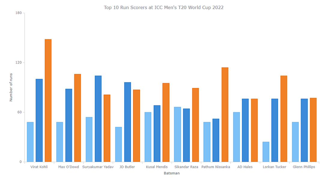
A grouped multi-series column chart greatly represents a breakdown by score category. But totals are also worth looking at. So, let’s create stacked columns now!
3. Basic JS Stacked Column Chart
To turn grouped columns into a stacked column chart, just one quick line of JavaScript code is more than enough.
Set the Value Stacking Mode
Enable the value stacking mode on the Y-scale:
chart.yScale().stackMode("value");Result 3: Stacked Column Chart
There you go! Now you’ve got a basic JS stacked column chart! Its interactive visualization is available on Playground with the full source code.
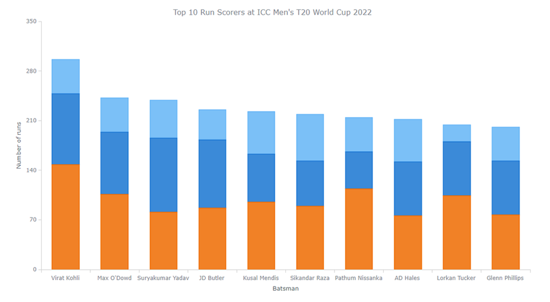
Now, let’s beautify it!
4. Custom JS Stacked Column Chart
Depending on exactly how you want to customize your JavaScript-based stacked column chart visualization, you may want to modify different things. I will show you some important but still easy-to-implement adjustments.
Adjust the Series
When you hover over the interactive columns, the tooltip automatically shows the values for each category. But which one is where? Let’s name the series, and everything will become clear!
At the same time, why don’t we play with the colors a little? I will paint the series in the colors of the ICC T20 World Cup 2022’s official logo. This will make the column chart look so much more personalized and aesthetically pleasing.
For this, I create a function that will accept each series, its name, and the color associated with it. I will also add a stroke attribute in the function, which will be applied to each series for creating a sort of padding between each category.
var setupSeries = function (series, name, color) {
  series.name(name).stroke("2 #fff 1").fill(color);
};
Now, I set up the three series with the function just created and give each of the series the respective name and color.
// store the series
var series;

// create the first series with the function
series = chart.column(firstSeriesData);
setupSeries(series, "Runs scored with Sixes", "#eb2362");

// create the second series with the function
series = chart.column(secondSeriesData);
setupSeries(series, "Runs scored with Fours", "#00b1e5");

// create the third series with the function
series = chart.column(thirdSeriesData);
setupSeries(series, "Running between the wickets", "#0f0449");
Add a Legend
To further improve the legibility of the column chart, it is a good idea to add a legend that will show which color indicates which category. This can be done easily by just enabling the legend. I’ll just also add some font size and padding customizations.
chart.legend().enabled(true).fontSize(14).padding([10, 0, 0, 0]);Check it out; you can hide/show a specific category by clicking on the respective legend item.
Enhance the Labels, Tooltip, and Title
As you can see, some of the names of the batsmen are not visible on the X-axis. To rectify that, I rotate the labels so that each name can be seen.
chart.xAxis().labels().rotation(-90);The default column chart tooltip shows individual category values but not the totals. Moreover, totals are not included in the data set. But it’s easy to make them calculated automatically and then put them somewhere, for example, in the tooltip header.
chart.tooltip().titleFormat(function () {
  return this.x + " — " + this.points[0].getStat("categoryYSum");
});
Also, it is possible to display the values of all the categories together in the tooltip using the union mode.
chart.tooltip().displayMode("union");Finally, let’s make the chart title a bit larger, change its font color, and add some padding.
chart.title().fontSize(20).fontColor("#2b2b2b").padding([5, 0, 0, 0]);Result 4: Customized Stacked Column Chart
That’s it! The stacked column chart is all customized. Have a look at how stunning and insightful it has become! And feel free to see this interactive JS-based stacked column chart on Playground where you can also further play with its code, add your data, and so on.
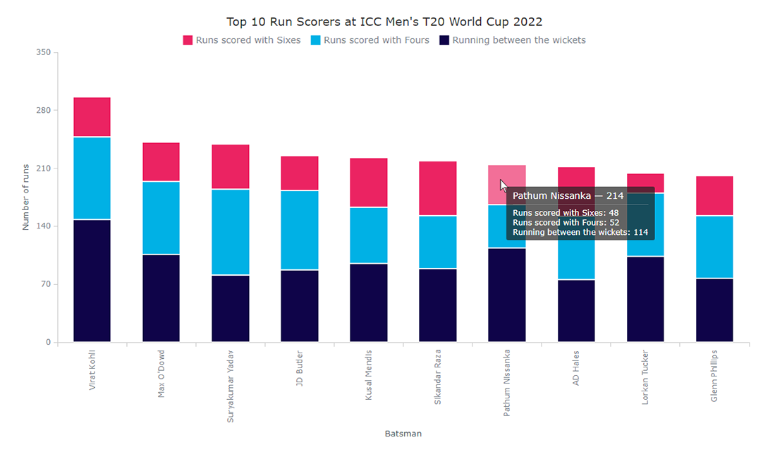
Looks lovely, doesn’t it? And I can distinctly see both total scores and how some batsmen have done a lot of running while some have accumulated more runs with their hits.
5. JS 100% Stacked Column Chart
Finally, I want to demonstrate how you can create a 100% stacked column chart representation that can help compare individual categories across all data points in an easier manner.
Switch the Column Stacking Mode
Just change the stacking mode from value to percent, and your stacked column chart will become a 100% stacked column chart:
chart.yScale().stackMode("percent");Result 5: 100% Stacked Column Chart
And it’s done, the final data visualization example in this tutorial! You are welcome to check out this JavaScript-based percent stacked column chart variation with the entire code on Playground.

Conclusion
In this tutorial, I showed you how to create JavaScript (HTML5) column charts in different variations, such as a regular, single-series column chart, a multi-series grouped column chart, a value-stacked column chart, and a 100% stacked column chart. You also saw how you can customize them.
I used the AnyChart JavaScript charting library, but there are multiple others out there at your disposal. A good thing is that fundamentally the process is similar to anyone. So you can use whichever suits your needs.
Let me know if you have any questions or suggestions. As the batting scores show you, the total figures include plenty of boundaries but quite a lot of running as well. So, go on then, work hard and knock it out of the ground with more such beautiful column charts and other data visualizations!
Opinions expressed by DZone contributors are their own.
Comments