How to Use Grafana Variables to Make More Interactive Dashboard Visualizations
Learn how to add features that allow you, your teammates, and your stakeholders to drill into specific details, see all results, and quickly get the info you need.
Join the DZone community and get the full member experience.
Join For FreeThe (All Too Common) Problem: Boring, Kind of Useful, Static Dashboards
Those of us that work with data often want to make useful dashboards that make it easier for ourselves and other people within our team and organization, to gain insight and make sense of the data we collect.
A common problem I’ve run into (both when creating dashboards and using them as a stakeholder) is that many dashboards aren’t interactive enough for non-technical stakeholders to get their questions answered without asking engineers to write new code or change the underlying queries powering the dashboard. Or worse, stakeholders try to dig into the code and accidentally break things!
Solution: Make Your Dashboards Interactive (and User-Friendly!)
Fortunately, many visualization tools have features to make your graphs, maps, tables, and other visualizations interactive via the tool's native UI. It’s a win-win situation: more usability for the stakeholders who rely on your dashboards, and less of your time spent attending to minor customization changes.
Here’s an example in Grafana, the open-source visualization tool, where I’ve created “pickers” (filters) that allow me and other stakeholders of the dashboard to choose values from a drop down menu and immediately see our selections appear in the visual, without having to change any of the underlying SQL queries powering the dashboard.
However, enabling features like pickers in the Grafana UI can be tricky.
In the rest of this post, I will show you how to use Grafana’s variables feature to build your own interactive dashboards. I’ll illustrate the process using the example of monitoring the live locations of buses going on different routes in New York City, but the steps I follow will work for any scenario.
Try It Yourself: Implementation in Grafana
Ready to learn how to use variables in Grafana dashboards powered by PostgreSQL queries?
Pre-requisites:
- Grafana Instance
- PostgreSQL data source with TimescaleDB enabled, connected to your Grafana instance. See here for how to connect one.
I’m going to use the example of visualizing the real-time location in New York City, using data from the Metropolitan Transportation Authority.
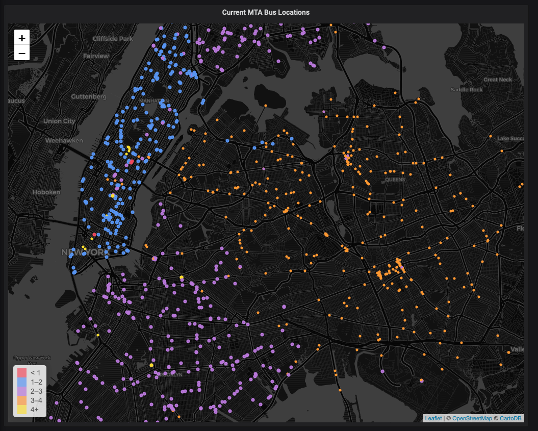
I have an existing Grafana World Map panel setup, pictured below. To replicate my initial setup (I use PostgreSQL with TimescaleDB enabled as my datasource), you can clone and follow the steps in this Github repo.
- Panel with visualization, using PostgreSQL as the data source.
Here’s what my panel looks like before we make it interactive. You can download the JSON to replicate the dashboard in this Github repo.
Here’s the corresponding SQL query I used to generate the data for that panel:
SELECT
max(time) as "time",
vid AS "vehicle_id",
route_id,
CASE WHEN route_id LIKE 'M%' THEN 1
WHEN route_id LIKE 'B%' THEN 2
WHEN route_id LIKE 'Q%' THEN 3
WHEN route_id LIKE 'S%' THEN 4
ELSE 0
END AS "color",
ST_X(geom) AS "longitude",
ST_Y(geom) AS "latitude"
FROM mta WHERE time > now()-interval '1.5 minutes'
GROUP BY vid, route_id, geom
ORDER BY 1;
From the query above, notice that I’m using the variable color to distinguish between different types of buses based on their route. There are 4 types of bus routes: M, B, S, and Q — corresponding to New York’s boroughs of Manhattan, Brox and Brooklyn, Staten Island and Queens.
I then use Grafana’s threshold settings to assign each bus type to a color:
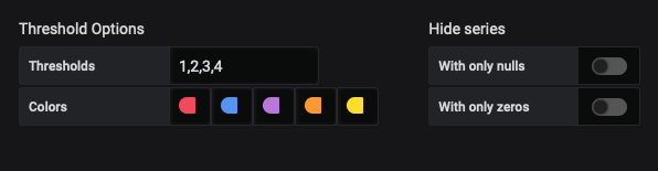
Notice that there are 5 colors - one for each bus route M,B,Q and S, as well as one for routes that don’t fall into those categories.
While the standard static panel tells us the live location of the buses, there’s not much that we can do to interact and explore the data more, apart from zooming in and out.
Let’s change that by creating a variable to alter which bus routes we display on the map.
Step 1: Create a Variable as A Query
Our goal here will be to create a variable which controls the type of buses displayed in the visual, based on the bus’ route.
For simplicity sake, let’s define 4 types of bus routes: M, B, Q, and S.
Grafana includes many types of variables, and variables in Grafana function just like variables in programming languages. We define a variable, and then when we reference it, we’re referring to the thing we defined the variable as.
To create a new variable, go to your Grafana dashboard settings, navigate to the Variable option in the side-menu, and then click the Add variable button.
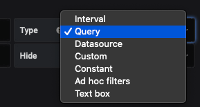
In this case, we use the Query type, where our variable will be defined as the result of an SQL query.
How to create a variable of type Query
Under the General section, we’ll name our variable route . Then, we’ll assign it the label of “MTA Bus Route.”
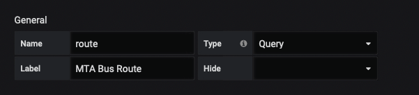
Name, label, and type settings for our route variable
Labels in Grafana are the human-readable descriptors that appear next to your dashboard’s drop-down (picker) menu.
Your variable labels display in your final dashboard UI, while name is used to reference the variable in queries used in dashboard panels.
Secondly, let’s define the query that will define the variable, under Query options .
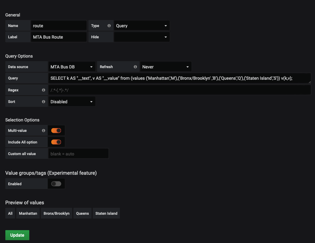
Settings used to create our route variable
Here, we select our variable’s data source, which is the database that the query will execute against. In this case, we use “MTA Bus DB”, the PostgreSQL database that houses our MTA Bus data.
Now, we define a SQL query whose results will define our `route` variable:
SELECT * from (values ('M'),('B'),('Q'),('S')) v;
This query returns the letters M, B, Q, S — which are the types of buses, based on their route_id — for a refresher, see the SQL query in the prerequisites section.
We could also use a query that’s more advanced but gives the additional benefit of human-readable names, rather than using symbols or acronyms:
xxxxxxxxxx
SELECT k AS "__text", v AS "__value" from (values ('Manhattan','M'),('Bronx/Brooklyn' ,'B'),('Queens','Q'),('Staten Island','S')) v(k,v);
Here we define four key-value pairs to be the set of possible values for our route variable, where the key is the human-readable name of the bus type and the value is the letter corresponding to the route type.
- As an aside: This variable could also have been of type
Custom, as we have a static list of values that never changes, allowing us to specify the values directly without the need to specify them through SQL. - However, if you want the mapping from key to values, in order to express both symbols and human readable names, an SQL query is required. I’ve used a SQL query in the example since in practice you often want variables to take on values that are not hard coded but change based on data in the database, such as customer names, cluster names etc.
Next, let’s define how we will select our variable.
Since we want to see many different types of buses, we’ll enable the multiple selections option, as it’s reasonable to want to see many different types of buses at once. We also want an “All” option to quickly select all the bus types, rather than selecting them one by one.
As an aside, sometimes you might not want to select multiple options – like if you're selecting metrics from different databases.
But, in this case, I find it valuable to see data from multiple bus routes at the same time.
We can see a preview of what the resulting options available to us will be at the bottom under "Preview of Values." In our case, we have ‘All’, ‘M’, ‘B’, ‘Q’, ‘S’, which are the options we want (i.e., our 4 individual bus routes and the “select all” option).
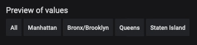
Grafana renders a handy preview of what values of "route" will be down in the drop down menu
Step 2: Modify Your Graph Query to Use Your New Variable
In this step, we modify our query to use the variable we created in Step 1.
For a SQL query, we do this by modifying the WHERE clause to filter out undesirable results. In our case, we want to show only the bus types that are selected through the dropdown menu picker in the UI.
Here’s the modified query:
xxxxxxxxxx
SELECT
max(time) as "time",
vid AS "vehicle_id",
route_id,
CASE WHEN route_id LIKE 'M%' THEN 1
WHEN route_id LIKE 'B%' THEN 2
WHEN route_id LIKE 'Q%' THEN 3
WHEN route_id LIKE 'S%' THEN 4
ELSE 0
END AS "color",
ST_X(geom) AS "longitude",
ST_Y(geom) AS "latitude"
FROM mta WHERE time > now()-interval '1.5 minutes'
AND substring(route_id,1,1) IN ($route)
GROUP BY vid, route_id, geom
ORDER BY 1;
The relevant part of the query, where we reference our new variable by the name we defined in Step 1, is these lines 13 and 14 above:
xxxxxxxxxx
WHERE time > now()-interval '1.5 minutes'
AND substring(route_id,1,1) IN ($route)
This line says that our visualization displays only if the first letter of its route_id is in the set of allowed routes (as selected by the user through the dropdown picker, defined by the route variable). The values selected in the picker will define what our $route variable will be.
For example:
- If a user selects all routes then
route = (M, B, S, Q), the set of all the types possible. - But, if a user selects only the M and B routes, then
route = (M,B)and we automatically filter out S and Q buses and display only buses with route_id starting with M and B.
Once we’ve modified the query, we then save our changes and check if our variable works as expected.
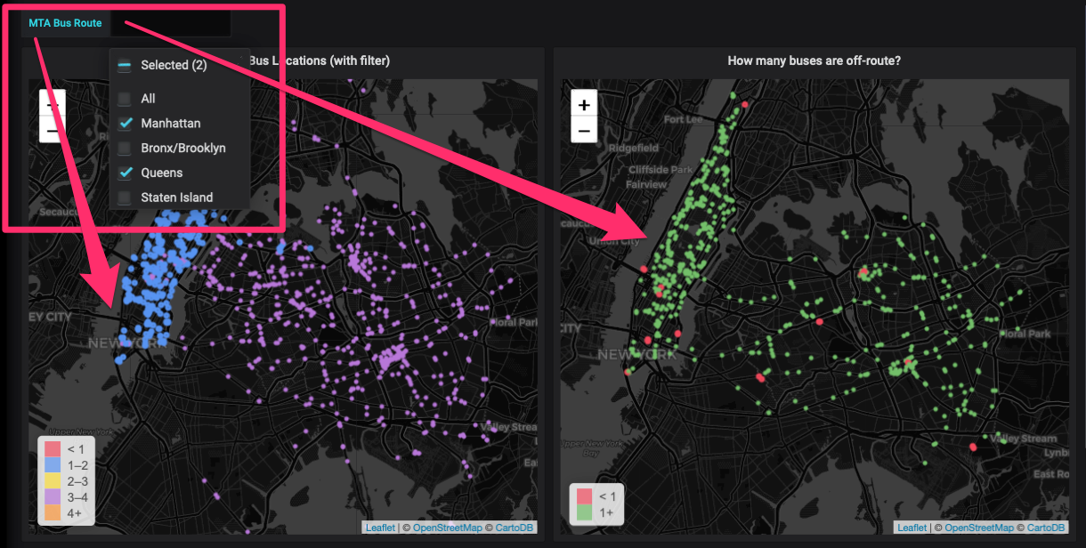
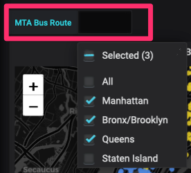
To do this, we select various routes in the picker and verify that only our selections appear, like so:
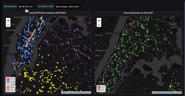
Our new interactive dashboard, where our map updates based on the routes we select in our drop down menu.
As you can see, our map automatically changes the bus types displayed in the visual ,based on the selection we make in the dropdown! Notice how the change takes place in multiple panels, since they all use the variable, $route in their query.
That’s it! We’ve successfully created an interactive Grafana visual using variables!
Learn More
Found this tutorial useful? Here’s are a few more resources to help you build Grafana dashboards like a pro:
Technical Session on Getting Started with Alerts in Grafana
Learn how to define alert rules for your panels and dashboards, configure different notification channels, like Slack and email, and take my demo and integrate it into your own Grafana projects.
If you RSVP and can’t attend live, no worries. I’ll make sure you get the recording and resources shortly following the session.
Resources to Build Awesome Visualizations in Grafana
This post gives you step-by-step demos and shows you how to create 6 different visuals for DevOps, IoT, geospatial, and public data use cases (and beyond), as well as answers to common questions about building visuals in Grafana.
Grafana Mega-tutorial
We’ve compiled all our tutorials, tips, and tricks for visualizing PostgreSQL data in Grafana into this one doc. You’ll find everything from how to create visuals for Prometheus metrics to how to visualize geo-spatial data using a World Map. Check it out here.
Published at DZone with permission of Avthar Sewrathan. See the original article here.
Opinions expressed by DZone contributors are their own.
Comments