

PWA on iOS, Part 6: Performance, Rendering, and Keyboard
An installed PWA can work offline and still feel unfinished. Learn where WebKit drops frames and how to fix scrolling, the keyboard, safe areas and memory.
An installed PWA on an iPhone can work offline and receive push notifications and still leave the impression that it was never quite finished. The keyboard slides up with a pause, the bottom button hides under the home indicator, the feed jerks when images finish loading. Explaining this away with "well, it's the web" is pointless: every one of these symptoms has a concrete cause in rendering, layout, or loading, and most of those causes can be found and fixed. This article follows the path from HTML to pixels and shows where frames get lost along the way.
This is Part 6 of the PWA on iOS series. In Part 5, we made a PWA work offline and receive push notifications; here we look at why it can still feel slow. You'll learn where WebKit drops frames, how to fix scrolling, safe areas, the keyboard, images, and memory, and how to measure all of it on a real iPhone.
How WebKit Draws a Home Screen Web App
A web app launched from the Home Screen is drawn by the same WebKit stack thatWKWebView is built on. There's no address bar and the lifecycle is its own, but HTML, CSS, JavaScript, and networking are all handled by the same engine as in Safari, with all of its strengths and quirks.
The page's content lives in a separate Web Process that holds the DOM, styles, layout, and scripts, while the UI Process handles interaction with iOS. A crashed page shouldn't drag the system interface down with it, and the price of this isolation is that the process can be evicted from memory, and returning from the background is sometimes a fresh launch rather than a continuation of the old one. JavaScript here is executed by JavaScriptCore, and in both the browser and a web app it has a JIT that compiles hot code into machine code. The claim "JS is always slow on the iPhone" is long outdated. What's slow is specific code: a thousand synchronous geometry reads inside a scroll handler will kill a frame even with the best JIT, while React with an ordinary DOM can run quite briskly on the same phone.
Compositing, that is, assembling finished layers into the final picture, goes through Metal in modern WebKit, and the GPU helps noticeably here. But GPU capabilities aren't unlimited. A full-screen blur, a pile of large semi-transparent layers, and will-change on everything force the system to create and keep textures in memory, and the result is often worse than without any of these "accelerations."
You have to measure on a phone; emulation in a browser on a laptop will show you very little.
The 16 ms Frame Budget and the 60 Hz Limit on iPhone
On a 60 Hz screen, a new frame is needed roughly every 16.7 milliseconds. If the main thread is busy longer than that, the browser misses the deadline, and the person sees a stutter. Of those sixteen milliseconds, your code gets noticeably less, because the browser also has to fit in styles, layout, and painting.
For those who don't write frontend code, it helps to picture the main thread as the only cook in a kitchen, who takes orders, chops, fries, and carries out the plates. While he's busy with one complicated dish, new orders wait at the window, and no expensive stove can fix that. A user's tap is exactly such an order, and if the cook is busy parsing a huge JSON, the response to the tap will come late, however many cores the phone has.
The iPhone Pro has ProMotion with a refresh rate of up to 120 Hz, and many expect the web on it to be as smooth as a native interface. That won't happen. By default, Safari limits page updates and requestAnimationFrame to roughly 60 frames per second even on such screens, and the limit can be lifted with the experimental flag Prefer Page Rendering Updates near 60fps in Safari's settings. Ordinary users don't go there, and installed web apps and WKWebView, judging by discussions in the WebKit bug tracker, live on the system flag values, so for a PWA it's reasonable to treat 60 frames as the ceiling. That makes the goal simpler and more honest: a steady response to the finger, smooth native scrolling, and no long tasks.
For canvas animations and games, a simple rule follows from this: compute motion from elapsed time, not from the number of frames. Refresh rates on iPhones vary, and in Low Power Mode WebKit, by many developers' observations, can drop requestAnimationFrame as low as 30 frames per second, and an animation designed around a fixed step per frame will run half as fast in that mode.
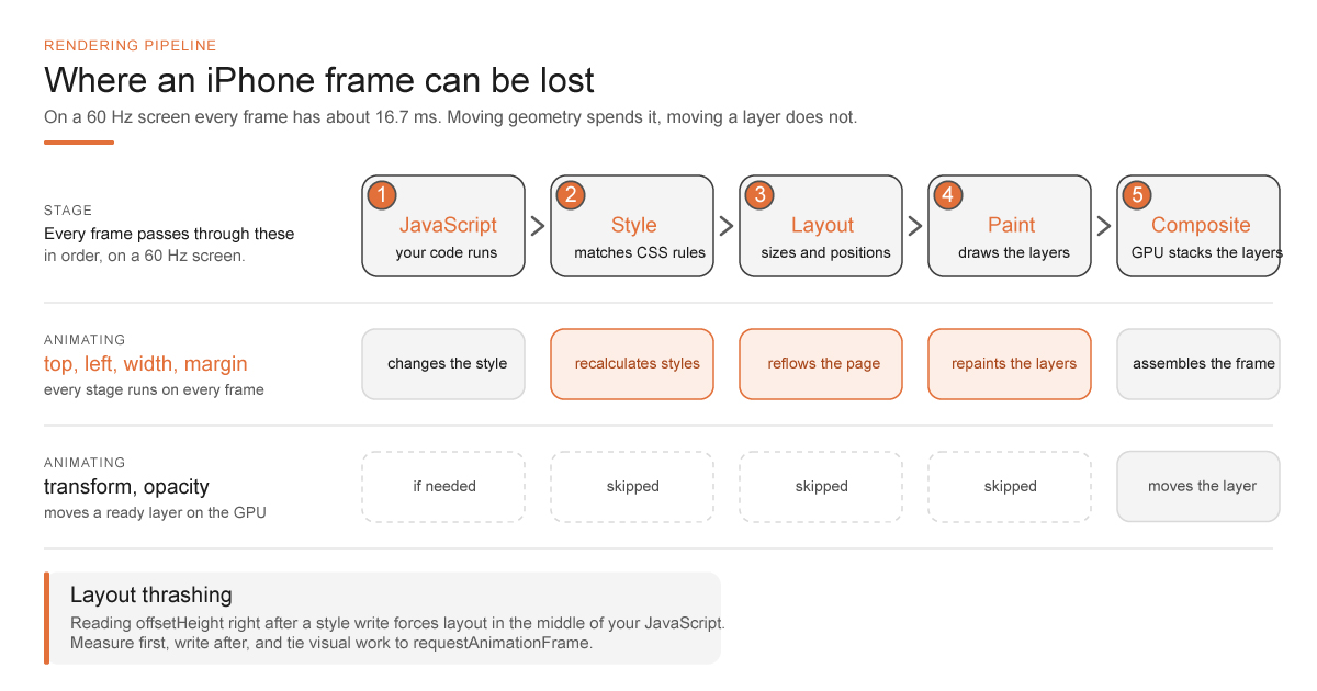
The path of a frame looks roughly like this. JavaScript changes the DOM or classes, WebKit recalculates styles, re-lays out the elements if necessary (layout), paints the layers (paint), and the compositor assembles them on screen. Not every edit goes through all the stages, but a change to geometry almost always triggers an expensive layout, followed by a paint.
CSS Transform vs. Top and Layout Thrashing on iPhone
Animating top, left, width, height, or margin to move an element is a bad habit: every frame forces the system to recalculate the layout. For movement and transparency there are transform and opacity, which the compositor can handle on a separate layer without a layout on every frame. The difference is easy to see on a simple pop-up notification:
/* Moving geometry: layout on every frame */
.toast { top: -4rem; transition: top 180ms ease-out; }
.toast.is-visible { top: 1rem; }

/* Moving a layer: the compositor does the work */
.toast {
  transform: translateY(-120%);
  opacity: 0;
  transition: transform 180ms ease-out, opacity 180ms ease-out;
}
.toast.is-visible { transform: translateY(0); opacity: 1; }
But transform isn't free either. A huge animated area with filter: blur() quietly runs into the GPU and memory limits, especially on earlier iPhone generations. will-change: transform should be applied only to elements that are really about to start moving, and removed after the transition, because will-change across the whole page turns an optimization into a resource leak. backdrop-filter is a similar story: a phone will usually survive one glass-effect header, but blur on every card of a long list I would first test on the oldest device in your audience.
Layout Thrashing and the Order of Reads and Writes
The sneakiest variety of the problem looks harmless. The code changes the style of one element, immediately reads offsetHeight of another, and writes a style again. Each such read forces the browser to catch up on layout synchronously, and in a loop over a hundred cards that is far from a minor DOM operation. The effect is called layout thrashing, and it's cured by the order of operations:
// Bad: writes and forced measurements interleaved
for (const card of cards) {
  card.style.width = `${container.clientWidth}px`;
  card.style.setProperty("--h", `${card.offsetHeight}px`);
}

// Better: all measurements first, then all writes
const width = container.clientWidth;
const heights = cards.map((card) => card.offsetHeight);
cards.forEach((card, i) => {
  card.style.width = `${width}px`;
  card.style.setProperty("--h", `${heights[i]}px`);
});
Measuring is fine; what matters is doing it rarely and in the right order: read first, then write, and tie the visual work to requestAnimationFrame. A task that doesn't affect the current frame is better postponed, split into chunks, or moved to a Web Worker.
content-visibility and contain-intrinsic-size
Since Safari 18, WebKit has had the content-visibility property, which lets the browser skip layout and painting for blocks that are far off screen. On long pages with reports or a feed this gives a noticeable gain, but it only works paired with contain-intrinsic-size; otherwise the browser doesn't know how much space to reserve, and the scrollbar starts jumping. The implementation isn't without rough edges yet: Jeremy Keith, for example, described a case where Safari with content-visibility: auto didn't paint text inside an SVG. I'd introduce it selectively and verify on a device, as with the older contain: content.
Native Scrolling, Virtual Lists and Sticky Headers on iOS
Native iOS scrolling is better optimized than almost any hand-rolled equivalent. Implementing it through touchmove, preventDefault(), and a manual translateY without an exceptional reason isn't worth it: the gesture moves to the main thread, accessibility breaks, and you start an endless fight with iOS physics, which the user feels in their fingers.
Virtualizing Long Lists
Long lists are a different story. Even if each row is simple, several thousand DOM nodes make styles, layout, painting, and memory noticeable, and then virtualization helps: render only the visible window with a small margin and don't keep the entire chat history in the DOM. It works as long as row height is stable. As soon as a comment expands inside a card and the height jumps, scrolling starts teleporting, and people describe it with the words "the app scrolls by itself." In that case, either fix the height and open details on a separate screen, or don't virtualize that particular list. The scroll handler shouldn't do heavy computation or synchronous layout either. If you need a read-progress indicator or scroll-depth analytics, make the listener passive ({ passive: true }) and batch updates into a single requestAnimationFrame, so there isn't a call for every pixel of scrolling.
The -webkit-overflow-scrolling: touch property was long the way to get momentum scrolling in a nested container, and it still lingers in old templates. On modern iOS, the place to start is a different question: do you need a separate scrollable container at all? Nested scrollers conflict with the keyboard, the back gesture, and page scrolling, and half of the "weird scrolling" in web apps is born right there. overscroll-behavior: contain helps avoid passing scroll outward at the edge of a slide-in panel, but support and behavior are uneven across iOS versions, so it can't be considered a universal switch for rubber-band scrolling. If your feed needs its own pull-to-refresh gesture, I'd replace it with an explicit button: the system gesture and your touchmove handler together produce accidental reloads at exactly the moment when the person has simply scrolled to the end of a report.
Two small things from the same area constantly surface in bug reports with the words "something shifted." position: sticky stops working if any ancestor has overflow: hidden, even one added just for nice rounded card corners, so the culprit has to be tracked down along the chain of parents. And a pinned header hides the heading of a section you've jumped to via an anchor, until you add scroll-padding-top that accounts for env(safe-area-inset-top).
Tap Delay, Hover Styles and Input Zoom on iPhone
The old mobile web delayed click by about 300 milliseconds, waiting for a possible double-tap to zoom. On iOS since roughly version 9.3, that delay has mostly gone away when the viewport is correct (width=device-width). FastClick and global touchend handlers from 2015 templates are better removed: duplicated clicks and broken button semantics cost more than a delay that no longer exists. touch-action: manipulation on buttons removes the remnants of double-tap waiting wherever it still shows up, but don't hang it on links in text, since people sometimes need to zoom into a paragraph.
There is one more old oddity connected with touch. :hover styles on the iPhone fire after a tap and stick until the person touches something else, so a button that highlights on hover on desktop stays highlighted on the phone after being pressed, and looks as if something is still going on. Wrap such styles in @media (hover: hover), and on touch screens they simply won't turn on.
Another old quirk is still alive in both Safari and an installed web app. When focus lands in an input, select, or textarea with a font smaller than 16 pixels, the iPhone zooms the page in, and a compact 14px form turns after the tap into an enlarged page that doesn't always zoom back out. The person thinks the app is broken, when all that broke is the font size. The cure is boring: a font of 16 pixels or more on input fields. A popular workaround via maximum-scale=1 in the viewport blocks this zoom and at the same time deprives the people who really need it of the ability to zoom the page, so in review I remove such a meta tag. Here the accessibility requirements and the fight against the bug coincide completely.
100dvh, Safe Areas and viewport-fit on iPhone
When the iPhone X with its notch and home indicator appeared in 2017, the screen stopped being a rectangle, and viewport-fit=cover and the env(safe-area-inset-*) variables appeared for the web. viewport-fit=cover lets content occupy the entire surface of the screen, including the zones by the notch, the Dynamic Island, and the bottom bar. Without it, WebKit keeps the margins itself, and with it, the responsibility for keeping buttons from ending up under system elements passes to you:
.app-shell {
  min-height: 100dvh;
  padding:
    calc(12px + env(safe-area-inset-top))
    max(16px, env(safe-area-inset-left))
    calc(16px + env(safe-area-inset-bottom));
}

.bottom-bar {
  position: fixed;
  inset-inline: 0;
  bottom: 0;
  padding: 12px 16px calc(12px + env(safe-area-inset-bottom));
}
Don't substitute a fixed 44 or 34 pixels for env(). Different models, orientations, and future devices will turn those numbers into a lie, whereas env() returns zero where there's no cutout, and that is exactly what you need.
The 100vh Problem and dvh Units
100vh has been unreliable on mobile for a long time. Historically, that unit corresponded to the screen height with the browser bar hidden, and the problem became even more visible when Safari moved its address bar to the bottom in iOS 15 in 2021: blocks of 100vh height regularly started sliding under that bar. The answer was new units: Safari 15.4 introduced svh, lvh, and dvh, that is, the height with the bar expanded, with it hidden, and the current one. In an installed web app there is no browser bar and the picture is simpler, but modal windows, the keyboard, and screen rotation still need checking. For a full-screen shell, I start with 100dvh and keep a fallback value for older versions.
Sometimes the interface needs to know whether it was opened from the Home Screen or in a tab, to hide an install hint or to style the top padding differently. For that, there is the (display-mode: standalone) media query and the old navigator.standalone, and both checks describe the launch mode, not "iPhone versus everyone else." Don't tie business logic to them. And remember navigation too: standalone has no address bar and lacks some of the browser buttons, so wherever the person needs to go back, keep a clear back button built on the History API, and test following a deep link.
How to Handle the iOS Keyboard With visualViewport
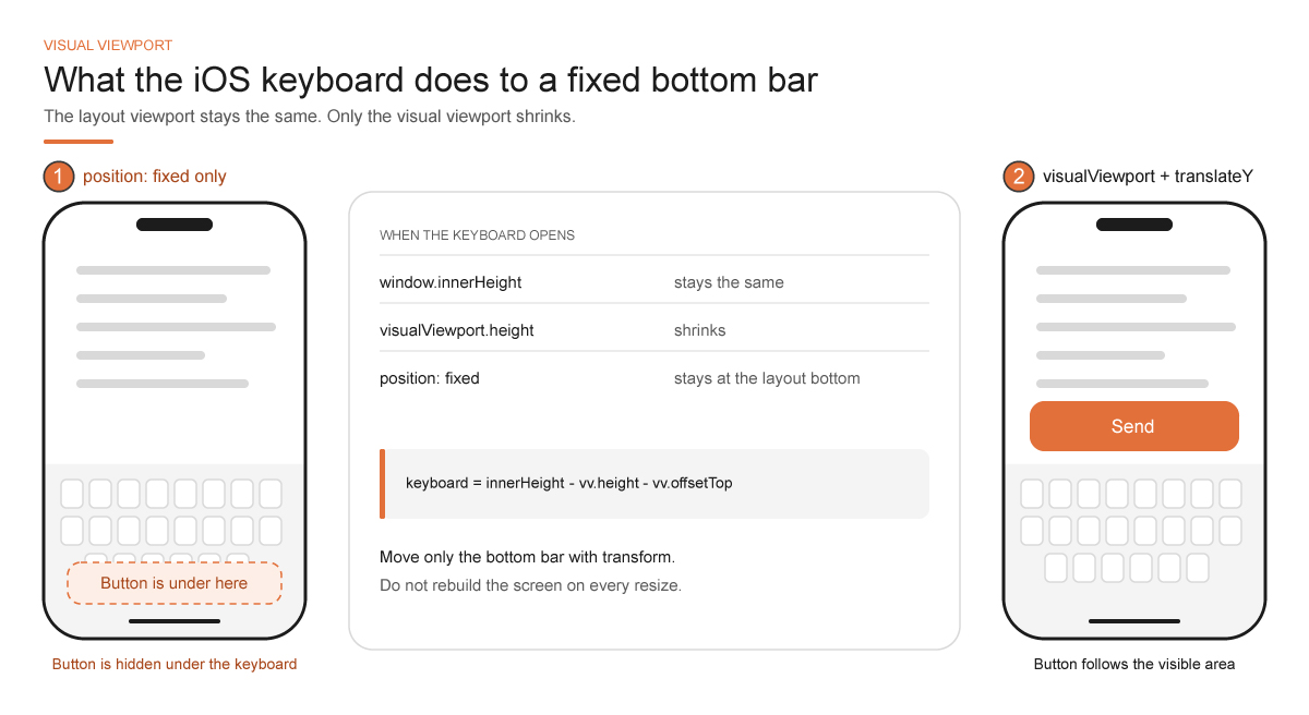
A form at the bottom of the screen on the iPhone spawns a whole class of bugs. The keyboard slides up, the visible area (visualViewport) shrinks, and a "Send" button with position: fixed stays under the keyboard. In Safari and in an installed app this behaves similarly, but not identically: standalone has no browser bar, but it does have the home indicator and sometimes a different order of events.
Reading window.innerHeight once at load is useless, because the height changes after the keyboard is already open. visualViewport has height and offsetTop and the resize and scroll events, and you can hang a panel shift on them:
function pinComposer() {
  const vv = window.visualViewport;
  if (!vv) return;
  const bar = document.querySelector(".composer");
  const keyboard = Math.max(0, window.innerHeight - vv.height - vv.offsetTop);
  bar.style.transform = keyboard ? `translateY(-${keyboard}px)` : "";
}

window.visualViewport?.addEventListener("resize", pinComposer);
window.visualViewport?.addEventListener("scroll", pinComposer);
translateY is chosen here deliberately: a shift handled by the compositor is cheaper than changing bottom and recalculating the layout of the whole page on every frame of the keyboard animation. Check portrait, landscape, and a field at the very bottom of a long form; these are three different bugs, which a screenshot captioned "the form looks fine" won't catch.
Interactive-widget and the VirtualKeyboard API
In Chromium, for such cases there is the viewport parameter interactive-widget=resizes-content, which makes the keyboard shrink the layout itself. WebKit was actively finishing its support in 2025–2026, and by default iOS behaves like resizes-visual, that is, the keyboard shrinks only the visible area. Until that parameter works on every iOS version in your fleet, I wouldn't rely on it and would keep the visualViewport code. The VirtualKeyboard API, which gives Chromium control over the keyboard from script, isn't in Safari either.
You can't make the keyboard appear sooner with any CSS. The input.focus() call must happen close to the user's tap: if you hide it in a promise chain after a network request, iOS may decide it's no longer a gesture, and the keyboard won't come up at all. And don't rebuild the entire screen on every resize event from visualViewport; move only the bottom bar.
Numeric Keyboards With inputmode
The speed of working with a form on a phone often depends more on which keyboard came up than on rendering. The inputmode="numeric" attribute on a quantity field immediately shows a numeric keyboard, inputmode="decimal" adds a separator, and enterkeyhint changes the label on the enter key to "Next," "Search," or "Send." Safari has supported both attributes for a long time, and for someone who enters a quantity two hundred times a shift, they save more time than any JavaScript optimization. The user doesn't see how many cores the phone has; they see only a button that didn't respond.
Images and Fonts Without Layout Shift on Mobile
While an image has no width and height, the browser doesn't know how much space to reserve for it and shifts the feed when the file arrives. On slow mobile internet, this is exactly what makes the app feel twitchy. The width and height attributes or aspect-ratio reserve a rectangle right away, decoding="async" on large images below the first screen takes decoding off the critical frame, and loading="lazy" on the main first-screen image, on the contrary, only adds emptiness, because lazy-loading what's needed immediately does harm.
A 40×40 avatar that arrived as 2000×2000 is decoded in full, and resizing on the CDN is cheaper than hoping the phone's GPU will cope. Offline, such files also eat the storage quota, so small versions belong in the precache, and originals from the design system have no place there. Formats have a trap of their own: the iPhone learned to display AVIF only with iOS 16, and if the lower bound of your audience is below that, an image with no JPEG next to it turns into a hole in the layout on older phones. Most modern iPhones render at three physical pixels per point, some models at two, and srcset with 2x and 3x variants saves both memory and traffic compared with one huge image for every case. <picture> with a fallback type is cheaper than any JavaScript decoder, and the offline cache should hold the format that the lowest iOS version will actually display, or the empty main screen will hit exactly the people who also have the worse network.
Fonts follow a similar rule. The system stack (-apple-system, BlinkMacSystemFont, Segoe UI, sans-serif) gives a fast first frame and typography familiar to iOS. If you can't do without a brand font, limit the set of weights, serve WOFF2, choose a font-display strategy deliberately, and preload only the genuinely critical file. Four weights, each with an extra character set, add hundreds of kilobytes and a layout shift when the font finally arrives. The easiest way to see how much your fonts really weigh is the inspector's network panel, filtered by type.
Space for data that will arrive later should be reserved in advance, too. A skeleton with the same geometry as the future card behaves far more calmly than a spinner that later pushes the whole feed down.
Dark Mode, Dynamic Type and Reduced Motion in an iOS PWA
Without <meta name="color-scheme" content="light dark">, input fields, scrollbars, and some system elements stay light even if you've painted the background #111, and in dark mode this looks like white inputs pasted into a dark app. A single meta tag and color-scheme: light dark on the root element turn on proper system controls, and from there CSS variables under prefers-color-scheme take over. The launch screen takes part here as well: if background_color in the manifest is white while the app is dark, the first second hurts the eyes, and automatically switching the splash to the system theme isn't possible on all iOS versions. Choose the color for the theme in which your customers open the app more often.
In a Safari tab, theme-color with the media attribute worked from Safari 15 through 18: two meta tags, one for (prefers-color-scheme: light) and the other for dark, and the browser bar recolored along with the system theme. Safari 26 changed this. According to developers’ tests, the tint now comes from the page’s CSS, the body background or fixed elements at the screen edges, rather than from the meta tag, and Apple hasn’t documented the change. Check on a device, and keep the body background in your theme color.
The system text size enlarges type if your layout is built on rem and the scale isn't pinned. The native interface is ready for this; the web often isn't: a header exactly 48 pixels tall, text in it grew to 22, and the title spilled over the edge. The check takes a minute. In the iPhone's Settings, under Display & Brightness, crank the text size to the maximum and open the installed app. Almost every first layout built "as in Figma" breaks right here. If you want text to follow the system size setting by itself, WebKit has font: -apple-system-body and related values for headings and captions, but this is a nonstandard Apple extension, and other browsers will need an ordinary fallback font.
prefers-reduced-motion: reduce should be respected before you've spent a week on the perfect animation curve. On iOS it's a toggle in the Accessibility settings, and it's turned on, among others, by people who get motion sick from parallax. Under it, remove carousel autoscroll, endless skeleton shimmer, and large displacements, and keep the appearance of blocks simple:
@media (prefers-reduced-motion: reduce) {
  *, *::before, *::after {
    animation-duration: 0.01ms !important;
    animation-iteration-count: 1 !important;
    transition-duration: 0.01ms !important;
    scroll-behavior: auto !important;
  }
}
The rule is blunt, but you don't have to remember it in every component that gets added half a year from now, and targeted exceptions, for example for a progress indicator, can be restored with a separate class.
View Transitions in Safari Without Heavy Libraries
A web app often feels like a website because the screen changes instantly, with no transition at all. In the past, people pulled in libraries for smooth animation between states and kept both screens in the DOM at once. Since Safari 18, WebKit has the View Transitions API: document.startViewTransition() takes a snapshot of the current state, you change the DOM, and the browser itself smoothly transitions the old picture into the new one. Safari 18.2 added transitions between different documents, and for a multi-page site they're enabled by two lines of CSS on both pages:
@view-transition {
  navigation: auto;
}
In a single-page app, the same is done with the call document.startViewTransition(() => renderNextScreen()), and for older versions it's enough to check that the function exists and otherwise just call renderNextScreen() directly. Browsers without support will do an ordinary transition, so the risk is minimal. Two caveats remain, though. Transitions should be turned off under prefers-reduced-motion, and elements participating in a transition shouldn't unexpectedly change size at the moment of the snapshot, or you'll get flicker instead of smoothness.
A similar saving of JavaScript comes from the :has() selector, which Safari shipped first among the major browsers, in version 15.4. You can now style a card by the state of a checkbox inside it, or a form with an error in any field, without event handlers, and a handler that doesn't exist will never occupy the main thread.
Main Thread Limits and Long Tasks in an iOS PWA
The main thread is shared by JavaScript, input handling, styles, layout, and part of painting. A synchronous 200-millisecond task doesn't become acceptable just because the JIT is fast: while it runs, a tap on a button waits in the queue, and the person feels the app has frozen. Such tasks should be split into pieces; heavy computation, such as parsing a large document or building a search index, should be moved to a Web Worker, and route code should be loaded on demand. A worker has no access to the DOM, and the result still has to be applied to the interface on the main thread, and that last operation is worth keeping small: ten thousand result rows at once will kill a frame just as the parsing itself would.
A typical example from an app with a product list looks like this. On screen there's a list of two thousand items and a search field at the top; the filter runs on every keystroke, and after each letter the interface redraws the entire list. On the developer's laptop, everything flies, but on a two-year-old iPhone, typing a word becomes torture, because each letter waits for the redraw after the previous one to finish. It's cured by a combination of a small delay before filtering, so you don't compute every intermediate letter, list virtualization, and, if your framework can do it, marking the list update as less urgent than the input (React has startTransition for this).
Every scheduling tool has its own deadline. requestAnimationFrame is for preparing the next frame, IntersectionObserver for loading the next catalog page, a worker for background indexing. requestIdleCallback was absent from Safari for a long time, and on the lowest iOS version in your fleet it may not exist, so don't hang critical work on it and keep a fallback path through setTimeout. The first screen is best drawn immediately from the HTML that arrived, with analytics and warming up the next route moved into free time.
The network draws frames too. Splitting code by route is useful when the route really isn't needed on the start screen, but ten small pieces on the critical path easily lose to a single well-compressed file. Preload the next screen on explicit intent, for example, after a card is opened, and don't download the whole catalog for a hypothetical navigation, because on mobile internet such "smart prefetch" becomes a competitor to the first render.
Memory Limits of iOS Web Apps and How to Spot Them
Performance on the iPhone depends not only on frames but also on memory, and here the web is almost blind. Safari on iOS has no performance.memory, no measureUserAgentSpecificMemory(), and no navigator.deviceMemory, so you can't find out from JavaScript how much memory the page occupies and how much is left. Apple doesn't publish the limit after which the system kills a process, and it depends on the phone model, on what else is open in the background, and on the iOS version. You learn about the problem from indirect signs: the person returns to the app after a call or the camera, and it loads from scratch and opens on the start screen instead of where they were a minute ago, or a Safari tab suddenly reloads with a message that a problem occurred on the page.
The main memory eaters are usually the same ones. A decoded 12-megapixel photo occupies about 48 megabytes in memory, however much the source JPEG weighs, and a feed of a couple dozen such pictures at full resolution quickly becomes a reason for the system to close the process. Large canvases, WebGL textures, huge JavaScript arrays, and a DOM with tens of thousands of nodes go in the same pile. In a feed, show previews and load the original on tap, release references to heavy objects when a screen is closed, shrink an unneeded canvas to zero size so the browser frees its buffer, and don't keep in memory a whole history that can be re-read from IndexedDB.
The most convenient way to check this is on the oldest phone in your audience, with several heavy apps open next to yours. The Timelines tab in Web Inspector can record memory too, and the graph shows whether it grows with every transition between screens, which usually means a leak, not honest load.
How to Measure PWA Performance on a Real iPhone
First, fix the scenario: a cold start on a bad network, returning from the background, scrolling five hundred cards, opening a form, a transition with no network. Then check the installed app on a real device, because a Safari tab and a Home Screen icon are close but live in different containers with different histories in memory. Web Inspector in Safari on the Mac connects to the iPhone, and on the Timelines tab you can see where frames go: long JavaScript tasks, frequent style and layout recalculations, image decoding, heavy layer effects.
Next to Timelines there is the Layers tab, and in a conversation about compositing it is more useful than any article, this one included. It shows which elements WebKit has promoted to separate layers, for what reason, and how much memory each occupies. If after an "optimization" with will-change a hundred layers of several megabytes each have appeared there, you can see the texture leak with your own eyes, and there's nothing left to argue about.
A Frame Watchdog Without the Long Tasks API
Automatic metrics are harder on iOS than in Chrome. The Long Tasks API, through which PerformanceObserver reports tasks longer than 50 milliseconds, isn't supported in Safari, and code with observe({ type: "longtask" }) on an iPhone will quietly collect nothing. A rough substitute can be built on requestAnimationFrame, noticing large gaps between frames while the page is on screen:
let last = performance.now();

function watchFrames(now) {
  const gap = now - last;
  if (gap > 100 && document.visibilityState === "visible") {
    reportJank({ gap: Math.round(gap), route: location.pathname });
  }
  last = now;
  requestAnimationFrame(watchFrames);
}

requestAnimationFrame(watchFrames);
Such a watchdog won't give trace-level precision, but it will show on which screens real users' interfaces freeze for longer than a tenth of a second. It's worth enabling on a sample of sessions, because it spends a little time on every frame itself.
More often than FPS, I look at the time from a tap on the main button to the change of its state. If it's more than about 100 milliseconds, the person will tap again, and a counter of repeated taps in analytics turns out to be cheaper than any argument about hertz. So the simple product signals are the time of first paint and first interaction, the share of failed requests after returning from the background, and the frequency of those very repeated taps. If a button is pressed three times in a row, the interface either showed no response or was blocked.
Smoothness comes down to whether the person knows their tap was received, and a pretty animation shouldn't replace that. Imitating a button press through transform: scale() is pleasant, but not everyone will notice it: for someone who has Reduce Motion, or VoiceOver turned on in their phone's settings, the animation tells nothing. For such people, the response must be in the markup itself: a real <button> that goes into a disabled state and changes its label to "Sending," with a visible focus and a sufficient touch area. The same goes for large system type: if the layout fell apart with it, then for that person the interface is broken, however fast the frames render and however green the timeline in the inspector is.
Other Parts in This Series
- PWA on iOS, Part 1: PWAs on the iPhone Are Older Than They Look
- PWA on iOS, Part 2: HTTPS, Manifest and Service Worker
- PWA on iOS, Part 3: Chrome on iPhone Is WebKit Too. How One Engine Sets the Rules for PWAs on iOS
- PWA on iOS, Part 4: What Add to Home Screen Really Does
- PWA on iOS, Part 5: Service Worker Updates, Cache, and Push
Opinions expressed by DZone contributors are their own.