

Bringing Graph Analytics to Snowflake With Neo4j
Run Neo4j graph algorithms directly on your Snowflake data to uncover insights about connectivity, criticality, and failure impact that SQL alone can't easily surface.
 CORE
·
CORE
·
Join the DZone community and get the full member experience.
Join For FreeSnowflake has become a go-to platform for storing and querying operational data at scale. SQL is excellent at filtering rows, joining tables, and aggregating numbers. But there's a class of questions where SQL starts to struggle: questions about connections.
Which machines in a production line depend on this one? If this component fails, what else goes down with it? Which assets play equivalent structural roles across parallel workflows? These are fundamentally questions about relationships, and answering them in SQL requires increasingly complex recursive queries as the number of hops grows.
Graph analytics is a natural complement here. Rather than replacing SQL, it adds a new lens on data you already own. In this article, we'll see how to use the Neo4j Graph Analytics Native App, available from the Snowflake Marketplace, to run graph algorithms directly on Snowflake tables — no data movement, no separate infrastructure, no new data store to maintain.
The full source code is available on GitHub.
The Scenario
We'll work with a manufacturing plant dataset: 20 machines (Cutters, Welders, Presses, Assemblers, and Painters) connected by directed material flow relationships. Each machine has a risk level (low, medium, or high), and each relationship carries a throughput rate.
This is representative of the kind of operational data that already exists in Snowflake for real systems — asset registers, process flows, supply chain graphs. The questions we ask of it apply equally to those domains.
Setup
The Neo4j Graph Analytics app is installed from the Snowflake Marketplace — just search for "Neo4j." Once installed, we'll create a database, load the demo data, and configure the permissions the app needs to read from and write to our tables.
The data lives in two tables: nodes (one row per machine) and rels (one row per material flow connection). Graph algorithms need a simplified view of these — just node IDs and source/target pairs — so we create two projection-ready tables:
# Node view - just the IDs, which is what graph projections need
session.sql("""
    CREATE OR REPLACE TABLE ga_demo.public.nodes_vw AS
    SELECT machine_id AS nodeId
    FROM ga_demo.public.nodes
""").collect()

# Relationship view - aggregate to ensure one weight per pair
session.sql("""
    CREATE OR REPLACE TABLE ga_demo.public.rels_vw AS
    SELECT
        src_machine_id            AS sourceNodeId,
        dst_machine_id            AS targetNodeId,
        CAST(SUM(throughput_rate) AS FLOAT) AS total_amount
    FROM ga_demo.public.rels
    GROUP BY src_machine_id, dst_machine_id
""").collect()
Thinking in Graphs
Before running algorithms, it's worth establishing a shared vocabulary.
A graph is made of nodes (entities) and relationships (connections between them). Both can carry properties. In our plant, each machine is a node — its machine_type and risk_level are properties on that node. Each material flow connection is a relationship — its throughput_rate is a property on that relationship.
The data are already in Snowflake. A graph is not a separate thing you import data into. It's a lens on data you already own.
Every algorithm call in Neo4j Graph Analytics includes a project block that tells the app which Snowflake tables to use as nodes and which to use as relationships. The app reads those tables, builds a temporary in-memory graph structure, runs the algorithm, writes results back to a Snowflake table we specify, and then discards the in-memory structure. Our data never leaves Snowflake.
We can visualize the plant graph before running any algorithms to get a sense of its structure.
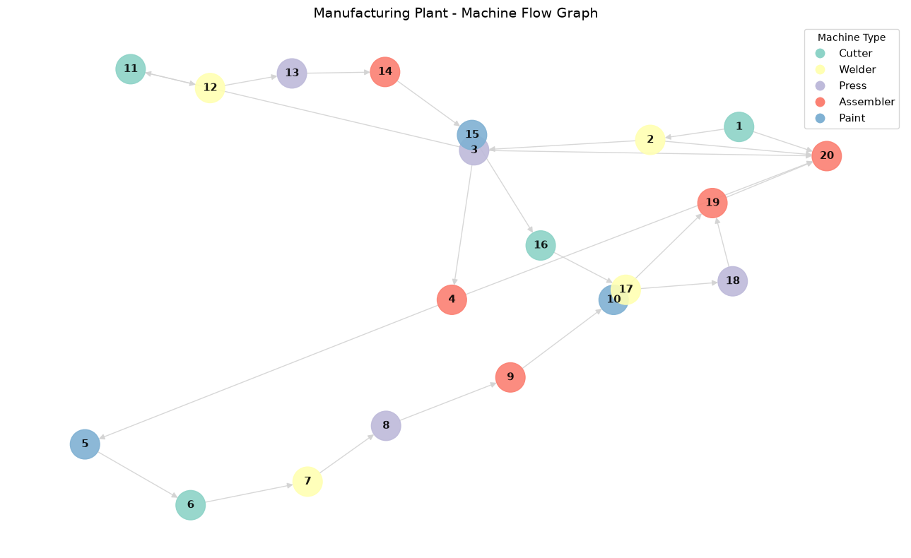
Figure 1. Manufacturing Plant Graph
A few things are immediately visible: one node appears to receive connections from many others, and one node seems to sit between otherwise separate sections of the plant. The algorithms that follow will confirm these observations numerically.
Connectivity Analysis: Weakly Connected Components
Our first question is foundational: is this plant one integrated system, or does it split into isolated subsystems?
Weakly Connected Components (WCC) treat the graph as undirected — it ignores the direction of material flow and asks simply: can every machine reach every other machine through some path? The output assigns each machine a component ID. Multiple component IDs would indicate isolated sub-plants.
session.sql("""
    CALL neo4j_graph_analytics.graph.wcc('CPU_X64_XS', {
        'project': {
            'defaultTablePrefix': 'ga_demo.public',
            'nodeTables': ['nodes_vw'],
            'relationshipTables': {
                'rels_vw': {
                    'sourceTable': 'nodes_vw',
                    'targetTable': 'nodes_vw'
                }
            }
        },
        'compute': {},
        'write': [{
            'nodeLabel': 'nodes_vw',
            'outputTable': 'ga_demo.public.nodes_wcc'
        }]
    })
""").collect()
The results show a single component containing all 20 machines — the plant operates as one integrated network. This is a useful baseline: it tells us there are no isolated subsystems that might be invisible to centralized monitoring.
Criticality Analysis: PageRank and Betweenness Centrality
Knowing the plant is connected, we can ask: which machines are most critical?
We use two algorithms that measure criticality in different ways. A machine can be critical for one reason but not the other, and the distinction has real operational implications.
PageRank: Flow Importance
PageRank asks which machines receive material from many well-connected upstream machines. A high PageRank score means a machine is a destination for flow from important sources. If it slows down, the backlog ripples upstream.
session.sql("""
    CALL neo4j_graph_analytics.graph.page_rank('CPU_X64_XS', {
        'project': {
            'defaultTablePrefix': 'ga_demo.public',
            'nodeTables': ['nodes_vw'],
            'relationshipTables': {
                'rels_vw': {
                    'sourceTable': 'nodes_vw',
                    'targetTable': 'nodes_vw'
                }
            }
        },
        'compute': { 'mutateProperty': 'score' },
        'write': [{
            'nodeLabel': 'nodes_vw',
            'outputTable': 'ga_demo.public.nodes_pagerank',
            'nodeProperty': 'score'
        }]
    })
""").collect()
Machine 20 comes out on top — it sits at the confluence of multiple upstream chains, the assembly hub where material from across the plant converges.
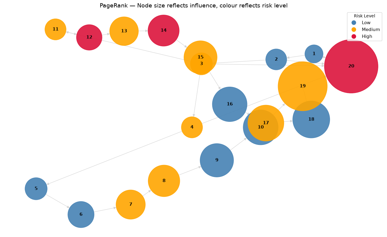
Figure 2. PageRank Visualization
Betweenness Centrality: Structural Importance
Betweenness asks a different question: which machines appear most often on the shortest path between other machines? A high Betweenness score means a machine is a structural bridge. It may not handle the most flow, but its position connects otherwise separate parts of the plant. If it goes offline, it disconnects or lengthens paths across the network.
session.sql("""
    CALL neo4j_graph_analytics.graph.betweenness('CPU_X64_XS', {
        'project': {
            'defaultTablePrefix': 'ga_demo.public',
            'nodeTables': ['nodes_vw'],
            'relationshipTables': {
                'rels_vw': {
                    'sourceTable': 'nodes_vw',
                    'targetTable': 'nodes_vw'
                }
            }
        },
        'compute': { 'mutateProperty': 'score' },
        'write': [{
            'nodeLabel': 'nodes_vw',
            'outputTable': 'ga_demo.public.nodes_betweenness',
            'nodeProperty': 'score'
        }]
    })
""").collect()
Machine 3 has the highest Betweenness score — despite having a much lower PageRank than Machine 20. It's not the busiest machine; it's the one whose failure would do the most structural damage.
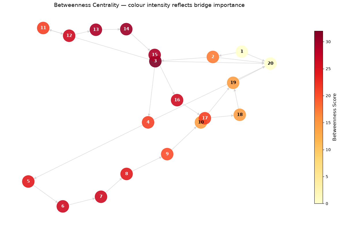
Figure 3. Betweenness Centrality Heatmap
This is the key insight from running both algorithms: PageRank and Betweenness reveal different kinds of importance. A maintenance plan that uses only one of them is missing half the picture.
Structural Similarity: FastRP and KNN
So far we've identified individual critical machines. This section asks a different question: which machines play the same structural role in the workflow, even if they're different types?
Machines with structurally equivalent positions can share maintenance windows, act as backups for each other, or be treated as a unit for risk modeling — even if they look different on paper.
We use two algorithms in sequence.
Fast Random Projection (FastRP)
FastRP generates a compact embedding vector for each machine by sampling the graph structure around it. Two machines with similar upstream and downstream neighbors will end up with similar embedding vectors, regardless of their type or risk level. We use 16 dimensions — a good balance for a 20-node graph.
session.sql("""
    CALL neo4j_graph_analytics.graph.fast_rp('CPU_X64_XS', {
        'project': {
            'defaultTablePrefix': 'ga_demo.public',
            'nodeTables': ['nodes_vw'],
            'relationshipTables': {
                'rels_vw': {
                    'sourceTable': 'nodes_vw',
                    'targetTable': 'nodes_vw'
                }
            }
        },
        'compute': {
            'mutateProperty': 'embedding',
            'embeddingDimension': 16
        },
        'write': [{
            'nodeLabel': 'nodes_vw',
            'outputTable': 'ga_demo.public.nodes_fastrp',
            'nodeProperty': 'embedding'
        }]
    })
""").collect()
K-Nearest Neighbor (KNN)
KNN takes the embeddings and finds, for each machine, its most structurally similar peer. Similarity is measured using cosine similarity of the embedding vectors — a score of 1.0 means identical structural position, 0.0 means completely different.
Note that KNN operates on node properties rather than graph edges, so its projection block contains no relationship table — the one exception to the pattern seen in the other algorithm calls.
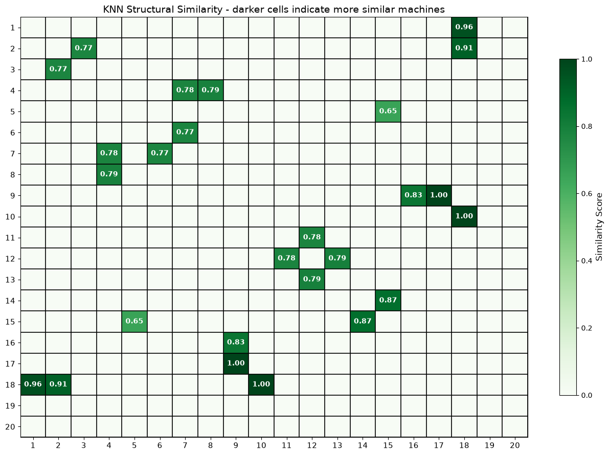
Figure 4. KNN Structural Similarity Matrix
The results show high-similarity pairs between machines of different types. This is expected: FastRP captures structural position in the graph, not machine attributes. Two machines with similar upstream and downstream neighbors will have similar embeddings regardless of their type, risk level, or throughput rate.
Failure Simulation
Static risk analysis tells us which machines are currently important. We can turn that into a dynamic tool by asking: what actually happens to the rest of the plant when Machine 3 goes offline?
We simulate the failure by creating filtered views that exclude Machine 3 and all its connections, then re-run PageRank and Betweenness on the degraded graph.
Normalization matters here: raw scores shrink after failure because the graph is smaller. We divide each score by the sum of all scores in that run so we're comparing relative importance within each graph, not absolute values.
session.sql(f"""
    CREATE OR REPLACE VIEW ga_demo.public.nodes_failure_vw AS
    SELECT machine_id AS nodeId
    FROM ga_demo.public.nodes
    WHERE machine_id != {EXCLUDED}
""").collect()

session.sql(f"""
    CREATE OR REPLACE VIEW ga_demo.public.rels_failure_vw AS
    SELECT
        src_machine_id AS sourceNodeId,
        dst_machine_id AS targetNodeId,
        CAST(SUM(throughput_rate) AS FLOAT) AS total_amount
    FROM ga_demo.public.rels
    WHERE src_machine_id != {EXCLUDED}
      AND dst_machine_id != {EXCLUDED}
    GROUP BY src_machine_id, dst_machine_id
""").collect()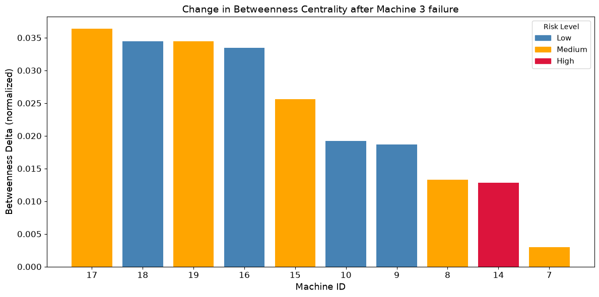
Figure 5. Betweenness Delta Bar Chart
The key finding: machines that were not flagged as high risk in the baseline analysis gain significant Betweenness importance after Machine 3's failure. The network reroutes through alternative paths, promoting machines that were structurally insignificant in the baseline into critical bridge positions. Static risk labels don't capture this — graph analysis does.
The notebook is designed to support experimentation: change the EXCLUDED variable to any machine ID and re-run the section to see how the network responds to a different failure.
Community Detection: Louvain
The previous sections analyzed individual machines. Louvain community detection asks: does the plant naturally organize itself into clusters?
Louvain finds groups of machines that are more densely connected to each other than to the rest of the network. These communities often correspond to real operational sub-units — parallel production lines, shared workflow stages, or tightly coupled machine groups.
session.sql("""
    CALL neo4j_graph_analytics.graph.louvain('CPU_X64_XS', {
        'project': {
            'defaultTablePrefix': 'ga_demo.public',
            'nodeTables': ['nodes_vw'],
            'relationshipTables': {
                'rels_vw': {
                    'sourceTable': 'nodes_vw',
                    'targetTable': 'nodes_vw'
                }
            }
        },
        'compute': { 'mutateProperty': 'community' },
        'write': [{
            'nodeLabel': 'nodes_vw',
            'outputTable': 'ga_demo.public.nodes_louvain',
            'nodeProperty': 'community'
        }]
    })
""").collect()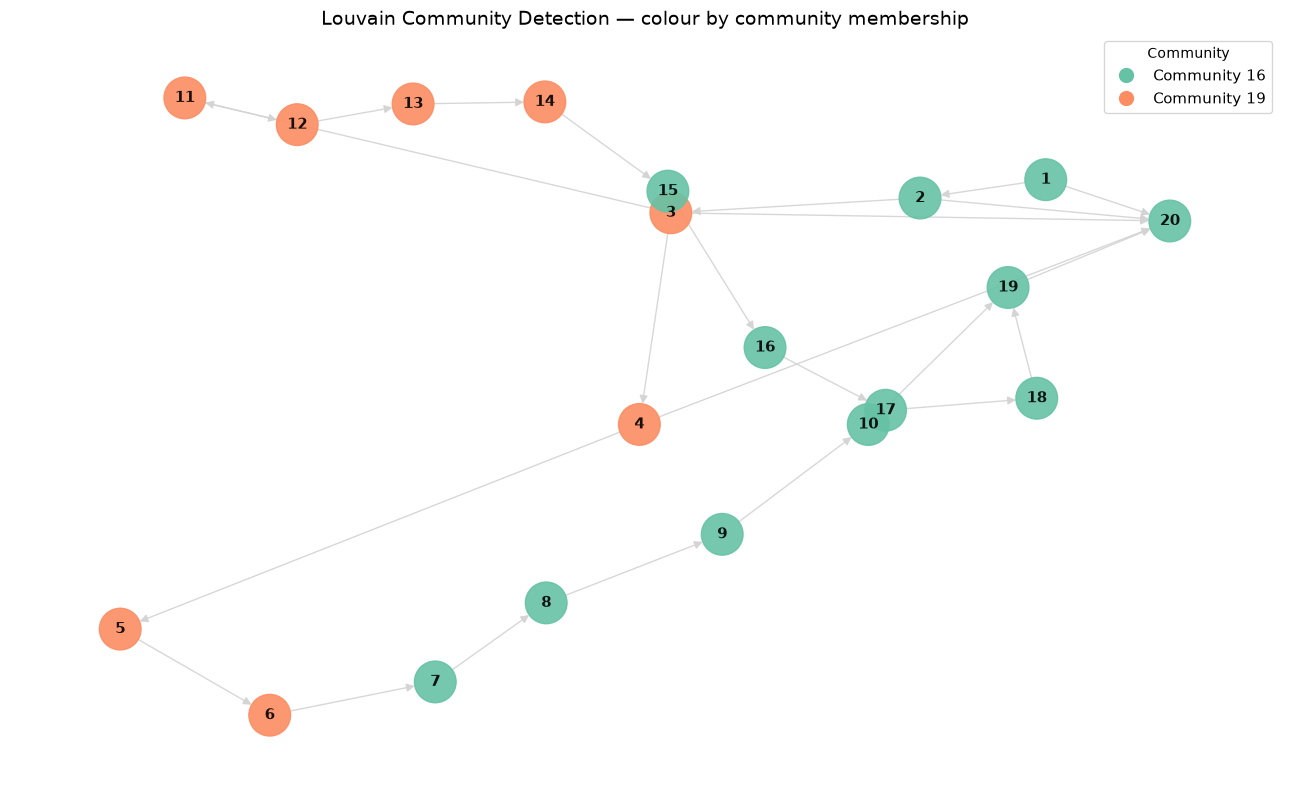
Figure 6. Louvain Community Detection
Joining the community results back to the risk levels reveals that the smaller community has a disproportionate concentration of high-risk machines relative to its size. This also explains the failure simulation results: Machine 3 sits in this community and acts as its main bridge to the rest of the plant. Community detection connects the structural analysis back to operational risk in a way that neither algorithm produces on its own.
Bringing It All Together
The final step joins all four algorithm outputs into a single risk summary table:
risk_summary = session.sql("""
    SELECT
        n.machine_id,
        n.machine_type,
        n.risk_level,
        ROUND(p.score, 4) AS pagerank_score,
        ROUND(b.score, 4) AS betweenness_score,
        l.community
    FROM ga_demo.public.nodes n
    JOIN ga_demo.public.nodes_pagerank p    ON n.machine_id = p.nodeid
    JOIN ga_demo.public.nodes_betweenness b ON n.machine_id = b.nodeid
    JOIN ga_demo.public.nodes_louvain l     ON n.machine_id = l.nodeid
    ORDER BY pagerank_score DESC
""").to_pandas()
This table combines flow importance, structural importance, and community membership into a single view — one that would be difficult to produce from SQL alone and impossible without running the underlying graph algorithms.
Summary
SQL and graph analytics aren't competing approaches — they're complementary ones. Snowflake handles what it does well: storing, filtering, and aggregating operational data at scale. Neo4j Graph Analytics, running as a Native App inside Snowflake, adds a layer of analysis that SQL alone can't easily provide: understanding how entities relate to each other, which ones are structurally critical, and how the network behaves under failure conditions.
The full source code is available on GitHub.
Opinions expressed by DZone contributors are their own.
Comments