Ngx-Bootstrap DateRange Picker and Date Picker
In this article, we are going to learn the use of Ngx-Bootstrap DateRange Picker and Date Picker in Angular 8.
Join the DZone community and get the full member experience.
Join For FreeIntroduction
In this article, we are going to learn the use of Ngx-Bootstrap DateRange Picker and Date Picker in Angular 8.
Ngx-Bootstrap has released a package of open-source tools which is native Angular directives for Bootstrap 3 and 4. It contains all core components powered by Angular. In this article we will learn about DatePicker component which is a cool feature of Ngx-bootstrap.
Prerequisites
- Basic knowledge of Angular
- Visual Studio Code must be installed
- Angular CLI must be installed
- Node JS must be installed
Step 1
Let's create a new Angular project using the following NPM command,
ng new datepicker
Step 2
Now, let's create a new component by using the following command,
xxxxxxxxxx
ng g c ngx-bootstrap-datepicker
Step 3
Install ngx-bootstrap from npm by using the folowing command.
xxxxxxxxxx
npm install ngx-bootstrap --save
Or,
xxxxxxxxxx
ng add ngx-bootstrap --component datepicker
Step 4
Now let's add bootstrap styles in our index.html file.
For Bootstrap 3,
xxxxxxxxxx
<link href="https://maxcdn.bootstrapcdn.com/bootstrap/3.3.7/css/bootstrap.min.css" rel="stylesheet">
For Bootstrap 4,
xxxxxxxxxx
<link href="https://maxcdn.bootstrapcdn.com/bootstrap/4.0.0/css/bootstrap.min.css" rel="stylesheet">
Step 5
Let add the template in our ngx-bootstrap-datepicker.component.html.
xxxxxxxxxx
<div class="card">
<div class="card-body pb-0">
<h4 style="text-align: center;">Example of Date Picker and Date Range Picker</h4>
<div class="row">
<div class="col-12 col-md-12">
<div class="card">
<nav class="navbar navbar-expand navbar-light bg-white topbar mb-4 static-top nav-kc">
<div class="col-md-6">
<div class="input-group">
<input type="text" name="daterange" autocomplete="off" bsDaterangepicker
[bsConfig]="{ rangeInputFormat : 'MMMM Do YYYY', dateInputFormat: 'MMMM Do YYYY', showWeekNumbers: false }"
id="DateOfBirth" placeholder="Date Range" (bsValueChange)="dateRangeCreated($event)"
class="form-control" />
</div>
</div>
<div class="col-md-3">
<div class="input-group">
<input type="text" name="daterange" autocomplete="off" bsDatepicker
[bsConfig]="{ dateInputFormat: 'MMMM Do YYYY', showWeekNumbers: false }" id="DateOfBirth"
placeholder="Date" (bsValueChange)="dateCreated($event)" class="form-control" />
</div>
</div>
</nav>
<div class="card-body position-relative">
<div class="table-responsive cnstr-record product-tbl">
<table class="table table-bordered heading-hvr">
<thead>
<tr>
<th>ArtNo.</th>
<th>Brand</th>
<th>
Price/Unit</th>
<th>Provider</th>
<th>P. Art. N</th>
<th>S. A/C</th>
<th>Buy A/C</th>
<th>Created Date</th>
</tr>
</thead>
<tbody *ngFor="let product of products; let i = index">
<tr>
<td align="center">{{product.ArtNo}}</td>
<td>{{product.Brand}}</td>
<td>{{product.Price }}</td>
<td>{{product.Provider}}</td>
<td>{{product.ProviderArtNo}}</td>
<td>{{product.SalesAccount}}</td>
<td>{{product.BuyAccount}}</td>
<td>{{product.CreatedDate}}</td>
</tr>
</tbody>
</table>
</div>
</div>
</div>
</div>
</div>
</div>
</div>
In bsConfig method we can format the date and time. showWeekNumbers is a boolean value which is true by default and displays the number of the week.
Also we can select the min date. max date, etc.
xxxxxxxxxx
<input type="text" name="daterange" autocomplete="off" bsDatepicker
[bsConfig]="{ dateInputFormat: 'MMMM Do YYYY', showWeekNumbers: false }" id="DateOfBirth"
placeholder="Date" (bsValueChange)="dateCreated($event)" class="form-control" />
Step 6
Now, open the ngx-bootstrap-datepicker.component.ts file and add the following code in this file.
xxxxxxxxxx
import { Component, OnInit } from '@angular/core';
import { DatePickerService } from '../datepicker.service';
@Component({
selector: 'app-ngx-bootstrap-datepicker',
templateUrl: './ngx-bootstrap-datepicker.component.html',
styleUrls: ['./ngx-bootstrap-datepicker.component.css']
})
export class NgxBootstrapDatepickerComponent implements OnInit {
products = [];
tempproducts=[];
constructor(private datepickerService: DatePickerService) { }
ngOnInit() {
this.getProducts();
}
getProducts() {
this.products = this.datepickerService.getAllProducts();
this.tempproducts = this.datepickerService.getAllProducts();
}
dateCreated($event){
this.products = this.tempproducts;
this.products = this.products.filter(x => x.CreatedDate == $event.toJSON().split('T')[0]);
}
dateRangeCreated($event) {
this.products = this.tempproducts;
let startDate = $event[0].toJSON().split('T')[0];
let endDate = $event[1].toJSON().split('T')[0];
this.products = this.products.filter(
m => new Date(m.CreatedDate) >= new Date(startDate) && new Date(m.CreatedDate) <= new Date(endDate)
);
}
}
Step 7
Create a service dataservice using the following NPM command
xxxxxxxxxx
ng g service data
Now, open the data.service.ts file and add the following code,
xxxxxxxxxx
import { Injectable } from '@angular/core';
@Injectable()
export class DataService {
employees: any[];
getAllProducts() {
return this.employees = [
{
ProductId: 1,
ArtNo: "100",
Provider: "OppoProvider",
ProviderArtNo: "1Yu",
Brand: "Oppo",
Price: 7810.23,
BuyAccount: "123",
SalesAccount: "321",
CreatedDate: "2020-04-17"
},
{
ProductId: 1,
ArtNo: "101",
Provider: "OppoProvider",
ProviderArtNo: "1Yu",
Brand: "Oppo",
Price: 2310.23,
BuyAccount: "123",
SalesAccount: "321",
CreatedDate: "2020-04-15"
},
{
ProductId: 1,
ArtNo: "102",
Provider: "OppoProvider",
ProviderArtNo: "1Yu",
Brand: "Oppo",
Price: 7810.23,
BuyAccount: "123",
SalesAccount: "321",
CreatedDate: "2020-04-11"
},
{
ProductId: 1,
ArtNo: "103",
Provider: "OppoProvider",
ProviderArtNo: "1Yu",
Brand: "Oppo",
Price: 5810.23,
BuyAccount: "123",
SalesAccount: "321",
CreatedDate: "2020-03-21"
},
{
ProductId: 1,
ArtNo: "104",
Provider: "OppoProvider",
ProviderArtNo: "1Yu",
Brand: "Oppo",
Price: 4770.23,
BuyAccount: "143",
SalesAccount: "211",
CreatedDate: "2020-03-01"
},
];
}
}
Step 8
Now, open the app.component.html file and add the following code in the file,
xxxxxxxxxx
<app-ngx-bootstrap-datepicker></app-ngx-bootstrap-datepicker>
Step 9
Let's open app.module.ts file and add the following code in the file,
xxxxxxxxxx
import { BrowserModule } from '@angular/platform-browser';
import { NgModule } from '@angular/core';
import { FormsModule} from '@angular/forms';
import { AppComponent } from './app.component';
import { BsDatepickerModule } from 'ngx-bootstrap/datepicker';
import { NgxBootstrapDatepickerComponent } from './ngx-bootstrap-datepicker/ngx-bootstrap-datepicker.component';
@NgModule({
declarations: [
AppComponent,
NgxBootstrapDatepickerComponent
],
imports: [
BrowserModule,
FormsModule,
BsDatepickerModule.forRoot()
],
bootstrap: [AppComponent]
})
export class AppModule { }
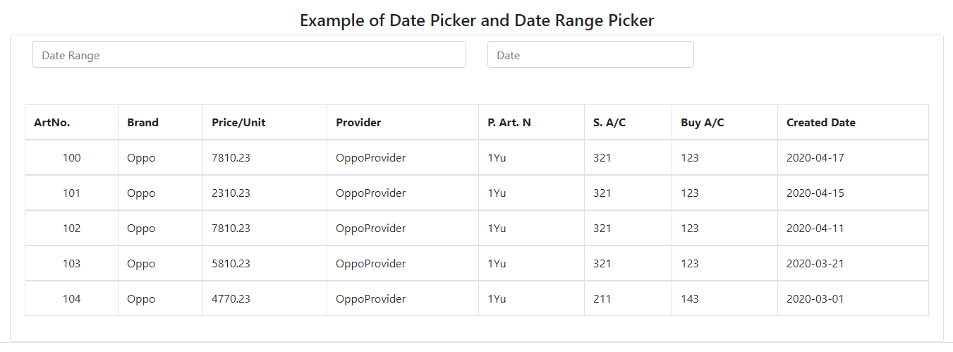
Now it's time for the output,


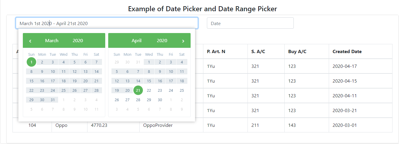
Date range picker is where we can select a range of datess. After selecting date one event will fire which is an array,

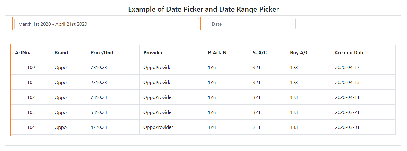
The below image shows that it will fetch only those data which comes in the range from April 1 to April 14.

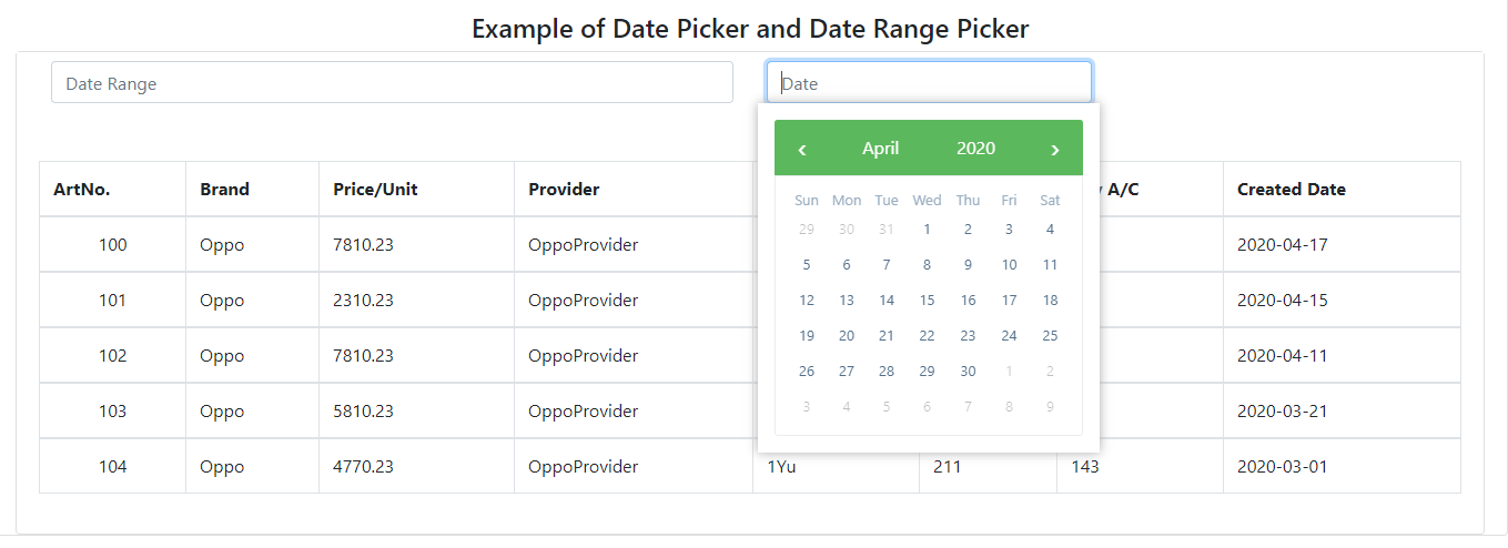
The below image shows the normal ngx-bootstrap datepicker.


Conclusion
I hope you have enjoyed this article as much as I have enjoyed writing and coding the examples.
Please let me know how to improve it.
Opinions expressed by DZone contributors are their own.

Comments