Setting Thresholds With Quantiles
The idea is to look at the shape of your data and use that to decide where you feel is the right threshold. One of the best ways to do that is to plot the quantiles.
Join the DZone community and get the full member experience.
Join For Freei was talking with someone the other day about a visualization i remembered seeing some years ago, that could help set a reasonable value for a threshold on a metric. as i’ve written , thresholds are basically a broken way to monitor systems, but if you’re going to use them, i think there are simple things you can do to avoid making threshold values completely arbitrary.
i couldn’t find the place i’d seen the visualization (if you know prior art for the below, please comment!) so i decided to just blog about it. suppose you start off with a time series:
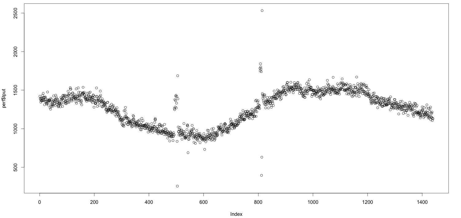
the idea is that you might want to alert on this metric breaking some threshold, but what’s the right value? there are lots of ways you could do it: a multiple of the average, some quantile, some number of standard deviations from the mean, etc, etc. for example, you could say “i want to alert if the metric exceeds its usual 99.9th percentile.” but isn’t 99.9 an arbitrary number, too? what makes it so special? is there any way to pick a number that isn’t just pulled out of a hat?
i need to preface all of this with a disclaimer. everyone’s systems are different, static thresholds are silly, quantiles are known to the state of california to cause cancer, and so on. what i’m about to show you is only slightly less arbitrary. don’t confuse it for a rule that actually has a strong reason why it’s better than the alternatives.
the idea is to look at the shape of your data and use that to decide where you feel is the right threshold. the “shape” is the distribution of the data–how its values are typically spread.
one of the best ways to do that is to plot the quantiles. in the following plot, the quantiles go from left to right. at the far left is the 0th percentile, and at the far right is the 100th percentile. another way to say that is the left is the minimum value and the right is the maximum value.
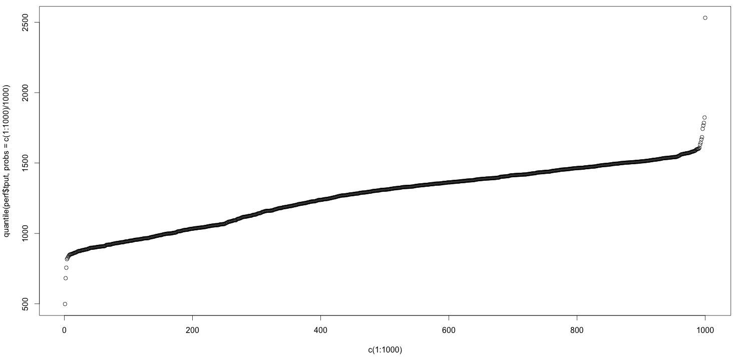
i’ve made no effort to polish this chart; you’ll notice that i generated the quantiles by taking a vector of 1000 numbers and dividing it by 1000, for example.
now, as you look at this chart, you can see that near the far right, it suddenly jumps–it has an elbow. let’s zoom in on the last 10% of the chart, i.e. the 90th percentile and above:
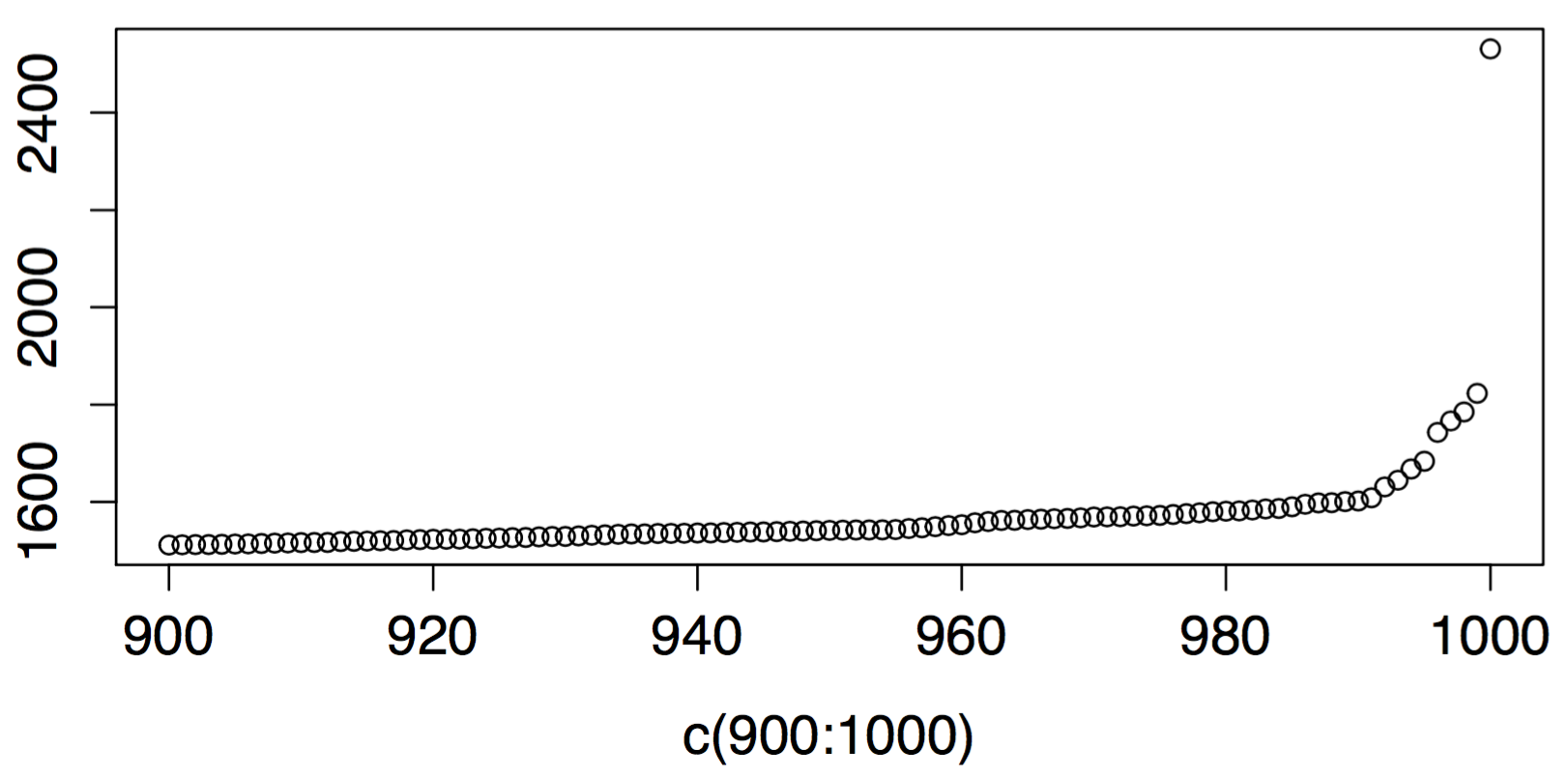
there’s nothing magical about this elbow. there’s nothing magical about the last 10 percent of values. it just so happens that those last few are disproportionately larger than the rest. in simple terms, it means that the system’s model, or perhaps the parameters for its model, apparently changed. and if you’re going to pick a place to alert on a threshold, maybe a point where the behavior diverges rapidly is as good as any and better than some.
in other words, you could put your threshold just at the point where the quantile plot gets steeper, which is about the value 1600 in this dataset.
not all data behaves this way. some metrics will have a nice line all the way up and to the right, with no elbow. some will jump sooner. some will have a big ledge, even several ledges. you’ll get all kinds of different shapes and sizes of data. the point is to at least know what shapes and sizes your own data has.
visualizations like this have a lot of explanatory power and can show you potentially surprising things very easily. that’s why this kind of visualization, rather than just the standard boring time series plot, is not a bad thing to know how to do. it’s not revolutionary, things like this are used in all sorts of ways and by lots of people. qq plots , for example, are a related technique.
so i’m probably repeating myself too much, but again this is nothing special, but it’s something anyway. with this approach, there still may not be a strong justification for choosing a number as a threshold, but at least there’s a reason and method, and it’s better than cargo cult, a random number generator, or copy-and-paste.
here’s the r code.
perf <- read.csv("/path/to/perf.csv", sep="")
plot(perf$tput)
plot(c(1:1000), quantile(perf$tput, probs=c(1:1000)/1000))
plot(c(900:1000), quantile(perf$tput, probs=c(900:1000)/1000))
related: someone on twitter pointed me to this blog post from dynatrace .
Published at DZone with permission of B Jones. See the original article here.
Opinions expressed by DZone contributors are their own.
Comments