Taking Your Web Performance's Temperature Using a Heat Map
Join the DZone community and get the full member experience.
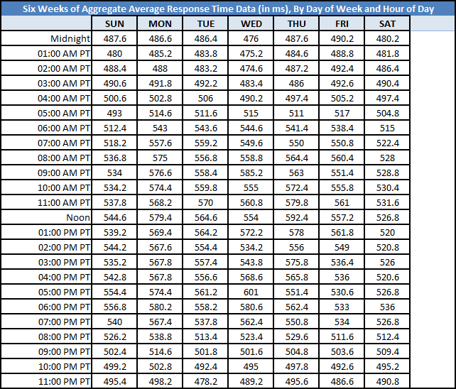
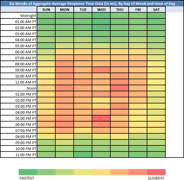
Join For Freein this heat map example, web site’s performance data is overlay with color, where red means “slowest” and green means “fastest” (with various color grades in between). i added this heat map example because the chart data was difficult to “crunch”, to analyze for patterns; adding color made this easier. download the excel sheet here . otherwise, see the below “before” and “after”.
before: raw chart data:
after: heat map:
side by side:
the chart data is the arithmetic mean average of six weeks’ worth of web site response time measurements (in milliseconds), broken down by day of week and by hour of day. i then used excel’s built-in /conditional formatting/color scales/red – yellow – green color scale/.
document complete / onload:
_the following is optional reading material._
here are some potential fact statements we get from looking at this heat map:
01. the weekends are the “fastest”.
02. the weekdays are the “slowest”.
03. response time slows starting at around 07:00 am pt and response time speeds starting at around 07:00 pm pt.
04. the “slowest” (i.e. the most red) “day of week”/”hour of day” combination is wednesday at 05:00 pm pt.
05. the “fastest” (i.e. the most green) “day of week”/”hour of day” combination is wednesday at 02:00 am pt.
06. interestingly enough, the “fastest” and “slowest” “day of week”/”hour of day” combination was on a wednesday.
07. friday afternoons were “faster” when compared to other weekday afternoons (insert comment here re: folks getting ready for the weekend!).
download the excel file here: https://docs.google.com/open?id=0b9n5sarv4oonmedtotlvohnib0e
********************************************************************************
i used his model to chart the performance heat map of google search (search for a keyword) and decided to compare the wait time (1st byte) and their search query time:
here is the same for etsy’s home page, wait time and the etsy server time:
(data from june 1 2012 to july 13 2012, time in est)
i used these 2 examples mainly because not only we are plotting a catchpoint metric but also overlaying customer telemetry coming from google (how long it takes for google to spit the results) or etsy (how long it takes for their server to build the html). what would be cool is to get traffic volume during those days and hours to correlate the performance metrics and usage pattern. but what these chart show is clearly a performance degradation during certain days and hours of day that are driven by volume, users, usage…
enjoy the summer and try to keep your web performance cool!
thank you leo for sharing this!
Published at DZone with permission of Mehdi Daoudi, DZone MVB. See the original article here.
Opinions expressed by DZone contributors are their own.


Comments