Effective Ways of Presenting Research Data – UX
Join the DZone community and get the full member experience.
Join For Free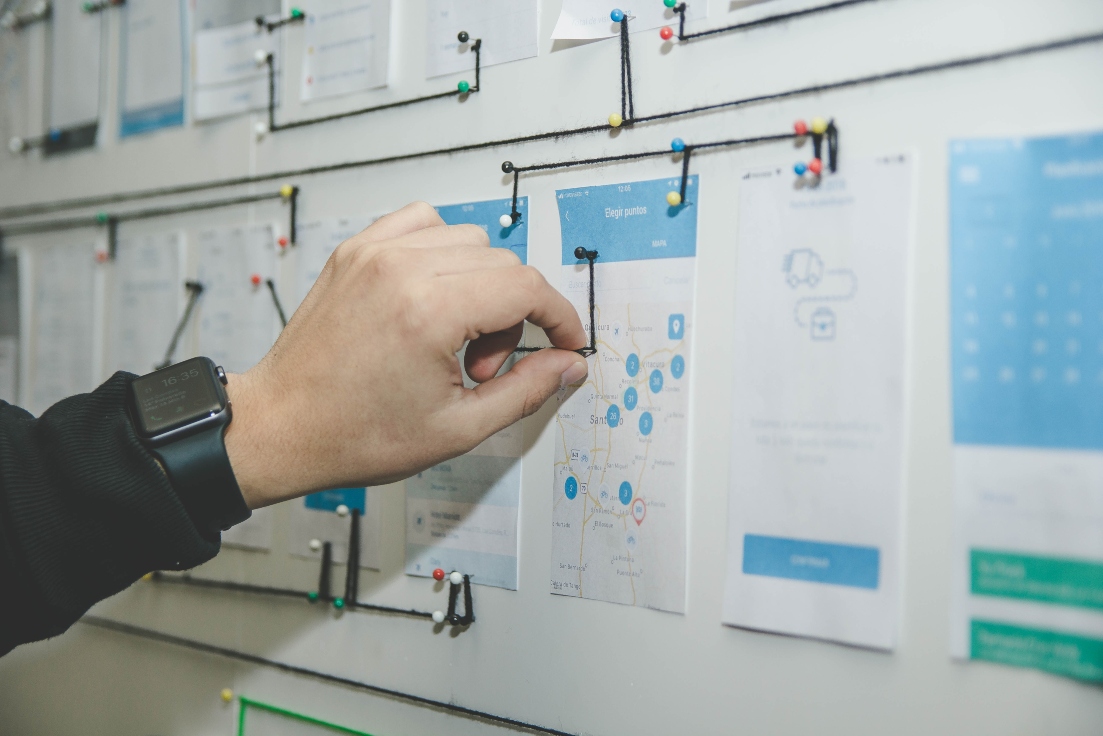
“Tell me and I forget, teach me and I may remember, involve me and I learn.” – Benjamin Franklin.
Let us agree! It is no easy task to see through a whole bundle of user research data (quantitative and qualitative) and convert them into design ideas. Though we used ‘n’ number of methodologies to gather those data that are required for our design process, the idea of consolidating them is mind-blogging.
Right now, you may have data from your user interview, survey, user testing, observation study and so on as post-its, notes, audio or video. You can synthesize these raw data into meaningful ideas and solutions (UX deliverables) and present them to your stakeholders for many valuable reasons.
Who Will Find the User Research Data Valuable - and Why?
Fellow UX Designers — To empathize with the user and come up with better design solutions and improve scalability.
UI Designers — To understand the user and product and its brand to come up with suitable mood boards, design standards, and interactions.
Developers — To understand user expectations on a screen and product level, to make coding adherable and accessible for its user.
Business Stakeholders — To understand where their business stands, what they need to work on and where their product will be in the near future after the design solution (ROI).
Don'ts of Presenting Research Data
To start with, let us see what must not be done while presenting research deliverables. This will be easier to understand why we do what we do.
Do not Dump Raw Data
You cannot just give your stakeholders with raw data. It is your research and understanding. It is not easy for anyone else other than you to follow up with those data. Only you will understand what your post-its, notes, and drawings say.
Do not Present an Essay
Presenting with text alone will be overwhelming to the audience, which is equivalent to presenting raw data, even though they are your consolidated thoughts. A combination of text and supporting graphics, like infographics, charts, and graphs makes it easier for anyone to follow-up with complex data.
Turning Raw Data Into Intelligence
To this end, how do you make your different stakeholders empathize with the user for their different needs, with your research data? The first step will be to familiarize yourself with your findings. I always transcribe my own recordings (audio/video) instead of getting it done by a different person. That way, looking at the recordings again and again, I will become more familiar with the scenarios and things happened during the sessions.
You can organize and present your findings to the stakeholders in many forms. Few of the tools I use are
Affinity Diagram.
Persona.
Empathy Map.
User Journey Map.
Stakeholder Workshop.
Affinity Diagram
Whenever I have too much qualitative information/ideas in hand, or the ideas seem too complex to handle, I rely on an Affinity Diagram. Affinity Diagrams help in organizing research data into empirical themes.
When you have too much of information/ideas spread all your ideas on a wall using post-its for everyone in your team to see.
Once all the information is up there, start finding patterns/themes, and group them accordingly. Make a group of 3-10 based on the information in hand. In cases where the same idea seems to fit in multiple groups, make duplicate post-its. At this point, making groups will be our only motive. Also, some ideas might not fit into any group, which is okay. We can deal with them later.
Once all the ideas are grouped, the team can start talking with each other and attempt to come up with theme headings or categories. Some ideas might go into different groups, or left out ideas might fit into some group. You can also juggle around the ideas as necessary. Consequently, keep looking and comment on each other ideas; you might find interesting patterns.
At times, the process might seem to be going on and on until the whole team comes into agreement. In such cases, to be safer, I prefer to keep the process on a clock. This will push the team to get into a mutual agreement before the timer stops. It all depends on an individual’s approach towards the process, which comes through experience.
What we achieve:
Organized data with proper groupings avoiding seizures.
Personas
Persona is a very effective tool; fundamentally, it creates fictional users. Each user represents an actual user group. We give a name and face to each user group and capture their frustrations and motivations. Furthermore, it is supposedly very effective when we give our persona a fictional background story because that makes the persona come alive, which helps the stakeholders empathize with the user group better. It is especially helpful in recognizing a persona at first glance, and also in recalling user group characterizations while communicating within the team.
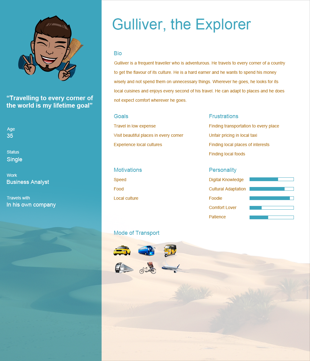
A persona must cover:
Personal details, such as name, age, gender, photograph, occupation, family, and interests.
Fictional background story.
Needs and goals.
Frustrations and motivations.
Social and psychological traits.
Experience relevant to the product.
I build personas at two different stages. Initially, this is done with only a designers’ understandings about the users’ mental model. This must be created for each user group, which can be used to recruit users (screener) for user interviews. This persona can be reiterated subsequently using the data gathered during user interviews and observations, which can be used to portray the actual user's mental model.
Though personas are fictional users, they are a balanced combination of both fictional and actual research data, thus ensuring the credibility of the persona. Hence, it is not advisable to lengthen the persona with irrelevant information. The length of the persona only depends on the breadth of the information you need to convey to your stakeholders.
What we achieve:
User goals, needs, environment, usage pattern, pain points and motivations, constraints.
Empathy Map
An Empathy Map helps capture a great deal about user groups. An empathy map usually contains data about what the user said, thought, and did and felt, which must be captured as 4 quadrants. I like to add pictures and transcripts to my empathy map, which gives my team a better perception.
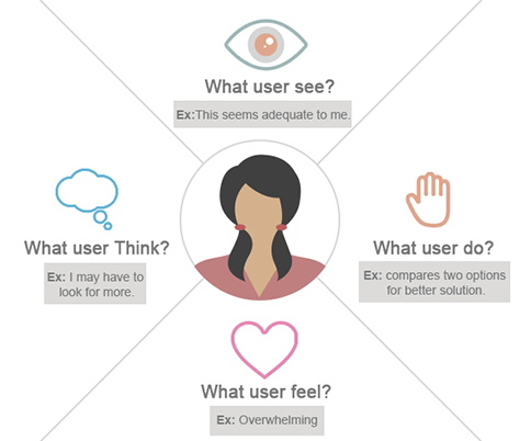
To create an empathy map, come up with questions that provide answers for the four quadrants in the illustration.
What the user said, captures the users’ daily activities, hobbies, what they see as their work, things that influence them, and what they see in the market.
What the user thought, captures what the user believes, worries, fears, what they think they need, and their goals.
What the user did, captures how the user did their tasks, what they do to solve their problems and how they deal with their frustrations and fears.
What the user felt, captures the emotional aspects of user behavior. This is the outcome of your observations during interviews and observational study.
What we achieve:
User expectations, problem areas, emotional connections.
User Journey Map
A User Journey map represents the process the user goes through to achieve a goal using your product from specified touch points (points from which the user encounters your product). The user journey map consists of scenarios and tasks, which helps break down the frustrations and motivations of the user. While personas will be of great help to understand the touch points and goals for a user journey map, user testing, user interviews, and observational data provide details to map the user journey.
A User Journey Map helps a designer to know how a user actually interacts with their product from their own words/actions. It also answers questions like, why a user spends time on a specific area, or why user dropped off in the middle of a purchase. You can also compare user journies of different users and identify common factors or conflicts in each individual's experience.
I define a User Journey Map as the actions users follow to achieve a goal in a given scenario, with certain expectations (of the user), through touch points using a product. Key words highlighted are the basic requirements to build a user journey map, and the outcome of a User Journey Map would be user emotions, moments of truth (drop off point), and designers’ thinking.
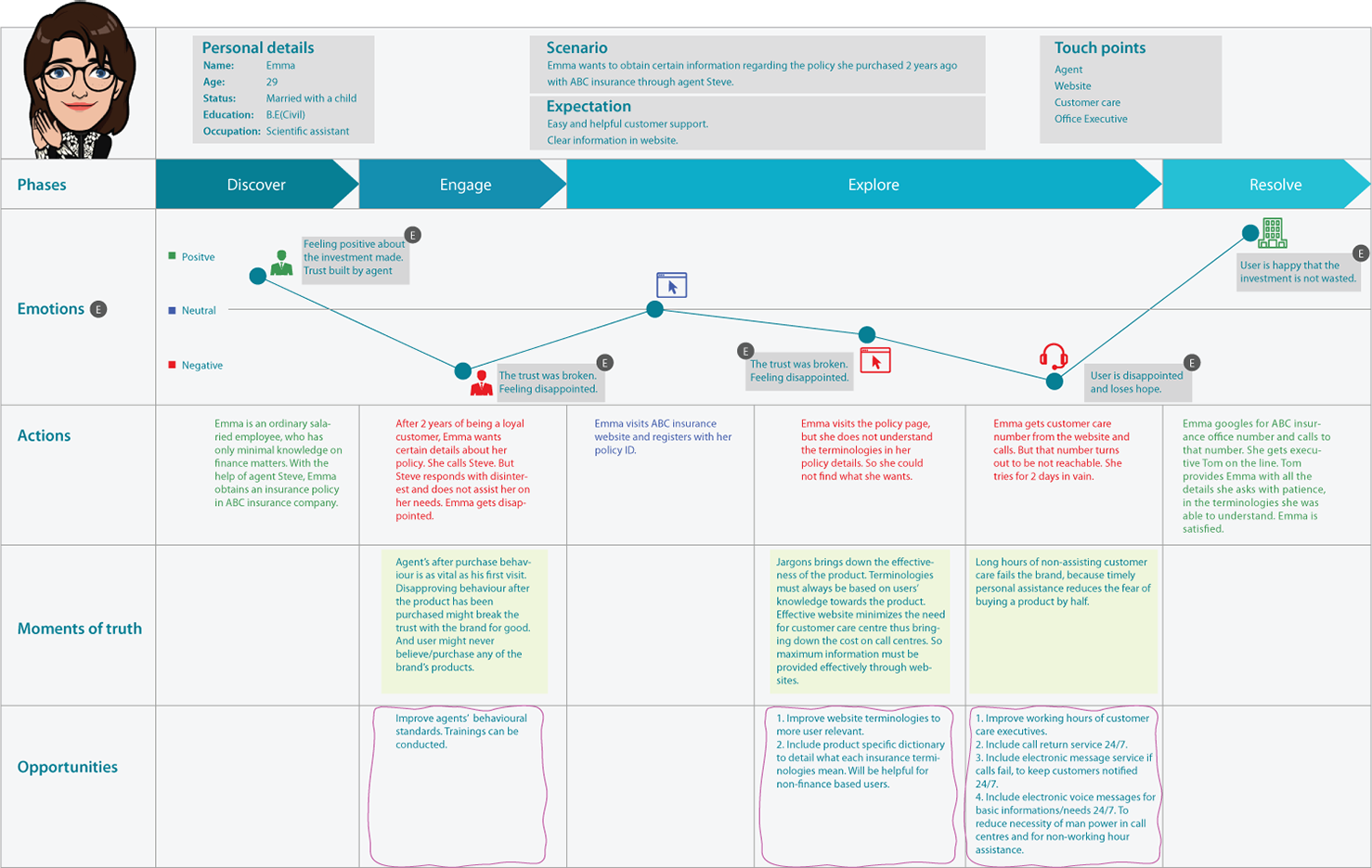
What we achieve:
User needs, user emotions, moments of truth (drop off point), opportunities (efficiency improvement area).
Stakeholder Workshop
Workshops are beneficial when your research team is small. Dealing with your own ideas might take you in many directions, but involving more heads might take you in directions you might not have thought of. While conducting workshops, involve your UX team and all your stakeholders (business, Engineering, and UI design). This will also encourage the team to be more open-minded and enthusiastic about the project.
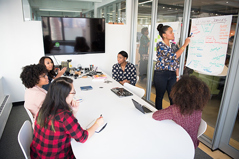
Facilitating a workshop does require experience, but this is something that you can learn. Conducting a workshop requires proper planning from its facilitator. An agenda must be set. Sometimes it's helpful to have a co-facilitator/someone to record workshop outputs, keep track of time, secure a venue, and get the participants together.
What we achieve:
More data for research, task/problem prioritization, and expert opinions/solutions.
Wrapping Up
Breaking down research data into chunks and presenting them in a condensed form is a highly sought-after skill. Apart from what we came across, there are tons of other ways in which you can present your findings. Each form in its own way informs different aspects (what we achieve) of your findings, answering different questions that your product demands.
Opinions expressed by DZone contributors are their own.

Comments