Visualizing Integration Applications
With the software world changing to a more agile/DevOps perspective, it's time to take a look at how we show our software and services interacting.
Join the DZone community and get the full member experience.
Join For FreeSince I've changed roles and started performing architect duties, I have to draw more boxes and arrows than write code. There are ways to fight that, like contributing to open source projects during sleepless nights, POCs, and demos, but drawing boxes to express architectures and designs is still a big part of it.
This post is about visualising distributed messaging/SOA/microservices applications in agile (this term has lost its meaning, but cannot find a better one in this case) environments. What I like about the software industry in recent years is that the majority of organizations I've worked with value the principles behind lean and agile software development methodologies.
As long as it is practical, everyone strives to deliver working software (rather than documentation), deliver fast (rather than plan for a long time), eliminate waste, respond to change, etc. And there are management practices, such as Scrum and Kanban; technical practices from Extreme programming (XP) methodology, such as unit testing and pair programming; and other practices, such as CI, CD, and DevOps to help implement the aforementioned principles.
With this line of thinking, I decided to put together a summary of the design tools and diagrams I find useful in my day to day job while working with distributed Systems.
Issues with 4+1 View Model and Death by UML
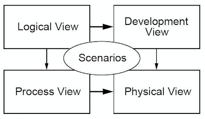
Every project kicks off with big ambitions, but there is never enough time to do things perfectly. At the end, we have to deliver whatever works. And that is a good thing — it is the way the environment helps us avoid gold plating, YAGNI, KISS, etc. so we do just enough and adapt to change. Looking back, I can say that most of the diagrams I've seen around are inspired by 4+1 view model of Philippe Kruchten which has Logical, Development, Process and Physical views.
 |
| 4+1 View Model |
I quite like the ideas and the motivation behind this framework: using separate views and perspectives to address a specific set of constraints and targeting the different stakeholders. That is a great way of describing complex software architectures. But I have two issues with using this model for integration applications.
Diagram Applicability
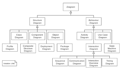
Typically, these views are expressed through UML, and for each view, you have to use one or more UML diagrams. The fact that I have to use 15 types of UML diagrams to communicate and express a system architecture in an accessible way defeats its purpose.
 |
| Death by UML |
With such a complexity, the chances are that there are only one or two people in the whole organisation who have the tools to create, and the ability to understand and maintain, these diagrams. And having hard to interpret, out-of-date diagrams is as useful as having out-of-date gibberish documentation. These diagrams are too complex and have limited value. They very quickly turn into a liability that you have to maintain rather than asset expressing the state of a constantly changing system.
Another big drawback is that the existing UML diagram types are primarily focused on describing object-oriented architectures rather than Pipes and Filters architectures. The essence of messaging applications is around interaction styles, routing, and data flow rather than structure. Class, object, component, package, and other diagrams are of less value for describing a Pipes and Filters based processing flows. Behavioural UML diagrams such as activity and sequence get closer, but they still cannot easily express concepts like filtering and content-based routing, which are fundamental parts of integration applications.
View Applicability
Having a different set of views for a system to address different concerns is a great way of expressing intent. But the existing views of the 4+1 model don't reflect the way we develop and deploy software nowadays.
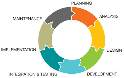
The idea that you have a logical view first, which then leads to development and process view, which lead to the physical view, is not always the case. The systems development lifecycle is not following the (waterfall) sequence of requirement gathering, designing, implementing, and maintaining.
 |
| Software Development Lifecycle |
Instead, other development methodologies such as agile, prototyping, synchronize and stabilize, and spike and stabilize are used, too. In addition to the process, the stakeholders are changing, too. With practices such as DevOps, developers have to know about the final physical deployment model, and ops has to know about the application processing flows, too. Modern architectures, such as microservices, affect the views, too. Knowing one microservice is in a plethora of services is not very useful. Knowing too much about all the services is not practical either. Having the right abstraction level to have a system-wide view with just enough details becomes vital.
Practical Visualisation for Integration Applications
The closest thing that has been working for me is described by Simon Brown as the C4 model. (You should also get a free copy of Simon's awesome The Art of Visualising Software Architecture book). In his model, Simon talks about the importance of a common set of abstractions, rather than common notation (such as UML), and then using a simple set of diagrams for the different levels of abstractions: system context diagram, container diagram, component diagram, and class diagram.
I quite like this "outside-in" approach, where you first have a 10,000-foot view and going deeper with more detailed views with each level. C4 is also not an exact match for middleware/integration applications either, but it is getting closer. If we were to use the C4 model, then system context diagrams would be one box that says ESB (or middleware, MOM, microservices) with tens of arrows from north to south. Not very useful.
The container diagram is quite close, but the term container is so overloaded (VM, application container, Docker container), which makes it less useful for communication. Component and class diagrams are also not a good fit, as Pipes and Filter architectures are focused around Enterprise Integration Patterns, rather than classes and packages.
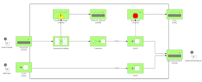
So at the end, what is it that worked for me? It is the following three types of diagrams, which I abbreviate as SSD (not as cool as C4): System Context Diagram, Service Design Diagram, and Deployment Diagram.
System Context Diagram
The aim of this model is to show all the services (whether they are SOA, Microservices, etc.) with their inputs and outputs. Ideally, the external systems are to the north, the services are in the middle section, and internal services are in the south.
Or, you could use both external and internal services on both sides of the middleware layer as shown below. Also having the protocol (such as HTTP, JMS, file) on the arrows, with the data format (XML, JSON, CSV) gives useful context too, but it's not mandatory. If there are too many services, you can leave the protocol and the data format for the service level diagrams. I use the direction of the arrow to indicate which service is initiating the call rather than the data flow direction.
 |
| System Context Diagram |
Service Design Diagram
 |
| Service Design Diagram |
Deployment Diagram
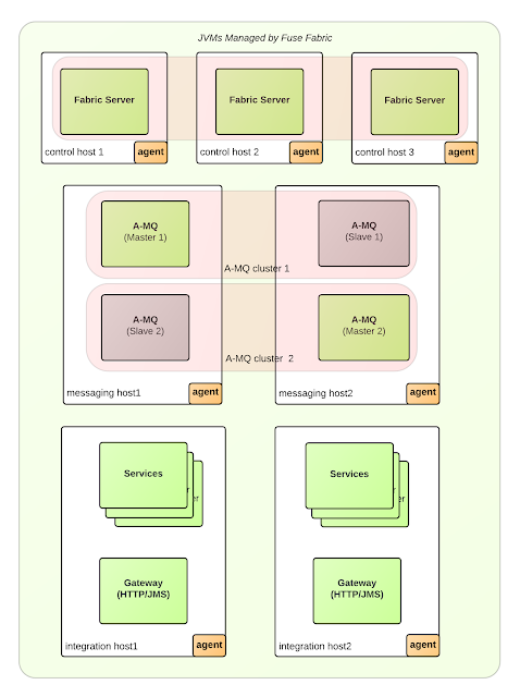
The previous two diagrams are the logical views of the system as a whole and each service separately. With the deployment diagram, we want to show where each service is going to be deployed. Maybe there will be multiple instances of the same service running on multiple hosts. Maybe some services will be active on one host and passive on the other. Maybe there will be a load balancer fronting the services, etc.
 |
| Deployment Diagram |
The deployment diagram is supposed to show how individual services and the system as a whole relates to the host systems (regardless whether that is physical or virtual).
What Tools Do I Use?
The System Context and the Deployment Diagrams are composed only of boxes and arrows and do not require any special tools. For the Service Design Diagram, you will need a tool that has the Enterprise Integration Pattern icons installed. So far, I have seen the following tools with EIP icon support:
- Mac OS: OmniGraffle with icons from graffletopia.This is what I've used to create all the diagrams for Camel Design Patterns book.
- Windows: Enterprise Architect by Sparx Systems with EIP icons by Harald Westphal. There are also MS Visio Stencils here.
- Web: LucidCharts, which ships EIP icons by default. That is the easiest tool to use, and it's accessible from everywhere. It is my favorite tool (with MS Visio import/export options for Windows users) and has free account plans to start with.
- Web: DrawIO another web tool with EIP icons. The beauty of this tool is that it forces you to use your own storage options for the diagrams, such as Google Drive, Dropbox, locally, etc., so you own the diagrams and keep them safe.
Other development tools that could be also used for creating EIP diagrams are:
- Red Hat JBoss Developer Studio.
- EIP Designer by Sirius.
- Talend Open Studio for ESB.
- Hawtio: The Camel plugin can visualize running Camel routes as EIP diagrams.
The System Context Diagram is useful to show the system-wide scope and reach of the services, the Service Design Diagram is good for describing what a service does, and the Deployment Diagram is useful mapping all that into something physical. In IT, we can expand work and fill up all the available time with things to do. I'm sure, given more time, we can invent 10 more useful views. But without the above three, I cannot imagine myself describing an integration application. As Antoine de Saint-Exupery put it long ago: "Perfection is finally attained not when there is no longer anything to add but when there is no longer anything to take away."
Published at DZone with permission of Bilgin Ibryam, DZone MVB. See the original article here.
Opinions expressed by DZone contributors are their own.

Comments