What, When, and How of Scatterplot Matrix in Python - Data Analytics
In this post, you will learn about some of the following in relation to scatterplot matrix.
Join the DZone community and get the full member experience.
Join For FreeIn this post, you will learn about some of the following in relation to scatterplot matrix. Note that scatter plot matrix can also be termed as pairplot. Later in this post, you would find Python code example in relation to using scatterplot matrix/pairplot (seaborn package).
- What is scatterplot matrix?
- When to use scatterplot matrix/pairplot?
- How to use scatterplot matrix in Python?
What Is Scatterplot Matrix?
Scatter plot matrix is a matrix (or grid) of scatter plots where each scatter plot in the grid is created between different combinations of variables. In other words, scatter plot matrix represents bi-variate or pairwise relationship between different combinations of variables while laying them in grid form. Here is a sample scatter plot matrix created using Sklearn Iris dataset.
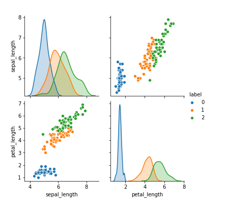
Scatter plot matrix is also referred to as pair plot as it consists of scatter plots of different variables combined in pairs. In above matrix of scatter plots, pay attention to some of the following:
- Diagonally from top left to right, the plots represent univariate distribution of data for the variable in that column.
- Other plots represent the pairwise scatter plots between sepal length and petal length.
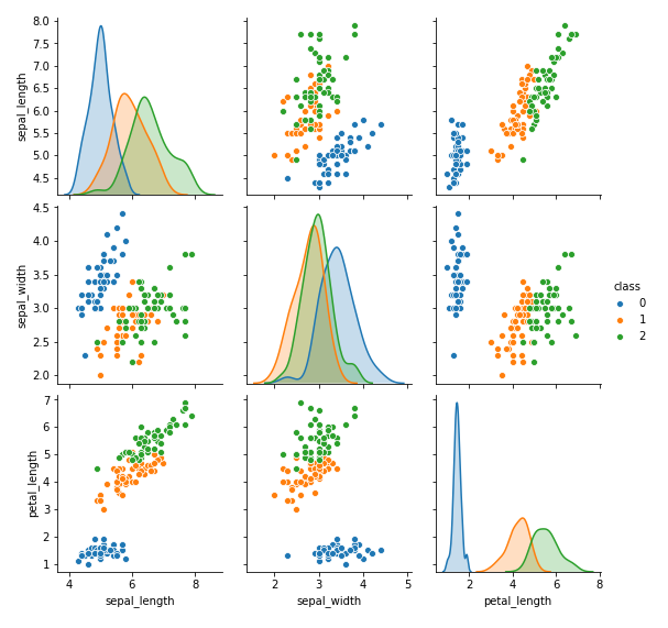
Here is another representation of pair plots comprising three different variables.
When to use Scatterplot Matrix/Pairplot?
Scatterplot matrix can be used when you would like to assess some of the following:
- Features correlation: Assess pairwise relationships between three or more variables. This is important to understand relationships between different features when building machine learning model
- Multicollinearity: Assess the collinearity / multi-collinearity by analyzing the correlation between two or more variables. Recall that multi-collinearity can result in two or more predictor variables that might be providing the same information about the response variable thereby leading to unreliable coefficients of the predictor variables (especially for linear models).
- Data is linearly separable?: Assess whether the data is linearly separable or not. The data which is linearly separable can be separated using a linear line. The data which isn't linearly separable would need to be applied with kernel methods. Thus, it may help determine machine learning algorithm one would want to use.
One can analyse the pairwise relationship at several stages of machine learning model pipeline including some of the following:
- Data analysis
- Before and after feature transformations
- Feature engineering
- Feature selection
Scatterplot Matrix Python Code Example
In this section, the usage of seaborn package's pairplot method is represented. By default, the pairplot function creates a grid of Axes such that each numeric variable in data is shared in the y-axis across a single row and in the x-axis across a single column. Here is the sample code representing pairplot:
import pandas as pd
import numpy as np
import matplotlib.pyplot as plt
import seaborn as sns
from sklearn import datasets
#
# Load iris dataset
#
iris = datasets.load_iris()
#
# Create dataframe using IRIS dataset
#
df = pd.DataFrame(iris.data)
df.columns = ['sepal_length', 'sepal_width', 'petal_length', 'petal_width']
df['class'] = iris.target
#
# Create pairplot of all the variables with hue set to class
#
sns.pairplot(df, hue='class')
plt.show()
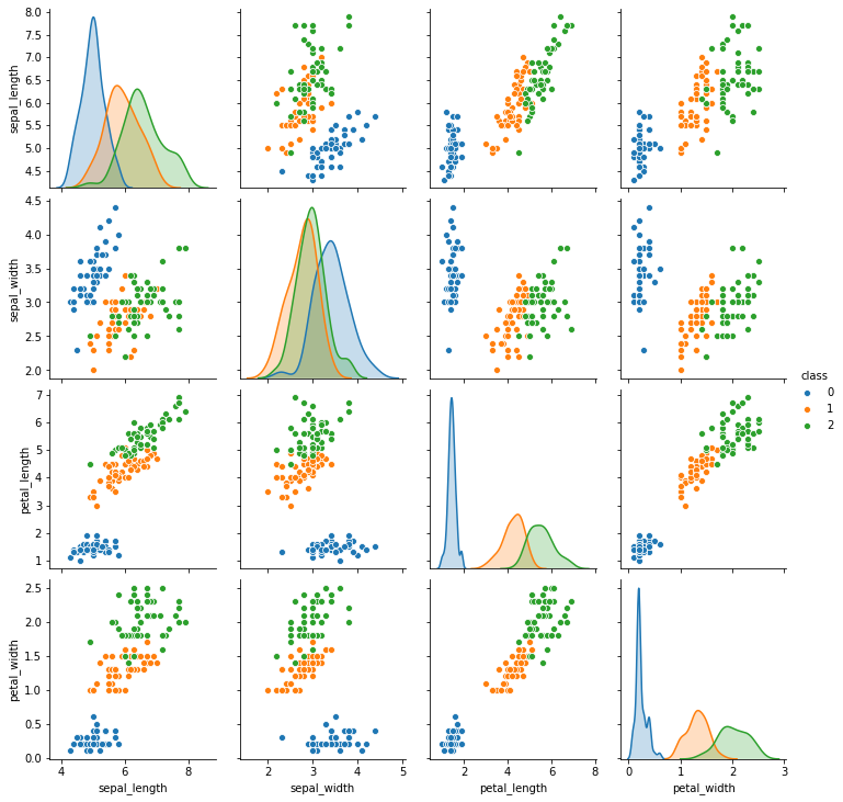
Pay attention to the usage of hue parameter which is passed categorical variable and used to map plot aspects to different colors. It is also possible to show a subset of variables or plot different variables on the rows and columns. Usage of vars parameter helps plot only a subset of variables as shown in the code below. The plots in fig1 and fig 2 represents usage of subset of variables for pairplot.
xxxxxxxxxx
sns.pairplot(df, hue='class', vars=['sepal_length', 'sepal_width', 'petal_length'])
plt.show()
References
Conclusions
Here are some learning from this post:
- Use scatter plot matrix or pairplot for assessing pairwise or bi-variate relationship between different predictor variables
- Use scatter plot matrix or pairplot for analyzing the multicollinearity between predictor variables
- Use scatter plot matrix or pairplot for assessing whether the data is linearly separable or otherwise.
Published at DZone with permission of Ajitesh Kumar. See the original article here.
Opinions expressed by DZone contributors are their own.
Comments