Working With Bootstrap 4 Grid System for Creating Responsive Layouts
The world is moving increasingly to responsive design. Here are a few neat examples with Bootstrap 4 Grid System and responsive design.
 ·
·
Join the DZone community and get the full member experience.
Join For FreeBefore going in depth discussion about Bootstrap 4 Grid style, let us first understand what is Bootstrap 4 Grid system and how it basically works.
Bootstrap Grid systems are highly advance designing features that work together with CSS, CSS3, HTML5, and HTML coding styles too that encourages every web developer and designer to validate any website content in a proper designing manner. The Bootstrap 4 grid system enables every professional to pitch the screen size into multiple rows and columns to design and create a variety of layouts for different websites in a unique way to fast user engagung process.
Bootstrap Grid Sytem enables an advanced row and column creation process where each column width Created by web developers and designers differs in screen sizes accordingly, as and when displayed. Bootstrap is basically a responsive process where each row may be adjusted at certain breakpoints, or can be displayed according to fluid working styles across wide number of viewports. Further, it encourages every developer and designer to design multiple rows depending on the website designing patterns. The following Bootstrap example works in terms of 4rem and em units with a new tier -sm added to it that can easily target numerous of mobile devices.
This article is more focused towards describing the working structure of Bootstrap Grid concepts where you will learn more about working methods of Grid systems and various ways to apply them to any website as well as in your projects.
Have a Look at Basic Bootstrap Grid Coding Examples:
<!DOCTYPE html>
<html lang="en">
<head>
<meta charset="utf-8">
<meta name="viewport" content="width=device-width,initial-scale=1">
<title>Basic Grid System</title>
<link rel="stylesheet" href="https://maxcdn.bootstrapcdn.com/bootstrap/3.3.6/css/bootstrap.css">
<!--[if lt IE 9]>
<script src="https://oss.maxcdn.com/html5shiv/3.7.2/html5shiv.min.js"></script>
<script src="https://oss.maxcdn.com/respond/1.4.2/respond.min.js"></script>
<![endif]-->
</head>
<body>
<!-- Content Section here -->
</body>
</html>
So, what's new in Bootstrap 4 Grid System
Now let's have a look:
We know that Bootstrap is originally the most advanced version of HTML, CSS, JS framework that is involved in building responsive and mobile first websites for web projects.
Below is the sample code for Bootstrap 4 Grid System:
<div class="bs-example">
        <!-- Bootstrap Grid -->
        <div class="row  show-grid">
          <div class="col-xs-1">.col-xs-1</div>
          <div class="col-xs-1">.col-xs-1</div>
          <div class="col-xs-1">.col-xs-1</div>
          <div class="col-xs-1">.col-xs-1</div>
          <div class="col-xs-1">.col-xs-1</div>
          <div class="col-xs-1">.col-xs-1</div>
          <div class="col-xs-1">.col-xs-1</div>
          <div class="col-xs-1">.col-xs-1</div>
          <div class="col-xs-1">.col-xs-1</div>
          <div class="col-xs-1">.col-xs-1</div>
          <div class="col-xs-1">.col-xs-1</div>
          <div class="col-xs-1">.col-xs-1</div>
        </div>
        <div class="row  show-grid">
          <div class="col-xs-2">.col-xs-2</div>
          <div class="col-xs-3">.col-xs-3</div>
          <div class="col-xs-7">.col-xs-7</div>
        </div>
        <div class="row show-grid">
          <div class="col-xs-4">.col-xs-4</div>
          <div class="col-xs-4">.col-xs-4</div>
          <div class="col-xs-4">.col-xs-4</div>
        </div>
        <div class="row show-grid">
          <div class="col-xs-5">.col-xs-5</div>
          <div class="col-xs-7">.col-xs-7</div>
        </div>
        <div class="row show-grid">
          <div class="col-xs-6">.col-xs-6</div>
          <div class="col-xs-6">.col-xs-6</div>
        </div>
        <div class="row show-grid">
          <div class="col-xs-12">.col-xs-12</div>
        </div>
</div>
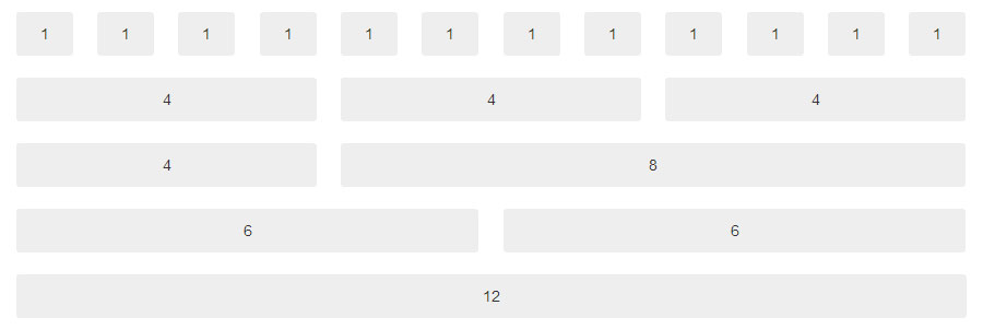
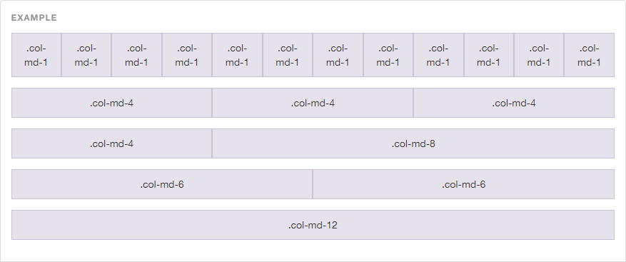
Here is your output for above code:

Numbers mentioned at the end of each class name signify the total number of columns.
.col-xs-1 spans one column and .col-xs-8 spans eight columns.
xs means colspan applies to extra small devices.
sm, md, and lg for small, medium, and large respectively
Grid systems are highly advanced HTML and CSS designing processes that insert multiple rows as well as columns with advance layout designing flexibilities. Well, typically, as we know, Bootstrap Grid Systems can have up to 12 columns that allow every web designer and developer to specify how these columns can scale up rows and columns for different viewport sizes.
Points to Be Considered When Working With Bootstrap Grid System:
Containers
Grids should be placed within the container to be written as.containerclass or as .container-fluid class for padding and alignment styles.
Rows and Columns
Rows comes with multiple columns that contains content section.
Padding
Padding comprises of columns that are offset by a negative margin on the row.
Working With More Than 12 Columns Per Row
In this situation, columns will be wrapped up into the next line where columns will be wrapped up into one group.
Working With Less Than 12 Columns Per Row
Designers can refer using any number of columns up to 12 .
Grid Classes
Grid classes are generally applied to devices with various screen width sizes that are either greater or equal to numerous of breakpoint sizes. Breakpoints are known as resolutions that are further divided into four sections:
< 768px Extra small devices Phones
≥ 768px Small devices Tablets
≥ 992px Medium devices Desktops
≥ 1200px Large devices Desktops
Multiple Classes
Signifies a class="col-sm-10 col-md-6" that specifies 10 columns for small viewports and 6 columns for medium as well as large viewports.
Given a Thought on How Bootstrapn 4 Grid System can be Used to Create Responsive Websites? No? We'll Have a Look on Further:
Every Bootstrap Grid System are Used as Dynamic and Flexible Layout Processes by Using Four Classes Such As:
xs (for extra small screen display such as phones)
sm (for small screen tablets)
md (for medium screen desktops)
lg (for large screen display such as desktops)
Setting Up Grids Patterns for Different Screen Sizes
Lets have a look on this topic that will include various screen sizes such as desktop, tablet and mobile devices. Below given examples will make you aware of the basic Bootstrap Grid coding structure for different devices.
Here, initially we create a new HTML file and allot a name: “grids_view.html.” Our basic HTML markup will look something like:
<!DOCTYPE html>
<html lang="en">
<head>
<meta charset="utf-8">
<meta name="viewport" content="width=device-width,initial-scale=1">
<title>How to Set up Grid For Multiple Screens</title>
<link rel="stylesheet" href="https://maxcdn.bootstrapcdn.com/bootstrap/3.3.6/css/bootstrap.css">
<style>
/*Your website style will come here*/
</style>
</head>
<body>
<!-- Your website content will come here -->
</body>
</html>
Next code is based on desktop view, tablet, and mobile display as well.
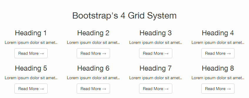
Now let me first introduce you guys to how Bootstrap will look like on desktop view:
- Used classes with prefix “col-md-*” – that re-sizes column in desktop screens.
- It is recommended to prefer using col-lg-* and col-xl-* prefixes.
- Prefixes col-md-*, cold-lg-* and col-xl-* comes under different grid sizes that are used to create columns for medium, large and extra large display screens.
- Desktop view contains a div container and a row class.
- Inside the div container, you will get to see 8 columns using the ‘col-md-3′ class feature.
- For each column, setting up h3 tag is esential.
- ‘col-md-12′ class are placed in the desktop view to expand the header section all over the screen.
<div class="container">
<div class="row">
<header class="col-md-12 text-center">
<h2>Bootstrap's 4 Grid System</h2>
</header>
<div class="col-md-3 text-center">
<h3>Heading 1</h3>
Lorem ipsum dolor sit amet..
<a class="btn btn-default" href="#">Read More →</a>
</div>
<div class="col-md-3 text-center">
<h3>Heading 2</h3>
Lorem ipsum dolor sit amet..
<a class="btn btn-default" href="#">Read More →</a>
</div>
<div class="col-md-3 text-center">
<h3>Heading 3</h3>
Lorem ipsum dolor sit amet..
<a class="btn btn-default" href="#">Read More →</a>
</div>
<div class="col-md-3 text-center">
<h3>Heading 4</h3>
Lorem ipsum dolor sit amet..
<a class="btn btn-default" href="#">Read More →</a>
</div>
<div class="col-md-3 text-center">
<h3>Heading 5</h3>
Lorem ipsum dolor sit amet..
<a class="btn btn-default" href="#">Read More →</a>
</div>
<div class="col-md-3 text-center">
<h3>Heading 6</h3>
Lorem ipsum dolor sit amet..
<a class="btn btn-default" href="#">Read More →</a>
</div>
<div class="col-md-3 text-center">
<h3>Heading 7</h3>
Lorem ipsum dolor sit amet..
<a class="btn btn-default" href="#">Read More →</a>
</div>
<div class="col-md-3 text-center">
<h3>Heading 8</h3>
Lorem ipsum dolor sit amet..
<a class="btn btn-default" href="#">Read More →</a>
</div>
</div>
</div>
Next section will show you how Bootstrap looks like in tablet view. This totally depends on whether you want to display your website in landscape view or portrait view.
Landscape view can be achieved using the col-md-* classes.
Portrait view can be achieved by using col-sm-* classes such as the col-sm-6 class.
To achieve tablet view, simply replace
<div class="col-md-3 text-center">with the following line of code:
<div class="col-md-3 col-sm-6 text-center">And at last, to achieve the mobile view, you’ll have to use the col-xs-12 class. For this part, you’ll have to use the same code as written above, and just need to replace
<div class="col-md-3">with the following line of code:
<div class="col-md-3 col-sm-6 col-xs-12 text-center">Responsive Website Output
After executing the code, this is how your website design will appear in various devices:
Use Grid Layouts with WordPress and Bootstrap
In our next section, we will have a deep look on what all are needed to work with grid layouts with Wordpress and Bootstrap features?
I will proceed with the coding example that will take you into the depth of working with grid layout systems with designing solutions with respect to functionalities, organizations, as well as the responsive design process. How you can create enhanced grid layouts of numerous featured images on your index as well as category pages in Wordpress?
Example of Grid Layout
Defining Bootstrap with the help of example:
Output of above example:
So, what do you mean by designing responsive layouts with Bootstrap 4?
Responsive Bootstrap web designing web design is a process of designing and developing websites to enable a better accessibility and viewing experience with optimal results to users who are accessing websites online.
In this high-paced responsive designing process, the growing trend of access to smartphones and tablets by every user has become truly unavoidable for them and hence your web designing style needs to be more responsive and more attracrtive with proper site optimization techniques. Responsive web designing methods are more prone to be an efficient and an alternative option for every developers to target a huge number of devices by engaging more users instantly with minimum amount of efforts needed.
Responsive layouts automatically adjust and adapts to numerous random device screen size, whether it is a desktop, a laptop, a tablet, or a mobile phone.
Creating Responsive Layout with Bootstrap
Developing and designing responsive websites has become much easier than before with the help of Bootstrap 4 Responsive designing patterns as it is free of applying any additional style sheets to enable a responsive feature. Bootstrap 4 is highly responsive as well as offering mobile-friendly designing patterns. Its advanced four tier grid classes offers advanced controlling functionalities over the layout by rendering them on various types of devices that deals with mobiles, tablets, desktop, laptops, LCD screen devices.

Working With Bootstrap 4 Responsive Embed
Bootstrp 4 Responsive works with adjustments of scaling videos as well as various profound media formats with containing block. Bootstrap's responsive embed component deals with easy video scaling process and various slide shows.
It is used as following coding style:
<iframe>,<video>,<object>, and<embed>elements.

Further ther is a step to validate the responsive embed component to one of the above mentioned elements by wrapping the elements within. It can be achieved as follows:
A<div>element with the.embed-responsiveclass, along with an intrinsic ratio class (eg,.responsive-embed-16by9or.responsive-embed-4by3).
<div class="embed-responsive embed-responsive-16by9">
<iframe class="embed-responsive-item" src="//www.youtube.com/embed/wMuNjnNyaiA" allowfullscreen
</iframe>
</div>
Bootstrap Responsive Utilities
Bootstrap Responsive Utiliy classes enables a proper and crystal clear visibility of bootstrap elements on various devices by adjusting screen sizes into specific ranges.
For v3.2.0 visibility option, the .visible-*-* classes for each breakpoint is defined into three variations, one for each CSSdisplay property value:
inline property value
block property value
inline-block property value.
CLASS | DESCRIPTION |
| Element are visible on extra small screen width that is less than |
| Element are visible only on small screen width that is greater than or equal to |
| Element are visible only on medium screen width that is greater than or equal to |
| Elements are visible only on large screen width that is greater than or equal to |
Opinions expressed by DZone contributors are their own.
Comments