DZone
Thanks for visiting DZone today,
Edit Profile
  • Manage Email Subscriptions
  • How to Post to DZone
  • Article Submission Guidelines
Sign Out View Profile
  • Post an Article
  • Manage My Drafts
Over 2 million developers have joined DZone.
Log In / Join
Refcards Trend Reports
Events Video Library
Refcards
Trend Reports

Events

View Events Video Library

Zones

Culture and Methodologies Agile Career Development Methodologies Team Management
Data Engineering AI/ML Big Data Data Databases IoT
Software Design and Architecture Cloud Architecture Containers Integration Microservices Performance Security
Coding Frameworks Java JavaScript Languages Tools
Testing, Deployment, and Maintenance Deployment DevOps and CI/CD Maintenance Monitoring and Observability Testing, Tools, and Frameworks
Culture and Methodologies
Agile Career Development Methodologies Team Management
Data Engineering
AI/ML Big Data Data Databases IoT
Software Design and Architecture
Cloud Architecture Containers Integration Microservices Performance Security
Coding
Frameworks Java JavaScript Languages Tools
Testing, Deployment, and Maintenance
Deployment DevOps and CI/CD Maintenance Monitoring and Observability Testing, Tools, and Frameworks

The software you build is only as secure as the code that powers it. Learn how malicious code creeps into your software supply chain.

Apache Cassandra combines the benefits of major NoSQL databases to support data management needs not covered by traditional RDBMS vendors.

Generative AI has transformed nearly every industry. How can you leverage GenAI to improve your productivity and efficiency?

Modernize your data layer. Learn how to design cloud-native database architectures to meet the evolving demands of AI and GenAI workloads.

  1. DZone
  2. Refcards
  3. Design Systems
refcard cover
Refcard #281

Design Systems

The importance of UX is exponentially growing, which means that collaboration between design and development teams is a must. Design systems help foster this collaboration. In this Refcard, you’ll learn about the four stages of design-development collaboration, the anatomy of a design system, the benefits of using a design system, and the future of design systems.

Free PDF for Easy Reference
refcard cover

Written By

author avatar George Abraham
Sr. Product Manager / Design Principal, Infragistics Inc.
Table of Contents
► Evolving Stages of Collaboration Between Design and Development ► The Anatomy of a Design System ► Benefits of Using a Design System ► What’s the Future for Design Systems?
Section 1

Evolving Stages of Collaboration Between Design and Development

Design and development represent core functional disciplines within software product teams, and each discipline has evolved rapidly on its own. And while there are mature solutions targeting designers or developers exclusively, solutions targeting a design-to-develop story are still in their infancy.

From a business success standpoint, enterprises acknowledge the need to deliver compelling UX in their applications. However, delivering compelling UX requires a high degree of collaboration between design and development. And this level of collaboration can prove expensive given the remote and distributed nature of modern work. The cost of delivering UX is also compounded by other factors, like the effort required to communicate design intent and for transforming visual specifications into code, to name a few. Unless we bring down these costs, it may be infeasible to deliver on compelling UX even for the most willing enterprises.

In recent years, design systems have emerged as a solution to improve collaboration between design and development. The design system approach has been embraced by organizations like Salesforce.com, IBM, Atlassian, etc. and serves as testament to its appeal.

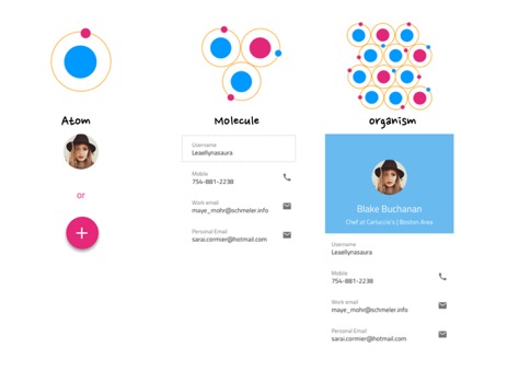
A design system, in simple terms, represents a deliberate inventory of UX patterns and brand style guide which are then realized as matching software components that can be reused or contextualized for building software applications. A design system can also be extended to contain voice and tone guidance for writing content, page templates, and even user flows. It is handcrafted for each organization’s specific application domain and usage context. Above all, it serves as a single source of truth for product teams when building applications and represents a collaboration-contract between design and development.

In this article, we will review:

  • Stages of design-development collaboration
  • The anatomy of a design system
  • Benefits of using a design system
  • The future for design systems

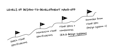
Before diving into design systems, let’s review how the collaboration artifacts between design and development have progressed. We can classify this broadly into four levels:

  1. Static visual specifications
  2. Interactive visual specifications (inspect)
  3. Visual specifications linked to UI components (design systems)
  4. Generating components from visual specifications (design systems +)

In all levels, it is assumed that some form of design activity precedes development. That is, specifications for the UIs and flows are created prior to development.

Image title

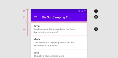
Level 1: Static Visual Specifications

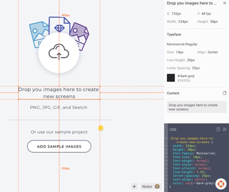
This form of design-to-development communication is most common. At this level, visual mock-ups are created using tools used by visual designers (e.g. Sketch, Adobe XD). The specifications for styles, layout, sizing, etc. are added as annotations on top of the mocks for review.

Image title

Vertical spacing guidance — Google Material Design

Developers refer to this documentation as part of their development process and manually transfer this into code form. This approach is okay for custom one-off projects that don’t need to be maintained.

Level 2: Interactive Visual Specifications (Inspect)

At this level, the visual design team is still sharing mockups and style guides with developers, but instead of a static document, they rely on tooling to provide the specs in a more accessible format. Using tools such as Zeplin.io, designers can upload their designs without taking the effort to markup the designs and developers can then view designs in the browser. More importantly, as they click on the design, developers can view the specifications on demand — even in a format that aligns with the target platform (e.g. HTML, CSS).

Image title

Viewing design specifications on demand using Zeplin.io

The key benefit of this approach is that designers don’t have to worry about manually adding annotations, and developers can still grab assets and specifications for any part of the UI. However, it’s not directly linked to any software components that are used by the organization.

Level 3: Visual Specifications Linked to UI Components

At this level, we can expect that design and development have collaboratively created an inventory of styles, layouts, and UI components that are relevant for their app domain; in other words, a design system. At this stage, design teams tend to create designs using a UI kit that reflects the design system. UI kits are collections of reusable visual design elements created using the design tool itself (e.g. Sketch) and match the components in the codebase. This makes it easier for the development team to implement the designs because matching UI components exist.

Image title

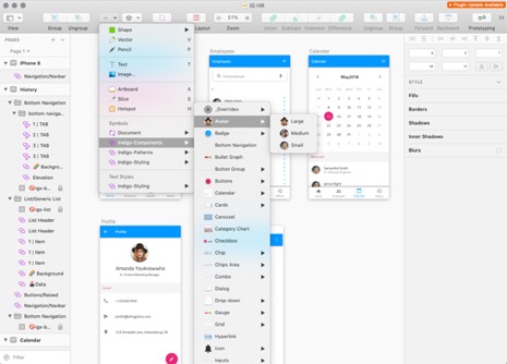
UI kit for the Indigo.Design System for use in the Sketch App

This by no means implies that the application is done. It’s just that developers can re-construct the mockups in code more easily. As you can tell, developers will still need to write UI code to make it looks like what’s specified, but at least they are doing it using reusable components that they know exist. This approach also reduces potential for miscommunication.

However, the bigger issue is that not all organizations have invested in a design system, so this level of collaboration is still in the future for most.

Level 4: Generating Components From Visual Specifications

Having a design system does not automatically ensure that UIs can be quickly created, but it makes it easier. Within the enterprise, an application may get updated over time (versions) and the UI updates may not be that significant. This reduces the dependence on generating complete UIs. However, for those organizations that are getting started with large migration projects — for example, moving desktop apps to web apps — being able to create UIs in a visual tool and then generating “good” UI code is significant in terms of cost-savings.

Image title

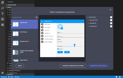
Generating components or UIs from visual specs using the Indigo.Design Code generator

Solutions like Indigo.Design aim to kick-start a design system for organization who don’t have one, and at the same time help generate the new UI components for a target platform (e.g. Angular). The additional ability to generate layouts for the components is unique. Using the Indigo.Design approach, designers can create their mockups using the Indigo.Design UI kit and developers can use a code generator extension in their IDE to select and generate components from the mock-ups.

Section 2

The Anatomy of a Design System

Now that we have a better idea of where a design system fits in the design to development story, let’s see how it’s structured.

A design system uses an approach for building scalable elements that can be best illustrated as atoms, molecules, and organisms. It’s generally referred to as the Atomic Design Methodology created by Brad Frost. It has become a popular approach for describing the structure of a design system.

Image title

Illustrating the atom-molecule-organism concept with examples

Returning to the metaphor of atoms, molecules, and organisms, you start by designing the tiniest component (e.g. button, avatar, label, heading, etc.). This tiniest component is referred to as an atom.

Going one level deeper, atoms consist of particles such as protons and neutrons. For a design system, this can be mapped to the base color palette and typography, which define the brand identity for the organization.

Going one level up from atoms, you have molecules, which are composed of atoms. Molecules can be mapped to components and represent more complex structures such as menu item, list item, and dropdown item.

Then, by combining layouts and multiple components, we get next hierarchal unit: UX patterns. If we’re sticking to our biological comparison, that brings us to organisms. These encapsulate UX best practices by following “good” design principles and are built for the specific needs of a product.

The point of illustrating design systems as atoms, molecules, and organisms is to draw parallels with a living system. A design system should not be static and never-changing — it should reflect the product’s UX needs and constantly evolve with the product and technologies used. New requirements emerge because of new device layout requirements. New product features and brand identity changes are inevitable. We must be sure that our design system is flexible and ready to change for us to adapt to these changes.

Section 3

Benefits of Using a Design System

Standardized UX

One of the strongest benefits of a design system is preserving consistency around different devices, products, and sub-products, as well as coordinate with marketing and branding.

A common source of inconsistency is when different developers and designers are involved in the development of the product. Meanwhile, the increasingly decentralized nature of work, even across time zones, makes it expensive to do 1:1 reviews. With a design system in place, designers and developers can work independently in their own tools without requiring low-level checks around design implementation. They can instead focus on high-value interactions around outcomes.

From the customer’s perspective, meaningful consistency across applications offered by the same organization allows users to reuse what they’ve learned from past interactions with apps.

As Diana Mounter from GitHub puts it:

  • "Design systems bring order to chaos. Everyone is kept on the same page, so the entire product remains consistent and polished throughout.
  • Design systems improve the user experience through the repeated use of familiar and proven patterns. Designing anything from scratch leaves room for error, so try to use what already works.
  • Design systems improve workflow efficiency. Product teams know exactly how components of new features should look and how to implement them."

Shared Vocabulary Between Design and Development

While consistency is a big win, something as simple as mutually agreed upon naming for components and patterns can go a long way. This is helpful for current users of the design system and also for onboarding future members. Making the naming convention explicit and shared makes it easier for both developers and designers to find the components in their respective tool environments.

Over time, the names for the UX patterns will start surfacing in conversations, serving as a surrogate for user requirements. For example, when someone mentions we should use a combo-box component, it’s clear to both designers and developers what type of behavior it supports and how it can help with the user’s task experience. Since a design system documents a component as a pattern, it usually explains when to use a specific component and how to use it the right way — with examples. So, in that sense, a design system can fulfill the need for approachable UX guidance, thus evangelizing design practices.

Speed Up Design Process and Development

Speed to delivery is an explicit benefit of reusing components in a design system. From a design perspective, efficiencies come from not having to create new components or patterns since they are already part of the design system UI kits. Even when faced with the need to create a new complex pattern, designers can rely on the design system guidelines and build something using the “atoms” or “molecules” already available. From a developer’s point-of-view, being able to generate the code for this component or pattern helps avoid inconsistency between design specs and code.

Learning speed is a not-so-obvious benefit of using a design system approach. Now that designers are freed up from pixel crafting, they can return to the true design process, focusing on designing user journeys or flows and evaluating them with users. The approach used for creating design deliverables can also be used to produce interim prototypes for usability testing and getting feedback from stakeholders.

Section 4

What’s the Future for Design Systems?

As we discussed, design systems offer common knowledge that can help align design and development. It’s a forum where teams can codify (as much they can) best practices. And since it’s supposed to be a living system, it also provides opportunities for new patterns and requirements to be discussed and then absorbed. More importantly, a design system is not just a repository, but a way to collaborate. However, it’s not a silver bullet for challenges faced by designers and developers when collaborating, nor does the existence of a design system preclude meaningful conversation between the two disciplines.

The biggest challenge for many enterprises is to get started with a design systems approach. For those who already have wide variety of apps in the wild, the initial phase is a tedious one. While there are several design systems available for reference, each has been created for its own parent organization. At the same time, they also share a lot in common with UX patterns and best practices, so there is a need for tooling and services to help organizations quickly create their own design system, rather than blindly copying.

It’s important to note that a design system is not just a set of UX best practices and UI kits. You also need matching UI components on the development side. While the design systems movement has traditionally been championed by design teams within large organizations, for it to truly succeed, the development team also needs to become a co-owner/contributor of the design system.

Also, the atoms-molecules-organisms structure is only a starting point for design systems; it does not have to stop there. It can contain additional information on how the apps are supposed to behave. The following is a list of potential candidates for inclusion in a design system, which by no means is exhaustive:

  • Interaction design guidance describes how users will interact with the applications, (gesture driven, mouse-and-keyboard driven, etc.). It outlines the do’s and don’ts.
  • Motion and transitions are becoming increasingly common to provide a level of dynamism and delight when using apps. However, while we may understand some of the transitions in isolation, it’s good to standardize it for the apps (e.g., slide transition for master-detail transition).
  • User stories can help document how some of the common or specialized tasks have been realized in the app. It can serve as inspiration for new designs.
  • Reference apps show how the different pieces of a design system can work together.

Like This Refcard? Read More From DZone

related article thumbnail

DZone Article

Enhancing Business Decision-Making Through Advanced Data Visualization Techniques
related article thumbnail

DZone Article

Event Driven Architecture (EDA) - Optimizer or Complicator
related article thumbnail

DZone Article

Rust, WASM, and Edge: Next-Level Performance
related article thumbnail

DZone Article

Proactive Security in Distributed Systems: A Developer’s Approach
related refcard thumbnail

Free DZone Refcard

Getting Started With Low-Code Development
related refcard thumbnail

Free DZone Refcard

JavaScript Test Automation Frameworks
related refcard thumbnail

Free DZone Refcard

Salesforce Application Design
related refcard thumbnail

Free DZone Refcard

E-Commerce Development Essentials

ABOUT US

  • About DZone
  • Support and feedback
  • Community research
  • Sitemap

ADVERTISE

  • Advertise with DZone

CONTRIBUTE ON DZONE

  • Article Submission Guidelines
  • Become a Contributor
  • Core Program
  • Visit the Writers' Zone

LEGAL

  • Terms of Service
  • Privacy Policy

CONTACT US

  • 3343 Perimeter Hill Drive
  • Suite 100
  • Nashville, TN 37211
  • support@dzone.com

Let's be friends: