That’s where another open-source tool, Sysdig, comes into play. It’s a Linux visibility tool with powerful command line options that allow you to control what to look at and display it. You can also use Sysdig Inspect, an electron-based open-source desktop application, for an easier way to start. Sysdig also has the concept of chisels, which are pre-defined modules that simplify common actions.
Once you install Sysdig as a process or a container on your machine, it sees every process, every network action, and every file action on the host. You can use Sysdig “live” or view any amount of historical data via a system capture file.
As a next step, we can take a look at the total CPU usage of each running container:
\$ sudo sysdig -c topcontainers\_cpu
CPU% container.name
----------------------------------------------------
90.13% mysql
15.93%  wordpress1
7.27% haproxy
3.46% wordpress2
...
This tells us which containers are consuming the machine’s CPU. What if we want to observe the CPU usage of a single process, but don’t know which container the process belongs to? Before answering this question, let me introduce the -pc (or -pcontainer) command line switch. This switch tells Sysdig that we are requesting container context in the output.
For instance, Sysdig offers a chisel called topprocs_cpu , which we can use to see the top processes in terms of CPU usage. Invoking this chisel in conjunction with -pc will add information about which container each process belongs to.
\$ sudo sysdig -pc -c topprocs\_cpu
As you can see, this includes details such as both the external and the internal PID and the container name.
Keep in mind that -pc will add container context to many of the command lines that you use, including the vanilla Sysdig output.
By the way, you can do all of these actions live or create a “capture” of historical data. Captures are specified by:
$ sysdig –w myfile.scap
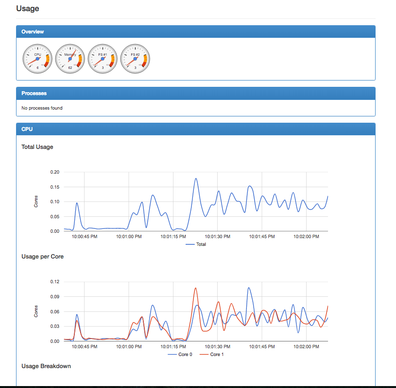
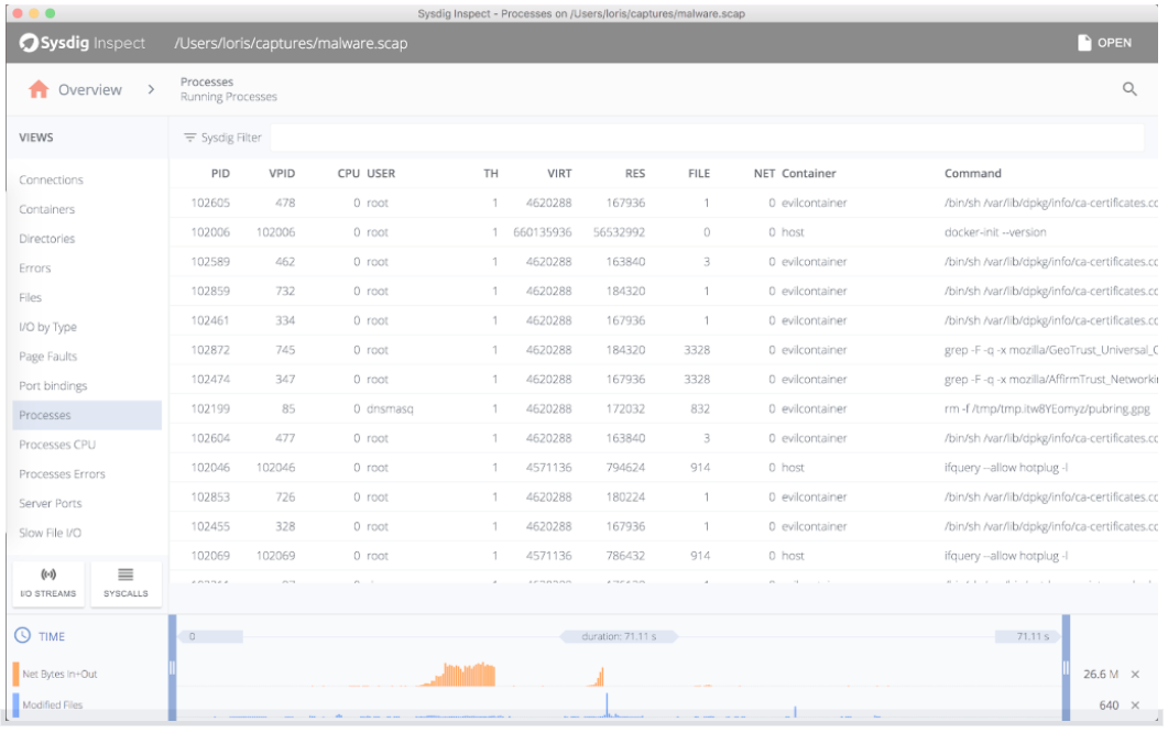
And then analysis works exactly the same. With a capture, you can also use Sysdig Inspect, which doesn’t have the power of the command line but the simplicity of a GUI:
Now, continuing: What if we want to zoom into a single container and only see the processes running inside it? It’s just a matter of using the same topprocs_cpu chisel, but this time with a filter:
$ sudo sysdig -pc -c topprocs\_cpu container. name=client
CPU% Process container.name
----------------------------------------------
02.69% bash client
31.04%curl client
0.74% sleep client
Compared to docker top and friends, this filtering functionality gives us the flexibility to decide which containers we see. For example, this command line shows processes from all the WordPress containers:
$ sudo sysdig -pc -c topprocs_cpu container.name contains wordpress
CPU% Process container.name
--------------------------------------------------
6.38% apache2 wordpress3
7.37% apache2 wordpress2
5.89% apache2 wordpress4
6.96% apache2wordpress1
So, to recap, we can:
- See every process running in each container including internal and external PIDs.
- Dig down into individual containers.
- Filter to any set of containers using simple, intuitive filters.
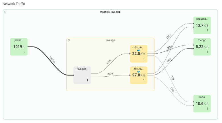
…all without installing a single thing inside each container. Now, let’s move on to the network, where things get even more interesting.
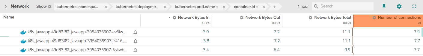
We can see network utilization broken up by process:
sudo sysdig -pc -c topprocs\_net\
Bytes Process Host\_pid Container\_pid container.name
----------------------------------------------------
72.06KB haproxy 738513
haproxy\
56.96KB docker.io 17757039
host\
44.45KB mysqld 699591
mysql\
44.45KB mysqld 699599
mysql\
29.36KB apache2 7893124
wordpress1\
29.36KB apache2 26895126
wordpress4\
29.36KB apache2 26622131
wordpress2\
29.36KB apache2 27935132
wordpress3\
29.36KB apache2 27306125
wordpress4\
22.23KB mysqld 699590
mysql\
Note how this includes the internal PID and the container name of the processes that are causing most network activity, which is useful if we need to attach to the container to fix stuff. We can also see the top connections on this machine:
sudo sysdig -pc -c topconns\
Bytes container.name Proto Conn
---------------------------------------------------
22.23KB wordpress3 tcp
172.17.0.5:46955->172.17.0.2:3306
22.23KB wordpress1 tcp
172.17.0.3:47244->172.17.0.2:3306
22.23KB mysql tcp
172.17.0.5:46971->172.17.0.2:3306
22.23KB mysql tcp
172.17.0.3:47244->172.17.0.2:3306
22.23KB wordpress2 tcp
172.17.0.4:55780->172.17.0.2:3306
22.23KB mysql tcp
172.17.0.4:55780->172.17.0.2:3306
14.21KB host tcp
127.0.0.1:60149->127.0.0.1:80
This command line shows the top files in terms of file I/O and tells you which container they belong to:
\$ sudo sysdig -pc -c topfiles\_bytes\
Bytes container.name Filename
---------------------------------------------------
63.21KB mysql/tmp/\#sql\_1\_0.MYI\
6.50KB client /lib/x86\_64-linux-gnu/libc.so.6\
3.25KB client  /lib/x86\_64-linux-gnu/libpthread.so.0\
3.25KB client /usr/lib/x86\_64-linux-/lib/x86\_64-linux-gnu/libgcrypt.so.11\
3.25KB client /usr/lib/x86\_64-linux-gnu/libwind.so.0\
3.25KB client /usr/lib/x86\_64-linux-gnu/libgssapi\_krb5.so.2\
3.25KB client /usr/lib/x86\_64-linux-gnu/liblber-2.4.so.2\
3.25KB client /lib/x86\_64-linux-gnu/libssl.so.1.0.0\
3.25KB client /usr/lib/x86\_64-linux-gnu/libheimbase.so.1\
3.25KB client /lib/x86\_64-linux-gnu/libcrypt.so.1
Naturally, there is a lot more you can do with a tool like this, but this should be a sufficient start to put our knowledge to work in some real-life examples.