

3D Air Quality Maps With Neo4j, Python, and R
Fetch AQI data from IQAir, store it in Neo4j, then visualize it with pydeck, Leaflet and R, plus Cypher queries showing what graph-native analysis looks like.
 CORE
·
CORE
·
Join the DZone community and get the full member experience.
Join For FreeAir quality across the Pyrenees corridor is a pressing concern, particularly during summer heatwaves and wildfire seasons. In this region, cities on both sides of the French-Spanish border share air masses, making cross-border analysis a natural fit for a graph database.
In this article, we'll build a pipeline that fetches real-time air quality data from the IQAir API, stores it in Neo4j as a graph, and produces complementary views of the data:
- An interactive 3D map using pydeck where we can zoom into individual cities and hover for details
- An interactive Leaflet web map with a heatmap layer and clickable city markers
- A time series analysis notebook with charts exploring how AQI changes over time across the French-Spanish border
- An Appendix visualization built with rayshader — a path-traced 3D terrain render — along with installation notes and rendering gotchas for anyone who wants to try it on Apple Silicon macOS
The pipeline is shown in Figure 1.
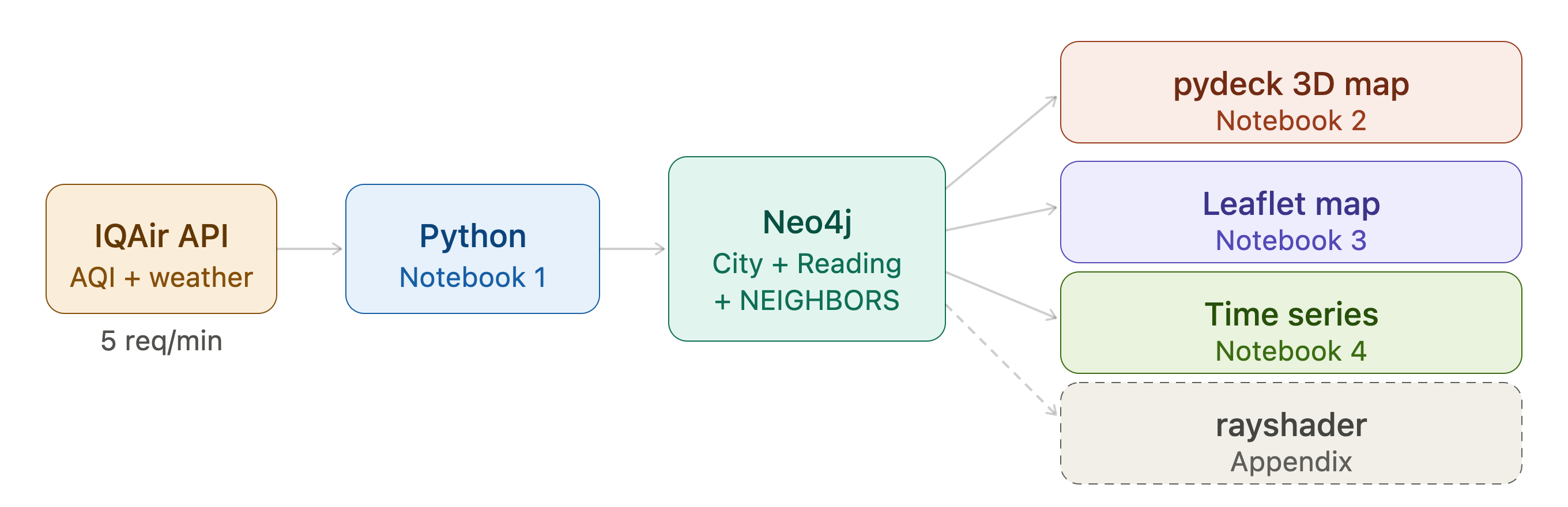
Figure 1. The data pipeline
We'll also run a series of Cypher queries that use the graph structure to find pollution corridors, cross-border neighbor pairs, and sharp AQI gradients.
The full source code is available on GitHub.
Why a Graph?
The obvious way to store air quality data is a relational table with one row per city and one column per reading. That works fine for simple queries. But once we want to ask questions like "which cities are within 200 km of each other and both above AQI 50?" or "which French city is closest to a Spanish city and how do their pollution levels compare?", a graph model is a cleaner fit. Let's see how.
Our data model has two node labels and two relationship types:
(:City {name, country, state, lat, lon})
  -[:HAS_READING]->
(:Reading {timestamp, aqi_us, aqi_category, main_pollutant,
           temperature, humidity, wind_speed})

(:City)-[:NEIGHBORS {distance_km}]-(:City)
Visually, we can see this in Figure 2.
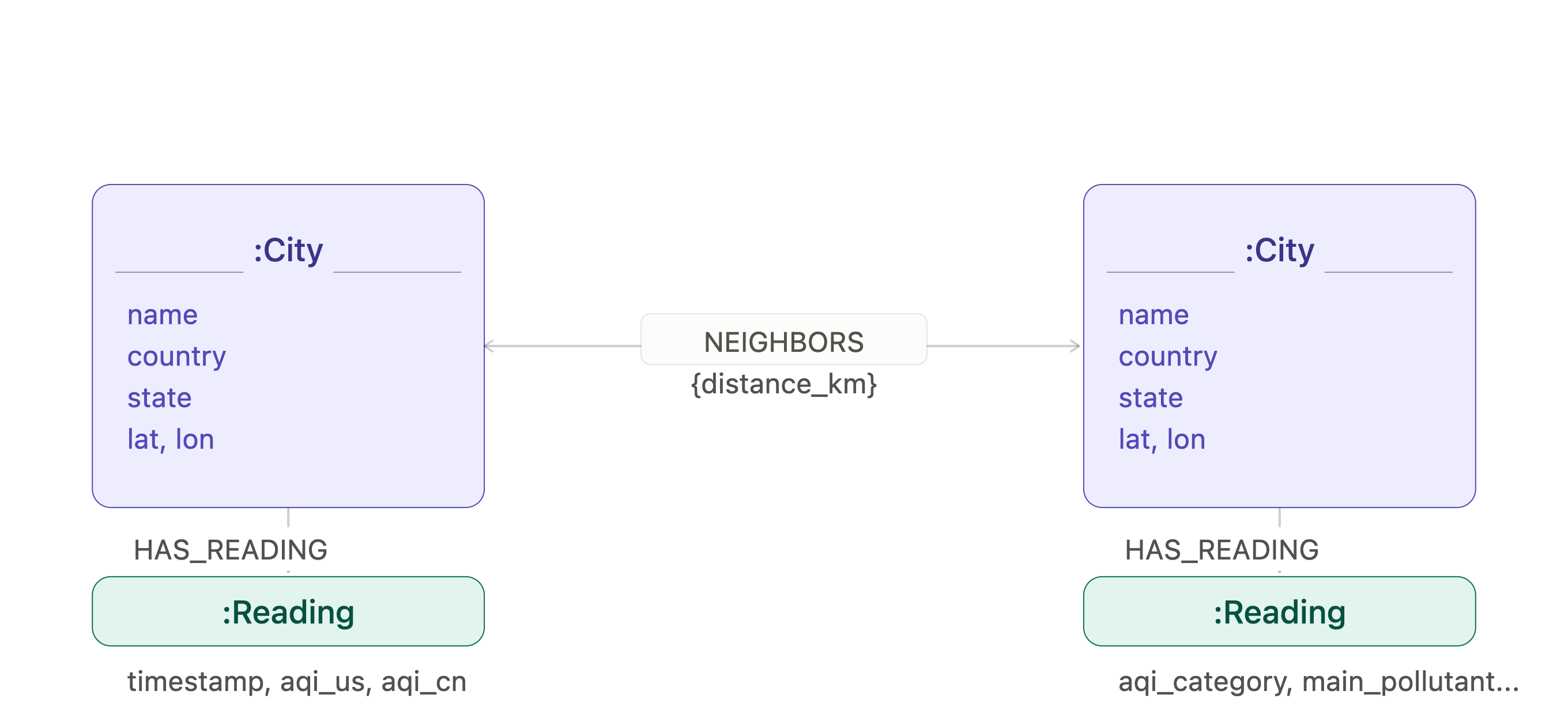
Figure 2. The Neo4j graph data model
City nodes are stable as they're created once and reused across runs. Each ingestion run appends a fresh Reading node, so the database accumulates a time series. The NEIGHBORS relationship links any two cities within 200 km of each other, with the great-circle distance stored on the relationship. That's the structure that makes the interesting graph queries possible.
Prerequisites
Neo4j Desktop/AuraDB
Connecting R to Neo4j deserves a brief note. R's graph database ecosystem is smaller than Python's. The main CRAN package, neo4r, uses the HTTP API rather than Bolt, which means it doesn't support neo4j+s:// URIs and runs into network restrictions on Aura's free tier. We work around this by using httr2 to call Neo4j's Query API v2 directly over HTTP, which works well for a local Neo4j Desktop instance.
Therefore, for this project, Neo4j Desktop is recommended for running Python and R.
- Download Neo4j Desktop.
- After installation, add a local DBMS, give it a name and a password, then click Start.
- Once the DBMS is running, open the Query tab, connect, then create a dedicated database for this project:
CREATE DATABASE aqi. - Switch to it with
:use aqiand confirm it's empty withMATCH (n) RETURN count(n)which should return0.
However, AuraDB works perfectly for the Python notebooks. So, if you still prefer to use AuraDB:
- Sign up at Get Started for Free.
- Create a new AuraDB Free instance.
- When the instance is created, download or note the credentials — the connection URI, username, and password.
- Once the instance is running, open the Query tab, connect to the instance.
- Confirm it's empty with
MATCH (n) RETURN count(n)which should return0.
IQAir API Key
The ingestion notebook fetches air quality data from the IQAir API.
- Sign up at IQAir.
- After registration, go to the dashboard and create a new API key.
- Copy the key, as it's needed for the
IQAIR_API_KEYenvironment variable. - The free tier allows 5 requests per minute — the notebook spaces calls 12 seconds apart to stay within this limit.
Environment Variables
All notebooks read credentials from environment variables rather than hardcoding them. Export these in your terminal before launching Jupyter:
export NEO4J_URI=bolt://127.0.0.1:7687
export NEO4J_USERNAME=your_username_here
export NEO4J_PASSWORD=your_password_here
export NEO4J_DATABASE=your_database_name_here
export IQAIR_API_KEY=your_iqair_api_key_here
If using AuraDB, set NEO4J_URI to your AuraDB connection URI instead:
export NEO4J_URI=neo4j+s://xxxx.databases.neo4j.ioThen launch Jupyter from the same terminal session, so it inherits the exported values.
R and the Jupyter R Kernel
Two notebooks (aqi_leaflet and aqi_timeseries) run in R. If you don't have R and its Jupyter kernel set up, here's how to get them running.
On macOS (using Homebrew):
brew install rThen open R from the terminal and install the IRkernel package:
install.packages("IRkernel")
IRkernel::installspec()
On Windows and Linux, download and install R from cran.r-project.org, then run the same two lines above in an R session.
Once installed, confirm Jupyter sees the R kernel:
jupyter kernelspec listYou should see ir listed alongside python3.
Note: On macOS, if installspec() fails with a "jupyter not found" error, R can't see the Jupyter executable in its PATH. Fix it by setting the PATH inside R before running installspec:
Sys.setenv(PATH = paste("/path/to/your/jupyter/bin", Sys.getenv("PATH"), sep = ":"))
IRkernel::installspec()
Run which jupyter in your terminal to find the correct path.
Notebook 1: IQAir to Neo4j (Python)
The IQAir free tier allows five requests per minute, so we space calls 12 seconds apart. We first fetch the list of cities for the Pyrenees corridor across France and Spain, then fetch weather and pollution data for each city. For ~100 cities, that's around 20 minutes to download the data end-to-end.
City nodes are written with MERGE so re-running the notebook is safe. Reading nodes are written with CREATE so each run appends to the time series rather than overwriting.
# City nodes — safe to re-run
def upsert_city(session, record):
    session.run("""
        MERGE (c:City {name: $city, country: $country})
        SET c.state = $state,
            c.lat   = $lat,
            c.lon   = $lon
    """, **record)

# Reading nodes — append each run
def create_reading(session, record):
    session.run("""
        MATCH (c:City {name: $city, country: $country})
        CREATE (r:Reading {
            timestamp:      $timestamp,
            aqi_us:         $aqi_us,
            aqi_category:   $aqi_category,
            main_pollutant: $main_pollutant,
            temperature:    $temperature,
            humidity:       $humidity,
            wind_speed:     $wind_speed
        })
        CREATE (c)-[:HAS_READING]->(r)
    """, **record)
After loading cities and readings, we calculate NEIGHBORS relationships using the Haversine formula. Any two cities within 200 km are linked, with the distance in kilometers stored on the relationship.
def haversine_km(lat1, lon1, lat2, lon2):
    R = 6371
    d_lat = math.radians(lat2 - lat1)
    d_lon = math.radians(lon2 - lon1)
    a = (math.sin(d_lat / 2) ** 2 +
         math.cos(math.radians(lat1)) * math.cos(math.radians(lat2)) *
         math.sin(d_lon / 2) ** 2)
    return R * 2 * math.atan2(math.sqrt(a), math.sqrt(1 - a))
In Figure 3, cities within 200 km are linked by a NEIGHBORS relationship (solid lines). Pairs beyond the threshold have no relationship (dashed). City color reflects AQI category.
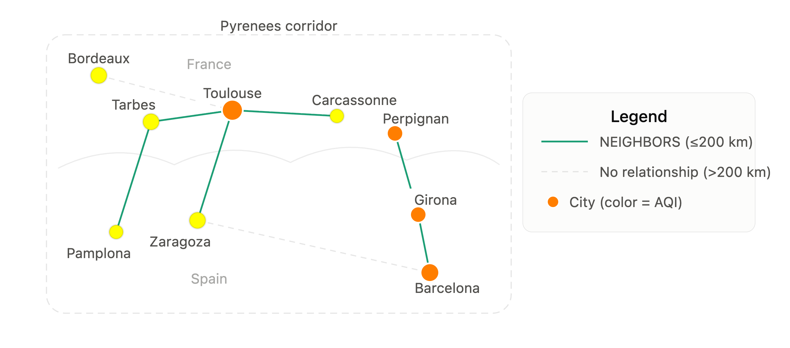
Figure 3. NEIGHBORS relationship
We use tqdm.notebook for progress bars throughout — the rate-limited API calls make the progress feedback very useful.
Notebook 2: Interactive 3D Map With pydeck (Python)
For the 3D visualization, we use pydeck, the official Python binding for deck.gl. Unlike a static render, pydeck produces an interactive HTML file, so we can pan, zoom, tilt, and rotate with the mouse and hover over any city for the full AQI and weather details.
Querying Neo4j
Now we'll connect to Neo4j and query each city's air quality reading (AQI, pollutant, weather, etc.) and return worst-to-best by AQI as a list of dictionaries.
driver = GraphDatabase.driver(
    NEO4J_URI,
    auth=(NEO4J_USERNAME, NEO4J_PASSWORD)
)

query = """
    MATCH (c:City)-[:HAS_READING]->(r:Reading)
    WITH c, r ORDER BY r.timestamp DESC
    WITH c, collect(r)[0] AS latest
    RETURN c.name                AS city,
           c.country             AS country,
           c.lat                 AS lat,
           c.lon                 AS lon,
           latest.aqi_us         AS aqi_us,
           latest.aqi_category   AS aqi_category,
           latest.main_pollutant AS main_pollutant,
           latest.temperature    AS temperature,
           latest.humidity       AS humidity,
           latest.wind_speed     AS wind_speed,
           latest.timestamp      AS timestamp
    ORDER BY latest.aqi_us DESC
"""

with driver.session(database=NEO4J_DATABASE) as session:
    result = session.run(query)
    records = [dict(r) for r in result]

driver.close()
Preparing the Data
We add an RGB color per city following the standard US AQI scale, a column height scaled from AQI, and a formatted tooltip string.
def aqi_color(aqi):
    if aqi <= 50:  return [0,   228, 0  ] # Good
    if aqi <= 100: return [255, 255, 0  ] # Moderate
    if aqi <= 150: return [255, 126, 0  ] # Unhealthy for Sensitive Groups
    if aqi <= 200: return [255, 0,   0  ] # Unhealthy
    if aqi <= 300: return [143, 63,  151] # Very Unhealthy
    return                [126, 0,   35 ] # Hazardous

AQI_HEIGHT_SCALE = 500

for r in records:
    r["color"]  = aqi_color(r["aqi_us"])
    r["height"] = r["aqi_us"] * AQI_HEIGHT_SCALE
    r["tooltip"] = (
        f"{r['city']}, {r['country']}\n"
        f"AQI (US): {r['aqi_us']} — {r['aqi_category']}\n"
        f"Main pollutant: {r['main_pollutant']}\n"
        f"Temperature: {r['temperature']}°C   Humidity: {r['humidity']}%\n"
        f"Wind: {r['wind_speed']} m/s\n"
        f"Recorded: {str(r['timestamp'])[:19]} UTC"
    )
We can see the actual color scale in Figure 4.

Figure 4. US AQI color scale
Building the Map
We use deck.gl's ColumnLayer for the 3D spikes and a ScatterplotLayer for ground-level dots. Setting disk_resolution = 4 gives the columns a square cross-section rather than a circle, which reads more like a spike especially when the map is tilted. The map is centered on the Pyrenees corridor with a 50-degree pitch to show the 3D columns clearly.
initial_view = pdk.ViewState(
    latitude  = 43.0,
    longitude = 1.5,
    zoom      = 5.5,
    pitch     = 50,
    bearing   = 0
)

column_layer = pdk.Layer(
    "ColumnLayer",
    data                  = records,
    get_position          = ["lon", "lat"],
    get_elevation         = "height",
    elevation_scale       = 1,
    radius                = 2000,
    get_fill_color        = "color",
    get_line_color        = [255, 255, 255],
    line_width_min_pixels = 1,
    pickable              = True,
    auto_highlight        = True,
    disk_resolution       = 4
)

scatter_layer = pdk.Layer(
    "ScatterplotLayer",
    data           = records,
    get_position   = ["lon", "lat"],
    get_radius     = 5000,
    get_fill_color = "color",
    opacity        = 0.6,
    pickable       = True
)

deck = pdk.Deck(
    layers             = [column_layer, scatter_layer],
    initial_view_state = initial_view,
    map_style          = "light",
    tooltip            = {"text": "{tooltip}"}
)

deck.to_html("aqi_pyrenees_pydeck.html", open_browser=False)
The output is a self-contained HTML file. Left-click drag rotates the view, right-click drag pans, and scrolling zooms. Hovering over any column shows the full city tooltip.
Notebook 3: Interactive Leaflet Map (R)
The pydeck map is the primary 3D visualization. The Leaflet map complements it with a different view of the same data — a 2D interactive map with built-in zoom controls, a togglable heatmap layer, and richer popups. It's also R-based, which rounds out the stack nicely.
m <- leaflet() |>
  addProviderTiles(providers$CartoDB.DarkMatter, group = "Dark") |>
  addProviderTiles(providers$CartoDB.Positron,   group = "Light") |>
  setView(lng = 1.5, lat = 43.0, zoom = 6) |>

  addHeatmap(
    lng       = aqi_data$lon,
    lat       = aqi_data$lat,
    intensity = aqi_data$aqi_us,
    blur = 30, max = max(aqi_data$aqi_us), radius = 40,
    group = "AQI Heatmap"
  ) |>

  addCircleMarkers(
    data        = aqi_data,
    lng         = ~lon, lat = ~lat,
    radius      = ~radius,
    color       = ~color, fillColor = ~color,
    fillOpacity = 0.8, stroke = TRUE, weight = 1.5,
    popup       = ~popup, label = ~paste0(city, ": ", aqi_us),
    group       = "AQI Markers"
  ) |>

  addLegend(
    position = "bottomright",
    colors   = c("#00E400", "#FFFF00", "#FF7E00",
                 "#FF0000", "#8F3F97", "#7E0023"),
    labels   = c("Good (0-50)", "Moderate (51-100)",
                 "Unhealthy Sensitive (101-150)", "Unhealthy (151-200)",
                 "Very Unhealthy (201-300)", "Hazardous (301+)"),
    title    = "US AQI", opacity = 0.9
  ) |>

  addLayersControl(
    baseGroups    = c("Dark", "Light"),
    overlayGroups = c("AQI Markers", "AQI Heatmap"),
    options       = layersControlOptions(collapsed = FALSE)
  ) |>
  hideGroup("AQI Heatmap")

saveWidget(m, "aqi_pyrenees_map.html", selfcontained = TRUE)
Marker radius scales between 8 and 30 pixels proportional to AQI, so the worst cities are immediately visually prominent. Each popup shows the full reading.
Querying the Graph
With the data loaded and the visualizations in place, let's look at what the graph model enables directly in Cypher.
These queries are designed to be run directly in the Query tab — open it from Neo4j Desktop or the AuraDB console, ensure you're connected to the correct database, paste each query into the editor, and run.
Query 1: AQI Leaderboard
The simplest query — fetch the latest reading per city and rank by AQI descending. The collect(r)[0] pattern picks the most recent reading after ordering by timestamp.
MATCH (c:City)-[:HAS_READING]->(r:Reading)
WITH c, r ORDER BY r.timestamp DESC
WITH c, collect(r)[0] AS latest
RETURN c.name AS city, c.country AS country,
       latest.aqi_us AS aqi_us, latest.aqi_category AS category
ORDER BY latest.aqi_us DESC;
When we ran this, Merignac topped the list at 69 — Moderate. AQI values in the Pyrenees corridor are dramatically lower than in many other global cities, reflecting Europe's stricter emissions controls, although summer wildfire smoke and urban pollution could still push values above 50.
Query 2: Cross-Border Neighbors
This is where the graph model shows its value. We traverse NEIGHBORS relationships to find city pairs in different countries — the cities that sit closest to the French-Spanish border.
MATCH (a:City)-[n:NEIGHBORS]-(b:City)
WHERE a.country = 'France'
  AND b.country = 'Spain'
MATCH (a)-[:HAS_READING]->(ra:Reading)
MATCH (b)-[:HAS_READING]->(rb:Reading)
WITH a, b, n, ra, rb ORDER BY ra.timestamp DESC, rb.timestamp DESC
WITH a, b, n, collect(ra)[0] AS latest_a, collect(rb)[0] AS latest_b
RETURN a.name AS city_france, latest_a.aqi_us AS aqi_france,
       b.name AS city_spain,   latest_b.aqi_us AS aqi_spain,
       n.distance_km AS distance_km
ORDER BY n.distance_km;
The graph reveals that cities on either side of the border are close enough to share air masses.
Query 3: Most Connected City
Treating cities as graph nodes, we can ask which city has the most neighbors within 200 km, which is a simple measure of degree centrality in our geographic network.
MATCH (c:City)-[:NEIGHBORS]-()
RETURN c.name AS city, c.country AS country, count(*) AS neighbors
ORDER BY neighbors DESC
LIMIT 10;
Cities in the dense urban areas tend to top this list, reflecting how tightly clustered the major cities are.
Query 4: AQI Summary by Country
A simple aggregation across the graph that compares France and Spain.
MATCH (c:City)-[:HAS_READING]->(r:Reading)
WITH c, r ORDER BY r.timestamp DESC
WITH c, collect(r)[0] AS latest
RETURN c.country AS country,
       round(avg(latest.aqi_us)) AS avg_aqi,
       min(latest.aqi_us) AS min_aqi,
       max(latest.aqi_us) AS max_aqi,
       count(c) AS cities
ORDER BY avg_aqi DESC;
In our run, Spain averaged slightly higher than France, although both were in the Moderate range. At the time of writing, the dataset covered 44 French cities and 54 Spanish cities across the regions in the corridor.
Query 5: Pollution Corridors
This query finds neighboring city pairs where both cities exceed the Moderate threshold (AQI > 50) — pairs that form part of a connected area of elevated pollution. The id(a) < id(b) condition prevents each pair from appearing twice.
MATCH (a:City)-[n:NEIGHBORS]-(b:City)
WHERE id(a) < id(b)
MATCH (a)-[:HAS_READING]->(ra:Reading)
MATCH (b)-[:HAS_READING]->(rb:Reading)
WITH a, b, n, ra, rb ORDER BY ra.timestamp DESC, rb.timestamp DESC
WITH a, b, n, collect(ra)[0] AS latest_a, collect(rb)[0] AS latest_b
WHERE latest_a.aqi_us > 50 AND latest_b.aqi_us > 50
RETURN a.name AS city_a, latest_a.aqi_us AS aqi_a,
       b.name AS city_b, latest_b.aqi_us AS aqi_b,
       n.distance_km AS distance_km
ORDER BY (latest_a.aqi_us + latest_b.aqi_us) DESC;
The results show neighboring city pairs where both are in the Moderate or above range. Depending upon conditions, clusters may appear along the Mediterranean coast and around major urban areas. The pattern shifts depending on when the query is run. Wildfire smoke and traffic peaks can elevate AQI across a whole corridor simultaneously.
Query 6: Sharp Gradients
Perhaps the most interesting result is cities that are neighbors on the graph but have noticeably different AQI values. Here we look for cities above AQI 80 next to cities below AQI 40.
MATCH (a:City)-[n:NEIGHBORS]-(b:City)
MATCH (a)-[:HAS_READING]->(ra:Reading)
MATCH (b)-[:HAS_READING]->(rb:Reading)
WITH a, b, n, ra, rb ORDER BY ra.timestamp DESC, rb.timestamp DESC
WITH a, b, n, collect(ra)[0] AS latest_a, collect(rb)[0] AS latest_b
WHERE latest_a.aqi_us > 80 AND latest_b.aqi_us < 40
RETURN a.name AS higher_aqi_city, latest_a.aqi_us AS aqi,
       b.name AS lower_aqi_neighbor, latest_b.aqi_us AS neighbor_aqi,
       n.distance_km AS distance_km
ORDER BY n.distance_km;
Some of these pairs may be less than 100 km apart. The graph highlights cases where nearby cities have substantially different AQI values. Terrain, meteorology, local emissions, and pollutant transport can all contribute to these differences — the graph surfaces the pattern, and domain knowledge explains the cause.
Query 7: AQI Change Over Time
If we run the ingestion notebook more than once, readings accumulate. This query shows how AQI has shifted between the first and most recent reading for each city.
MATCH (c:City)-[:HAS_READING]->(r:Reading)
WITH c, r ORDER BY r.timestamp
WITH c, collect(r) AS readings
WHERE size(readings) > 1
RETURN c.name AS city, c.country AS country,
       readings[0].aqi_us AS first_aqi,
       readings[-1].aqi_us AS latest_aqi,
       readings[-1].aqi_us - readings[0].aqi_us AS change,
       size(readings) AS total_readings
ORDER BY abs(readings[-1].aqi_us - readings[0].aqi_us) DESC;
Running this across morning and evening snapshots, we can examine whether AQI shows a diurnal pattern. The causes of any observed pattern depend on local meteorology, emissions, and pollutant type.
Notebook 4: Time Series Analysis (R)
The first three notebooks capture a snapshot — they show the current state of air quality across the Pyrenees corridor. Notebook 4 takes a different view: it queries all the accumulated readings in Neo4j and explores how AQI changes over time.
Each time we run Notebook 1, a new Reading node is appended to each City node. The graph accumulates a time series automatically — no schema changes, no new tables, just additional nodes linked by HAS_READING relationships. Notebook 4 queries that accumulation and produces five charts.
Chart 1: AQI Over Time
We plot AQI readings over time for the 15 cities with the highest average AQI. Each point represents a single reading. Lines connect readings for the same city. This shows both the level and the trend — which cities are consistently elevated and whether conditions are improving or worsening.
Chart 2: AQI Heatmap
Each row is one of the 30 cities with the highest average AQI, each column is a reading date, and the fill color follows the standard AQI scale. Cities are ordered so the worst appear at the top. This gives a focused view of the most polluted part of the corridor — showing both the overall level and how AQI shifts between reading dates for each city. As more data are collected on additional days, new columns appear automatically.
Chart 3: AQI vs Temperature
Each point represents a single reading — one city at one timestamp. AQI is on the y-axis and temperature in degrees Celsius on the x-axis. Points are colored by country, with a LOESS smooth trend line fitted separately for France and Spain. This explores whether warmer conditions are associated with higher AQI values across the corridor.
Chart 4: AQI Distribution per City
Box plots show the spread of AQI values across all readings for each of the 20 cities with the highest median AQI. A wide box indicates high variability between readings; a narrow box indicates consistency. Cities are ordered by median AQI and colored by country. This reveals which cities are reliably elevated and which fluctuate significantly between readings.
Chart 5: Most Improved vs Most Worsened
A faceted horizontal bar chart comparing the 10 cities that improved most against the 10 that worsened most between their first and latest reading. Green bars show improvement; red bars show deterioration. The contrast in scale between the two panels is itself informative — in our data, improvements were modest while deteriorations were dramatic, reflecting a broad worsening of air quality across the corridor between our first and most recent data collection.
Summary
What started as a simple API fetch ends up demonstrating something useful about graph databases: the NEIGHBORS relationship isn't just a convenience for querying — it encodes geographic structure in a way that makes pollution corridor analysis, cross-border comparisons, and gradient detection natural and concise in Cypher.
The notebooks serve distinct purposes:
- Notebook 1 handles ingestion and the graph model
- Notebook 2 gives the dramatic 3D view — zoom into Barcelona and the Catalan coastal cluster is immediately visible; zoom out, and we see the full corridor from the Atlantic to the Mediterranean
- Notebook 3 adds the interactive layer — the heatmap and togglable markers let us explore the data at our own pace
- Notebook 4 takes the temporal view — charts showing how AQI evolves across readings, which cities improved and which worsened, and how air quality varies with temperature, and the Cypher queries sit between the notebooks and show what graph-native exploration looks like directly in Neo4j
Together they give a complete picture of what the data says about air quality across the Pyrenees corridor. The appendix covers a fifth approach, a path-traced 3D terrain render using rayshader, for anyone who want to go further.
The full source code is available on GitHub.
Appendix: 3D Terrain Rendering With rayshader
We initially built the 3D visualization using rayshader, an R package that produces stunning path-traced renders of elevation data. This was eventually replaced with pydeck as the primary visualization — pydeck's interactive browser output is more useful for exploration, it requires no heavy system dependencies and, critically, it works reliably. The rayshader journey involved enough gotchas — both in installation and in rendering — that we felt it was worth documenting here as a reference for anyone who wants to try it.
What We Built
The rayshader notebook fetches real terrain elevation for the Pyrenees corridor from AWS Open Data via the elevatr package, renders it as a 3D scene with the imhof1 hillshade texture, overlays colored AQI spikes for each city and draws the France-Spain border as a terrain-following red line. The Pyrenees terrain is particularly striking — snow-capped peaks at over 3,000m, dramatic valleys and the Mediterranean coast visible in the lower right of the bounding box, as shown in Figure 5.
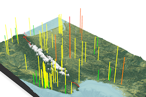
Figure 5. rayshader output
Installing rayshader on Apple Silicon macOS
The notebook uses render_snapshot() only — it does not require the full rayrender rendering stack. The installation is, therefore, much simpler than expected from other rayshader tutorials.
Level 1 — Recommended (Try This First)
Install system spatial libraries via Homebrew:
brew install udunits gdal proj geos harfbuzz fribidi libpng libtiffthen install rayshader and its dependencies from R:
install.packages(c(
  "elevatr", "httr2", "rnaturalearth", "rnaturalearthdata", "sf", "terra"
))

install.packages("rayshader",
  repos = "https://tylermorganwall.r-universe.dev")
Verify the install:
library(rayshader)
library(elevatr)
library(sf)
library(terra)
packageVersion("rayshader")
Level 2 — If render_snapshot() Fails With an OpenGL Error
Try adding software_render = TRUE:
render_snapshot(
  filename        = "aqi_pyrenees_3d.png",
  clear           = FALSE,
  software_render = TRUE
)
This is slower, but more reliable in some notebook environments.
Level 3 — Only If You Want Render_highquality()
render_highquality() uses a separate path-traced renderer (rayrender) that has additional dependencies not needed for this notebook. On Apple Silicon macOS, these require manual installation since pre-built CRAN binaries aren't available. Install Homebrew dependencies first:
brew install openexr imath cmake
brew install --cask xquartz
Log out and back in after installing XQuartz. Then install the rendering stack manually:
cd /tmp

# libimath — compile from source (requires cmake)
curl -L -o libimath.tar.gz \
  "https://tylermorganwall.r-universe.dev/src/contrib/libimath_3.2.2-1.tar.gz"
R CMD INSTALL libimath.tar.gz

# libopenexr and rayrender — use pre-built arm64 binaries
# Check current version first:
# curl -s "https://tylermorganwall.r-universe.dev/src/contrib/PACKAGES" | grep -A2 "^Package: rayrender"
curl -L -o libopenexr.tgz \
  "https://tylermorganwall.r-universe.dev/bin/macosx/big-sur-arm64/contrib/4.6/libopenexr_3.4.12-5.tgz"
R CMD INSTALL libopenexr.tgz

curl -L -o rayrender.tgz \
  "https://tylermorganwall.r-universe.dev/bin/macosx/big-sur-arm64/contrib/4.6/rayrender_0.41.6.tgz"
R CMD INSTALL rayrender.tgz
A download returning ~110 bytes means the URL is wrong — the version number has likely changed. Always check the current version before downloading.
Key rayshader Gotchas
A few things that aren't obvious from the documentation:
get_elev_raster() from elevatr needs an sf object, not an sfc. Wrap the bounding box correctly. Also, use terra::ext() rather than raster::extent() to extract the raster extent — terra is already installed as a dependency and avoids adding raster as an extra package:
bbox_sf <- st_as_sf(st_as_sfc(st_bbox(
  c(xmin = -2.0, ymin = 41.0, xmax = 5.5, ymax = 46.0),
  crs = st_crs(4326)
)))
Then extract the raster extent using terra::ext():
ext <- terra::ext(elev)render_label() doesn't accept a color argument in the current version, and it's not vectorized — you need to loop one city at a time. Only label cities above a threshold to avoid clutter.
render_path() is not vectorized — loop city by city. Each spike is represented as a two-point vertical path: the first point anchors at terrain elevation, the second rises proportionally to AQI value. Also note that offset in render_path() only applies when altitude = NULL — when you supply an explicit altitude vector, omit offset entirely.
The France-Spain border from Natural Earth can't be derived by intersecting country polygons — Natural Earth has small gaps between adjacent polygons. Use the dedicated boundary lines dataset instead:
border_lines <- ne_download(
  scale = 50, type = "boundary_lines_land",
  category = "cultural", returnclass = "sf"
)
For rendering speed: render_highquality() uses CPU cores only. Drop to samples = 64 and 1200x800 during iteration. Only go to samples = 256 and 2400×1600 for the final render.
Rendering Gotchas We Encountered
Beyond installation, we hit several rendering issues that aren't well documented:
Water surface causes a grey disc. Setting water = TRUE in plot_3d() or calling render_water() causes render_highquality() to render a large grey disc in the foreground — the water surface is being ray-traced as a 3D object, and its extent exceeds the view frame. The only fix is water = FALSE.
Compass and scale bar positioning is unreliable. render_compass() and render_scalebar() work in the interactive rgl window, but their position in the final render_highquality() PNG is unpredictable regardless of whether you use position strings ("SE", "NW") or manual x, y, z coordinates. After extensive experimentation, we removed both from the final notebook.
render_snapshot() can produce jagged spikes. In our environment, the OpenGL snapshot renderer produced visibly jagged line edges. smooth = TRUE and smooth_line = TRUE are not supported in the current version. Increasing linewidth to 12 partially mitigates this, although the root cause is the absence of line antialiasing in the rgl OpenGL backend.
display_png() hangs on large files. IRdisplay::display_png() hangs when trying to display a 2400×1600 PNG inline in Jupyter. Use cat() as a confirmation and open the file directly from Finder instead.
interactive = FALSE is not a valid parameter. Passing interactive = FALSE to render_highquality() causes a silent error. Remove it.
Despite these issues, render_snapshot() with water = TRUE, a white background and a large window size produce a perfectly usable output, as shown in Figure 5.
Opinions expressed by DZone contributors are their own.
Comments