5 Must-Have Angular Grid Row Features and How To Use Them
What are the must-have Angular Grid Row features to consider when working on your next project? In this article, we talk about the top five. Find out more.
Join the DZone community and get the full member experience.
Join For FreeWorking with big data is not that easy. Every component should provide the means and tooling to actually make sense of the data that is going to be used by the end user. This is where full-featured UI component libraries and rich row features prove to be handy.
In this article, I will look at the top five Angular Grid Row features to consider for your next project.
- Row selection
- Multi-row layout
- Role UI actions
- Row pinning
- Row dragging
In Brief – What Is Grid Row Feature in Angular?
Grid row features refer to the functionalities and capabilities that a certain Angular UI library provides so developers can manage and manipulate rows within a grid component efficiently and easily.
Here are my top five Angular Grid Row features that you must have:
1. Row Selection
With row selection, a row selector column precedes all other columns within the row. When a user clicks on the row selector, the row will either become selected or deselected, enabling the user to select multiple rows of data.
The sample below demonstrates the three types of Grid's row selection behavior. Use the buttons below to enable each of the available selection modes. A brief description will be provided on each button interaction through a Snackbar message box. Use the switch button to hide or show the row selector checkbox.
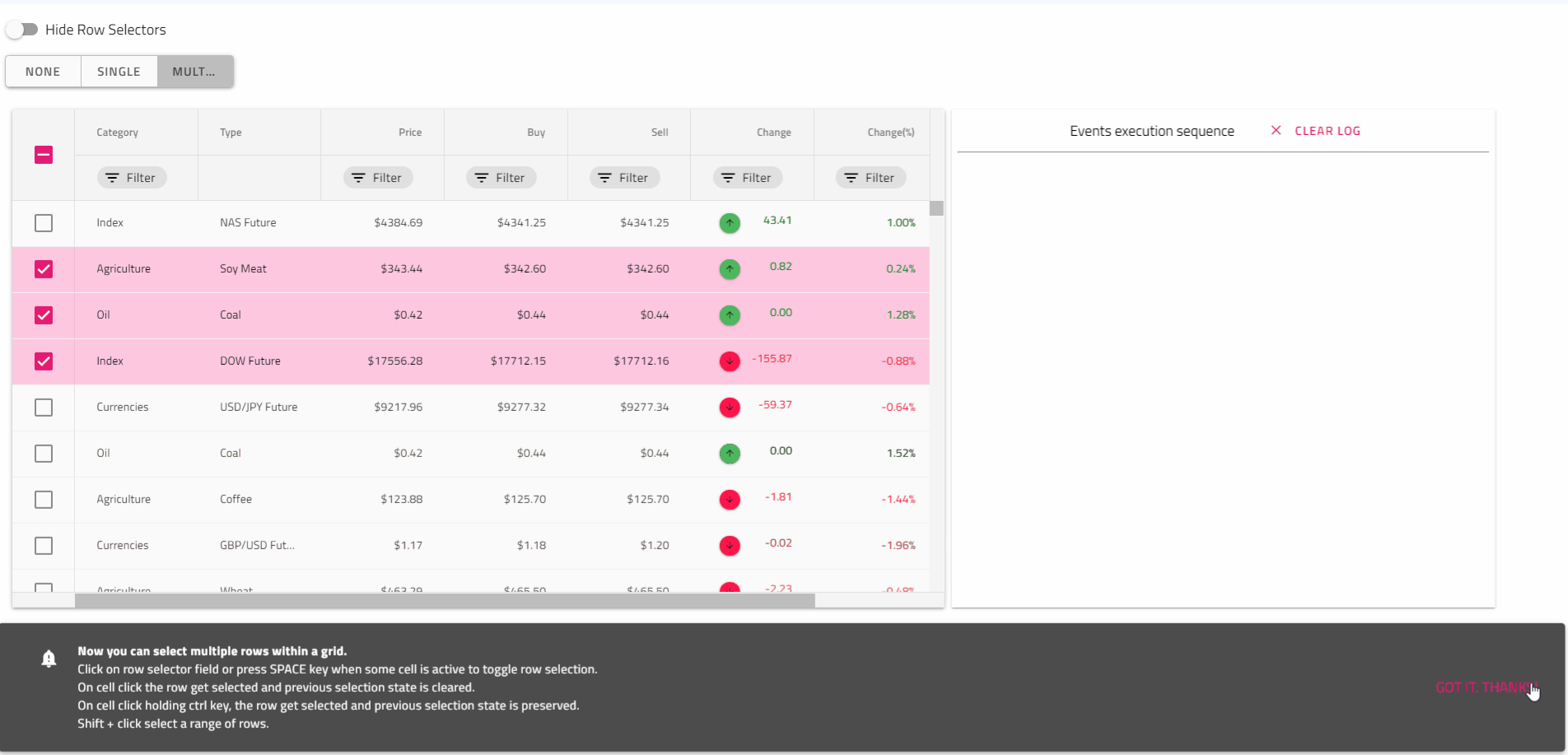
Based on the components library that you use or the plan that you have for creating such a Grid feature, you should definitely consider three different modes of selection - none, single, and multiple. Let's look at a concrete example: the Ignite UI Angular library.
Single row selection can be easily set up; the only thing you need to do is to set [rowSelection] = '"single"' property. This gives you the opportunity to select only one row within a Grid. You can select a row by clicking on a cell or pressing the space key when you focus on a cell of the row, and of course you can select a row by clicking on the row selector field. When row is selected or deselected rowSelectionChanging event is emitted.
<!-- selectionExample.component.html -->

<igx-grid [data]="remote | async" [rowSelection]="'single'" [autoGenerate]="true"
          (rowSelectionChanging)="handleRowSelection($event)" [allowFiltering]="true">
</igx-grid>
/* selectionExample.component.ts */

public handleRowSelection(args) {
    if (args.added.length && args.added[0] === 3) {
        args.cancel = true;
    }
}
To enable multiple row selection in the igx-grid just set the rowSelection property to multiple. This will enable a row selector field on each row and in the Grid header.
<!-- selectionExample.component.html -->

<igx-grid [data]="remote | async" [primaryKey]="'ProductID'" [rowSelection]="'multiple'"
        (rowSelectionChanging)="handleRowSelection($event)" [allowFiltering]="true" [autoGenerate]="true">
</igx-grid>
<!-- selectionExample.component.ts -->

 public handleRowSelection(event: IRowSelectionEventArgs) {
    // use event.newSelection to retrieve primary key/row data of latest selected row
    this.selectedRowsCount = event.newSelection.length;
    this.selectedRowIndex = event.newSelection[0];
 }
2. Multi-Row Layout
Multi-row Layout extends the rendering capabilities of the igxGridComponent. The feature allows splitting a single data record into multiple visible rows.
Multi-row Layout can be implemented on top of the grid layout W3 specification and should conform to its requirements.
That's the case with the Ignite UI Angular library, it was achieved through the declaration of Multi-row Layout igx-column-layout component. Each igx-column-layout component should be considered as a block containing one or multiple igx-column components. Some of the grid features work on block level (those are listed in the "Feature Integration" section below). For example, the virtualization will use the block to determine the virtual chunks, so for better performance, split the columns into more igx-column-layout blocks if the layout allows it. There should be no columns outside of those blocks and no usage of IgxColumnGroupComponent when configuring a multi-row layout.
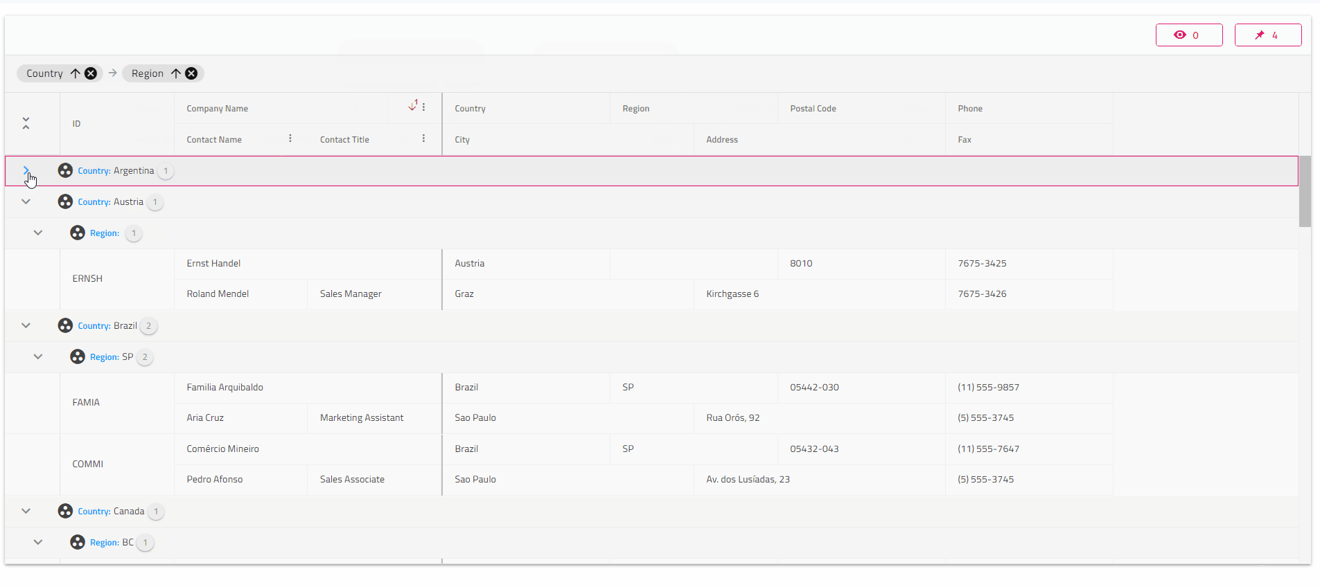
IgxColumnComponent exposes four @Input properties to determine the location and span of each cell:
colStart: Column index from which the field is starting. This property is mandatory.rowStart: Row index from which the field is starting. This property is mandatory.colEnd: Column index where the current field should end. The amount of columns between colStart and colEnd will determine the amount of spanning columns to that field. This property is optional. If not, set defaults tocolStart + 1.rowEnd: Row index where the current field should end. The amount of rows between rowStart and rowEnd will determine the amount of spanning rows to that field. This property is optional. If not, set defaults torowStart + 1.
<igx-column-layout>
	<igx-column [rowStart]="1" [colStart]="1" [rowEnd]="3" field="ID"></igx-column>
</igx-column-layout>
<igx-column-layout>
	<igx-column [rowStart]="1" [colStart]="1" [colEnd]="3" field="CompanyName"></igx-column>
	<igx-column [rowStart]="2" [colStart]="1" [colEnd]="2" field="ContactName"></igx-column>
	<igx-column [rowStart]="2" [colStart]="2" [colEnd]="3" field="ContactTitle"></igx-column>
</igx-column-layout>
<igx-column-layout>
	<igx-column [rowStart]="1" [colStart]="1" [colEnd]="3" field="Country"></igx-column>
	<igx-column [rowStart]="1" [colStart]="3" [colEnd]="5" field="Region"></igx-column>
	<igx-column [rowStart]="1" [colStart]="5" [colEnd]="7" field="PostalCode"></igx-column>
	<igx-column [rowStart]="2" [colStart]="1" [colEnd]="4" field="City"></igx-column>
	<igx-column [rowStart]="2" [colStart]="4" [colEnd]="7" field="Address"></igx-column>
</igx-column-layout>
<igx-column-layout>
    <igx-column [rowStart]="1" [colStart]="1" field="Phone"></igx-column>
    <igx-column [rowStart]="2" [colStart]="1" field="Fax"></igx-column>
</igx-column-layout>
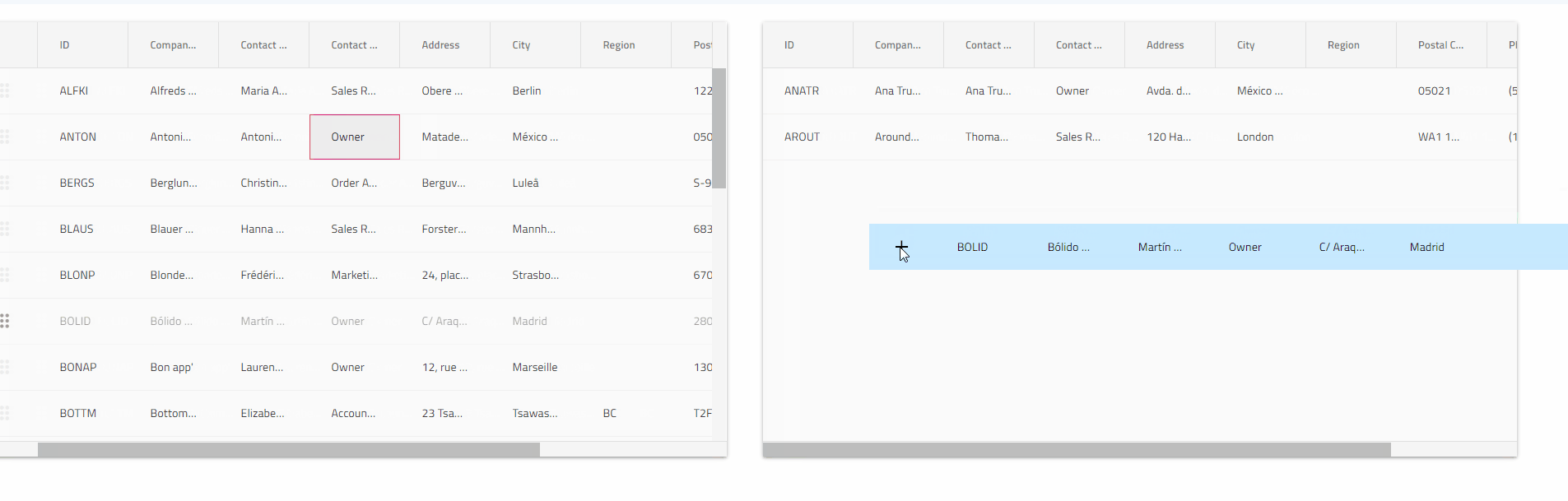
3. Row UI Actions
The grid component in Ignite UI for Angular provides the ability to use ActionStrip and utilize CRUD for row/cell components and row pinning. The Action Strip component can host predefined UI controls for these operations.
Its main purpose is to provide an overlay area containing one or more actions, allowing additional UI and functionality to be shown on top of a specific target container upon user interaction, e.g., hover. The container should be positioned relatively as the Action Strip attempts to overlay it and is itself positioned absolutely. Despite overlapped by an Action Strip, the main interactions and user access to the target container remain available.
Based on the implementation that you take, you might need to initialize and position the Action Strip correctly; it needs to be inside a relatively positioned container as in the case of Ignite UI Angular Action strip:
<div style="position:relative; width:100px; height:100px;">
    <igx-action-strip>
        <button igxButton (click)="makeTextBold()">
            <igx-icon>format_bold</igx-icon>
        </button>
    </igx-action-strip>
<div>
For scenarios where more than three action items will be shown, it is best to use IgxActionStripMenuItem directive. Any item within the Action Strip marked with the *igxActionStripMenuItem structural directive will be shown in a dropdown, revealed upon toggling the more button i.e., the three dots representing the last action
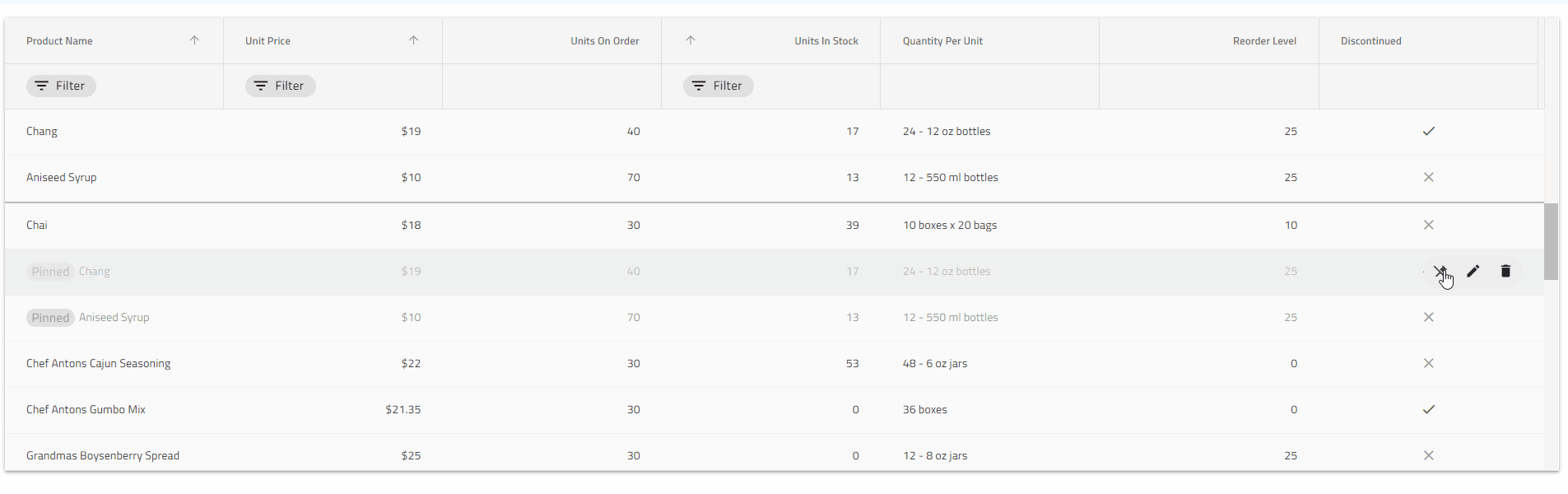
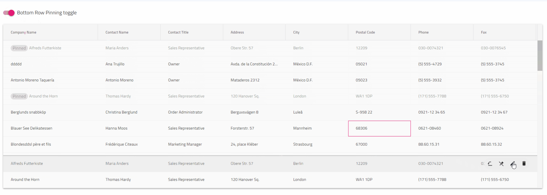
4. Row Pinning
One or multiple rows can be pinned to the top or bottom of the Angular UI Grid. Row Pinning allows end-users to pin rows in a particular order, duplicating them in a special, visible area even when they scroll the Grid vertically. The Material UI Grid has a built-in row pinning UI, which is enabled by initializing an igxActionStrip component in the context of the Grid. In addition, you can define custom UI and change the pin state of the rows via the Row Pinning API.
Based on the UI consistency and ease of you that you are trying to achieve, you can implement a built-in row-pinning UI. In the example below, such a functionality is enabled by adding an igxActionStrip component with the GridPinningActions component. The action strip is automatically shown when hovering a row and will display a pin or unpin button icon based on the state of the row it is shown for. An additional action allowing to scroll the copy of the pinned row into view is shown for each pinned row as well.
<igx-grid [data]="data" [autoGenerate]="false">
    <igx-column *ngFor="let c of columns" [field]="c.field" [header]="c.field">
    </igx-column>

    <igx-action-strip #actionStrip>
        <igx-grid-pinning-actions></igx-grid-pinning-actions>
        <igx-grid-editing-actions></igx-grid-editing-actions>
    </igx-action-strip>
</igx-grid>
5. Row Dragging
Angular Grid Row dragging provides users with a row drag handle with which they can initiate the dragging of a row.
Row dragging feature is tightly coupled with the Grid Row implementation as a whole. It lets users pass the data of a grid record onto another surface, which has been configured to process/render this data in a particular way.
If you are a developer who wants to achieve such functionality, first define and answer the questions that may come from an end-user, what would he want and expect?
- Be able to click on a grid row and drag it in order to provide its content as input to another piece of UI.
- Have a clear indication as I drag a row whether I can drop it on the underlying area or not.
- See a ghost of the dragged row while dragging.
- I do not want the ghost to have selected or active classes applied while dragging.
- Be able to cancel the dragging by pressing the
Esckey while dragging is performed. - When I drag a row that is in edit mode, I want to exit edit mode and save the changes that are made.
- If I am dragging a row that is selected or has a selected cell, no selection-related classes should be copied to the ghost.
User Interface example:
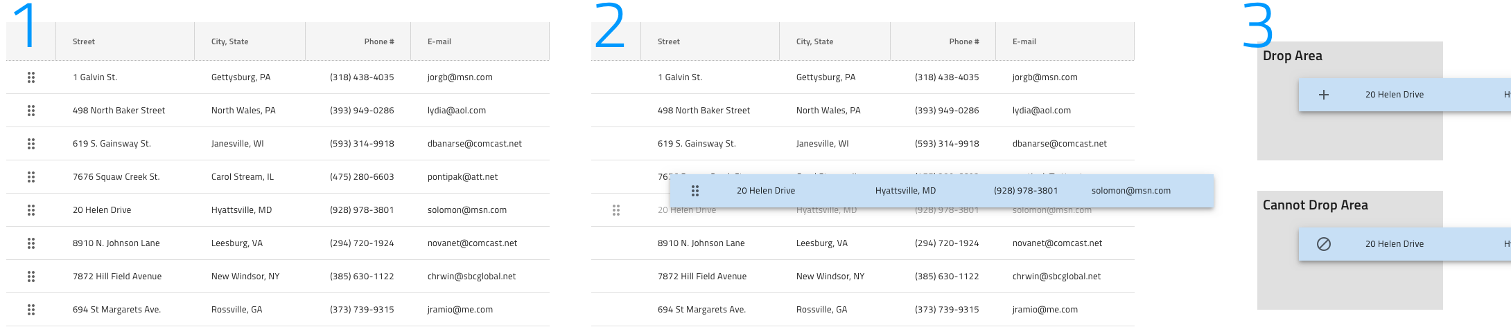
IgxGrid example:
Wrap Up
There are different Grid row features and functionalities in Angular UI libraries available on the market. But to me, the must-have features are precisely Row selection, Multi-row layout, Role UI actions, Row pinning, and Row dragging. With them, users can more easily manage and manipulate tabular data.
Published at DZone with permission of Zdravko Kolev. See the original article here.
Opinions expressed by DZone contributors are their own.
Comments