Introducing Sierra Charts
See how Sierra's new Charts feature can be used to easily add charting support to your client or server-side Java applications.
Join the DZone community and get the full member experience.
Join For FreeSierra is an open-source framework for simplifying the development of Java Swing applications. It is based on the open-source Kilo framework, which has been discussed in previous articles:
- Writing (Slightly) Cleaner Code With Collections and Optionals
- Efficiently Transforming JDBC Query Results to JSON
- Using Schema Annotations to Create and Execute SQL Queries
For example, Sierra's UILoader class can be used to easily construct a hierarchy of user interface elements:
<?xml version="1.0" encoding="UTF-8"?>

<!DOCTYPE column-panel SYSTEM "sierra.dtd">

<column-panel padding="8" opaque="true" background="white">
    <image-pane image="world.png" scaleMode="fill-width"/>
    <text-pane text="Hello, World!" horizontalAlignment="center"/>
</column-panel>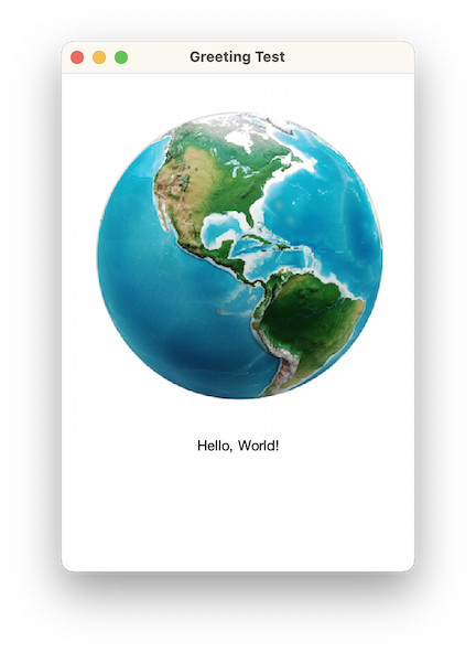
Although the same result could be achieved programmatically, as shown below, the markup version is less verbose and more readable:
var columnPanel = new ColumnPanel();

columnPanel.setBorder(new EmptyBorder(8, 8, 8, 8));

columnPanel.setOpaque(true);
columnPanel.setBackground(Color.WHITE);

var imagePane = new ImagePane();

try (var inputStream = getClass().getResourceAsStream("world.png")) {
    imagePane.setImage(ImageIO.read(inputStream));
} catch (IOException exception) {
    throw new RuntimeException(exception);
}

imagePane.setScaleMode(ImagePane.ScaleMode.FILL_WIDTH);

columnPanel.add(imagePane);

var textPane = new TextPane("Hello, World!");

textPane.setHorizontalAlignment(HorizontalAlignment.CENTER);

columnPanel.add(textPane);
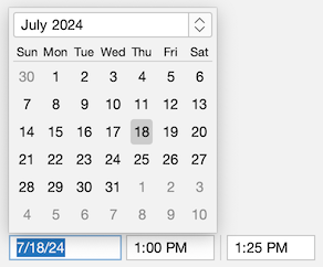
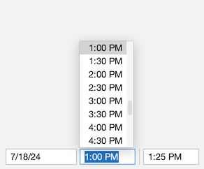
Sierra also includes some common user interface elements not provided by Swing, such as date/time pickers:
Sierra Charts
As of version 3.6, Sierra now additionally provides support for the following common chart types:
- Pie/Doughnut
- Bar/Stacked bar
- Time series
- Scatter
- Candlestick
Each is discussed in more detail below.
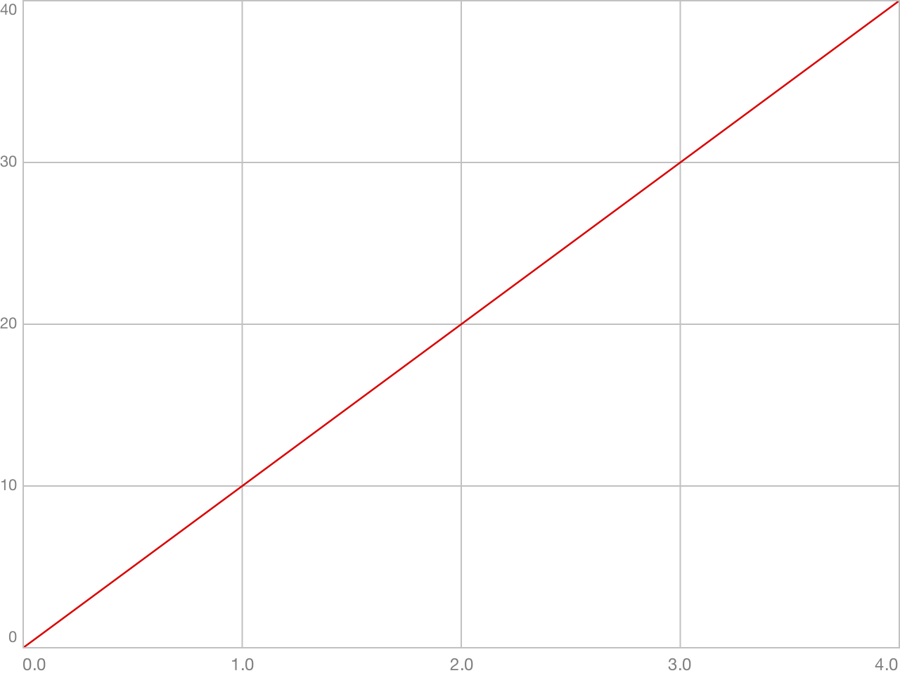
Data Sets
Instances of the DataSet class represent the data to be presented by a chart:
public class DataSet<K extends Comparable<? super K>, V> { ... }DataSet defines the following properties:
- "label" – a description of the data set, as a
String - "color" – the color associated with the data set, as a
Color - "stroke" – the stroke associated with the data set, as an instance of
BasicStroke - "dataPoints" – the data set's data points, as an instance of
SortedMap
Map keys generally represent the chart's domain, with their associated values representing the range.
For example, this code creates a simple data set for use by a time series chart. The sortedMapOf() and entry() methods are provided by Kilo's Collections class:
var dataSet = new DataSet<Double, Double>("Positive Values", Color.RED);

dataSet.setDataPoints(sortedMapOf(
    entry(0.0, 0.0),
    entry(1.0, 10.0),
    entry(2.0, 20.0),
    entry(3.0, 30.0),
    entry(4.0, 40.0)
));
The resulting output is shown below:
ChartPane
The ChartPane component displays a chart. Chart panes can be created either programmatically or declaratively. For example:
<column-panel tabTitle="Pie Chart" opaque="true" background="TextArea.background" spacing="16" padding="16">
    <label font="h1.font" text="Sales by Region" horizontalAlignment="center"/>

    <chart-pane name="pieChartPane" weight="1"/>

    <row-panel>
        <spacer weight="1"/>
        <row-panel name="pieChartLegendPanel" spacing="16"/>
        <spacer weight="1"/>
    </row-panel>
</column-panel>
The following code creates a pie chart and populates the associated legend panel using the labels from the chart's data set and instances of the PieChart.LegendIcon type:
pieChartPane.setChart(createPieChart());

for (var dataSet : pieChartPane.getChart().getDataSets()) {
    pieChartLegendPanel.add(new JLabel(dataSet.getLabel(),
        new PieChart.LegendIcon(dataSet),
        SwingConstants.LEADING));
}
Pie Charts
The PieChart class represents a pie chart:
public class PieChart<K extends Comparable<? super K>, V extends Number> extends Chart<K, V> { ... }The chart displays one slice per data set:
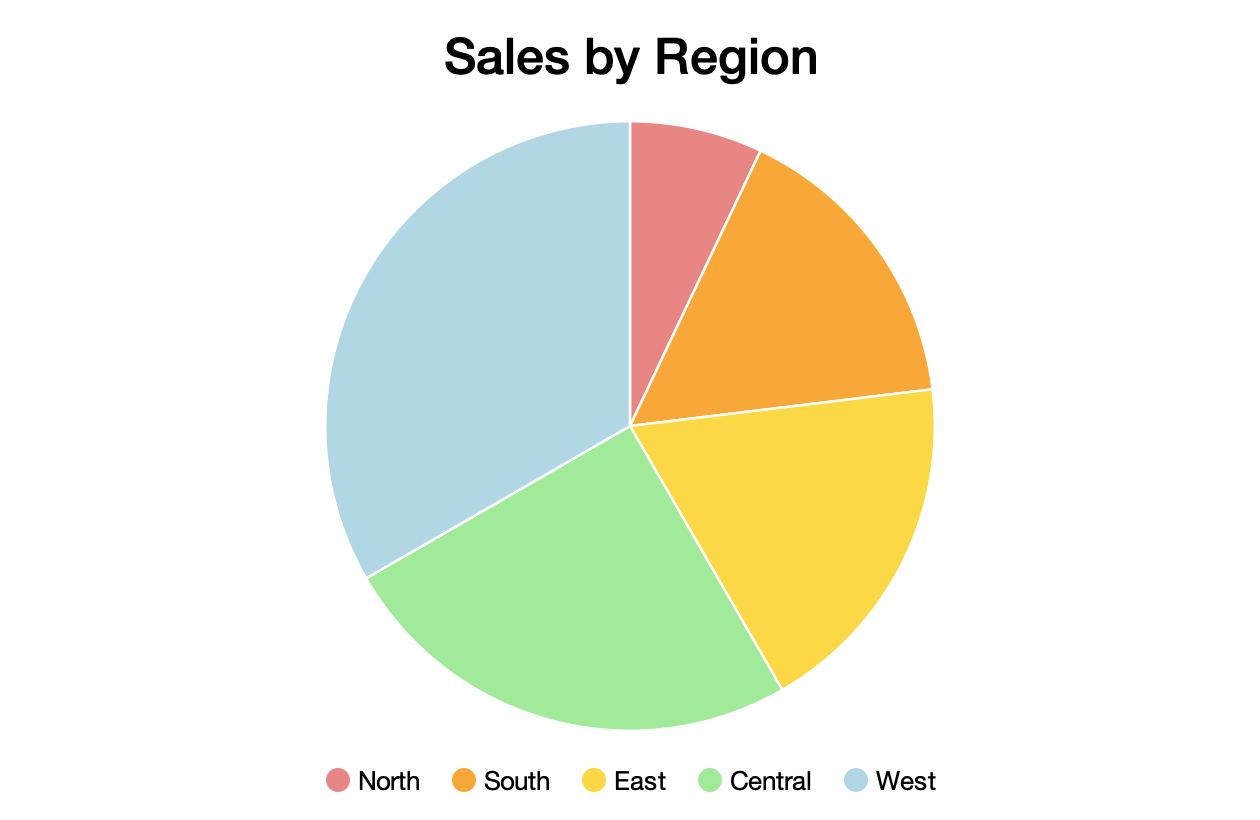
The size of each slice is determined by dividing the sum of its associated data point values by the total of all data point values across all data sets.
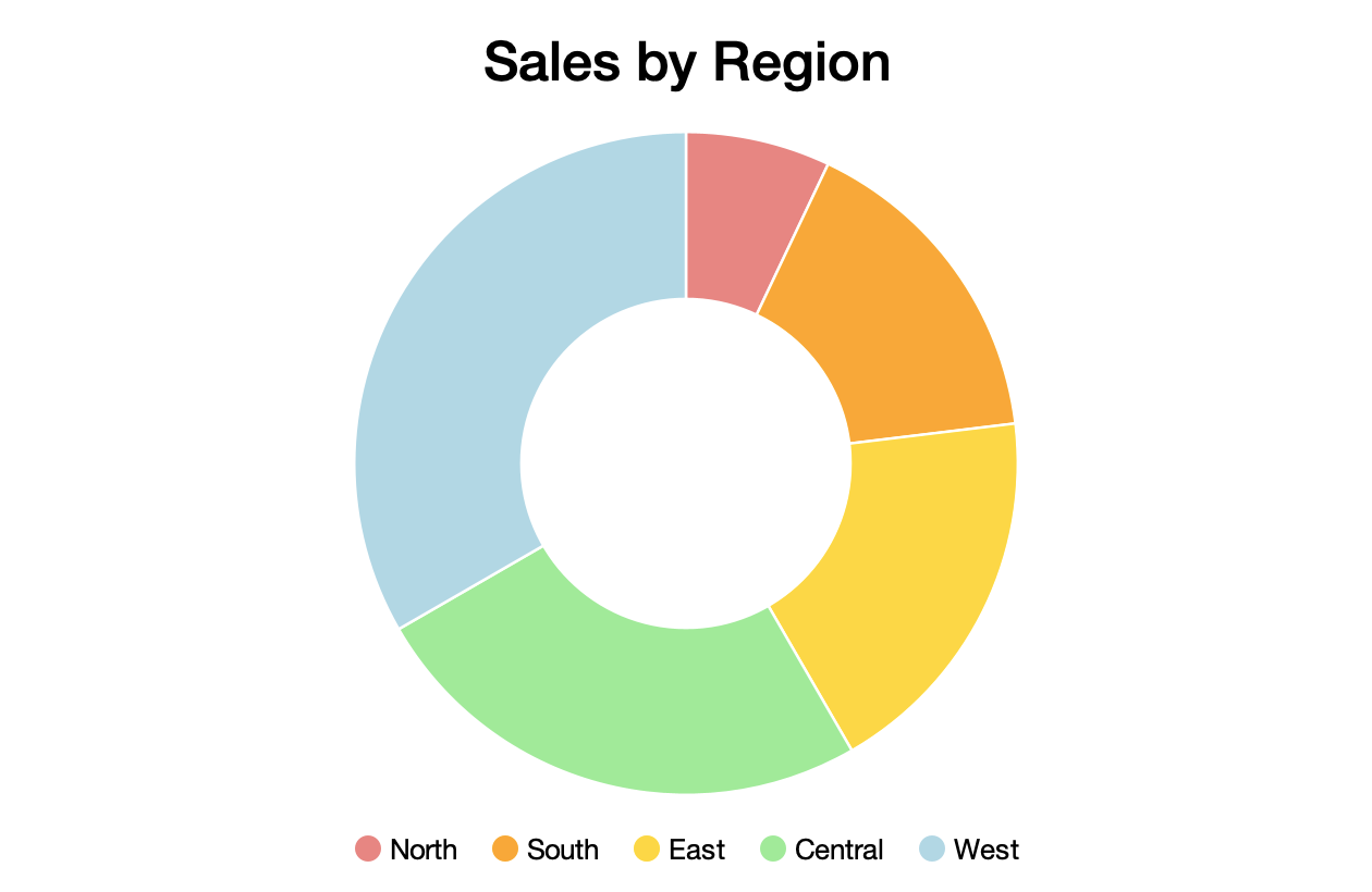
Pie charts can also be presented as a doughnut:
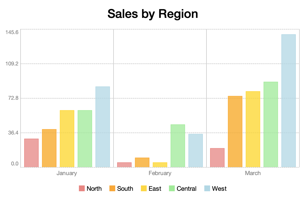
Bar Charts
The BarChart class displays a bar chart:
public class BarChart<K extends Comparable<? super K>, V extends Number>
        extends CategoryChart<K, V> {
    ...
}
var northDataSet = new DataSet<Month, Double>("North", UILoader.getColor("light-coral"));

northDataSet.setDataPoints(sortedMapOf(
    entry(Month.JANUARY, 30.0),
    entry(Month.FEBRUARY, 5.0),
    entry(Month.MARCH, 20.0)
));

var southDataSet = new DataSet<Month, Double>("South", UILoader.getColor("orange"));

southDataSet.setDataPoints(sortedMapOf(
    entry(Month.JANUARY, 40.0),
    entry(Month.FEBRUARY, 10.0),
    entry(Month.MARCH, 75.0)
));

...
Category labels are produced by the chart's domain label transform:
barChart.setDomainLabelTransform(
        month -> month.getDisplayName(TextStyle.FULL, Locale.getDefault())
);
Range labels are produced by the range label transform:
var rangeLabelFormat = NumberFormat.getNumberInstance();
rangeLabelFormat.setMinimumFractionDigits(1);
rangeLabelFormat.setMaximumFractionDigits(1);
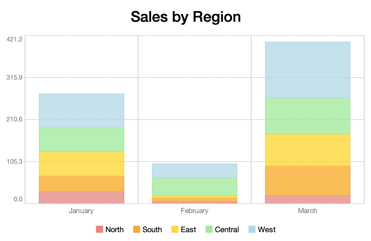
barChart.setRangeLabelTransform(rangeLabelFormat::format);Bars may optionally be stacked:
Time Series Charts
The TimeSeriesChart class displays a collection of values over a period of time:
public class TimeSeriesChart<K extends Comparable<? super K>, V extends Number>
        extends XYChart<K, V> {
    ...
}
For example, this chart shows a series of Double values (plotted on the y-axis) collected at Integer intervals (plotted on the x-axis):
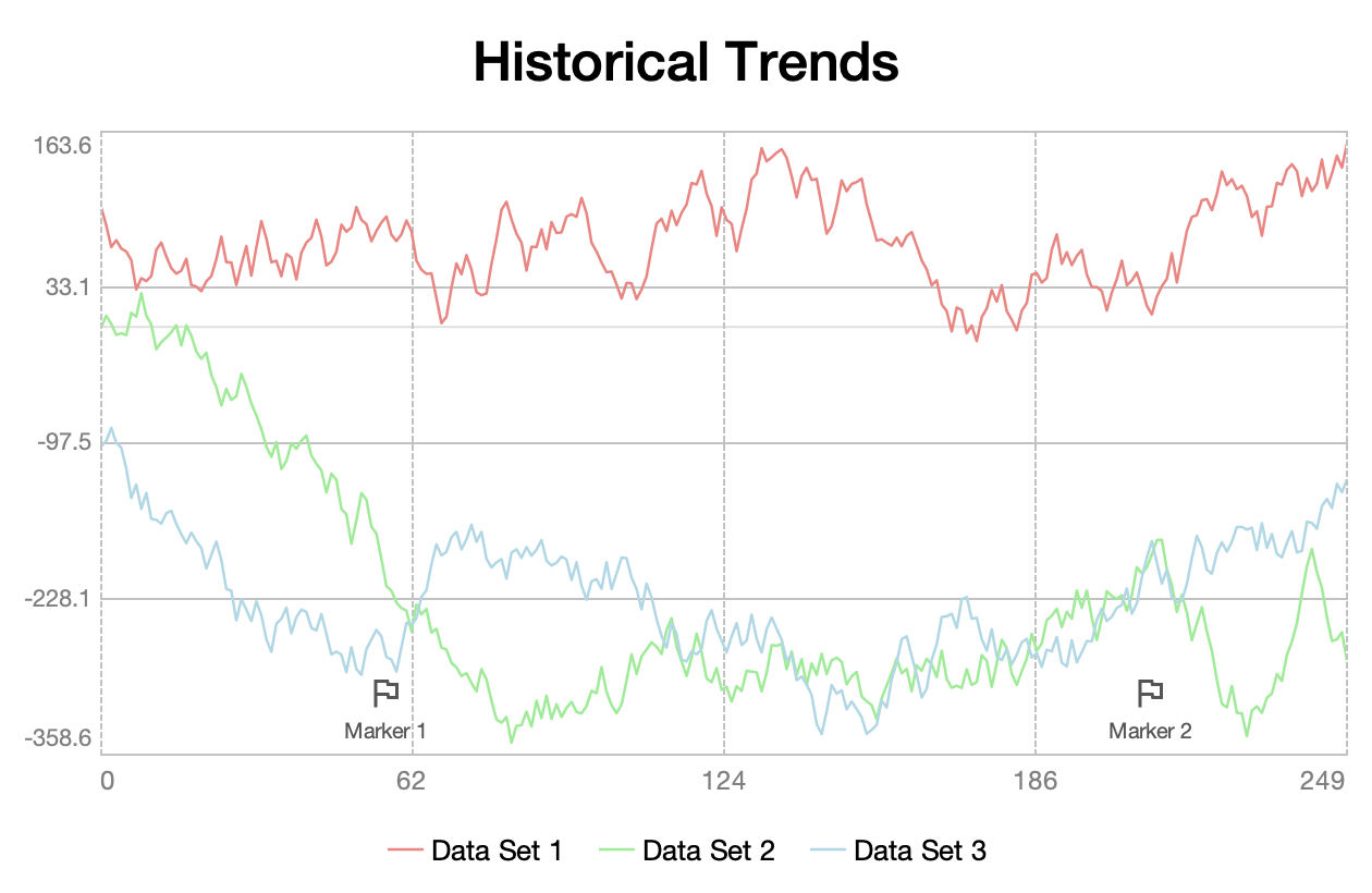
It also demonstrates the use of domain markers, which can be used to highlight specific data points.
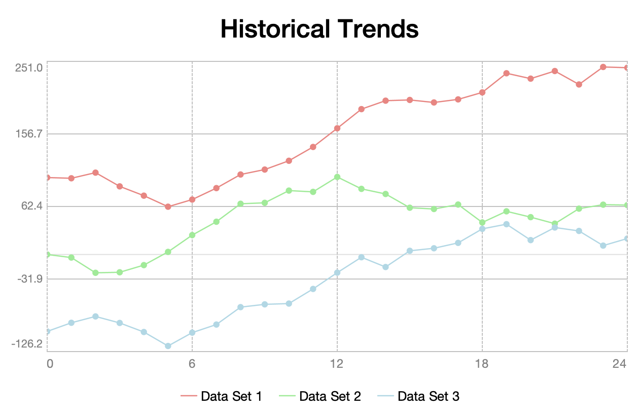
Individual value markers may optionally be shown:
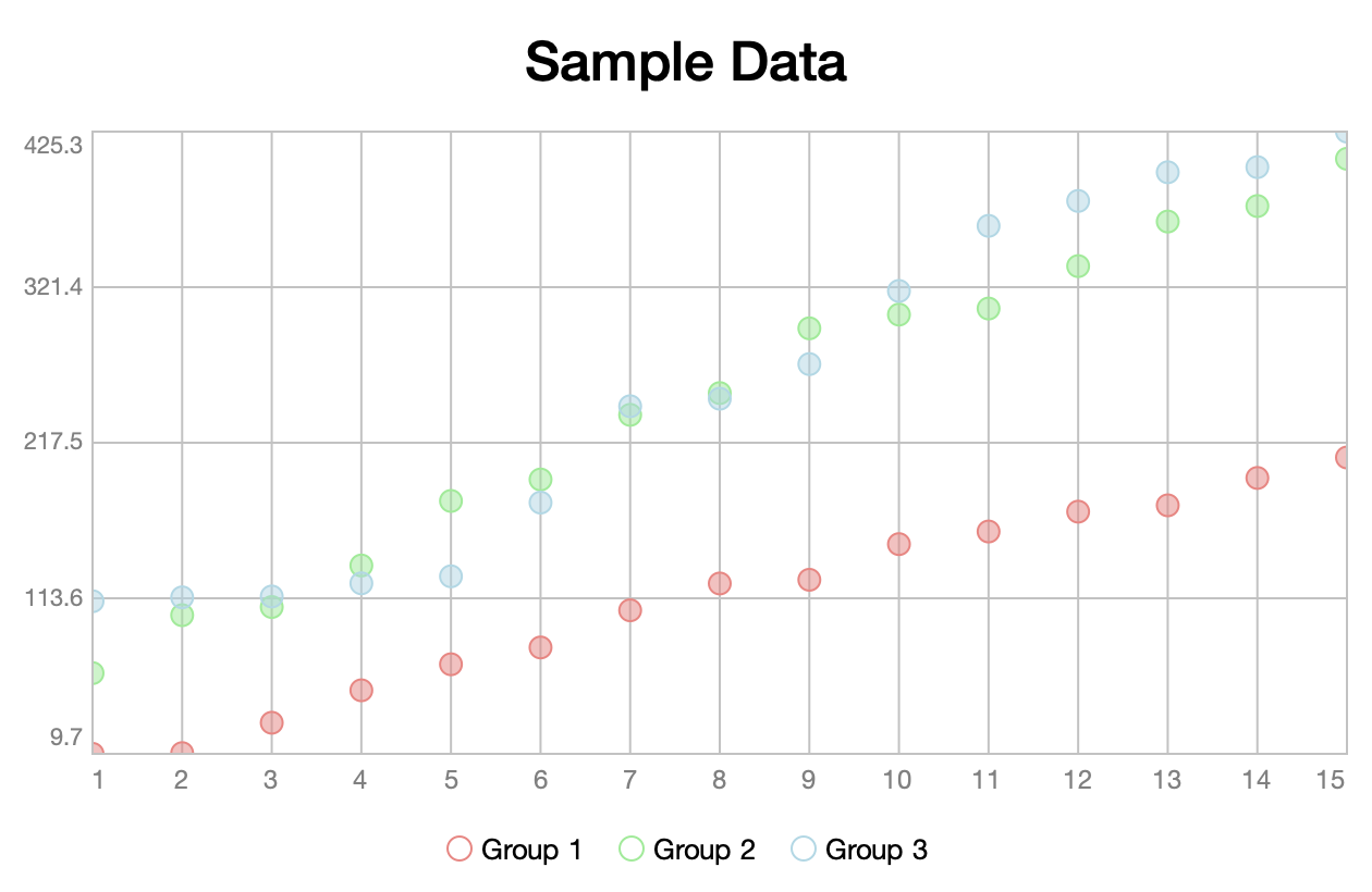
Scatter Charts
The ScatterChart class displays the relationship between two variables:
public class ScatterChart<K extends Comparable<? super K>, V extends Number>
        extends XYChart<K, V> {
    ...
}
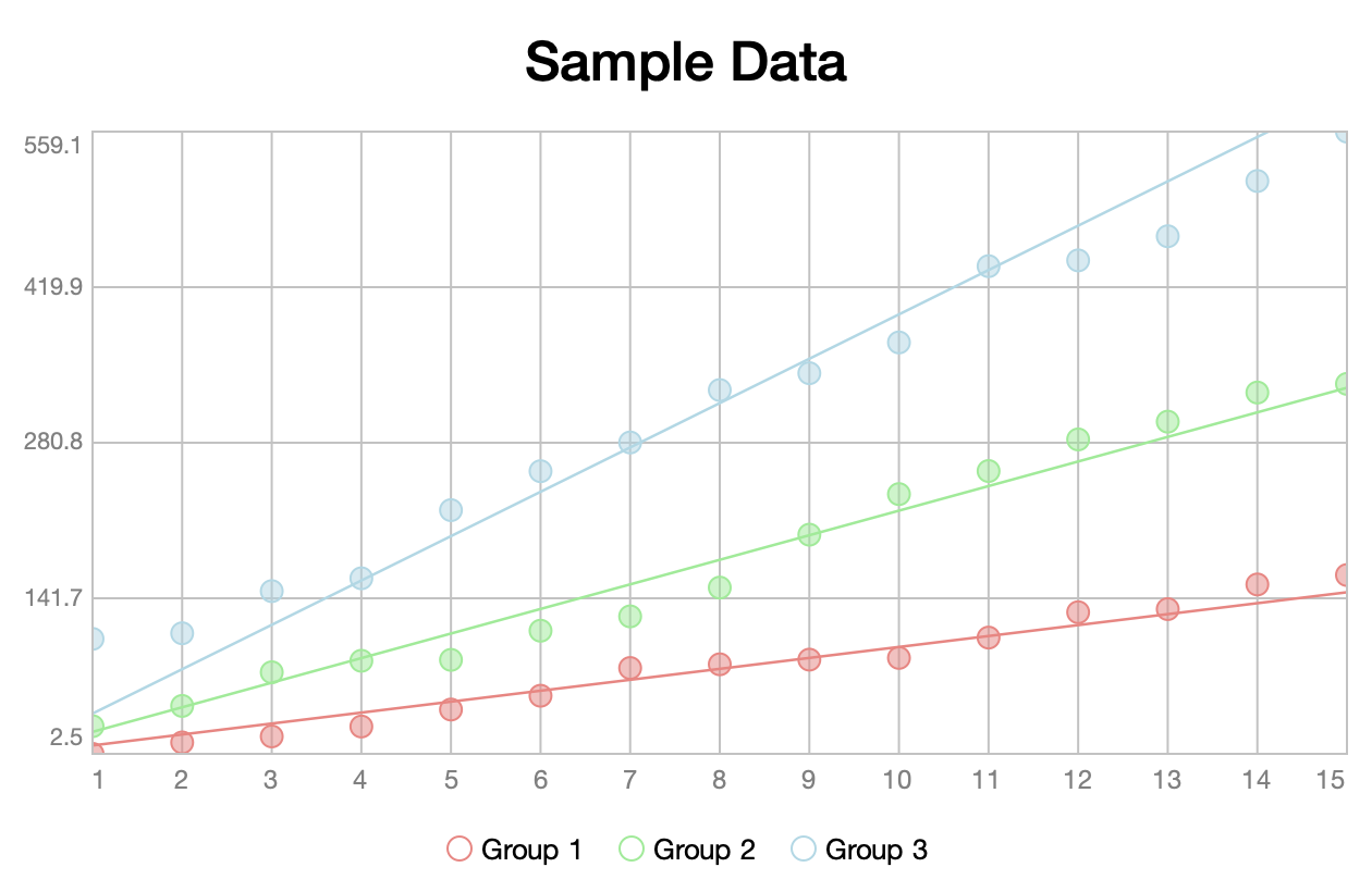
Linear trend lines may optionally be shown to help draw a correlation between the values:
Candlestick Charts
The CandlestickChart class displays a collection of OHLC (open, high, low, close) values:
public class CandlestickChart<K extends Comparable<? super K>>
        extends CategoryChart<K, OHLC> {
    ...
}
Candlestick charts are typically used to present historical pricing information. The box (or "body") represents the opening and closing values. A hollow body indicates a positive trend (a value where the closing price is higher than the opening price). A solid body represents a negative trend (a value where the closing price is lower than the opening price). The "wick" lines above and below the body represent the high and low values, respectively:
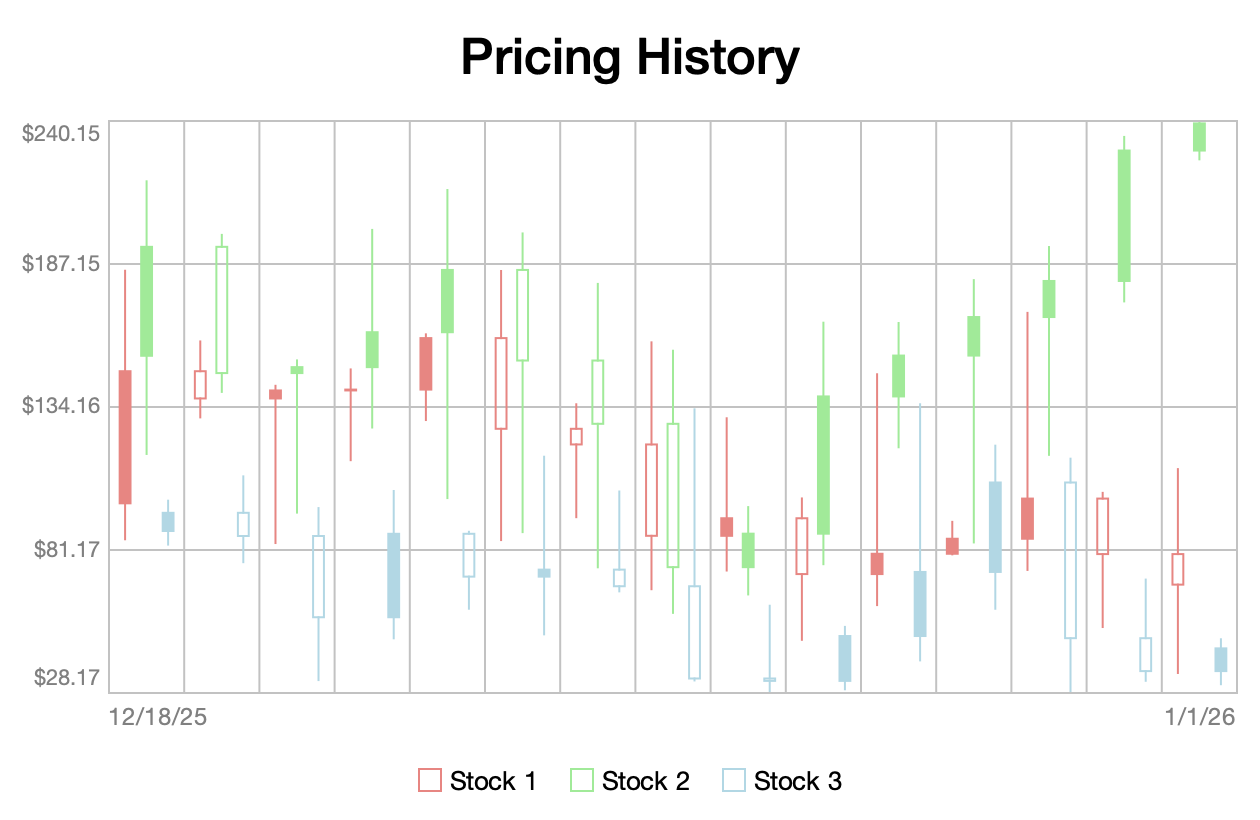
The OHLC type is defined as follows:
public record OHLC(
    double open,
    double high,
    double low,
    double close
) { ... }
Headless Usage
Charts can also be used in a headless environment. For example, the following code uses Apache Batik to create an SVG representation of a chart:
var document = domImplementation.createDocument("http://www.w3.org/2000/svg", "svg", null);

var svgGraphics = new SVGGraphics2D(document);

chart.draw(svgGraphics, WIDTH, HEIGHT);

var writer = new StringWriter();

svgGraphics.stream(writer, false);
Complete Example
The following is a complete example of an application built using Sierra. It uses the Tiingo End-of-Day API to retrieve historical stock pricing information:
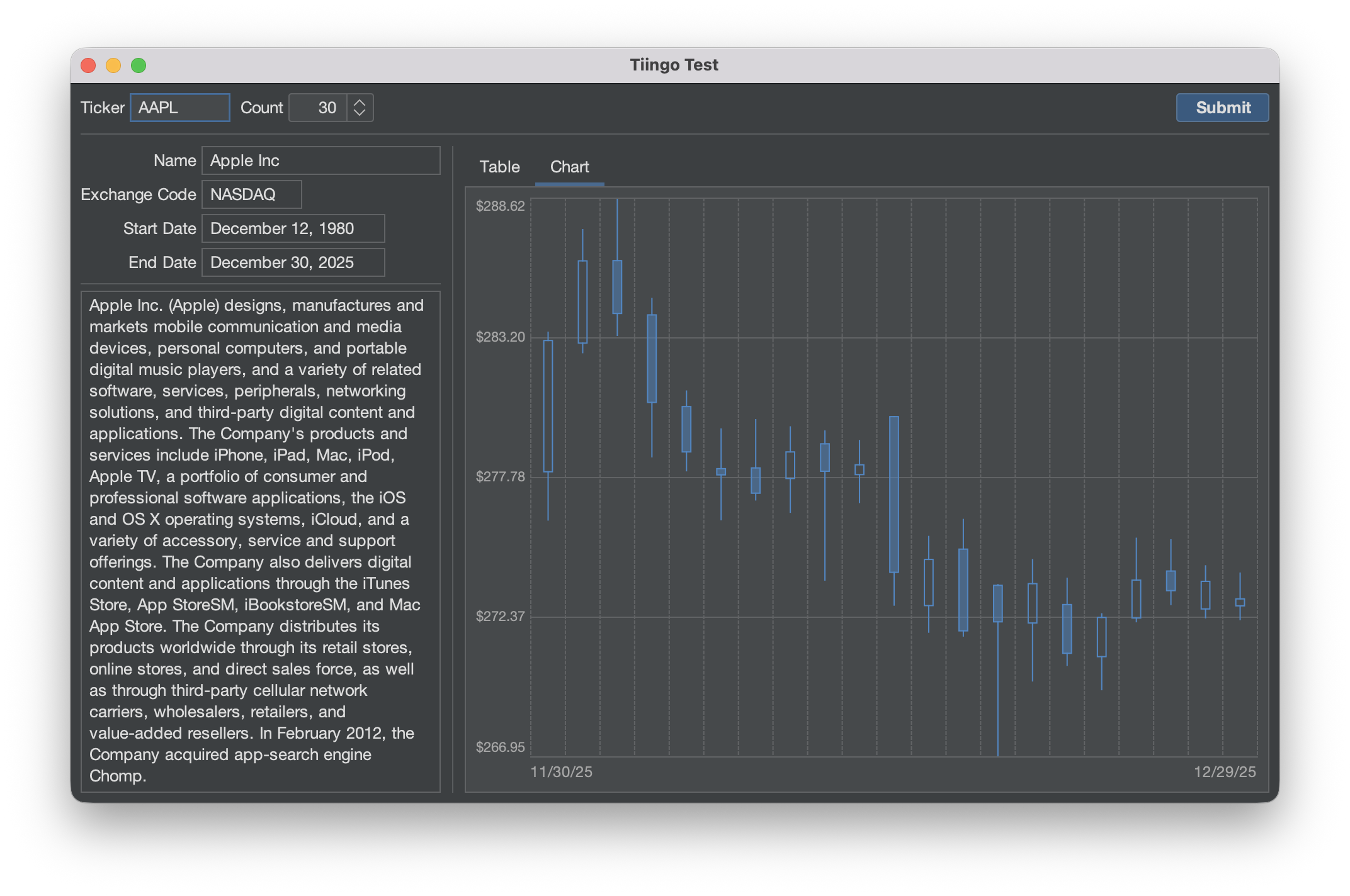
The source code for this example can be found here. For more information, see the project README.
Opinions expressed by DZone contributors are their own.
Comments