Creating a Box and Whiskers Chart With TypeScript and LightningChart JS
Learn how to create a fully customizable box and whiskers chart in Visual Studio Code using TypeScript, NodeJS, and LightningChart JS charting library.
Join the DZone community and get the full member experience.
Join For FreeHi, Omar here.
In this new article, I'll show you how to create a traditional box and whiskers chart using TypeScript and LightningChart JS. Specifically, this chart uses ChartXY, BoxSeries, and PointSeries to represent the outliers.
Box and Whiskers Chart
Also known as a box and whisker plot, this is a widely used chart that helps to visualize the dispersion of a set of data on a graph and consists of four parts:
- The median line (the vertical line in the middle of the box)
- The upper and lower fences (the lines on either side of the box)
- The whiskers (the short, dashed lines that project from each side of the box)

How To Read the Boxplot or Whiskers Chart
For reading a boxplot, you should consider that we are presenting five different numbers: the box represents the mid-range portion of the dataset, a.k.a, the interquartile range; whereas, the "whiskers" are those ends at the beginning and at end of the chart. The first one represents the 25% range while the third quartile represents the 75%+ quartile range mark.
The vertical line that you see within the main interquartile range represents the median.
When To Use a Whiskers Chart
Some of the most common applications of this chart are in statistics, e.g., scientists, pharmaceutical researchers, research analysts, etc. It is common to use this chart for visualizing how quantitative values are distributed.
In addition, multiple categorical values can be compared and discrepancies across different variables can be detected.
This article will walk you through creating a box and whisker chart with TypeScript. Let's set up our template.
Setting Up the Project Template
- Download the template.
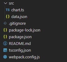
- Once opened in Visual Studio Code, you will see a file tree like this one:
![Box and whiskers project file tree]()
- Now, open a new terminal.
- As usual in a Node.js project, you'll have to run the NPM install command.
This is everything for the initial setup. Let's code.
data.json
If you open the data.json file, we will find three members. If you add more members, the results in the chart will be updated. See the code below:
{
        "name": "Software developer",
        "data": {
            "lowerExtreme": 17.5,
            "lowerQuartile": 19.6,
            "median": 21.2,
            "upperQuartile": 28.5,
            "upperExtreme": 48.1,
            "outliers": [
                50.1
            ]
        }
    },
Now, let's analyze the boxplot:

The lines extending parallel from the boxes are known as the "whiskers," which are used to indicate variability outside the upper and lower quartiles.
Outliers can sometimes be shown as individual dots on either side of the line that connects the whiskers.
Chart.ts
In this document, we will find all of the logic and configuration necessary to create a chart with animations and formatting for data.
1. Declare the constant lcjs that will refer to our @arction/lcjs library. If you're new to the lcjs library, this library contains advanced JavaScript charts that are high-performance, interactive, and fully customizable.
2. Extract required classes from lcjs.
import dataJson from './data.json'

// Import LightningChartJS
const lcjs = require('@arction/lcjs')
// Extract required parts from LightningChartJS.
const {
    lightningChart,
    AxisTickStrategies,
    AutoCursorModes,
    PointShape,
    UIElementBuilders,
    Themes
} = lcjs
3. Import the data.json file.
4. Create the chart object:
const chart = lightningChart().ChartXY({
    theme: Themes.auroraBorealis ,
})
    .setTitle('Age distribution across professions')
    // Disable interactions.
    .setAutoCursorMode(AutoCursorModes.disabled)
    .setMouseInteractions(false)
Now, let's deep dive into the cursor properties and their functionalities.
setAutoCursorMode: This property sets the chart to anAutoCursorbehavior by selecting a preset option fromAutoCursorModes. Here are the possible values:AutoCursorModes.snapToClosest(default): AutoCursor snaps to closest data point from mouse location.AutoCursorModes.onHover: AutoCursor is only shown when it is directly over a series.AutoCursorModes.disabled: AutoCursor is disabled.
setMouseInteractions:- Set if mouse and cursor interactions should be disabled during scrolling animations for the chart's series.
- Parameters:
- state:
boolean True, if the mouse and cursor interactions should be disabled during the scrolling animations;falseif not
- state:
Theme:- A collection of default implementations can be accessed by using the property
Themes. - The
Colortheme of the charts must be specified when they are created and can't be changed afterward. Otherwise, it would destroy the chart and it would have to be recreated. You can find more information about it in the documentation.
- A collection of default implementations can be accessed by using the property
getDefaultAxisX: Gets the X axissetTickStrategy: TheTickStrategydefines the positioning and formatting logic of theAxisticks as well as the style of created ticks. Read more about thesetTickStrategyin the documentation.
const axisX = chart.getDefaultAxisX()
    .setTitle('Profession')
    // No default ticks.
    .setTickStrategy(AxisTickStrategies.Empty)
    // Disable interactions.
.setMouseInteractions(false)dataJson: Inside this method, we will construct the chart object for each member(profession).
dataJson.forEach((profession, i) => {
const data = profession.databoxSeries: Creates the item for each member; the items will be the “figure” inside the chart.setBodyWidth: Width of the column itemTailWidth: Width of the upper and lower extreme lines
const boxSeries = chart.addBoxSeries()
        .setDefaultStyle((figure) => figure
            .setBodyWidth(0.70)
            .setTailWidth(0.70)
)pointSeries: Creates the points outliers and their sizes
const pointSeries = chart.addPointSeries({
        pointShape: PointShape.Circle
    })
.setPointSize(20)- Compute X positions for
BoxFigure:
const start = i * 1
    const end = start + 1
const middle = (start + end) / 2boxSeries.add:- Adds the X positions and values for each quartile
boxSeries.add({
        start,
        end,
        lowerExtreme: data.lowerExtreme,
        lowerQuartile: data.lowerQuartile,
        median: data.median,
        upperQuartile: data.upperQuartile,
        upperExtreme: data.upperExtreme,
})pointSeries.add:- Adds positions for each outlier (points)
data.outliers.forEach((outlier) => {
        pointSeries.add({
            x: middle,
            y: outlier
        })
})addCustomTick:- Creates a
CustomTickon the X-Axis to display the name of the profession.
- Creates a
axisX.addCustomTick(UIElementBuilders.AxisTick)
        .setValue(middle)
        .setTextFormatter(() => profession.name)
        .setGridStrokeLength(0)
NPM Start
To visualize the box and whiskers charts, run the npm start command in a new terminal. The chart will be rendered on the local server http://localhost:8080/.

Creating a box and whiskers chart is fairly simple, especially with the help of TypeScript annotations and the lcjs library documentation.
A box and whiskers chart can be used to show the distribution of a dataset within a certain range. As you're creating this chart, you can also customize it to make it look however you want. It's a great tool for discussing particular parts of your dataset, e.g., outliers detection.
Hope you enjoyed learning about how to create a box and whiskers chart and hope to see you here again for the next article!
Published at DZone with permission of LightningChart LightningChart. See the original article here.
Opinions expressed by DZone contributors are their own.
Comments