Developer’s Guide: How to Build a Dashboard With JavaScript Libraries
We take a look at two JavaScript libraries that can help devs create effective dashboards to help their org easily access data.
Join the DZone community and get the full member experience.
Join For FreeIt’s easy to become overwhelmed when your boss challenges you to find an out-of-the-box reporting tool or develop a dashboard completely from scratch.
As dashboards are used for making important decisions, they have to be fine-tuned and carefully organized. Also, they should satisfy the following requirements:
- Seamless integration process with the available tech stack.
- Full-featured functionality for reporting and data visualization.
- Affordable pricing.
- Up-to-date design.
- Ability to export reports in convenient formats.
While searching for a solution, my choice fell on two JavaScriptlibraries — a pivot table and a charting library — that fully met all above-mentioned criteria. What is more, they turned out to be totally compatible with each other.
Therefore, I’ve tried to combine the reporting features of the pivot grid and delightful visualizations of the charting library. As a result, I’ve created an analytical tool that fits my project and makes the analysis process more enjoyable.
Moreover, it allowed operating with the data almost in real-time as it can connect to the database, where the data is updated on a daily basis. Due to this, I could reflect the latest changes in the pivot table and charts.
Tools for Reporting and Visualization
Let me tell you about these tools. The first one is Flexmonster, a JavaScript pivot table component that transforms your raw data into an understandable form by means of aggregation, filtering, and sorting. Its built-in features enable data analysts to create interactive web reports that can be saved and accessed from any device.
Below are some features which captivated me the most:
- Ease of connection to a wide range of data sources (CSV, JSON, SQL, NoSQL data, OLAP cubes, and Elasticsearch).
- Integration with React, Angular, AngularJS, and other frameworks.
- Filtering options. I especially liked the Excel-like date filters that enabled me to focus on specific time ranges.
- Performance. Being optimized for processing large amounts of data, it uses little memory and allows for the generating of reports directly in the browser.
- Customization options. I liked the ability to change the style of the cells as well as the look and feel of the entire component by tuning CSS styles or applying report themes (the dark one is in my favorite).
- Interactivity. I’ve managed to restructure reports with the drag-and-dropfeature.
- Ability to create multi-level hierarchies that make it suitable for multi-dimensional analysis.
- Extensive APIs for easy component configuration.
- Exporting of reports to PDF, Excel, HTML, Image, etc.
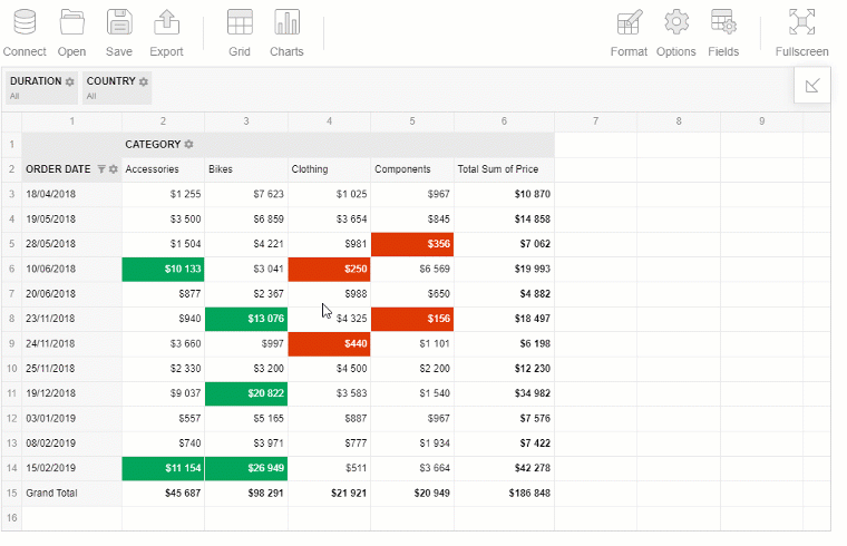
Check out an example of a report:
Now let's get to the second — FusionCharts. It's a piece of data visualization software that offers a bundle of more than 95 charts.
Features that simplify the developer's life:
- A wide range of front-end and backend integrations.
- A gallery of eye-catching charts that make your data visualization project stand out.
- Functional and visual features for customization. Especially I like annotations.
- Exporting of charts to PDF and images.
- Ready-to-use demos. Well-selected examples help to understand the purpose of each chart.

To my mind, both tools have the potential to make up a part of abusiness intelligence solution.
How to Create a Dashboard
In my view, the best approach is to learn by doing. I do hope my experience will help you to learn how to build a browser-based responsive dashboard that fits any project.
Step 1: Integration
- Firstly, integrate a pivot table with your application by setting up all its dependencies and initializing it. I recommend following the steps from the Quick Start guide which I’ve found user-friendly.
- Install the charting library by loading its scripts on the page.
- Create <div> containers where the components should be rendered.
Step 2: Importing a Dataset
The next step is to query the data from a database or any other data source and load it into the pivot table. This tutorial helped me establish a connection with my PostgreSQL database.
Step 3: Defining Objectives of the Analysis
Before you start designing a reporting tool for your end-users, you should always try to determine to what kind of industry-specific questions it should give answers to, as well as a goal which needs to be achieved as the far-reaching result. Then define key metrics that need to be tracked.
Step 4: Setting a Slice
To create a report, simply arrange the hierarchies by putting them into rows, columns, and measures. Later, you can change the slice with the drag-and-drop feature. To my mind, such interactivity greatly prevails over static reporting.
Also, try adding a multi-level hierarchy to be able to drill down every time you need to concentrate on the specific level of details.
Step 5: Connecting a Pivot Table to Charts
Attach a handler for the `reportcomplete` event which is fired when the data has finished loading and the grid is ready to display it. The handler should call the createChart() function that instantiates the chart on the web page.
Let me explain here how you make the charts react to the changes in the report.
In createChart(), you run the getData() method on a pivot table instance to get all the data from a current report, transform it for an appropriate format, and send to callbackHandler and updateHandler. These handlers define what should happen once the data is loaded or when some changes are applied to it (filtering, sorting, etc).
Only this way two components are bound together and share the same underlying data.
Extra Step: Customization
The icing on the cake: change the look and feel of your dashboard with themes for the pivot table and the charts. Include their theme files and add one more line of code to the functions of callbackHandler and updateHandler. I prefer the ‘fusion’ theme the most, you can apply any other one:
chart.setChartAttribute("theme", "fusion");
Enjoy the Results
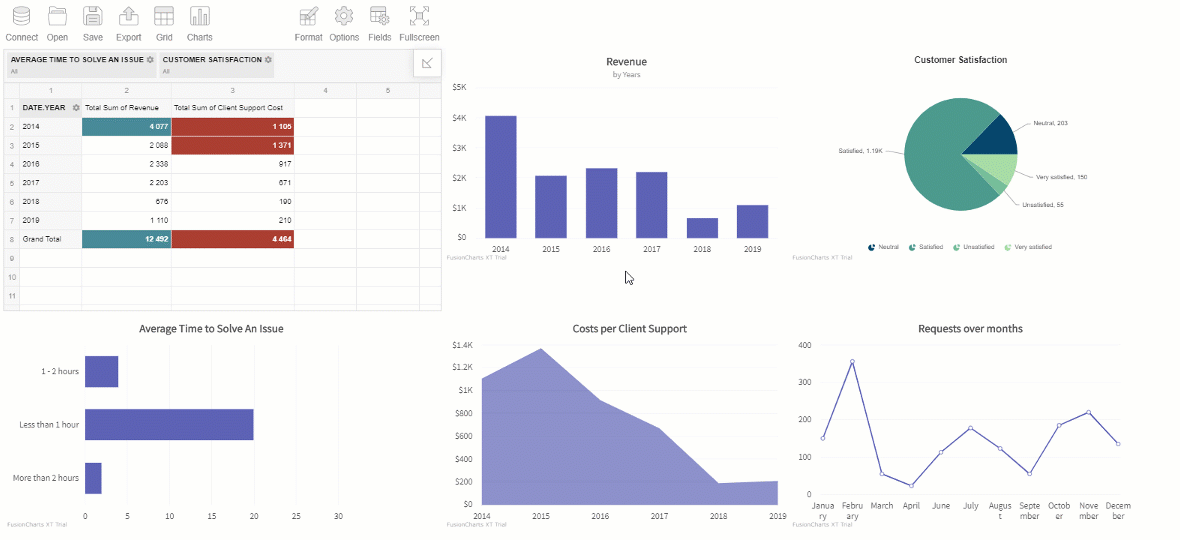
Our customer service dashboard looks as follows:
Conclusion
Today you’ve learned in practice how to build a dashboard with the pivot table and charts. To my mind, both tools are irreplaceable for building a dashboard. While a pivot table allows bringing the data in one place, the charts enhance the project with visual features.
Besides, both tools are fully customizable. This is especially important because dashboards always evolve over time due to the ever-changing nature of business processes.
I hope this tutorial will help your end-users save time while generating reports and improve the effectiveness of the department they are working in.
Feedback
Feel free to share this tutorial and a live demo with your teammates and friends — I’ll be glad to hear your feedback.
What are your favorite tools for creating interactive dashboards?
Useful Links
Opinions expressed by DZone contributors are their own.
Comments