Building Scalable and Resilient UI/UX With Angular and Node.js
Tech giants scale UI/UX by combining performance and design systems to ensure fast, consistent, and accessible experiences across platforms.
 CORE
·
CORE
·
Join the DZone community and get the full member experience.
Join For FreeIn large-scale applications, the synergy of a robust frontend and a high-performance backend is essential. By leveraging Angular for rich, maintainable UIs and Node.js (often with frameworks like Express or NestJS) on the backend, teams can ensure both high throughput and responsive user experiences. Modern SPAs (Single-Page Applications) by default offload much rendering to the browser, which can slow initial load and SEO. Therefore, tech leaders increasingly adopt hybrid rendering strategies – for example, using Angular Universal for server-side rendering (SSR) – to pre-render pages on Node.js servers. This approach boosts Core Web Vitals (e.g. FCP, LCP) by delivering HTML content to the browser immediately. In turn, heavy client-side JavaScript can “hydrate” that HTML into a fully interactive app. Careful choice of rendering model (CSR vs SSR vs SSG vs ISR) is a foundational performance strategy.
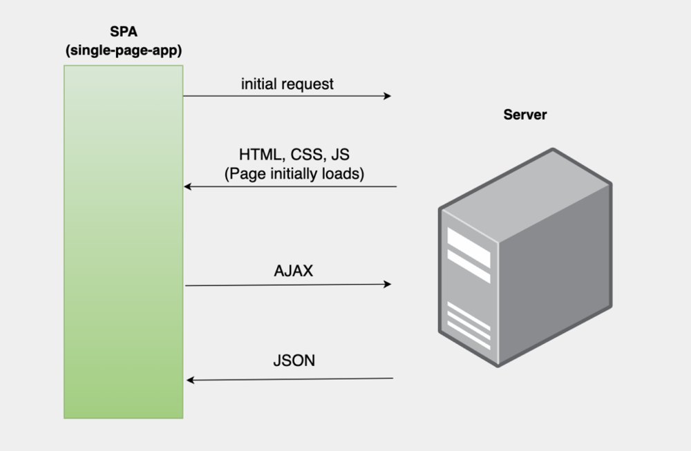
A typical Single-Page Application (SPA) rendering flow.
The initial request loads static HTML/CSS/JS, and subsequent interactions fetch JSON data via AJAX. Tech giants mitigate this heavy client load through lazy loading and SSR. For example, Angular’s router can loadChildren feature modules dynamically, keeping the initial bundle small:
const routes: Routes = [
  { path: 'users', loadChildren: () => import('./users/users.module').then(m => m.UsersModule) },
  { path: 'dashboard', component: DashboardComponent }
];
This defers large portions of the app until needed. In combination with Angular Universal, the Node.js server pre-renders the initial HTML. A minimal Angular Universal server might look like this:
import 'zone.js/node';
import * as express from 'express';
import { ngExpressEngine } from '@nguniversal/express-engine';
import { AppServerModule } from './src/main.server';

const app = express();
app.engine('html', ngExpressEngine({ bootstrap: AppServerModule }));
app.set('view engine', 'html');
app.set('views', 'browser');
app.get('*.*', express.static('browser', { maxAge: '1y' }));
app.get('*', (req, res) => {
  res.render('index', { req });
});
app.listen(4000);
This hybrid rendering pipeline ensures that the user sees meaningful content immediately, while Angular’s client-side bundle hydrates interactivity later.
To maintain performance at scale, teams implement multiple strategies in parallel:
- Server-Side Rendering (SSR) – Pre-render pages on Node.js to send complete HTML to clients. This improves initial load speed and SEO. Modern Angular (v19+) supports non-destructive hydration, meaning the server-rendered HTML stays intact when the client bundle loads. SSR pairs well with incremental or deferred views (using
@defer) to split rendering work between server and browser. - Code Splitting & Lazy Loading – Organize the app into feature modules or standalone components that load only when needed. This minimizes the size of the main bundle. For example, using Angular Router’s
loadChildren(above) ensures only the routes the user visits are downloaded, cutting initial JavaScript payload. - Caching and CDNs – Static assets (JS bundles, images, CSS) are served via CDNs geographically near users. API responses and dynamic content can also be cached. For example, use HTTP caching headers or a
Redislayer to store frequent queries on Node.js. This reduces bandwidth and latency for repeat visits. - Node.js Scalability (Clustering & Microservices) – Use multiple Node processes (or microservices) to utilize all CPU cores and isolate workloads. The Node.js
clustermodule,PM2, or container orchestration (Kubernetes) can spawn worker processes. If one process crashes, others continue serving requests. As DigitalOcean docs note, “the cluster module… creates multiple copies of the same application… with a load balancer to evenly distribute traffic”. By implementing clustering and stateless microservices (e.g. breaking a monolith into smaller Node services for payments, auth, etc.), teams achieve horizontal scalability and fault tolerance. - Performance Monitoring & Testing – Proactive testing with tools like
Lighthouse,WebPageTest, and real-user monitoring alerts teams to regressions. Automated CI pipelines can run performance budgets on key metrics to catch slowdowns early.
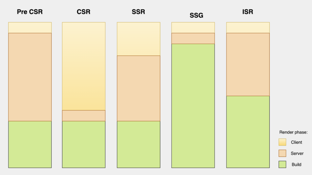
Comparison of rendering work across techniques.
CSR (Client-Side Rendering) offloads nearly all work to the browser, whereas SSR/SSG shift much of the workload to the server or build time (green = client, orange = server, yellow = build). In practice, tech leaders often “stack” approaches. For example, an Angular app might use SSR for the initial page and then client-side routing afterwards, or pre-generate most pages at build time (SSG) and hydrate them on demand. The goal is to minimize the browser’s work (for better Core Web Vitals) without sacrificing interactivity.
Design Systems: Foundation of Consistent UX
A design system enables teams to deliver a consistent and scalable UX. Google’s Material Design and Microsoft’s Fluent Design are examples of systems that define reusable components, styling tokens, interaction patterns, and accessibility standards.
By standardizing UI elements like buttons, dialogs, and forms, companies ensure visual and functional coherence. These design systems also facilitate onboarding and accelerate development across teams by reducing ambiguity and duplication.
Design Systems and Theming for Consistency
Robust design systems underpin large-scale UI consistency. Frameworks like Angular Material provide a ready-made system (based on Google’s Material 3) with reusable components, theming, and accessibility support. In these systems, design tokens are the foundational values (colors, typography, spacing, etc.) shared across components. As one expert explains, “Design tokens are essentially the building blocks of your design system” – a single source of truth for all design decisions. For example, the Material 3 token hierarchy might map semantic tokens to color palette CSS variables:
:root {
  /* Reference palette colors */
  --md-ref-palette-primary90: #FFD7F0;
  /* System tokens use reference tokens */
  --md-sys-color-primary-container: var(--md-ref-palette-primary90);
}
By defining such variables (or SCSS maps) centrally, an app can switch themes (light/dark/high-contrast) by overriding a few system tokens. Angular teams often build or publish shared token libraries (via npm) so all projects use the same base values.
Key elements of a scalable design system include:
- Design Tokens & Theming – Centralized variables for colors, fonts, and spacing. Using CSS custom properties or a token library (Style Dictionary, Figma exports) ensures the Angular components adapt automatically. As an example, Angular Material’s theming engine uses
SCSStokens (mat-palette,angular-material-theme) tied to CSS vars. - Component Libraries – A shared Angular component library (often wrapped in a mono-repo or published package) provides standardized UI components: buttons, cards, dialogs, form controls, etc. Teams at Google, Microsoft, and others leverage their own libraries (
Material,Fluent) so that UX is uniform across apps. In large organizations, product teams can contribute to these libraries just like front-end code. - Documentation & Storybooks – Document components and usage guidelines in tools like
Storybook. This accelerates onboarding and prevents duplicate efforts. A style guide detailing token usage, component variants, and accessibility rules helps large teams converge on the same patterns. - Automated Visual Regression – Integrate visual testing (
Chromatic,Percy) into CI to catch unintended UI drifts. When design tokens change, regression tests flag any component that looks off.
Responsive and Cross-Platform Layouts
Large tech companies must target a wide range of devices and platforms. Responsive design ensures that layouts adapt gracefully from mobile to desktop. Angular’s tooling supports responsive development via standard web techniques and libraries. Key strategies include:
-
Fluid Grids and Media Queries – Use
CSS GridorFlexboxwith percentage-based sizes and Angular’s built-in layout utilities. TheAngular CDKprovidesLayout Breakpointsto adjust component behavior based on screen width. Example:
.dashboard-container {
  display: grid;
  grid-template-columns: repeat(auto-fit, minmax(300px, 1fr));
  gap: 16px;
}
Components use @media queries or Angular CDK’s BreakPointObserver to rearrange or collapse sections.
- Mobile-First and Progressive Enhancement – Build the app to work on small screens first, then add enhancements for larger screens. Tools like
Angular Flex Layout(or CSS utility frameworks) simplify responsive adjustments in templates. - Progressive Web Apps (PWA) –
Angular CLIcan generate service workers and manifest files. APWAloads fast, caches resources offline, and gives a mobile-app-like experience. Tech giants leverageservice workers to cache assets and API calls, so repeat loads are instant. For example, Netflix’s PWA version on Android uses a service worker to pre-cache video metadata for quick startups. - Cross-Platform Frameworks – In addition to the web, Angular code can run in hybrid apps. Frameworks like
IonicandNativeScriptallow Angular developers to build mobile (iOS/Android) apps with the same code. Alternatively,Angular Elementscan turn components into web components for use in other frameworks. This code reuse means design tokens and services (from Node backends) apply everywhere. - Backend API Design – On the Node side, offering flexible APIs (
RESTwith pagination,GraphQLfor querying exactly what the UI needs) helps serve diverse clients efficiently. Mobile apps or IoT devices might use different API endpoints, but reusing business logic reduces redundancy.
Accessibility and Inclusive UX
Accessibility (A11y) is increasingly treated as a first-class requirement. Governments worldwide mandate that web apps be usable by people with disabilities. Meeting WCAG standards (contrast ratios, keyboard navigation, ARIA support) is both a legal requirement and a quality practice. In Angular applications, best practices include:
-
Semantic HTML & ARIA – Always use proper HTML elements (e.g.
<button>for buttons) and includeARIAroles/attributes when needed. For example:
<button aria-label="Close settings panel" (click)="close()">
  <mat-icon>close</mat-icon>
</button>- Keyboard Navigation – Ensure all interactive elements are reachable via
Taband give visible focus indicators. Test using only a keyboard to navigate the UI. TheAngular CDK A11ymodule can help manage focus restoration on route changes or modal dialogs. - Color Contrast and Themes – Design tokens should include high-contrast themes. For instance, Material’s dark mode not only swaps colors but also uses dedicated “
contrast” tokens to meetWCAG. Automated checks (ESLint A11yrules,Lighthouseaudits) can catch low-contrast issues inCSS variablesor tokens. - Screen Reader Testing – Regularly test key flows with screen readers (
NVDA,VoiceOver). Tools like Angular’scodelyzeror browser extensions can catch missingaria-labels. Provide descriptive alternative text for images, or generate it automatically (e.g.AWS Rekognitionor other AI captioning services can supplyalttext for uploaded images). - Captions and Transcripts – Any video/audio content should have captions or transcripts. For live interactions (Zoom-level apps), include live caption overlays when possible (the trend of “Live Caption” on videos).
- Inclusive Language and Layout – Consider users with cognitive or motor impairments. Keep UI simple, offer shortcuts, and ensure tappable elements are large enough.
AI-Driven Interfaces and Personalization
Cutting-edge UIs incorporate AI to personalize experiences and even replace traditional components with natural interfaces. For example, Netflix and Amazon tailor homepages using recommendation engines and A/B testing. A modern architecture might have a Node.js personalization service: a microservice that takes user behavior data, runs models (TensorFlow, PyTorch, or calling a cloud API like AWS Personalize or an OpenAI endpoint), and returns a customized UI layout or content list. For instance, a Node route could look like this:
import { Configuration, OpenAIApi } from 'openai';
const openai = new OpenAIApi(new Configuration({ apiKey: process.env.OPENAI_API_KEY }));

app.post('/chat', async (req, res) => {
  const prompt: string = req.body.prompt;
  const completion = await openai.createChatCompletion({
    model: 'gpt-4',
    messages: [{ role: 'user', content: prompt }]
  });
  res.json({ reply: completion.data.choices[0].message?.content });
});
On the Angular side, a component can call this service to implement a chat UI or dynamic content. Beyond chat, AI personalization can rank product lists, reorder menus, or generate UI copy on the fly.
Overall, the AI trend is making UIs smarter and more adaptive. Users might see feeds that learn their interests, layouts that adjust per user role, or even auto-generated form suggestions. As one Netflix post explains, they are even exploring “foundation models” that learn user preferences from vast history, suggesting that future UIs could reconfigure themselves in real time based on AI analysis (not yet widespread, but indicative of direction). For now, UI teams integrate pre-trained ML models to add features like image recognition (automatic alt text) or predictive typing in forms.
Responsive and Cross-Platform Design
Responsive design ensures UIs function across a range of devices, from phones to desktops. Techniques include fluid grids, relative units, and breakpoints. Cross-platform consistency is also vital: tools like React Native and Flutter allow code reuse across mobile and web while maintaining native performance.
Conclusion
Building a truly scalable and resilient UI/UX requires a holistic approach. Angular’s ecosystem provides powerful tools for performance (SSR, lazy modules, Material components), while Node.js on the server enables scalability (non-blocking I/O, clustering, microservices) and AI integration. Teams should invest early in a design system with tokens, ensure responsive layouts and rigorous accessibility, and leverage AI thoughtfully for personalization. The strategies used at tech giants – such as hybrid rendering, shared component libraries, and AI-driven recommendations – can be adopted by teams of any size to achieve robust, high-performance interfaces. By uniting advanced frontend techniques with a scalable backend, developers can deliver fast, consistent, and inclusive experiences that engage users at any scale.
Opinions expressed by DZone contributors are their own.
Comments