Implementing the “Card” UI Pattern in PhoneGap/HTML5 Applications
The Card UI pattern is a common look used by Pinterest and many other content sites. See how you can make a PhoneGap app with this look.
Join the DZone community and get the full member experience.
Join For Free“cards,” in a user interface, seem to be the rage these days. card-based user interface paradigms can be seen everywhere from google glass, to pinterest, google plus, spotify, flipboard, and many, many more places too innumerable to mention.

some proclaim the card user interface paradigm as the absolute future of web design, some see it as just another trend. in either case, you might need to implement a card style user interface in your own applications. if you happen to be building apps that target phonegap or in the browser, you’re in luck!
in this article, we’ll cover some techniques for building card ui paradigms with web standards. we won’t be focusing much on phonegap itself since this pattern is implemented purely from the html/css side of things, with interactivity and dynamism added via javascript. all source code for the examples discussed in this article can be accessed at:
https://github.com/triceam/cards-ui
what’s a card?
before we talk about building “card” interfaces, it’s important to understand exactly what we’re talking about. essentially, a card is a container that logically encapsulates bits of information. in most cases, a card is a rectangular area that contains a small amount of easily digestible information. the border of this rectangle is used to convey encapsulation of the content, in other words, a separation of the content within the “card” from content elsewhere on the screen. often there are many cards placed on the screen in close proximity to each other, and the borders or coloring of the cards is used to separate information between each of the cards. if you glance at the user interface for pinterest or google plus , you’ll quickly see user interface cards in action.
implementation in with phonegap, or in html, css, and javascript
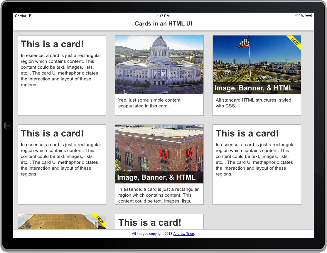
with web technologies, it is very easy to create rectangular visual structures, and to arrange content within those structures. let’s start with the basics. in the image below, we have two basic card structures, both implemented with html.

both of these examples can be seen in the 01_simple_card.html file in the github repository.
before we talk about the cards, let’s look at the page structure containing the cards. there is a header area, which would act as the header navigation in a phonegap area, a footer, and the main content area. each of these html structures has a css class that determines how the content is presented. all of the cards that we will be adding will be inside the <div> with the “content” css class.
<body>
    <div class="content">
        <!--- all cards go here --->
    </div>

    <div class="header">
        cards in an html ui
    </div>

    <div class="footer">
        all images copyright 2013 <a href="http://tricedesigns.com/" target="_blank">andrew trice</a>.
    </div>
</body>
each of these elements have css styles, which handle individual formatting. if you view the source, you will see that each has a fixed position and styles, which determine the general presentation colors, borders, and the touch scroll interaction.
inside the content <div> is where we define the cards. as i mentioned above, cards can be extremely simple. we have given the content <div> a light gray background color, and each card with a white background and slightly darker border, so that each card is visually differentiated from both the background, and from each other (if multiple cards are in closer proximity).
for the first card, we simply have a <div> that contains a heading element and a paragraph element, as shown in the code below.
<div class="card">
    <h1>this is a card!</h1>
    <p>in essence, a card is just a rectangular region which contains content.  this content could be text, images, lists, etc... the card ui methaphor dictates the interaction and layout of these regions.</p>
</div>
to achieve the visual treatment, there are just a few simple css styles applied to the html. the background and border colors have been defined, as well as the padding and overflow rules for the “card” container.
.card {
    background:#fff;
    border:1px solid #aaa;
    border-bottom:3px solid #bbb;
    padding:0px;
    margin:15px;
    overflow:hidden;
}
for each heading and paragraph element, we’ve also defined margin and padding rules to govern the spacing of elements. again, you can see that it is not overly complex.
.card h1 {
    margin:0px;
    padding:10px;
    padding-bottom:0px;
}

.card p {
    margin:0px;
    padding:10px;
}
now, let’s examine the second card, which contains both an image, a caption overlay, and a banner. you’ll notice that the second example uses the exact same css class for the card layout and the paragraph formatting. however, there is also a <div> with an image style, a <div> for the banner, and a heading for the caption overlay.
<div class="card">
    <div class="card-image image2">
        <div class="banner"></div>
        <h2>image, banner, & html</h2>
    </div>
    <p>all standard html structures, styled with css.</p>
</div>
you’ll notice that the card does not contain an html <img> tag for the image. instead, the image is applied through the .card-image and .image1 css classes. the .card css class defines the width, height, and background treatments. the image1 css class actually defines the image that is used as the <div> element’s background. in this case, the images are being applied as css backgrounds so that they are not stretched or distorted when the <div> elements are resized.
.card-image {
    width:100%;
    height:200px;
    padding:0px;
    margin:0px;
    background-position:center;
    background-repeat:no-repeat;
    position:relative;
    overflow:hidden;
}


.image1 {
    background-image:url('http://farm6.staticflickr.com/5323/9902848784_cbd10ba3ca_c.jpg');
}
in these examples, there are multiple different css classes defined for different images, but all use the .card-image css class so that they have the same display rules.
the yellow “new” banner is also actually a <div> element, where the banner is actually an image applied through css, and placed in the top left corner inside of the image’s <div> element.
.card-image .banner {
    height:50px;
    width:50px;
    top:0px;
    right:0px;
    background-position:top right;
    background-repeat:no-repeat;
    background-image:url('../images/new.png');
    position:absolute;
}
the caption is simply a heading element that is positioned inside of the image <div> at the bottom, with a semi-transparent background and white text to overlay the actual image content.
.card-image h1,
.card-image h2,
.card-image h3,
.card-image h4,
.card-image h5,
.card-image h6 {
    position:absolute;
    bottom:0px;
    width:100%;
    color:white;
    background:rgba(0,0,0,0.65);
    margin:0px;
    padding:6px;
    border:none;
}
everything that you are seeing so far is straightforward html and css, and is fairly simple. things start to get slightly more complicated when we start putting multiple cards next to each other, however it doesn’t have to be overly complex.
let’s take a look at the next example, which shows multiple cards in close proximity to each other.

this example can be viewed in the 02_multiple_cards_float.html file in the github repository.
in this example, we have multiple cards which have been defined using the exact html and css structures described above. however, in this case we’ve added a css class to the content element so that it defines a float-left behavior for each of the cards. you can see the css implementation below.
.float-left .card {
    float:left;
    width:300px;
    height:270px;
}
with the float left behavior defined for each card, the cards will be laid out to the right of the previous card if there is enough space in the horizontal area. if there is not enough space, the next card will drop to the next vertical line break. you’ll also notice that each card <div> has a fixed height, and a fixed-width of 300px. the fixed sizes guarantee that all of the content will be arranged by the browser without overlapping, and wrapping breakpoints are determined by the browser (the browser would determine if there would be 2 cards per horizontal line in portrait orientation versus 3 cards per horizontal line in landscape).
this works great if all of your cards are exactly the same size. however, that is seldom the case in the real world. this approach doesn’t allow for variable height or variable/responsive width content. so, let’s take a look at another example.
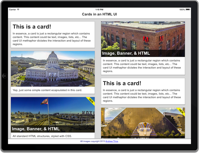
in this case, we have two columns of cards. each card has a variable height, based upon it’s content, and the width of the cards are variable, based upon the width of each column.

you can view this example in the 03_multiple_cards_columns.html file in the github repository.
in order to support variable height content, you need to “stack” the cards in separate vertical containers. if you tried to use css columns on a single div element, then you could run into issues with cards breaking mid-card when wrapping into separate columns.
to achieve this, i created two div containers, and placed the html for the cards inside of each.
<div class="content ">
    <div class="leftcolumn">
        <!--- cards here --->
    </div>
    <div class="rightcolumn">
        <!--- cards here --->
    </div>
</div>
the css for each of these columns dictates that each will be 49% of the width of the viewport, and each card will take up 100% of this space. this allows for content to scale with the viewport size, and since each card is in a separate container, there is no impact on variable-height content. since each “column” <div> element has the display property “inline-block”, the web view (or browser) will render these elements next to each other.
.rightcolumn,
.leftcolumn {
    display:inline-block;
    width:49%;
    vertical-align:top;
}
so, this is a step in the right direction, right?
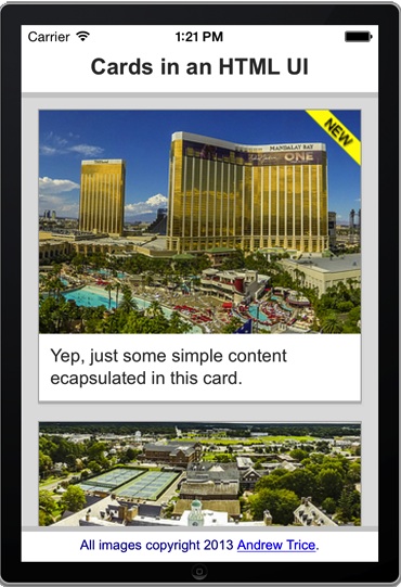
we now have variable height cards being displayed side by side next to each other. however, this still isn’t an ideal solution. if you were to view this on a phone form factor, you’d have 2 tiny columns of squished content. if you were to view this on a tablet in landscape orientation, you would have two columns of stretched content , or, at least, inefficient use of whitespace.
so far, we’ve only talked about the actual html structure, and the css styles used to display the content. in a real world application, you need things to be dynamic and responsive.
if you are building a phonegap application, or are leveraging client-side dynamic rendering, then you will need to add javascript to conditionally layout the html elements based upon the viewport of the device that is being used to consume the content.
so, let’s go ahead add some javascript to defineadaptive behaviors in this experience.


you can view this example in the 04_programmatic_cards.html file in the github repository.
this example is completely dynamic, leveraging zepto.js for quick dom manipulation and mustache.js for html template generation. in this example, the number of columns is determined programmatically based on the width of the web view. then, the html is generated for each card based upon the defined data and the html template, and placed into the appropriate column.
if you haven’t used html templates before, here’s a quick introduction… html templates allow you to dynamically generate html strings based upon data. this allows for easy separation of your data model from your presentation layer (html structure). you define a template structure with markup that determines where data should be injected. the template library takes this template, injects data, and outputs a full html string that is dynamic based upon whatever data is passed in.
in this example, we’re using the exact same css styles that we used in the previous example. we’re just generating all of the html structure at runtime. if the viewport width can have 1 column, it will be rendered with one column. if the viewport can have 2, it will have 2 columns, and so forth. in this example, we’ve also added an event listener for the window’s resize event, so we can dynamically switch from 2 to 3 columns if the user switches from portrait to landscape orientation. with this approach, we can now account for both variable height content, and variable width viewports.
now, let’s take a look at the template used to generate each card. this uses the mustache.js library’s syntax to markup both conditional elements, and data injection into the html string generation.
<script id="card-template" type="text/template">
    <div class="card">
        {{#image}}
            <div class="card-image {{ image }}">
                {{#banner}} <div class="banner"></div> {{/banner}}
                {{#caption}} <h2>{{caption}}</h2> {{/caption}}
            </div>
        {{/image}}
        {{#title}} <h1>{{title}}</h1> {{/title}}
        {{#message}} <p>{{{message}}}</p> {{/message}}
    </div>
</script>
here’s the script that brings this example to life. once the page loads, the appropriate event resize event handler is added, and the initial layout is generated based upon the window/viewport size.
<script>
    var content, columns, compiledcardtemplate = undefined;
    var min_col_width = 300;

    //data used to render the html templates
    var cards_data = [
        {   title:"this is a card!",
            message:"in essence, a card is just a rectangular region which contains content. this content is just html.  this could be <b>text</b>, <i>images</i>, <u>lists</u>, etc... the card ui methaphor dictates the interaction and layout of these regions."  },
        {   message:"yep, just some simple content ecapsulated in this card.",
            image:"image1"},
        {   image:"image2",
            banner:true,
            caption:"image, banner & html",
            message:"all standard html structures, styled with css."},
        {   title:"this is another card!",
            image:"image4",
            message:"here, you can see a more complex card.  it is all just layout of html structures.",
            caption:"look, it's vegas!",  },
        {   message:"yep, just some simple content ecapsulated in this card.",
            image:"image5",
            banner:true, },
        {   image:"image6",
            caption:"it's a college!",
            message:"with html in the content.<ul><li>bullet 1</li><li>bullet 2</li><li>bullet 3</li></ul>"},
        {   image:"image1",
            caption:"san francisco city hall",
            message:"all of these photos were captured with a quadcopter and gopro! check out my blog <a href='http://tricedesigns.com'>http://tricedesigns.com</a> to learn more!"},
    ];

    //page load initialization
    zepto(function($){
        content = $(".content");
        compiledcardtemplate = mustache.compile( $("#card-template").html() );
        layoutcolumns();
        $(window).resize(onresize);
    })

    //resize event handler
    function onresize() {
        var targetcolumns = math.floor( $(document).width()/min_col_width );
        if ( columns != targetcolumns ) {
            layoutcolumns();
        }
    }

    //function to layout the columns
    function layoutcolumns() {
        content.detach();
        content.empty();

        columns = math.floor( $(document).width()/min_col_width );

        var columns_dom = [];
        for ( var x = 0; x < columns; x++ ) {
            var col = $('<div class="column">');
            col.css( "width", math.floor(100/columns)+"%" );
            columns_dom.push( col );
            content.append(col);
        }

        for ( var x = 0; x < cards_data.length; x++ ) {
            var html = compiledcardtemplate( cards_data[x] );

            var targetcolumn = x % columns_dom.length;
            columns_dom[targetcolumn].append( $(html) );
        }
        $("body").prepend (content);
    }
</script>
be sure to check this out in the live html to get the best idea how it responds. if you are in the desktop browser, you can resize your window and see the columns change dynamically. if you are on a tablet, you can rotate your device and watch the user interface change from two to three columns.
in conclusion
that’s pretty much the basics for implementing a card-based user interface inside of a phonegap application. if you’re wondering how to get started building phonegap apps, just head over to
phonegap.com
and download the tools to get started. if you want to add mobile-themed user interface elements like buttons or lists to your apps (regardless of whether they implement the card layout), be sure to check out
topcoat
, an open source framework for user interface elements. if you want to add other kinds of effects and interactivity, be sure to check out the
effekt
library of css transitions and animations. if you want to add any additional interactivity, or make things dynamic based on data, then you’ll need to leverage javascript to programmatically generate new html structures at runtime, without reloading the html 5file. you can download all of the source code for these examples at:
https://github.com/triceam/cards-ui
, and also, be sure to check out my blog at
tricedesigns.com
for any updates!
this article was commissioned by intel and the
tizen
mobile web development team.
Opinions expressed by DZone contributors are their own.

Comments