How to Build an iOS and Android App in 24 hours with HTML5 and Cordova
Join the DZone community and get the full member experience.
Join For Free
what can one create during the new year and christmas holidays? as it turned down – quite enough. even if you have two kids and a bunch of family members whom you want to visit. the only thing you cannot accomplish in time is to finish an article for dzone. it takes a lot of time, nearly the entire january.
by the 5th of january i had a laptop and a couple of days to spend on some development. having estimated what i can do here, i decided to create a mobile app that would work faster than the original. for this, i needed to find communicative creators of a popular app.
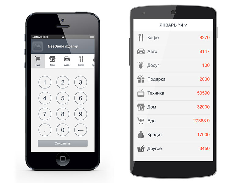
hence, i found a “ spender ” app in the app store. it is a simple app for tracking your budget. with it, you can estimate how effectively you spend your money in the end of each month. by the 5th of january, this app was in top-10 in the russian app store. i also found their dev-story on iphones.ru.
in their dev-story, the developers wrote that after completing their previous project, they had three-four free days. so, they decided to create a new app during this free time. their product manager and programmers helped them with positioning the app and its key features.
this encouraged me and i began to think how to create nearly the same app in 2 days .
note: the original app was updated in the middle of january, and now it looks a little different from my app. anyway, you can find its screenshots in the dev-story.
i already had the experience of mobile app development using c# and cocoa. since this was my personal free time, i wanted to use it with maximum effectiveness. even if i didn’t succeed, i was eager to learn a new framework or programming language.
i was working for devexpress from 2006 till2011 and have been reading their announces since i left the company. so, i knew that they created a mobile js-framework based on cordova/phonegap. they made it after i left the company, so i was curious to try it.
the gartner research company reports that by august, 2013 most of the enterprise mobile software was created using phonegap or phonegap-based products (like kony ). from my consumer experience, it's far from true. maybe i was wrong?
i'm not so good at html and javascript. i can create mark-up with stackoverflow.com and i can write simple selectors with jquery. i can also find the required information in their documentation. in other words, html+js was a gap in my knowledge and i was ready to fill it or gain some experience.
thus, i planned to create a cross-platform application that could become an advantage over the original ios-only spender app. moreover, i wanted to spend my time in the most effective way. on the one hand, i had a potentially effective js framework, on the other – a lack of js experience. i hoped that the js framework advantages could balance my poor experience.
since i like to use a vcs during development, i'll try to recover my progress.
you can download complete apps here:
i'm not sure i can provide public access to my repo, because it contains images i bought from fotolia and third-party libraries, each with a difference license. i'm not a lawyer, so i’d prefer not to take the risk. the most curious of you can take a look into the app bundle itself. js wasn't minified.
place: tula, russia, date: january, 5, 2014
+20 minutes
spent on installing node.js and cordova cli
+10 minutes
downloaded a template app from cordova. added a template from phonejs. created a git-repo, registered it in webstorm. added a new record to the httpd.conf in order to have an ability to debug my future app in the browser.
+38 minutes
changed the app namespace to "io.nikitin.thriftbox". added navigation. phonejs is an mvc-framework. each app screen is represented as a collection of html markup (views) and fabric function (viewmodel). here is how it looks at its simplest
<div data-options="dxview : { name: 'home', title: 'home' } ">
    <div data-options="dxcontent : { targetplaceholder: 'content' } ">
    // view content
    </div>
</div>
and
thriftbox.home = function (params) { // request parameters taken from uri
  return {}; // viewmodel instance
};
then view and view model are bound via knockout-bindings . to be in time, i create only two screens: expense input and monthly expense report.
+4 hours 20 minutes
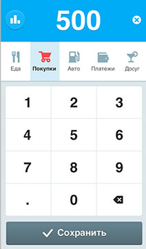
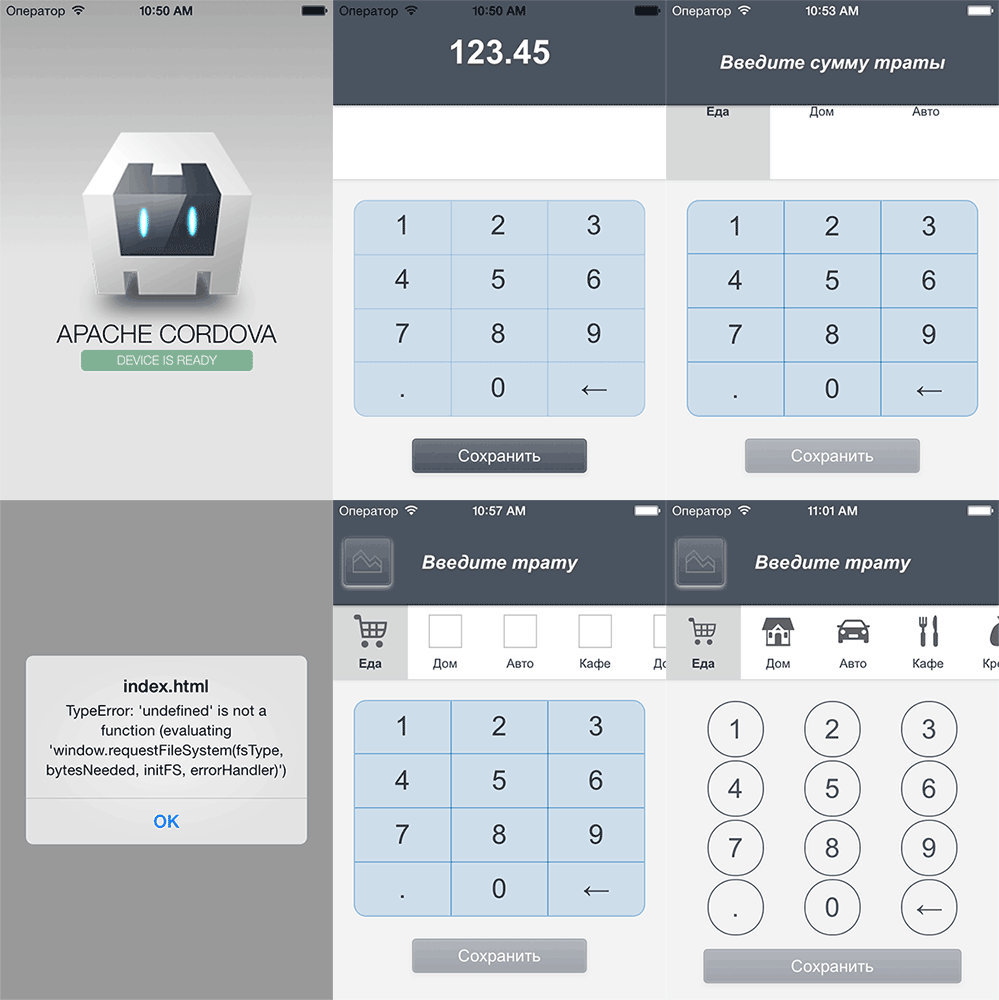
here i got stuck for the first time. i couldn't create a markup of digit buttons.
the original app had a huge keyboard that looked like a calculator or dialer.
![]()
i found out that it was not that easy to create such a keyboard, even using a
table
tag. in the iphone retina screen, 1px borders between buttons changed their colors after clicking on the buttons. on my iphone, the difference in colors was very noticeable. i had to invent how to tackle this.
![]()
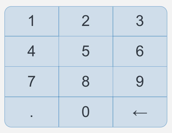
i tried to implement buttons using
div
s. but i couldn't achieve a border width of 1 px and make all buttons look equal in different screens. three hours later i gave up the idea of using divs and moved forward.
+28 minutes removing a clicked button indicator on ios. ios displays a gray indicator around tapped links and objects with the onclick event handler. since i had my own indicator of a tapped object (the tapped button became darker), i didn't need the default indicator. i solved this problem using the dxaction event:
was:
<td data-bind="click: function() { buttonpress('1') }">1</td>became:
<td data-bind="dxaction: function() { buttonpress('1') }">1</td>
this event is an extended variation of a "click" event: its handler supports uri navigation between views and correctly works in the scrollable area.
+14 minutes
the
buttonpress
event handler shown in the previous example now validates numbers from user input.
    var number = ko.observable(null);
    var isvalidnumber = ko.computed(function() {
        return  number() && parsefloat(number()) > 0;
    });

    ......

    function buttonpress(button) {
        if (button) {
            if (number())
                number(number() + button);
            else
                number(button);
        } else if (number())
            number(number().substr(0, number().length - 1));
    }

    var viewmodel = {
        number: number,
        isvalidnumber: isvalidnumber,

        viewshowing: viewshowing,
        buttonpress: buttonpress
    };

    .....
+8 minutes added a fastclick.js , which removes a delay between tapping the screen and raising the 'click' event on phones. the mobile browser delays the raising of the click event by default to be sure the end-user will not perform a double tap. for the end-user, this looks as if the app is sluggish. you click buttons much faster than an app responds. fastclick.js handles the touchstart event and then creates all the click event process logic.
btw, adding this library was a mistake; later i'll tell why.
+4 minutes added a limitation to the length of user input numbers. corrected the font size for a better look-and-feel.
+58 minutes added a choice of an expense category. added a scrollable pane with available categories below the input field. video .
it took less time than it could be. in the phonejs component collection, i found dxtileview . it provides a kinetic scrolling with the required appearance out-of-the-box. it's not easy to implement kinetic scrolling by yourself and thus it’s great that this scrolling is enabled for ios only - android doesn't have it.
<div class="category" data-bind="dxtileview: {
                                      datasource: categories,
                                      itemmargin: 0,
                                      baseitemheight: 72,
                                      baseitemwidth: 72,
                                      listheight: 72
                                    }">
    <div class="tile"
         data-options="dxtemplate: { name:'item' }"
         data-bind="css: { selected: $parent.category() == $data },
                    click: function() { $parent.category($data) }">
        <div><img data-bind="attr: { src: image }"/></div>
        <div data-bind="text: name"></div>
    </div>
</div>
it was 7:40 pm, so, i decided to continue the next day.
place: tula, russia, date: january, 5, 2014
+3 hours 9 minutes storing data on a local storage. phonejs contains classes for working with data: selection, filtering, sorting, and grouping. there are several approaches to store data: odata and localstorage. i didn't want to implement a server side for a free app, and decided to use localstorage. later i found out that this was not an ideal decision. for example, when updating to ios 5.1 user data is erased , other people complained that localstorage is cleared regularly or even when shutting the device down. i didn't want to risk, so i used file api of phonegap.
documentation says that this api is based on w3c file api. in fact, this means that this api differs in safari for mac os, chrome for mac os, cordova for ios and cordova for android. file api implementation is different for ios and android . e.g. android implementation doesn't contain the 'blob' class and 'window.permanent' constant. ii however implements the 'localfilesystem' and 'localfilesystem.persistent' classes. the laptop browser provides additional api for requesting an additional storage space, which mobile browsers don't provide.
the available documentation for this api adds more problems. i found several articles searching by "html5 file api". and, i couldn't find an article that would cover all my questions. finally i created a new class for working with fileapi. this class supports cordova 3.3 on ios, android, and chrome 32 for mac os and windows 8. you can find it here: https://github.com/chebum/filestorage-for-phone.js/blob/master/filestorage.js
you can use it as follows:
//  in this example i create data/records file in the documents folder of the app
fs.initfileapi(1000000, true)
    .then(function () {
        var records = new fs.filearraystore({ key: "id", filename: "records" });
        return records.insert({ customer: "peter" })
     })
     .then(function () {
        alert("record saved!");
     });

// or use low-level api:
fs.initfileapi(100000, true)
    .then(function() {
        return fs.writefile("file1", "file content")
    })
    .then(function() {
        alert("file saved!");
    });
+33 minutes
saving the added records to the storage. category list is stored in
arraystore
, to simplify the selection operations.
+26 minutes
creating layout for the app's views. phonejs provides several
layouts
that are the placeholders for the views. my app's start page didn't fit into any of the available layout, so i have chosen the emptylayout. but, it doesn't provide animation effects when navigating through views. i copied the emptylayout code and added an attribute that had animation effects.
+1 h. 51 min.
template's about screen was redesigned to a report screen, empty by that moment. created a viewmodel that selects data for a current month. added localization date formatting for the screen caption.
+59 minutes
added the display of expenses grouped by categories for a current month.
+28 minutes
added the selection of months for which the report should be generated. end-users can tap the screen header to select the required month.
+1 h. 20 min.
added cordova-plugin statusbar that didn't work outof-the-box. i found that the reference to cordova.js was commented in the phonejs app template:
<!--<script type="text/javascript" src="cordova.js"></script>-->
as a result, the native part of my app didn't work.
+39 minutes
in the report screen, the upper part was changed to
dxtoolbar
.
+22 minutes
i discoveredwhy the dxbutton click event handler didn't work. removing the fastclick.js solved my problem, but caused a delay between tapping and event raising. i've changed the dxaction event subscription to 'touchstart'.
+25 minutes
formatting output strings when generating a report.
at night i dreamed of crappy buttons in the application’s main screen.
places: tula, vnukovo airport, date: january, 7-8, 2014
i had an early flight to budapest from vnukovo, and because i had no time in the afternoon, i gradually completed at the airport at night. as you know, it’s not very comfortable to sleep or sit in a café chair for a long time, but it turned out that programming was ok.
+2 h. 5 min.
in the morning, i decided to split the buttons in order to remove borders between them. i took the ios dialer keyboard as a sample.
![]()
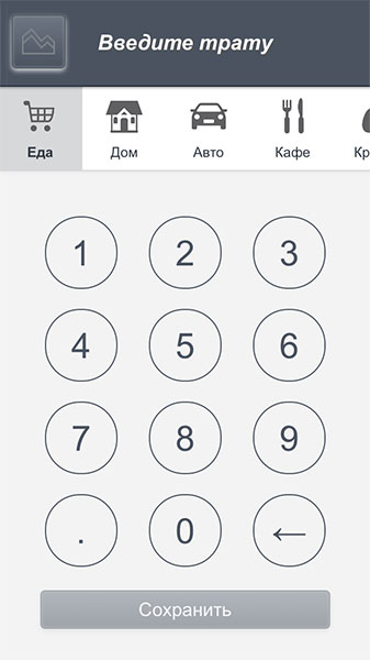
i created three keyboards. the button size changes depending on screen resolution: for 3.5'', 4'' and 5'' phones. each table cell contained a div with configured alignment.
because of the lack of an incomplete vertical text alignment in html, the final css style for buttons ended to be quite complex:
.home-view .buttons td div {
    color: #4a5360;
    border: 1px solid #4a5360;
    text-align: center;

    position: absolute;
    left: 50%;

    /* small buttons - default */
    font-size: 26px;
    padding: 13px 0 13px 0;
    width: 52px;
    line-height: 26px;
    border-radius: 26px;

    margin-left: -27px;
    margin-top: -27px;
}
+1 h. 50 minutes
i bought several vector icon sets on fotolia. i cut the required icons and converted them to png. it took me quite a long time, maybe, because it was 1.30 am :)
+1 hour 10 minutes
added a splash-screen for the app.
+36 minutes
created three sizes for the app icon. localized the app name for ios.
+20 minutes
hiding the splash screen after the app is completely loaded.
+2 hours
fixing multiple bugs.
+2 hours
creating screenshots for play store
+30 minutes
creating screenshots for app store
+30 minutes
writing an app description for two app stores.
+1 h. 30 minutes
submitting my app to the app store. here i faced with an issue with the app certification.
my accountancy
let's summarize the time i spent and divide it into categories.
development: 21 hours 37 minutes
graphics and texts: 8 hours 26 minutes
totally: 30 hours 3 minutes
as a result, i got a minimum-feature working app, though it is not as cool as the latest version of "spender". i couldn't create splitting expenses by days and income input. my app's ui could be more elegant as well.
after analyzing the original 'spender' developer work, i got the following. they say that they involved four developers for three-four days. it is about 96-128 man-hours. i spent only 30 man-hours and got an app for three mobile platforms. ios and android versions are already in stores. the version for windows phone 8 requires a ui redesign.
i can be proud of myself :).
 you can download complete apps here:
ios
,
android
Opinions expressed by DZone contributors are their own.

Comments