Managing State in Angular with ngrx/store
In this article, we'll explore managing state with an immutable data store in an Angular application using ngrx/store: reactive Redux for Angular.
Join the DZone community and get the full member experience.
Join For FreeManaging State in Angular Apps
State management in large, complex applications has been a headache plaguing AngularJS / Angular developers over the last few years. In AngularJS (version 1.x), state management is often addressed using a confusing mixture of services, events, and $rootScope. In Angular (versions 2+), component interaction is cleaner but can still be quite involved, encompassing many different approaches depending on the desired direction of the flow of data.
Note: In this article, AngularJS refers specifically to version 1.x of the framework while Angular refers to versions 2.x and up, as per the Branding Guidelines for Angular.
Some developers are using Redux with AngularJS or Angular. Redux is a "predictable state container for JavaScript apps" and supports a single, immutable data store. Redux is best-known for its use with React, but it can be utilized with any view library. Egghead.io hosts an excellent free video series on Redux from its creator, Dan Abramov.
Introducing Ngrx/Store
For our Angular application, we're going to use ngrx/store rather than Redux. What is the relationship between Redux and ngrx/store and why would we prefer one over the other?
Relationship to Redux
Ngrx/store is an "RxJS powered state management library for Angular applications, inspired by Redux", authored by Rob Wormald, an Angular Developer Advocate. It shares Redux's core fundamentals but uses RxJS, which implements the observer pattern in JS and comes packaged with Angular. It follows the core principles of Redux and is specifically designed for Angular.
Fundamental Tenets of Ngrx/Store
- State is a single, immutable data structure.
- Actions describe state changes.
- Pure functions called reducers take the previous state and the next action to compute the new state.
- State accessed with the
Store, an observable of state and an observer of actions.
Let's break this down. The following is a quick (but important) overview of the basics. We'll go more indepth as we build our application.
Actions
Actions are information payloads that send data from the application to the reducer, which updates the store. Actions are the only way the store receives data.
In ngrx/store, the Actioninterface looks like this:
// actions consist of type and data payload
export interface Action {
  type: string;
  payload?: any;
}
The type should describe the kind of state change we want. For example, this might be something like 'ADD_TODO' or 'DECREMENT', etc. The payload is the data being sent to the store in order to update it. Actions are dispatched to the store like so:
// dispatch action to update store
store.dispatch({
  type: 'ADD_TODO',
  payload: 'Buy milk'
});
Reducers
Reducers specify how the state changes in response to actions. A reducer is a pure function that describes state mutations in the app by taking the previous state and the dispatched action and returning the next state as a new object, generally using Object.assign and/or spread syntax:
// reducer function specifies how the state
// changes when an action is dispatched
export const todoReducer = (state = [], action) => {
  switch(action.type) {
    case 'ADD_TODO':
      return [...state, action.payload];
    default:
      return state;
  }
}
It's important to be mindful of purity when writing reducers. Pure functions:
- Do not mutate state outside their scope.
- Have return values that depend only on their inputs.
- Given the same input, always return the same output.
You can read more about purity here. It is the responsibility of the developer to ensure purity and state immutability in JavaScript, so make sure to be mindful when writing your reducers.
Store
The store holds the entire immutable state of the application. The store in ngrx/store is an RxJS observable of state and an observer of actions.
We can use Store to dispatch actions. We can also subscribe to observe and react to state changes over time with Store's select() method, which returns an observable.
Angular With Ngrx/Store: Custom Pet Tags App
Now that we're familiar with the basics of how ngrx/store works, we're going to build an Angular app that allows users to customize a name tag for their pet. Our app will have the following features:
- Users can choose tag shape, font style, text, and optional extras.
- Users will need to authenticate before creating a tag.
- Users can see a simple preview of their tag as they build it.
- When finished, users can create another tag or log out.
We'll create several components to compose a tag builder and a tag preview. We'll create components and routes for logging in, creating a tag, and finishing up. The state of our tag builder app will be managed with ngrx/store. We'll also use Auth0and route guards to protect our application.
When finished, our custom pet tags app will looks like this:
Let's get started!
Angular App Setup
Install Dependencies
Make sure you have Node.js with npm installed (LTS download recommended).
Next, we'll install the Angular CLI for scaffolding and serving our app. Run the following command to install angular-cli globally:
$ npm install -g @angular/cliThis will install the latest version of the Angular CLI tool. Keep in mind that the Angular CLI just came out of beta and is now into release candidates at the time of writing. Updates are still to be expected. If you need to update your Angular CLI installation at any time, refer to the Angular CLI GitHub README here.
Create an Angular App
In a directory of your choosing, open a command prompt and create a new Angular app project:
$ ng new pet-tags-ngrxNavigate into your new /pet-tags-ngrx folder and install the necessary packages to support ngrx/store, like so:
$ cd pet-tags-ngrx
$ npm install @ngrx/core @ngrx/store --save
We now have everything we need to get started on our app.
Customize App Boilerplate
Let's customize the generated Angular boilerplate to better suit the application we want to build.
Create a src/App/Core Folder
First, create the following folder: src/app/core. Our app's root component and core files will live here. Move the app.component.* files into this folder.
Note: For brevity, this tutorial will not cover testing. We will ignore all
*.spec.tsfiles. If you'd like to write tests, please do so. Otherwise, these files will not be mentioned again in this article and they have been removed from the source code in the GitHub repository for simplicity.
Update App Module
Next, open the src/app/app.module.ts file. We need to update the path to our app.component file since we just moved it into the src/app/core folder:
// src/app/app.module.ts
...
import { AppComponent } from './core/app.component';
...
Organize Assets
Navigate to the src/assets folder.
Inside assets, add a new folder called images. Leave this empty for now; we'll add some images later. Next, move the src/styles.css file from the root folder into src/assets.
Moving styles.css requires us to make a change to .angular-cli.json. Open this file and change the styles array as follows:
// .angular-cli.json
...
"styles": [
  "assets/styles.css"
],
...
Add Bootstrap CSS to Angular App
Finally, we'll add Bootstrap CSS to the index.html file in our app. This <link>tag was copied from the Bootstrap CDN. We'll only use the compiled CSS and not JS. While we're at it, let's update our app's <title> to "Custom Pet Tags":
<!-- index.html -->
...
  <title>Custom Pet Tags</title>
  ...
  <!-- Bootstrap CDN -->
  <link
    rel="stylesheet"
    href="https://maxcdn.bootstrapcdn.com/bootstrap/4.0.0-alpha.6/css/bootstrap.min.css"
    integrity="sha384-rwoIResjU2yc3z8GV/NPeZWAv56rSmLldC3R/AZzGRnGxQQKnKkoFVhFQhNUwEyJ"
    crossorigin="anonymous">
</head>
...
Serve the App
We can serve our app on localhost and watch for changes with the following command:
$ ng serveStart the server and navigate to http://localhost:4200. The app should look like this:
App Component
Now we're ready to start building out the features of our Custom Pet Tags Angular application. We'll start with the app.component.* files. This is our root component. Changes here will be minimal.
Delete App Component CSS
Let's delete the app.component.css file. We won't need it since we'll only use Bootstrap for styling this component.
App Component Typescript
We also need to remove the reference to the deleted CSS file in the app.component.ts file. We can also delete the boilerplate title property from the AppComponent class. Our file should look like this:
// src/app/core/app.component.ts
import { Component } from '@angular/core';

@Component({
  selector: 'app-root',
  templateUrl: './app.component.html'
})
export class AppComponent {

}
App Component Template HTML
Now let's add some HTML to the app.component.html template. Replace the current contents of this file with the following:
<!-- src/app/core/app.component.html -->
<div class="container">
  <div class="row">
    <div class="col-sm-12">
      <h1 class="text-center">Custom Pet Tags</h1>
    </div>
  </div>
  <router-outlet></router-outlet>
</div>
We'll use Bootstrap styles to add a grid and a heading. Then we'll add the <router-outlet> directive. This is where our views will render when we change routes in our single page app. At this point, the app will throw an error until we establish routing and page components. Let's do that next.
Create Page Components
As mentioned before, our app will have three routes: a homepage with a login, a page where the user can create and preview a new pet tag, and a completion page where the user can view their finished tag and log out.
Let's create these page components so we can set up routing. Then we'll come back to each of them to build them out.
Execute the following commands from the root your pet-tags-ngrx project folder to generate the components:
$ ng g component pages/home
$ ng g component pages/create
$ ng g component pages/complete
The ng g command (or its longform, ng generate) creates the necessary files and folders for Angular components, directives, pipes, and services. It also imports components in app.module.ts. We now have the scaffolding for our three page components, so let's set up routing.
Create a Routing Module
Let's build a separate NgModule to support routing. Create a new file in the src/app/core folder called app-routing.module.ts:
// src/app/core/routing-module.ts
import { NgModule } from '@angular/core';
import { RouterModule } from '@angular/router';

import { HomeComponent } from '../pages/home/home.component';
import { CreateComponent } from './../pages/create/create.component';
import { CompleteComponent } from './../pages/complete/complete.component';

@NgModule({
  imports: [
    RouterModule.forRoot([
      {
        path: '',
        component: HomeComponent
      },
      {
        path: 'create',
        component: CreateComponent
      },
      {
        path: 'complete',
        component: CompleteComponent
      },
      {
        path: '**',
        redirectTo: '',
        pathMatch: 'full'
      }
    ])
  ],
  providers: [],
  exports: [
    RouterModule
  ]
})
export class AppRoutingModule {}
We now have our three routes: /, /create, and /complete. Page not found errors will redirect back to the homepage.
Next let's open our main app module file (app.module.ts) and add the new AppRoutingModule to imports like so:
// src/app/app.module.ts
...
import { AppRoutingModule } from './core/app-routing.module';
@NgModule({
...,
imports: [
...,
AppRoutingModule
],
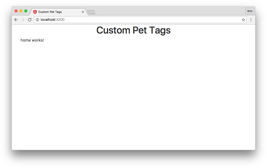
...We now have routing set up. We should be able to navigate in the browser by entering the URLs defined in the AppRoutingModule. Our HomeComponent now renders in the <router-outlet> when we're on the homepage:
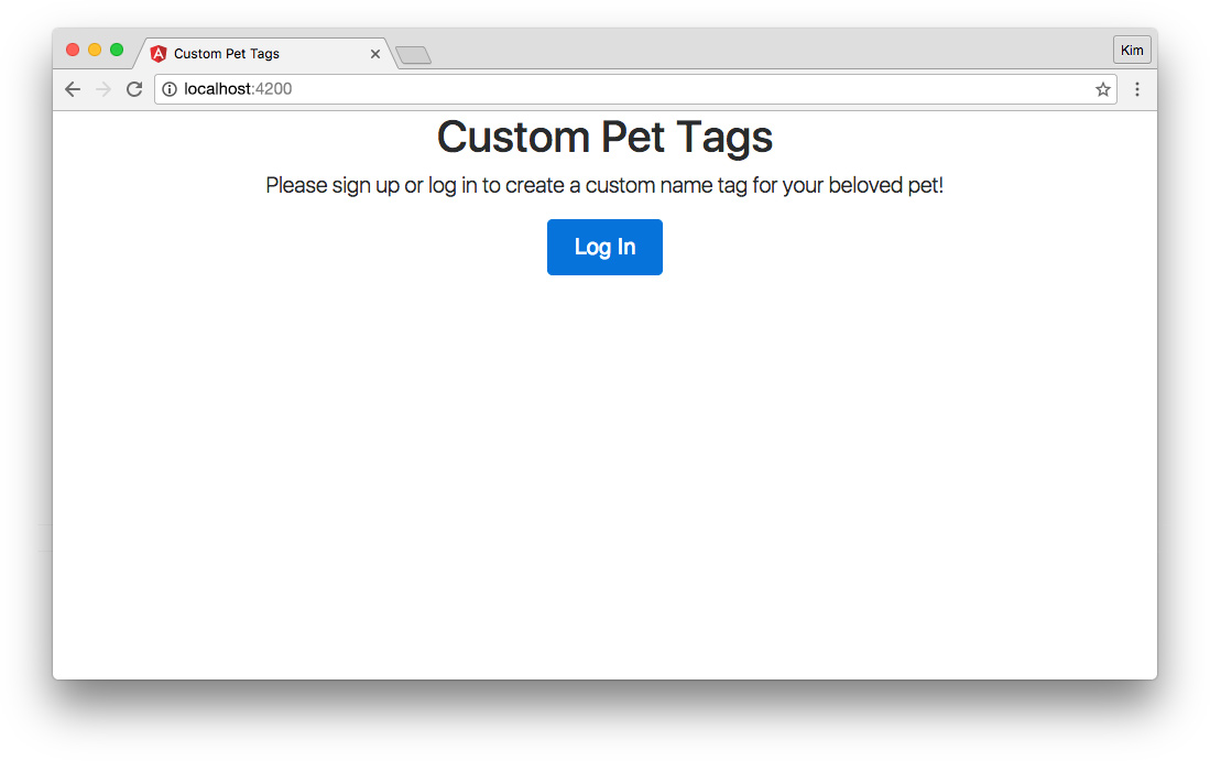
"home" Page Component
The HomeComponent will simply have a message and a login button for unauthenticated visitors. If a user is already logged in, they'll be sent to the /create route instead.
Note: Initially, we'll set up our components without authentication. After the primary features of our ngrx/store app are built, we'll add Auth0 authentication and a route guard.
For now, let's add a message and a placeholder button that takes the user to the /create page. Open the home.component.html template and replace the boilerplate content with the following markup:
<!-- src/app/pages/home/home.component.html -->
<div class="row">
  <div class="col-sm-12 text-center">
    <p class="lead">
      Please sign up or log in to create a custom name tag for your beloved pet!
    </p>
    <p>
      <button
        class="btn btn-lg btn-primary"
        routerLink="/create">Log In</button>
    </p>
  </div>
</div>
At the moment, the "Log In" button simply navigates to http://localhost:4200/create. Later, we'll update it to authenticate the user before going to the Create page.
Our homepage now looks like this:
Pet Tag Model
Now it's time to start implementing our custom tag builder and state management. The first thing we'll do is create a model for our state. We want this model to represent the current custom pet tag.
Create a new file: src/app/core/pet-tag.model.ts.
// src/app/core/pet-tag.model.ts
export class PetTag {
  constructor(
    public shape: string,
    public font: string,
    public text: string,
    public clip: boolean,
    public gems: boolean,
    public complete: boolean
  ) { }
}

export const initialTag: PetTag = {
  shape: '',
  font: 'sans-serif',
  text: '',
  clip: false,
  gems: false,
  complete: false
};
The class declares the shape of the PetTag type. These are the required properties and type annotations for our application's custom pet tag state object.
Next we want to export a constant called initialTag. This constant declares the values in the default state object. We'll use this to initialize state as well as reset it.
Pet Tag Actions
Now we're ready to build an actions creator for our action types. Recall that actions are dispatched to a reducer to update the store. We'll declare an action for each kind of modification we want to make to the store.
Create the following file: src/app/core/pet-tag.actions.ts.
// src/app/core/pet-tag.actions.ts
export const SELECT_SHAPE = 'SELECT_SHAPE';
export const SELECT_FONT = 'SELECT_FONT';
export const ADD_TEXT = 'ADD_TEXT';
export const TOGGLE_CLIP = 'TOGGLE_CLIP';
export const TOGGLE_GEMS = 'TOGGLE_GEMS';
export const COMPLETE = 'COMPLETE';
export const RESET = 'RESET';
We're defining actions as constants. Alternatively, we could construct injectable action classes as done in the ngrx/example-app. For our small demo app, this can contribute to indirection, so we'll keep it simple.
Pet Tag Reducer
Now let's build our reducer function that will take actions and update the store. Create a new file: src/app/core/pet-tag.reducer.ts.
// src/app/core/pet-tag.reducer.ts
import { Action } from '@ngrx/store';
import { PetTag, initialTag } from './../core/pet-tag.model';
import { SELECT_SHAPE, SELECT_FONT, ADD_TEXT, TOGGLE_CLIP, TOGGLE_GEMS, COMPLETE, RESET } from './pet-tag.actions';

export function petTagReducer(state: PetTag = initialTag, action: Action) {
  switch (action.type) {
    case SELECT_SHAPE:
      return Object.assign({}, state, {
        shape: action.payload
      });
    case SELECT_FONT:
      return Object.assign({}, state, {
        font: action.payload
      });
    case ADD_TEXT:
      return Object.assign({}, state, {
        text: action.payload
      });
    case TOGGLE_CLIP:
      return Object.assign({}, state, {
        clip: !state.clip
      });
    case TOGGLE_GEMS:
      return Object.assign({}, state, {
        gems: !state.gems
      });
    case COMPLETE:
      return Object.assign({}, state, {
        complete: action.payload
      });
    case RESET:
      return Object.assign({}, state, initialTag);
    default:
      return state;
  }
}
First we import Action from ngrx/store. Then we need the PetTag model and its default state, initialTag. We also need to import the actions we created in the previous step.
Now we'll create our petTagReducer() function. The reducer accepts previous state and the dispatched action as arguments. Remember that this is a pure function: inputs determine outputs and the function does not modify global state. This means that when we return anything from the reducer, it either needs to be a new object or it can output an unmodified input (such as in the defaultcase).
We'll use Object.assign() to return new objects containing the values from source objects in most cases. The sources will be the previous state and objects containing the action payload.
The TOGGLE_CLIP and TOGGLE_GEMS actions toggle booleans that are assigned in the initialTag state. Therefore, we don't need a payload when we dispatch these actions; we can simply set the value to its opposite in these cases.
We're sending a payload with the COMPLETE action because we want to explicitly set it to true, and only do so once for each tag created. We could use a toggle for this as well, but for clarity, we'll dispatch a specific value as a payload instead.
Note: Notice that the
RESETcase uses the importedinitialTagobject. BecauseinitialTagis a constant, using it here does not interfere with the reducer's purity.
Import Store in App Module
We now have actions and a reducer function. We need to tell our application to use the store and reducer. Open the app.module.ts file and update the following:
// src/app/app.module.ts
...
import { StoreModule } from '@ngrx/store';
import { petTagReducer } from './core/pet-tag.reducer';

@NgModule({
  ...,
  imports: [
    ...,
    StoreModule.provideStore({ petTag: petTagReducer })
  ],
  ...
We can now implement state management with Store updates in our application.
Building the "create" Page
Our CreateComponent, which we initialized earlier for routing, is going to be a smart component. It will have several dumb child components.
Smart and Dumb Components
Smart components, also known as container components, are generally root level components. They contain business logic, manage state and subscriptions, and handle events. In our application, they are the routable page components. CreateComponent is a smart component and will implement the logic for our custom tag builder. It will handle events emitted by several dumb child components that make up the tag builder.
Dumb components, also known as presentational components, rely only on the data they are given by parent components. They can emit events that are then handled in the parent, but they do not utilize subscriptions or stores directly. Dumb components are modular and reusable. For example, we will use a tag preview dumb component on both the Create page and the Complete page (CreateComponent and CompleteComponent will be smart components).
"create" Page Features
Our Create page will have the following features:
- Tag shape selector.
- Tag font style selector and tag text field.
- Options to include a clip and add gems.
- Preview of the tag's shape and text.
- A "Done" button that finalizes the custom tag.
"create" Component Typescript
Let's start with the CreateComponent class. Open the create.component.tsfile:
// src/app/pages/create/create.component.ts
import { Component, OnInit, OnDestroy } from '@angular/core';
import { Observable } from 'rxjs/Observable';
import { Subscription } from 'rxjs/Subscription';
import { Store } from '@ngrx/store';
import { SELECT_SHAPE, SELECT_FONT, ADD_TEXT, TOGGLE_CLIP, TOGGLE_GEMS, COMPLETE } from './../../core/pet-tag.actions';
import { PetTag } from './../../core/pet-tag.model';

@Component({
  selector: 'app-create',
  templateUrl: './create.component.html'
})
export class CreateComponent implements OnInit, OnDestroy {
  tagState$: Observable<PetTag>;
  private tagStateSubscription: Subscription;
  petTag: PetTag;
  done = false;

  constructor(private store: Store<PetTag>) {
    this.tagState$ = store.select('petTag');
  }

  ngOnInit() {
    this.tagStateSubscription = this.tagState$.subscribe((state) => {
      this.petTag = state;
      this.done = !!(this.petTag.shape && this.petTag.text);
    });
  }

  ngOnDestroy() {
    this.tagStateSubscription.unsubscribe();
  }

  selectShapeHandler(shape: string) {
    this.store.dispatch({
      type: SELECT_SHAPE,
      payload: shape
    });
  }

  selectFontHandler(fontType: string) {
    this.store.dispatch({
      type: SELECT_FONT,
      payload: fontType
    });
  }

  addTextHandler(text: string) {
    this.store.dispatch({
      type: ADD_TEXT,
      payload: text
    });
  }

  toggleClipHandler() {
    this.store.dispatch({
      type: TOGGLE_CLIP
    });
  }

  toggleGemsHandler() {
    this.store.dispatch({
      type: TOGGLE_GEMS
    });
  }

  submit() {
    this.store.dispatch({
      type: COMPLETE,
      payload: true
    });
  }

}
This smart component contains the logic for customizing a pet tag.
We'll import OnInit and OnDestroy, which will initialize and clean up our store subscription. We'll also need Observable and Subscription from RxJS and Store from ngrx/store. Our actions will be dispatched from this component, so we'll need to import most actions from the actions creator, with the exception of RESET. Finally, we'll import our PetTag model.
We won't be needing any CSS for this component, so I've removed the CSS file and reference to it.
In the CreateComponent class, tagState$ is a PetTag-shaped observable. In the constructor, we'll use the ngrx/store method select() to set this.tagState$ to the state observable.
Our ngOnInit() lifecycle hook will set up the subscription to the tagState$observable. This will set the petTag property to the state returned by the observable stream each time a new state is pushed. The done property will check for a selected shape and text. These are the two properties of a pet tag that must have truthy values in order for the tag to be "fully customized." The ngOnDestroy() lifecycle hook then cleans up the subscription when the component is destroyed.
Finally, we'll create the event handler functions that dispatch actions to the store. These handlers will be executed when the child dumb components emit events to update the custom tag state. Each handler uses the store.dispatch() method to send the desired action type and payload to our reducer.
Note: In a more complex app, you may wish to dispatch actions in an actions creator service that can be injected into your components. However, for our small app and for learning purposes, this is unnecessary, so we will dispatch actions directly from our smart components using constants from our actions creator,
pet-tag.actions.ts.
Aside: Code Linting
Angular's CLI comes with code linting in the form of the codelyzer package. You can lint your project at any time by running the following command:
$ ng lintLet's take the opportunity to lint our pet tags app now. If any errors are found, correct them before proceeding. It's good practice to lint periodically throughout development to maintain clean code. The linting configuration can be found at tslint.json in your project.
Tag Shape Component
Now we'll build our first presentational component: TagShapeComponent. When we're finished with this component, the Create page should look like this:
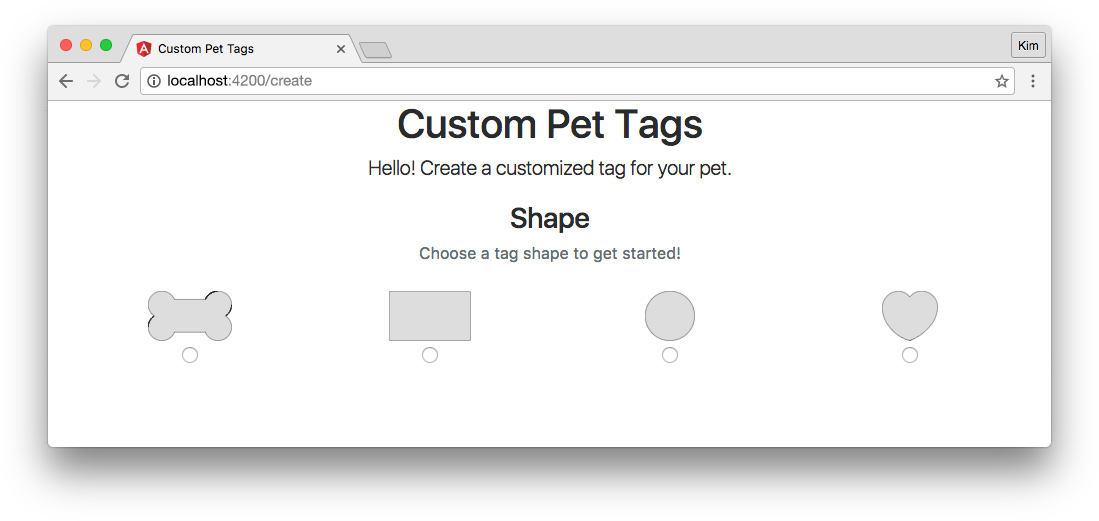
Let's generate the scaffolding for this child component with the following Angular CLI command:
$ ng g component pages/create/tag-shapeThe tag shape component will display four different images with possible shapes: a bone, a rectangle, a circle, and a heart. The user can select which shape they'd like for their custom pet tag.
Download all four .svg images from the GitHub repository here: pet-tags-ngrx/src/assets/images/. Place them in your local pet-tags-ngrx/src/assets/images folder.
Tag Shape Component Typescript
Next, open the tag-shape.component.ts file:
// src/app/pages/create/tag-shape/tag-shape.component.ts
import { Component, Output, EventEmitter } from '@angular/core';

@Component({
  selector: 'app-tag-shape',
  templateUrl: './tag-shape.component.html',
  styleUrls: ['./tag-shape.component.css']
})
export class TagShapeComponent {
  tagShape: string;
  @Output() selectShapeEvent = new EventEmitter();

  constructor() { }

  selectShape(shape: string) {
    this.selectShapeEvent.emit(shape);
  }

}
Add Output and EventEmitter to the @angular/core imports.
Our tag shape selector will use radio buttons, so we'll need a property to store the shape ngModel. The shape name options are strings, so we'll set tagShape's type annotation to string.
Next we need an @Output() decorator to emit an event when the user selects a shape. This will send the information to the parent CreateComponent. The selectShape(shape) method will emit the event with shape information. The parent can then handle this event with the selectShapeHandler() method we created earlier in CreateComponent. We'll hook this up to the parent shortly.
Tag Shape Component Template
Before that, we'll add the necessary template markup for our TagShapeComponent. Modify the tag-shape.component.html file as shown:
<!-- src/app/pages/create/tag-shape/tag-shape.component.html -->
<div class="row">
  <div class="col-sm-12 text-center">
    <h3>Shape</h3>
    <p class="form-text text-muted">Choose a tag shape to get started!</p>
  </div>
</div>

<div class="row">
  <label class="tagShape col-sm-3">
    <img src="/assets/images/bone.svg">
    <input
      type="radio"
      name="shape"
      [(ngModel)]="tagShape"
      (change)="selectShape(tagShape)"
      value="bone">
  </label>

  <label class="tagShape col-sm-3">
    <img src="/assets/images/rectangle.svg">
    <input
      type="radio"
      name="shape"
      [(ngModel)]="tagShape"
      (change)="selectShape(tagShape)"
      value="rectangle">
  </label>

  <label class="tagShape col-sm-3">
    <img src="/assets/images/circle.svg">
    <input
      type="radio"
      name="shape"
      [(ngModel)]="tagShape"
      (change)="selectShape(tagShape)"
      value="circle">
  </label>

  <label class="tagShape col-sm-3">
    <img src="/assets/images/heart.svg">
    <input
      type="radio"
      name="shape"
      [(ngModel)]="tagShape"
      (change)="selectShape(tagShape)"
      value="heart">
  </label>
</div>
We'll create radio options for each of our four shapes along with their images. When any input is selected, we'll use the (change) event to fire our method emitting the selectShapeEvent with the tagShape as its argument.
Tag Shape Component Styles
This component could use a little bit of styling beyond Bootstrap, so add the following to the tag-shape.component.css file:
/* src/app/pages/create/tag-shape/tag-shape.component.css */
:host {
  display: block;
  margin: 20px 0;
}
.tagShape {
  padding: 10px;
  text-align: center;
}
img {
  display: block;
  height: auto;
  margin: 0 auto;
  max-height: 50px;
  max-width: 100%;
  width: auto;
}
Note: The
:hostpseudo-class selector targets the component's host element,<app-tag-shape>in this case.
Add Tag Shape Component to the Create Page
Finally, we'll implement our TagShapeComponent by adding it to the our smart CreateComponent template. Open the create.component.html file and replace the boilerplate markup with the following:
<!-- src/app/pages/create/create.component.html -->
<p class="col-sm-12 text-center lead">
  Hello! Create a customized tag for your pet.
</p>

<app-tag-shape
  (selectShapeEvent)="selectShapeHandler($event)"></app-tag-shape>
Our parent component is now listening for the selectShapeEvent from the tag shape child and handling it by executing the selectShapeHandler() method we created in our CreateComponent class earlier. If you recall, that method dispatches the SELECT_SHAPE action to the store and looks like this:
selectShapeHandler(shape: string) {
  this.store.dispatch({
    type: SELECT_SHAPE,
    payload: shape
  });
}
Our app now updates state when the user selects a shape for their custom pet tag!
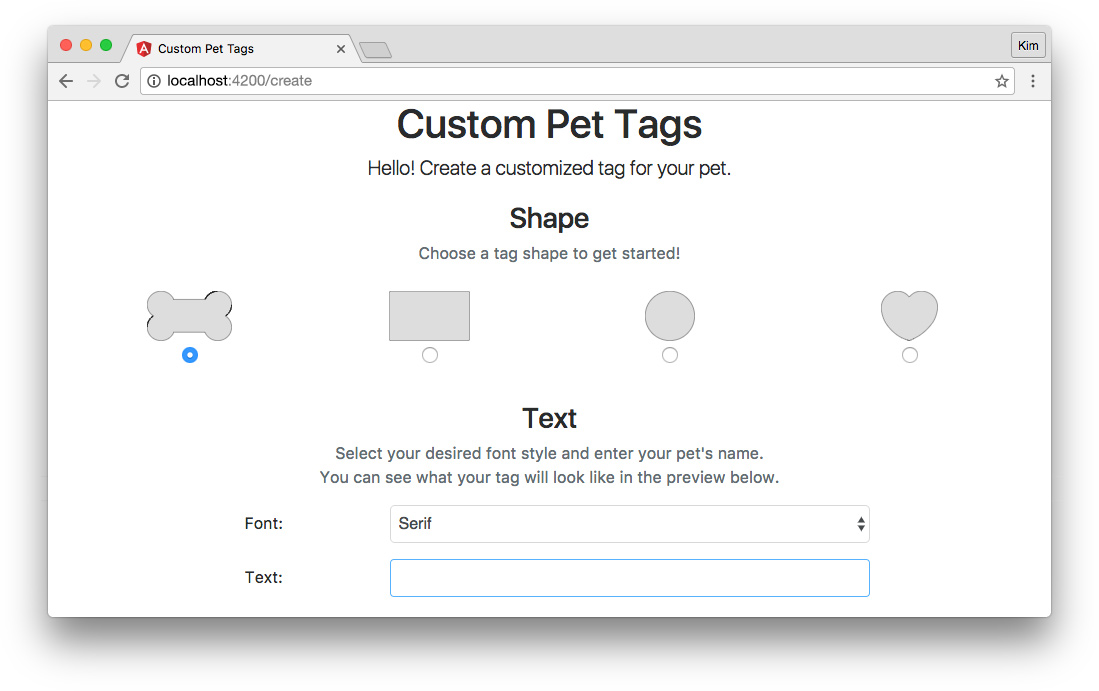
Tag Text Component
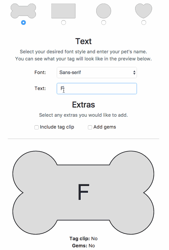
Next we'll create a child component that lets the user choose a font style and enter the text they'd like on their pet tag. Our Create page will look like this once we've added our tag text component:
Generate the component scaffolding with the following command:
$ ng g component pages/create/tag-textTag Text Component Typescript
Now open the tag-text.component.ts file:
// src/app/pages/create/tag-text/tag-text.component.ts
import { Component, Output, EventEmitter } from '@angular/core';

@Component({
  selector: 'app-tag-text',
  templateUrl: './tag-text.component.html',
  styleUrls: ['./tag-text.component.css']
})
export class TagTextComponent {
  tagTextInput = '';
  fontType = 'sans-serif';
  @Output() selectFontEvent = new EventEmitter;
  @Output() addTextEvent = new EventEmitter;

  constructor() { }

  selectFont(fontType: string) {
    this.selectFontEvent.emit(fontType);
  }

  addText(text: string) {
    this.addTextEvent.emit(text);
  }

}
This component works the same way as our TagShapeComponent, so it looks very similar. We'll import Output and EventEmitter and create properties for the tagTextInput and fontType based on user inputs.
Note: We aren't adding
stringtype annotations to our properties because declaring initial values allows types to be inferred automatically.
We'll emit events when the user updates the tag text or changes the font style selection.
Tag Text Component Template
Our tag text component template, tag-text.component.html, should look like this:
<!-- src/app/pages/create/tag-text/tag-text.component.html -->
<div class="row">
  <div class="col-sm-12 text-center">
    <h3>Text</h3>
    <p class="form-text text-muted">
      Select your desired font style and enter your pet's name.<br>
      You can see what your tag will look like in the preview below.
    </p>
  </div>
</div>

<div class="form-group row">
  <label for="font" class="col-sm-2 offset-sm-2 col-form-label">Font:</label>
  <select
    id="font"
    name="font"
    class="form-control col-sm-6"
    [(ngModel)]="fontType"
    (change)="selectFont(fontType)">
      <option value="sans-serif">Sans-serif</option>
      <option value="serif">Serif</option>
  </select>
</div>

<div class="form-group row">
  <label for="tagText" class="col-sm-2 offset-sm-2 col-form-label">Text:</label>
  <input
    id="tagText"
    type="text"
    class="form-control col-sm-6"
    [(ngModel)]="tagTextInput"
    (input)="addText(tagTextInput)"
    maxlength="8" />
</div>
We're using a <select> element and a text input field to let the user choose options for their custom pet tag. The ngModels are updated on user input and events are emitted to the parent component.
Tag Text Component Styles
We'll add just one ruleset to tag-text.component.css:
/* src/app/pages/create/tag-text/tag-text.component.css */
:host {
  display: block;
  margin: 20px 0;
}
Add Tag Text Component to the Create Page
Finally, we need to add the TagTextComponent to the Create page:
<!-- src/app/pages/create/create.component.html -->
...
<app-tag-text
  *ngIf="petTag.shape"
  (selectFontEvent)="selectFontHandler($event)"
  (addTextEvent)="addTextHandler($event)"></app-tag-text>
Notice that we're adding an *ngIf structural directive to the <app-tag-text>element. We only want this component to appear once the user has selected a shape. This is because we're going to create a preview of the tag soon, and it doesn't make sense to show a preview unless a shape has already been selected. This prevents users from entering text or extra tag options before choosing a shape.
We'll listen for TagTextComponent to emit the selectFontEvent and addTextEvent events and handle them with the methods we added to CreateComponent earlier, which dispatch the SELECT_FONT and ADD_TEXTactions and payloads to the reducer:
selectFontHandler(fontType: string) {
  this.store.dispatch({
    type: SELECT_FONT,
    payload: fontType
  });
}

addTextHandler(text: string) {
  this.store.dispatch({
    type: ADD_TEXT,
    payload: text
  });
}
Tag Extras Component
Now we'll let the user choose whether they want a few extras for their custom pet tag. Once we've implemented the tag extras component, our Create page will look like this:
Create the scaffolding for TagExtrasComponent with this command:
$ ng g component pages/create/tag-extrasTag Extras Component Typescript
Open tag-extras.component.ts:
// src/app/pages/create/tag-extras/tag-extras.component.ts
import { Component, Output, EventEmitter } from '@angular/core';

@Component({
  selector: 'app-tag-extras',
  templateUrl: './tag-extras.component.html',
  styleUrls: ['./tag-extras.component.css']
})
export class TagExtrasComponent {
  tagClip: boolean;
  gems: boolean;
  @Output() toggleClipEvent = new EventEmitter;
  @Output() toggleGemsEvent = new EventEmitter;

  constructor() { }

  toggleClip() {
    this.toggleClipEvent.emit();
  }

  toggleGems() {
    this.toggleGemsEvent.emit();
  }
}
This should look very familiar by now. "Extras" are options to include a tag clip or gems with our pet tag, so they are boolean values serving as ngModels for checkboxes.
Tag Extras Component Template
Add the necessary markup to the tag-extras.component.html template:
<!-- src/app/pages/create/tag-extras/tag-extras.component.html -->
<div class="row">
  <div class="col-sm-12 text-center">
    <h3>Extras</h3>
    <p class="form-text text-muted">Select any extras you would like to add.</p>
  </div>
</div>

<div class="row">
  <div class="col-sm-4 offset-sm-2">
    <label>
      <input
        type="checkbox"
        [(ngModel)]="tagClip"
        (change)="toggleClip()"> Include tag clip
    </label>
  </div>

  <div class="col-sm-4">
    <label>
      <input
        type="checkbox"
        [(ngModel)]="gems"
        (change)="toggleGems()"> Add gems
    </label>
  </div>
</div>
We'll use checkboxes to let the user choose whether they'd like to add extras.
Tag Extras Component Styles
We want to add a bottom border to our host element since this is the last component before we'll show the customized tag preview. Add the following to the tag-extras.component.css file:
/* src/app/pages/create/tag-extras/tag-extras.component.css */
:host {
  border-bottom: 1px solid #ccc;
  display: block;
  margin: 20px 0;
  padding-bottom: 20px;
}
Add Tag Extras Component to the Create Page
Let's add the tag extras component to create.component.html like so:
<!-- src/app/pages/create/create.component.html -->
...
<app-tag-extras
  *ngIf="petTag.shape"
  (toggleClipEvent)="toggleClipHandler()"
  (toggleGemsEvent)="toggleGemsHandler()"></app-tag-extras>
Like the tag text component, we'll only display the extras if the user has already selected a shape. The toggleClipEvent and toggleGemsEvent events are handled by the CreateComponent methods we created earlier to dispatch the TOGGLE_CLIP and TOGGLE_GEMS actions to the reducer:
toggleClipHandler() {
  this.store.dispatch({
    type: TOGGLE_CLIP
  });
}

toggleGemsHandler() {
  this.store.dispatch({
    type: TOGGLE_GEMS
  });
}
Since these are boolean toggles, no payloads are necessary. Recall that we set up the reducer to use the previous state to determine the next state in these cases.
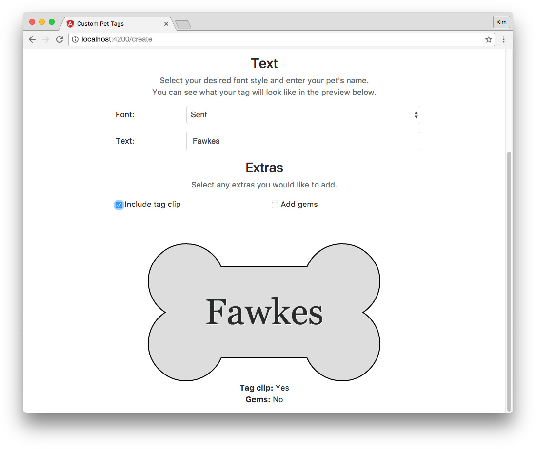
Tag Preview Component
Now let's create a component that shows a simple preview of the pet tag as it's being created. After we've implemented the tag preview presentational component, we'll be able to view the tag like so:
Let's scaffold the TagPreviewComponent. This component will be a child of both the Create and Complete pages, so let's create it in the root of the app folder like so:
$ ng g component tag-previewTag Preview Component Typescript
Open tag-preview.component.ts and add this code:
// src/app/tag-preview/tag-preview.component.ts
import { Component, OnChanges, Input } from '@angular/core';
import { PetTag } from './../core/pet-tag.model';

@Component({
  selector: 'app-tag-preview',
  templateUrl: './tag-preview.component.html',
  styleUrls: ['./tag-preview.component.css']
})
export class TagPreviewComponent implements OnChanges {
  @Input() petTag: PetTag;
  imgSrc = '';
  tagClipText: string;
  gemsText: string;

  constructor() { }

  ngOnChanges() {
    this.imgSrc = `/assets/images/${this.petTag.shape}.svg`;
    this.tagClipText = this.boolToText(this.petTag.clip);
    this.gemsText = this.boolToText(this.petTag.gems);
  }

  private boolToText(bool: boolean) {
    return bool ? 'Yes' : 'No';
  }

}
TagPreviewComponent is a dumb component that takes input from the CreateComponent parent and displays it, but does not produce any outputs. Import the Input decorator and the OnChanges lifecycle hook. We also need the PetTag model so we know what shape to expect from the input.
The TagPreviewComponent class needs to implement OnChanges so we can take advantage of the ngOnChanges() method. ngOnChanges() executes each time changes to the component's inputs are detected. We'll need this in order to update our preview whenever the user modifies their custom pet tag.
The @Input() petTag that we'll be receiving from the parent component is the state object, which has the shape declared by the PetTag model we defined at the beginning. For example, it might look something like this:
{
  shape: 'bone',
  font: 'serif',
  text: 'Fawkes',
  clip: true,
  gems: false,
  complete: false
}
We want to display this data in a user-friendly, visual way. We'll do this by showing an image of the tag with user-inputted text and notes about whether the user has chosen to include a clip or gems.
We'll set the image source as well as the tag clip and gems option text ("Yes" or "No") when changes to the input are detected. The input is provided by CreateComponent's subscription to its tagState$ store observable.
Tag Preview Component Template
Open the tag-preview.component.html file and add:
<!-- src/app/tag-preview/tag-preview.component.html -->
<div *ngIf="petTag.shape" class="row tagView-wrapper">

  <div class="col-sm-12">
    <div class="tagView {{petTag.shape}}">
      <img [src]="imgSrc" />
      <div class="text {{petTag.font}}">
        {{petTag.text}}
      </div>
    </div>

    <p class="text-center">
      <strong>Tag clip:</strong> {{tagClipText}}<br>
      <strong>Gems:</strong> {{gemsText}}
    </p>
  </div>

</div>
The preview will show if there is a shape. We'll display the appropriate shape SVG image and a shape class. We'll also display the pet tag text in the appropriate font using a class with the font value. Finally, we'll print out whether the user has chosen to include a tag clip or gems.
Tag Preview Component Styles
Recall that there are four possible tag shapes: a bone, rectangle, circle, and heart. In order to display a nice preview with any of these shapes, we'll need some additional styling. Open the tag-preview.component.css file:
/* src/app/tag-preview/tag-preview.component.css */
.tagView-wrapper {
  padding-top: 20px;
}
.tagView {
  height: 284px;
  position: relative;
  width: 100%;
}
img {
  display: block;
  height: 100%;
  margin: 0 auto;
  width: auto;
}
.text {
  font-size: 48px;
  position: absolute;
  text-align: center;
  text-shadow: 1px 1px 0 rgba(255,255,255,.8);
  top: 99px;
  width: 100%;
}
.bone .text,
.rectangle .text {
  font-size: 74px;
  top: 85px;
}
.sans-serif {
  font-family: Arial, Helvetica, sans-serif;
}
.serif {
  font-family: Georgia, 'Times New Roman', Times, serif;
}
After some basic styling to position the preview elements, we'll set the font sizes based on shape and the font families based on the user's selected font style.
Now our <app-tag-preview> is ready to be added to the container component templates.
Add Tag Preview Component to the Create Page
Open create.component.html and let's add the tag preview child component at the bottom:
<!-- src/app/pages/create/create.component.html -->
...
<app-tag-preview
  [petTag]="petTag"></app-tag-preview>
Square brackets ([...]) denote a one-way binding syntax. We already established our local petTag property in the CreateComponent's tagStateSubscription, and we're passing this to the tag preview component.
Now we should be able to see live changes in the tag preview as we customize our tag:
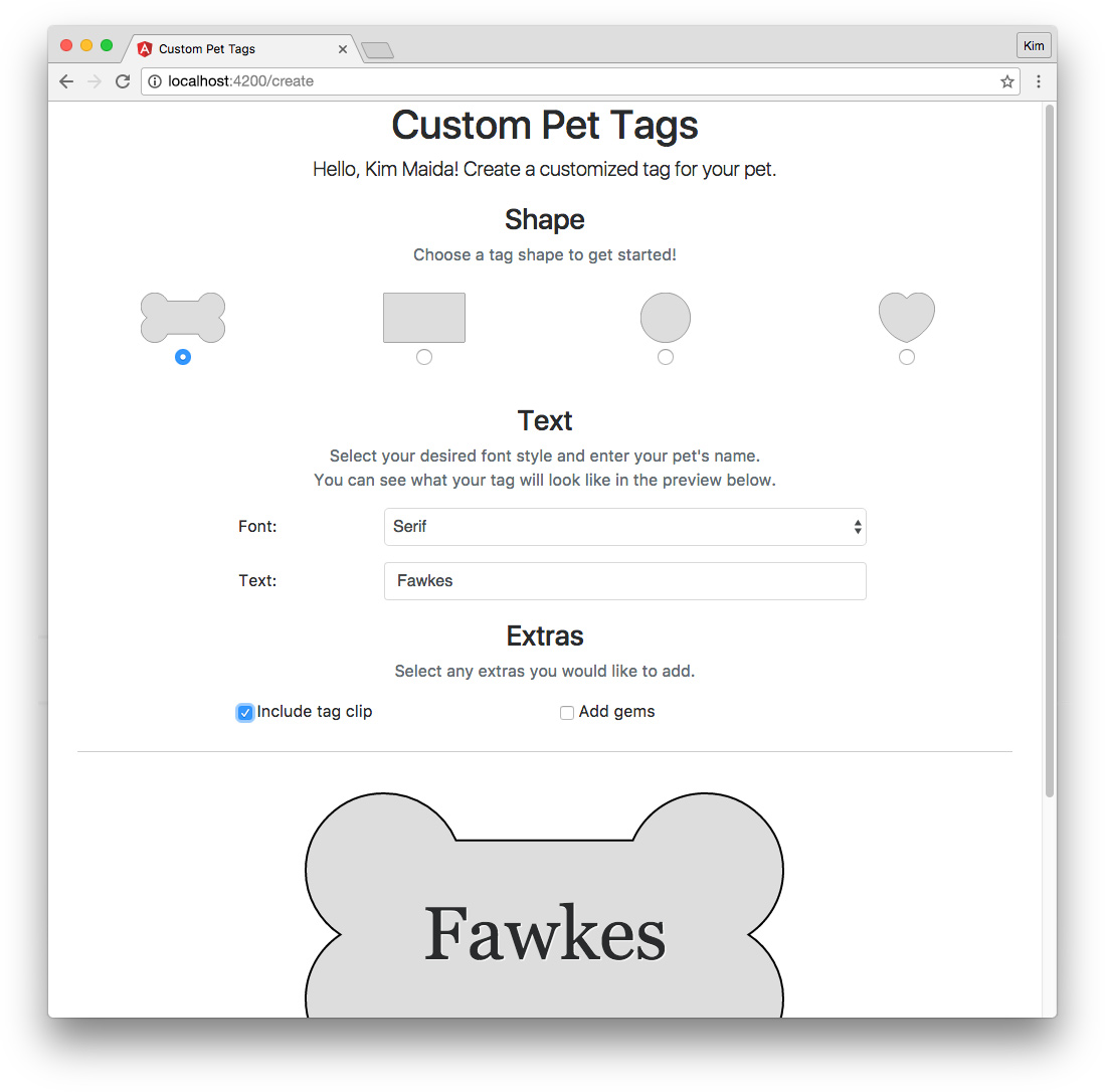
Submit Completed Tag
Now that we have our tag builder and preview built, let's add a "Done" button to submit the finished tag to the Complete page. When implemented, our Create page should look like the following:
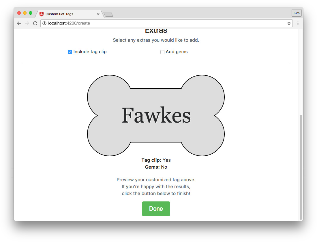
We've already created a submit() method in CreateComponent that dispatches the COMPLETE action and payload to the reducer. All we need to do is create a button that calls this method in our create.component.html template:
<!-- src/app/pages/create/create.component.html -->
...
<div class="row">
  <div class="col-sm-12 text-center">
    <p class="form-text text-muted" *ngIf="petTag.shape">
      Preview your customized tag above.<br>
      If you're happy with the results,<br>
      click the button below to finish!
    </p>
    <p>
      <button
        class="btn btn-success btn-lg"
        *ngIf="petTag.shape"
        [disabled]="!done"
        (click)="submit()"
        routerLink="/complete">Done</button>
    </p>
  </div>
</div>
We'll disable the button if the done property is falsey. We declared done in the CreateComponent's tagStateSubscription earlier. It looks like this:
this.done = !!(this.petTag.shape && this.petTag.text);The tag can be considered ready for submission if it has a shape and text. If the user has added these, then they will be able to click the button to submit their tag. We'll also route the user to the Complete page.
"complete" Page Component
We scaffolded the Complete page when we set up the main routes for our app. Once we've implemented the component, the Complete page will look something like this after the user has created a custom pet tag:
"complete" Component Typescript
Now let's open the complete.component.ts smart component and implement the following code:
// src/app/pages/complete/complete.component.ts
import { Component, OnInit, OnDestroy } from '@angular/core';
import { Observable } from 'rxjs/Observable';
import { Subscription } from 'rxjs/Subscription';
import { Store } from '@ngrx/store';
import { RESET } from './../../core/pet-tag.actions';
import { PetTag } from './../../core/pet-tag.model';

@Component({
  selector: 'app-complete',
  templateUrl: './complete.component.html'
})
export class CompleteComponent implements OnInit, OnDestroy {
  tagState$: Observable<PetTag>;
  private tagStateSubscription: Subscription;
  petTag: PetTag;

  constructor(private store: Store<PetTag>) {
    this.tagState$ = store.select('petTag');
  }

  ngOnInit() {
    this.tagStateSubscription = this.tagState$.subscribe((state) => {
      this.petTag = state;
    });
  }

  ngOnDestroy() {
    this.tagStateSubscription.unsubscribe();
  }

  newTag() {
    this.store.dispatch({
      type: RESET
    });
  }

}
CompleteComponent is a routable smart (container) component. We'll be managing a store subscription, so we need to import OnInit, OnDestroy, Observable, Subscription, and Store. We'll also have a link the user can click to start over and create a new tag. This will set the state back to its initial values, so we need to import the RESET action, as well as PetTag and initialTag from our model.
This component doesn't need any styling beyond Bootstrap, so we'll delete the complete.component.css file and remove the reference to it.
Like in our CreateComponent smart component, we'll create a tagState$observable, tagStateSubscription, and a local petTag property. We'll also create an emptyTag property with the PetTag type. We'll set its value to initialTag.
In the constructor, we'll assign tagState$ as the store observable. Then in ngOnInit(), we'll subscribe to the observable and set the petTag property. In the ngOnDestroy() method, we'll clean up our subscribtion by unsubscribing.
Finally, our newTag() method will dispatch the RESET action. This "resets" the application state so that a new tag can be customized.
"complete" Component Template
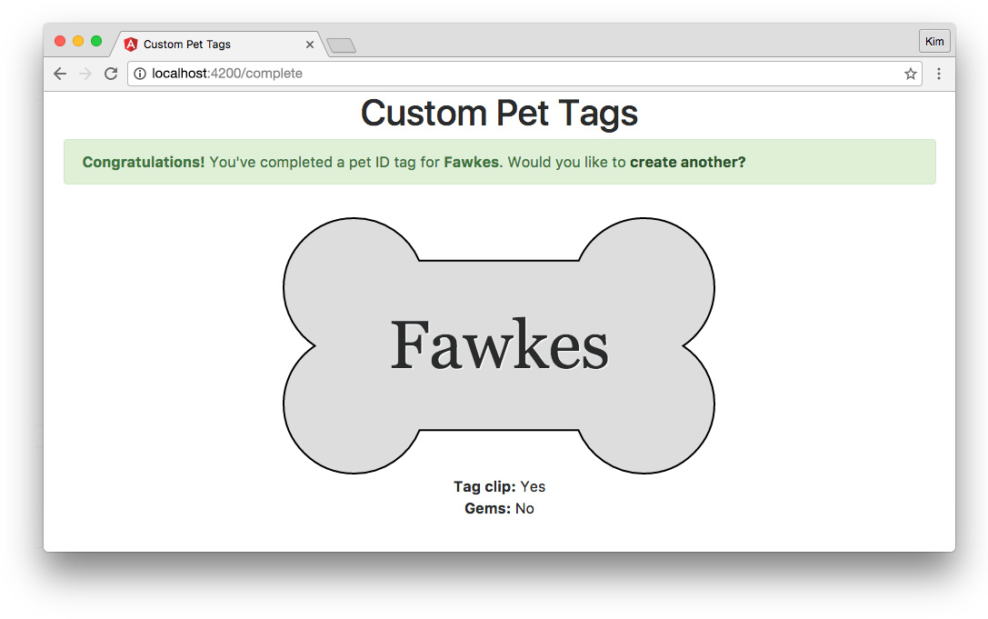
Our CompleteComponent's HTML template will look like this:
<!-- src/app/pages/complete/complete.component.html -->
<div *ngIf="petTag.complete">
<div class="row">
<p class="col-sm-12 alert alert-success">
<strong>Congratulations!</strong> You've completed a pet ID tag for <strong>{{petTag.text}}</strong>. Would you like to <a (click)="newTag()" routerLink="/create" class="alert-link">create another?</a>
</p>
</div>
<app-tag-preview [petTag]="petTag"></app-tag-preview>
</div>
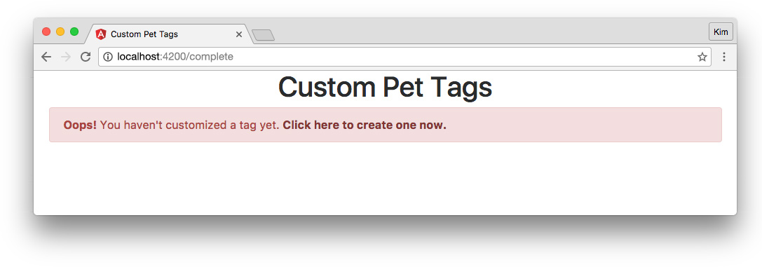
<div *ngIf="!petTag.complete" class="row">
<p class="col-sm-12 alert alert-danger">
<strong>Oops!</strong> You haven't customized a tag yet. <a routerLink="/create" class="alert-link">Click here to create one now.</a>
</p>
</div>First we'll show a success alert that congratulates the user on creating a custom tag for their pet, grabbing the pet's name from the petTag state object's text. We'll provide a link to create another tag that executes the newTag() method and routes the visitor back to the Create page to start fresh.
Then we'll show the tag preview component and pass the petTag object to it: <app-tag-preview [petTag]="petTag">
Finally, we'll need to show an error message if the user manually navigates to the /complete route without having finished customizing a tag. A link should be available to take them back to the Create page. The Complete page error should look like this:
We now have the primary functionality of our Custom Pet Tags application set up and working!
Authentication With Auth0
We'll now protect our application so that only authenticated users can access it. We already set up a "Log In" button in our HomeComponent, but right now it just navigates to the Create page. Let's hook up the authentication functionality using Auth0.
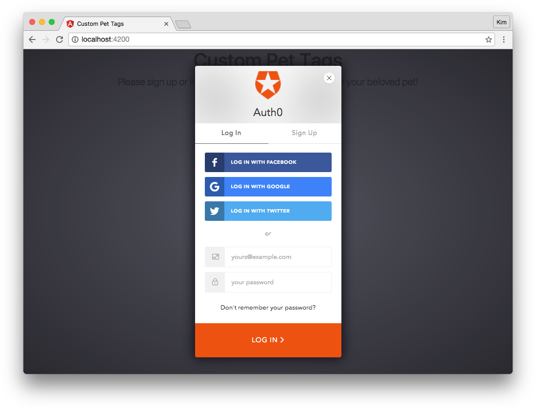
Sign Up for Auth0
The first thing we'll need is an Auth0 account. Follow these simple steps to get started:
- Sign up for a .
- In your Auth0 Dashboard, create a new client.
- Name your new app and select "Single Page Web Applications."
- In the Settings for your newly created app, add
http://localhost:4200to the Allowed Callback URLs and Allowed Origins (CORS). - If you'd like, you can set up some social connections. You can then enable them for your app in the Client options under the Connections tab. The example shown in the screenshot above utilizes username/password database, Facebook, Google, and Twitter.
Set Up Dependencies
Auth0 authenticates using JSON Web Tokens. Let's install the angular2-jwt helper library using npm:
$ npm install angular2-jwt --saveWe also need the Auth0 Lock library. This provides the login widget and methods. We'll include the CDN-provided script for Lock in the <head> of our index.html file, like so:
<!-- src/app/index.html -->
...
  <!-- Auth0 -->
  <script src="https://cdn.auth0.com/js/lock/10.11.0/lock.min.js"></script>
</head>
...
Create an Auth Service
Next we'll create a service to manage authentication. User authentication will be handled via local storage and it won't be necessary to create another store. In a more complex application, you may wish to make a user store, but for our purposes, a simple service will work just fine.
Let's create an authentication service:
$ ng g service core/AuthOur auth.service.ts file should look like this:
// src/app/core/auth.service.ts
import { Injectable } from '@angular/core';
import { Router } from '@angular/router';
import { tokenNotExpired } from 'angular2-jwt';

// avoid name not found warnings
declare var Auth0Lock: any;
declare var localStorage: any;

@Injectable()
export class AuthService {
  lock = new Auth0Lock('[CLIENT_ID]', '[CLIENT_DOMAIN]', {
    auth: {
      redirectUrl: 'http://localhost:4200',
      responseType: 'token'
    }
  });
  userProfile: Object;

  constructor(private router: Router) {
    this.userProfile = JSON.parse(localStorage.getItem('profile'));

    // add callback for lock 'hash_parsed' event
    this.lock.on('hash_parsed', (authResult) => {
      if (authResult && authResult.idToken) {
        localStorage.setItem('id_token', authResult.idToken);

        // get user profile
        this.lock.getProfile(authResult.idToken, (error, profile) => {
          if (error) {
            throw Error('There was an error retrieving profile data.');
          }
          localStorage.setItem('profile', JSON.stringify(profile));
          this.userProfile = profile;

          // on successful authentication and profile retrieval, go to /create route
          this.router.navigate(['/create']);
        });
      } else if (authResult && !authResult.idToken) {
        // authentication failed: show Lock widget and log a warning
        this.login();
        console.warn(`There was an error authenticating: ${authResult}`);
      }
    });
  }

  login() {
    this.lock.show();
  }

  logout() {
    localStorage.removeItem('id_token');
    localStorage.removeItem('profile');
  }

  get authenticated(): boolean {
    // search for an item in localStorage with key == 'id_token'
    return tokenNotExpired();
  }

}
We'll import Router to handle redirection after login and tokenNotExpired(from angular2-jwt) to make sure our user still has a valid JWT.
To avoid TypeScript warnings, we need to declare types for Auth0Lock and localStorage. We'll be able to inject our AuthService wherever we need access to its properties and methods (ie., in other components).
In the AuthService class, we need to create a new Lock instance with our Auth0 client's ID and domain. These can be found in your Auth0 dashboard settings for the Single Page Application client you just set up. Replace [CLIENT_ID] and [CLIENT_DOMAIN] with your personalized information. We'll pass a configuration object to our Lock instance with a redirectUrl and responseType.
Note: You can read more about Lock configuration in the docs.
We'll create a property to store the user's profile information that we'll retrieve when a visitor authenticates. This has an Object type.
Because we'll be storing the user's profile and access token in local storage, the first thing we'll do in our constructor is check for an existing profile. If there's a profile in storage already, we'll set the userProfile property.
Next we need to listen to the Lock instance for the hash_parsed event. This is a low-level event that we'll use (instead of the authenticated event) in order to handle single page app redirection upon login.
If an idToken is present, we'll save it to localStorage and use it to retrieve the user's profile information. Once the profile has been successfully retrieved, we can save it to localStorage and redirect to the Create page. If there is no idToken returned, we'll reinitialize the login and log an authentication warning.
Finally, we'll implement three methods: login(), logout(), and the authenticated accessor. The login() method will simply display the Lock widget so the user can log in with Auth0. The logout() method removes the user's token and profile from local storage. The authenticated getter checks the JWT to see if it has expired and returns a boolean representing authentication status.
We're now ready to use AuthService to authenticate users in our application.
Provide Auth Service in App Module
We're going to provide AuthService globally to the application in our app.module.ts:
// src/app/app.module.ts
...
import { AuthService } from './core/auth.service';

@NgModule({
  ...
  providers: [
    AuthService
  ],
  ...
Import AuthService in the app module and add it to the providers array. We can now inject this service elsewhere in our application.
Home Component Login
The first thing we'll implement with AuthService is the "Log In" button we created on the homepage.
Open home.component.ts:
// src/app/pages/home/home.component.ts
...
import { Router } from '@angular/router';
import { AuthService } from './../../core/auth.service';

...
  constructor(public auth: AuthService, private router: Router) { }

  ngOnInit() {
    if (this.auth.authenticated) {
      this.router.navigate(['/create']);
    }
  }

}
Import AuthService and Router and make them available to the constructor. auth should be public because we need to access its methods in the Home template. Using the OnInit lifecycle hook, we'll check if the user is authenticated. If so, we'll navigate to the Create page so the user can skip the login on the homepage.
Now open home.component.html:
<!-- src/app/home/home.component.html -->
...
      <button
        class="btn btn-lg btn-primary"
        (click)="auth.login()">Log In</button>
...
We'll update the "Log In" button so that clicking it executes the AuthServicelogin() method and shows the Auth0 Lock login box.
We now have a functioning login in our app!
Complete Component Logout
We also need a way for our users to log out. We'll add a "Log Out" button to the Complete page component.
Open complete.component.ts:
// src/app/pages/complete/complete.component.ts
...
import { AuthService } from './../../core/auth.service';

...
  constructor(..., public auth: AuthService) { }
...
We'll import AuthService and make it publicly available to the constructor so we can access its properties and methods in the HTML template.
Next open complete.component.html:
<!-- src/app/pages/complete/complete.component.html -->
...
    <p class="col-sm-12 alert alert-success">
      <strong>Congratulations, {{auth.userProfile.name}}!</strong> ...
    </p>
...
<div class="row">
  <p class="col-sm-12 text-center">
    <a
      class="btn btn-danger btn-lg"
      (click)="auth.logout()"
      routerLink="/">Log Out</a>
  </p>
</div>
We'll greet the user by name and add a "Log Out" button to call the AuthService's logout() method and redirect the user back to the homepage.
Greet User in Create Component
For a personal touch, we'll also greet the user by name on the Create page. Open create.component.ts:
// src/app/pages/create/create.component.ts
...
import { AuthService } from './../../core/auth.service';

...
  constructor(..., public auth: AuthService) { }
...
Import the AuthService and make it publicly available in the constructor.
Next open the create.component.html template and add a personalized greeting after Hello:
<!-- src/app/pages/create/create.component.html -->
<p class="col-sm-12 text-center lead">
  Hello, {{auth.userProfile.name}}! Create a customized tag for your pet.
</p>
...
Now our app feels more personalized.
Create a Route Guard
We can log in and out of our app, but that doesn't offer much more than simple personalization at the moment. Any visitor can still navigate to any route they wish if they simply enter URLs manually. Let's implement a route guard so that routes are activated only for logged in users.
Important Security Note: In our simple demo app, authentication is simply for routing because we don't have a server component. Client-side authentication does not confer security features. If you're building an authenticated app with a server, you'll need to authorize API requests with the JWT provided by Auth0 using an
Authorizationheader. You can read more on how to do this in the Auth0 Angular 2 Calling APIs docs. Theangular2-jwtpackage we installed providesAUTH_PROVIDERSto help accomplish this. When making API calls in an authenticated app, we would secure our server requests in addition to implementing presentational route guards. You can read more about securing a Node API in the Angular 2 Authentication tutorial here.
Create a new file in src/app/core called auth.guard.ts:
// src/app/core/auth.guard.ts
import { Injectable } from '@angular/core';
import { Router, CanActivate } from '@angular/router';
import { AuthService } from './auth.service';

@Injectable()
export class AuthGuard implements CanActivate {

  constructor(private auth: AuthService, private router: Router) { }

  canActivate() {
    if (this.auth.authenticated) {
      return true;
    }
    this.router.navigate(['/']);
    return false;
  }

}
We need to inject the route guard in our routing module, so we need to import Injectable. We'll also need Router to redirect the user when they're not authenticated, and CanActivate to activate (or deactivate) routes based on user authentication status. We'll import AuthService to get this authentication information. That's it for imports.
The AuthGuard class implements CanActivate, a guard which determines if a route can be activated or not. We'll make AuthService and Router available privately to the constructor.
Our canActivate() method checks if the user is authenticated. If they are, the route can be activated so we'll return true. Otherwise, we'll redirect to the Home page so the user can log in and return false: the route cannot be activated.
App Routing Module With Route Guard
Now that we've created a route guard, we need to apply it in our application. Let's open the app-routing.module.ts file and make some updates:
// src/app/core/app-routing.module.ts
...
import { AuthGuard } from './auth.guard';

@NgModule({
  imports: [
    RouterModule.forRoot([
      ...
      {
        path: 'create',
        component: CreateComponent,
        canActivate: [
          AuthGuard
        ]
      },
      {
        path: 'complete',
        component: CompleteComponent,
        canActivate: [
          AuthGuard
        ]
      },
      ...
    ])
  ],
  providers: [
    AuthGuard
  ],
  ...
First we need to import our AuthGuard. Then we'll add the canActivate: [ AuthGuard ] key/value to each route that we want to protect. This includes the 'create' route and the 'complete' route. Finally, we need to add AuthGuard to the providers array.
Unauthorized users can no longer access routes that require authentication. Trying to access protected routes when not logged in redirects visitors to the homepage where they'll see the "Log In" button.
Note: Don't forget to run
$ ng lintif you haven't been doing so and make sure there are no issues with our code.
Conclusion
Our simple Angular + ngrx/store + Auth0 application is now complete. Try it out!
Aside: You Might Not Need ngrx/Store
State management libraries are great, but please make sure you've read You Might Not Need Redux before you implement ngrx/store in a production Angular application.
Our tutorial's sample app is reasonably simple because we're using ngrx/store for teaching and learning. When building production apps for yourself or clients, consider the necessity and ramifications of using a tool like Redux or ngrx/store before implementing. Angular (with its inclusion of RxJS) now does a great job of managing global data with services. Therefore, smaller, simpler apps work just fine with local state. In these cases, it's possible to introduce confusion and indirection if ngrx/store is used unnecessarily.
That said, ngrx/store and its kin are incredibly helpful and valuable tools when managing state in large or particularly complex applications. Hopefully you're now able to reason about the paradigm used by Redux and ngrx/store. This should help you make informed decisions regarding how and when to use state management libraries.
Additional State Management Resources
Here are some additional resources for learning how to manage state with stores:
- ngrx/store on GitHub
- @ngrx/store in 10 minutes
- Comprehensive Introduction to @ngrx/store
- ng-conf: Reactive Angular 2 with ngrx - Rob Womald
- Angular 2 Service Layers: Redux, RxJS and Ngrx Store - When to Use a Store and Why?
- Getting Started with Redux - Dan Abramov on Egghead.io
While Angular makes it reasonably straightforward to share and pass data in smaller apps with services and component communication, managing global application state can rapidly become a mess and a headache in complex apps. Global stores like ngrx/store greatly aid in organizing and compartmentalizing state management. Hopefully you're now prepared to tackle building your own Angular apps with ngrx/store!
Published at DZone with permission of Kim Maida. See the original article here.
Opinions expressed by DZone contributors are their own.
Comments