Subtitles: The Good, the Bad, and the Resource-Heavy
This article explores techniques for building an adaptive, performance-optimized subtitle component with embedded content and a non-uniform (gradient) background.
Join the DZone community and get the full member experience.
Join For FreeStack: HTML + CSS + TypeScript + Next.js (React)
Goal: Build a universal expandable subtitle with an embedded "Show more" button and gradient background.
Introduction
User interfaces often require short blocks of content that may vary in length depending on the data returned from the backend. This is especially true for subtitles and short descriptions, where designers frequently request a “show more” interaction: the first two lines are shown, and the rest is revealed on demand.
But what if the subtitle also has to:
- Include an inline "show more" button?
- Be rendered over a gradient background?
- Support responsive layout and dynamic font settings?
In this article, we’ll explore multiple approaches — from naive to advanced — and land on an elegant, efficient CSS-only solution. Along the way, we’ll weigh performance tradeoffs and development complexity, which will help you choose the right approach for your project.
The Bad
The first idea that comes to mind for many junior developers is to slice the text received from the backend by a fixed number of characters. This way, the subtitle fits into two lines and toggles between the full and truncated versions.
function App() {
  const [isSubtitleOpen, setSubtitleState] = useState(false);
  const subtitle = 'Lorem, ipsum dolor sit amet consectetur adipisicing elit. Mollitia, corporis?';
  const visibleSubtitle = subtitle.slice(0, 15);

  const toggleSubtitleState = () => setSubtitleState(prev => !prev);

  return (
    <>
      <button onClick={toggleSubtitleState}>
        {isSubtitleOpen ? subtitle : visibleSubtitle} {isSubtitleOpen ? 'show less' : '... show more'}
      </button>
    </>
  );
}
Why this is a bad idea:
- It ignores styling properties like
font-size,font-family, andfont-weight, which affect actual visual length. - It doesn’t support responsive design — character counts vary drastically across screen widths (e.g., 1280px vs. 768px).
Also, given the constraints — an embedded button within content and a gradient background — line-clamp and text-overflow: ellipsis are not viable. Absolute positioning for the button is off the table too.
Let’s explore smarter options that can save you development hours and performance costs.
The Resource-Heavy
Let’s level up with smarter, layout-aware techniques.
Option 1: Hidden Container Measurement
This method creates an off-screen, absolutely positioned container with the same styling as the visible subtitle. You use either a native loop (O(n)) or binary search (O(logN)) to find the character at which a line break occurs. This accounts for styling and container width.
While accurate, this approach is highly performance-intensive. Each iteration requires re-rendering the hidden element to measure its height, which is costly.
Option 2: Canvas Text Measurement
A much faster O(1) alternative. Here's the idea:
- Measure the full text width using canvas (with correct font styles).
- Estimate average character width.
- Calculate how many characters fit in two lines minus the button width.
This avoids DOM reflows and instead leverages CanvasRenderingContext2D.measureText().
const measureTextWidth = (text: string, font = '14px sans-serif'): number => {
  const canvas = document.createElement('canvas');
  const context = canvas.getContext('2d');
  if (!context) return 0;
  context.font = font;
  return context.measureText(text).width;
};
Usage example:
const showMoreSuffix = `... ${staticText?.show_more.toLowerCase() ?? 'show more'}`;
const [isHeaderOpen, setIsHeaderOpen] = useState(false);
const [sliceSubtitle, setSliceSubtitle] = useState(subtitle);

const textRef = useRef<HTMLSpanElement | null>(null);
const blockRef = useRef<HTMLDivElement | null>(null);

useEffect(() => {
  const updateSubtitleState = () => {
    if (subtitle && textRef.current && blockRef.current) {
      const el = textRef.current;
      const container = blockRef.current;
      const computedStyle = window.getComputedStyle(el);
      const fontSize = computedStyle.fontSize || '14px';
      const fontFamily = computedStyle.fontFamily || 'sans-serif';
      const fontWeight = computedStyle.fontWeight || 'normal';
      const font = `${fontWeight} ${fontSize} ${fontFamily}`;
      const containerWidth = container.offsetWidth;
      const suffixWidth = measureTextWidth(showMoreSuffix, font);
      const subtitleWidthOnly = measureTextWidth(subtitle, font);
      const avgCharWidth = subtitleWidthOnly / subtitle.length;
      const maxLineWidthPx = containerWidth * 2 - suffixWidth;
      const maxChars = Math.floor(maxLineWidthPx / avgCharWidth);
      setSliceSubtitle(subtitle.slice(0, maxChars));
    }
  };

  updateSubtitleState();
  window.addEventListener('resize', updateSubtitleState);
  return () => window.removeEventListener('resize', updateSubtitleState);
}, [subtitle, showMoreSuffix]);
This approach is precise and avoids expensive DOM operations, but the code is verbose and tricky to maintain, which led me to look further.
The Good
CSS-powered UI changes are more performant thanks to how browsers render styles. That's why the final approach leans on CSS, particularly clip-path combined with line-clamp.
Key Idea:
- Use
line-clamp-2andoverflow-hiddento restrict to 2 lines. - Clip part of the second line with a custom
clip-path, leaving space for the button. - Overlay the "Show more" button in that space.
Implementation:
const [isHeaderOpen, setIsHeaderOpen] = useState(false);
const subtitleClasses = classNames({
'line-clamp-2 overflow-hidden [display:-webkit-box] [clip-path:polygon(0_0,_100%_0,_100%_50%,_70%_50%,_70%_100%,_0_100%)]':
!isHeaderOpen,
});
const handleOpenExpand = () => setIsHeaderOpen(!isHeaderOpen);
return (
{subtitle && subtitleVisible && (
<div className="mhg-alpha-body-1-relaxed h-auto pl-0">
{buttonVisible && isTextTruncated && (
<button
type="button"
className="relative text-left"
onClick={handleOpenExpand}
>
<span className={subtitleClasses}>{subtitle}</span>
{!isHeaderOpen && (
<span className="absolute bottom-0 text-nowrap [left:70%]">
... <u>{staticText.show_more.toLowerCase()}</u>
</span>
)}
</button>
)}
</div>
)}
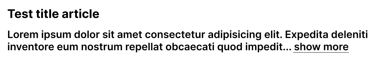
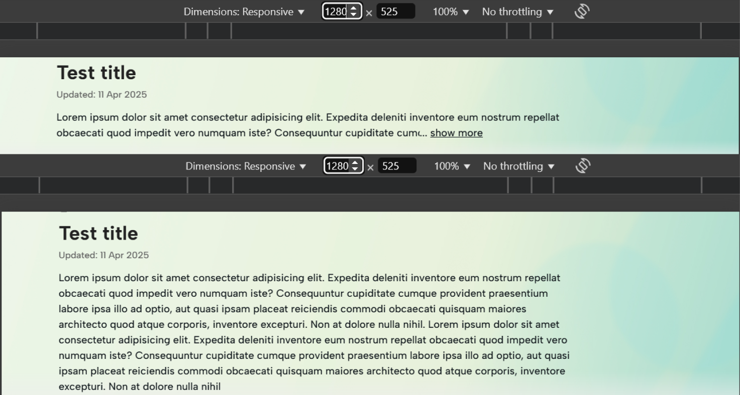
);By clipping 70% of the second line and adding a button aligned at 70% from the left, the layout adapts well across screen sizes and fonts, without JS computations.
This approach:
- Eliminates JavaScript calculations.
- Adapts to any screen size or font.
- Renders purely through CSS, enabling faster paint and layout operations.
- Is elegant and highly maintainable.
Result:
Conclusion
Before writing this article, I explored numerous resources looking for a working solution. Finding none, I decided to document the key approaches for tackling embedded button subtitles.
Hopefully, this helps you save development time and optimize your application performance in similar UI scenarios.
Happy coding!
Opinions expressed by DZone contributors are their own.
Comments