Tableau Dashboard Development Best Practices
There are many ways a user can create a dashboard but there are ways to make it better. I will go over the best practices to follow while creating these reports.
Join the DZone community and get the full member experience.
Join For FreeTableau is a great tool for turning data into clear, interactive visuals. But to get the most out of it, it’s important to follow a few best practices. These help keep dashboards clean, fast, and easy to understand. Whether you're building reports for yourself or a wider team, sticking to some core development habits can save time, avoid headaches, and make your work more impactful.
Data Sources and Extracts
It is the main section of Tableau where you begin the configuration to pull the data from any source from this list.
Single Table (Logical) vs. Multi-Table (Physical) Data Sources
|
Single / Logical Tables
|
Multi / Physical Tables
|
|
| Pros |
|
|
| Cons |
|
|
Data Source Classifications
- Simplest Data Source: When the data consists of a single table.
- Typical Data Source: if the data source is tables joined together in Tableau via direct joins or relationships.
- Complex Data Source: if the data source leverages a database view or Custom SQL Query where complex logic is being applied (e.g., subqueries, aggregations, window functions, etc.)
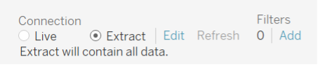
Extracts
It is best to use extracts when developing and deploying new reports to server. It is helpful to ensure data sources are limited only to the data (i.e. only columns and records applicable to the report). It will greatly improve the speed and space usage of reports.
Extract settings are found by editing the data source settings:
What is a Tableau Data Extract?
Extracts are saved subsets of data that are used to improve performance or take advantage of Tableau functionality not available or supported in the original data source. When we create extracts, we are specifying the total amount of data that should be copied from the source into an extract based on the columns saved in the Tableau data source and the data source filters applied.
See Tableau documentation for more information on extracts:
How a Single Tableau Data Extract Impacts a Process
For every embedded workbook data source or published Tableau data source which uses an object from a database, Tableau Server will execute a query on database at extract time to transmit the relevant columns and rows from the database to Tableau server.
Factors of Poor Extract Performance
- the size of the table or resulting table (# or rows, # of columns).
- network latency between database and Tableau Server.
- extracts scheduled during peak database processing hours.
Tableau executes all joins directly on the database prior to transmitting data which can impact database performance if the tables are very large or join logic is not optimized.
Best Practices
- Use
Physical tableextracts by default unless you're intentionally building aLogical tabledata source. - Minimize complex logic in views or
Custom SQL. Instead, move logic to an automated post-processing procedure to reduce the impact on the database server. - Extracts should happen less frequently and off-peak.
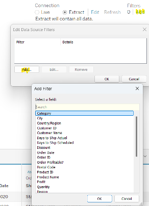
Filters
The screenshots for filters below shows data from the sample superstore dataset from Tableau.
Data Source Filters
Dashboard Filters
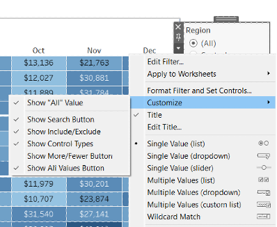
- Generally,
Multiple Values (dropdown)is a good filter option, but you can use others if appropriate. UsingWildcard Matchcan be faster if you're searching through a long list (like a list of employees). - Limiting to
Only Relevant Valueswill restrict the options based on other filters. You can also limit toOnly Values in Context, which applies the context filters first. - Customize to show/hide the
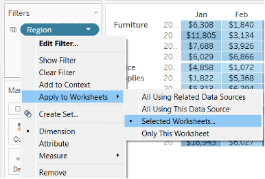
"All"value. CheckShow Apply Buttonto let users select multiple options before refreshing the dashboard, instead of triggering a refresh after each click. - Consciously choose which worksheets to apply the filter to. If you have multiple sheets in a dashboard, you’ll likely want the filter to apply to
Selected Worksheetsinstead ofOnly This Worksheet.
User Filters
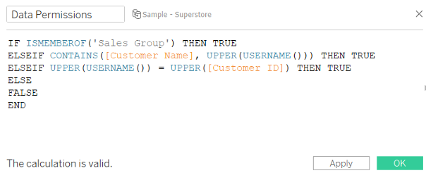
Some workbooks require that people only see certain information based on who they are (i.e. I should only see projects I am assigned to, or I should only see people in my reporting line). You can use the USERNAME() and ISMEMBEROF() functions in Tableau to accomplish this. See below calculated field, where the field "Data Permissions" is only true if the Tableau user is in the Sales group or is in the reporting line of the person or is the people manager of the person. This field then added to the Tableau Filters such that Data Permissions = TRUE.
Note: Tableau is case-sensitive, so the UPPER() function is used.
Key Dashboard Elements, With an Emphasis on User Experience
It is important to keep in mind the overall user experience when building a Tableau dashboard. We should choose to configure workbooks to...
- be easy to use and navigate.
- view sizing - will it be used primarily by teams on laptops or teams in-office?
- filter configurations
- given view sizing, should filters be at the top or side?
- will using a show/hide container affect how filter information appears in email subscriptions?
- actions
It is always considered a good practice to include the actions in all the dashboards, this enables the user to click on different data elements of the dashboard. A user can drill down to see how a specific aggregated value was generated. For many use cases it is also advisable to include a URL as an action. A user can click on it and it will take them to a webpage that will provide more information related to the cell that clicked on.
- naming: The worksheet and dashboards naming conventions should be named appropriately
- be
responsiveandperformant
- default filter settings - should all rows be hidden by default?
- data volume - is the dataset larger than necessary?
- extract & logical complexity - is the data source extracts completing in a timely manner on the server?
Adding Info Text and Help Text
Info / help text should be provided where it can help resolve user confusion when using or navigating the workbook; all other information should be included in the documentation. Help text can contained in a floating container to help reduce dashboard crowding.
Helpful content which can be considered to be added as info / help text:
- Clarifying that there are filters being applied.
- Noting a specific assumption or rule applied in the data.
- Highlighting a feature or dashboard action.
- Indicating a data source or support email for a particular data point.
Extensions
It comes as an add-on feature from Tableau where users can download them from their website. It has helped me with several scenarios. Few of them are covered below.
Export All (often updated to say "Easy Export" in dashboards)
- very helpful for any view where users would like to export data to excel.
- best practice is to include only key columns and to format nicely to improve user experience.
- Caution! - using this extension with a large dataset can cause dashboards to load much slower.
- helpful for automatically moving the date filter window as time goes on (e.g. always show
-4 weeks to +8weeks relative to today). - takes a few seconds to be applied in a view.
- applied upon using the view containing the extension...therefore, may need to be added across all views even though the filter applies across the workbook.
Dashboard Layout and Design
Tableau Dashboard Sizes
It's helpful to try to be consistent across an entire workbook and considerate of how the full audience will be engaging with the workbook (i.e. via email subscription, on laptop/while traveling, in office/with monitors).
Broad Audience - often on laptop or traveling, less familiar with navigating Tableau, may often opt for subscriptions
- I have found that
1150 x 750works well for heavy laptop audiences. - Minimizing show/hide containers helps with navigating the workbook.
- Oversized dashboards can be difficult to navigate due to the need of excessive scrolling.
Small Audience - often in-office, comfortable with navigating Tableau
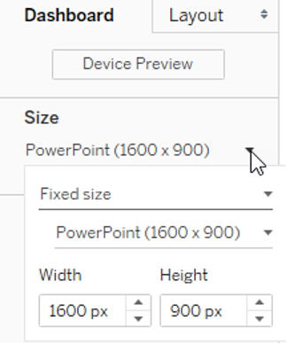
I have found that option to select PowerPoint (1600x900) works well for most of the scenarios.
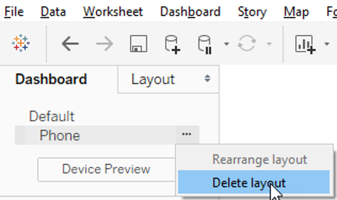
Mobile Layouts
I have found that these are more confusing than helpful, and that they can cause weird layout behavior when on laptop. It is recommended that all alternative layouts be removed (i.e. tablet, phone).
Dashboard Permission
A common practice we follow is to create AD groups specific to each project and site. This helps restrict the users based on the data they should have access to.
- Reader AD: The users who are a part of this group can only view the dashboard.
- Publisher AD: Users in this group have admin rights to manage the content of the project
- Site Admin AD: They are defined at the site level, and they manage the access for the whole site.
- Server Admin AD: This is the Tableau administrator group who manages and controls the content of the entire Tableau server.
Conclusion
Great dashboards aren’t just about looking good. They should feel intuitive, load fast, and make it easy for people to find what they need. When you focus on layout, filters, interactivity, and clarity, the final product becomes something users actually enjoy exploring.
Opinions expressed by DZone contributors are their own.
Comments