The Power of Visualization in Exploratory Data Analysis (EDA)
In this article, we explore various data visualization techniques to conduct Exploratory Data Analysis, which is a vital step in understanding data's hidden insights.
Join the DZone community and get the full member experience.
Join For FreeExploratory Data Analysis (EDA) is the initial phase of data analysis, where we examine and understand our data. One of the most powerful tools at our disposal during EDA is data visualization. Visualization allows us to represent data visually, helping us gain insights that are difficult to obtain from raw numbers alone. In this article, we'll explore 11 essential Python visualizations for EDA, providing concise explanations and Python code for each, along with the benefits of effective visualization.
What Is Data Visualization in EDA?
Data visualization in EDA is the process of representing data graphically to reveal patterns, trends, and relationships within the data. It involves creating charts, graphs, and plots to transform complex data into easily understandable visuals.
Why Is Data Visualization Effective in EDA?
- Simplifies Complexity: Data can be complex, with numerous variables and data points. Visualization simplifies this complexity by presenting information in a visual format that's easy to comprehend.
- Pattern Recognition: Visualizations make it easier to identify patterns and relationships within the data, aiding in hypothesis generation and validation.
- Enhanced Communication: Visual representations of data are more accessible and engaging, making it simpler to convey findings and insights to stakeholders.
- Anomaly Detection: Visualizations can quickly highlight outliers or unusual data points, prompting further investigation.
- Time Efficiency: Visualizations provide a rapid overview of data, saving time compared to manually inspecting raw data.
Now, let's explore 11 essential Python visualizations for EDA, each accompanied by a one-line explanation and Python code.
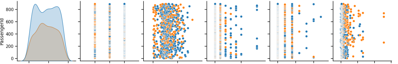
1. Scatter Matrix Plot
A scatter matrix plot displays pairwise scatter plots between numerical features, aiding in the identification of relationships.
import pandas as pd
import seaborn as sns

data = pd.read_csv('titanic.csv')
sns.pairplot(data, hue="Survived")
2. Heatmap
Heatmaps visualize the correlation between numerical features, helping to uncover dependencies in the data.
import seaborn as sns
import matplotlib.pyplot as plt

correlation_matrix = data.corr()
plt.figure(figsize=(10, 8))
sns.heatmap(correlation_matrix, annot=True, cmap="coolwarm")

3. Box Plot
Box plots represent the distribution and spread of data, useful for detecting outliers and understanding central tendencies.
import seaborn as sns
import matplotlib.pyplot as plt

sns.boxplot(x="Pclass", y="Age", data=data)

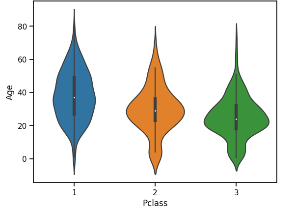
4. Violin Plot
Violin plots combine box plots with kernel density estimation, offering a detailed view of data distribution.
import seaborn as sns
import matplotlib.pyplot as plt

sns.violinplot(x="Pclass", y="Age", data=data)
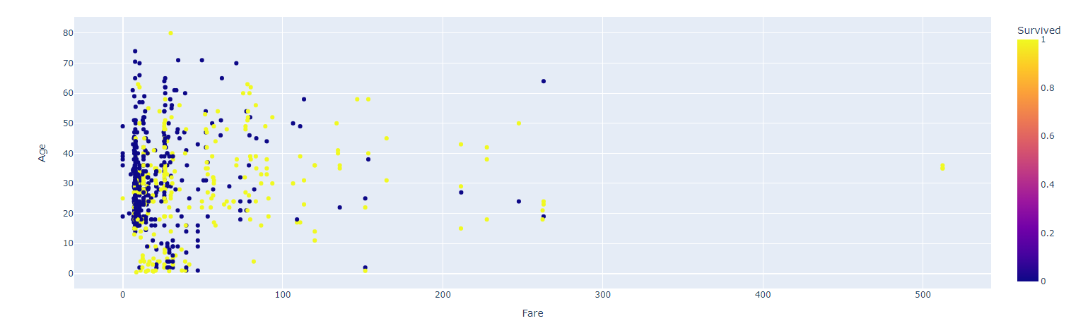
5. Interactive Scatter Plot (Plotly)
Plotly allows the creation of interactive scatter plots, providing additional information on hover.
import plotly.express as px

fig = px.scatter(data, x="Fare", y="Age", color="Survived", hover_name="Name")
fig.show()
6. Word Cloud
Word clouds visually represent word frequency in text data, aiding text analysis.
from wordcloud import WordCloud
import matplotlib.pyplot as plt

# Sample text data
text = """
This is a sample text for creating a word cloud.
Word clouds are a great way to visualize word frequency in text data.
They can reveal the most common words in a document or corpus.
Word clouds are often used for text analysis and data exploration.
"""

# Create a WordCloud object
wordcloud = WordCloud(width=800, height=400, background_color="white").generate(text)

# Display the word cloud
plt.figure(figsize=(10, 5))
plt.imshow(wordcloud, interpolation="bilinear")
plt.axis("off")
plt.show()
7. Stacked Bar Chart (Altair)
Altair is great for creating stacked bar charts effectively visualizing data in different categories.
import matplotlib.pyplot as plt

# Sample data
categories = ['Category A', 'Category B', 'Category C']
values1 = [10, 15, 8]
values2 = [5, 12, 10]

# Create the figure and axes objects
fig, ax = plt.subplots()

# Create stacked bar chart
bar1 = ax.bar(categories, values1, label='Value 1')
bar2 = ax.bar(categories, values2, bottom=values1, label='Value 2')

# Add labels and legend
ax.set_xlabel('Categories')
ax.set_ylabel('Values')
ax.set_title('Stacked Bar Chart')
ax.legend()

# Show the plot
plt.show()

8. Parallel Coordinates Plot
Parallel coordinates plots help visualize high-dimensional data by connecting numerical features with lines.
from pandas.plotting import parallel_coordinates
import matplotlib.pyplot as plt

parallel_coordinates(data[['Age', 'Fare', 'Pclass', 'Survived']], 'Survived', colormap=plt.get_cmap("Set2"))

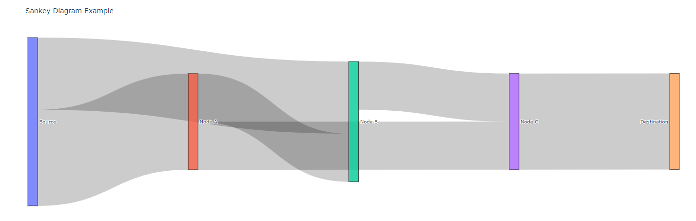
9. Sankey Diagrams
Sankey diagrams are powerful for visualizing the flow of data, energy, or resources. They are increasingly used in fields such as data science, sustainability, and process analysis to illustrate complex systems and the distribution of resources.
import plotly.graph_objects as go

fig = go.Figure(go.Sankey(
    node=dict(
        pad=15,
        thickness=20,
        line=dict(color="black", width=0.5),
        label=["Source", "Node A", "Node B", "Node C", "Destination"],
    ),
    link=dict(
        source=[0, 0, 1, 1, 2, 3],
        target=[1, 2, 2, 3, 3, 4],
        value=[4, 3, 2, 2, 2, 4],
    ),
))

fig.update_layout(title_text="Sankey Diagram Example", font_size=10)
fig.show()
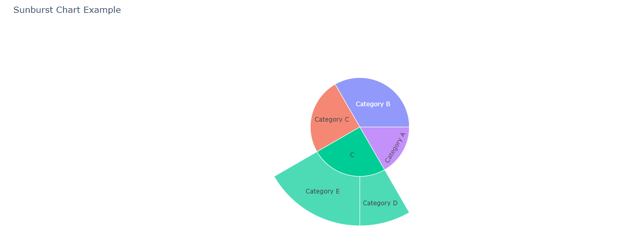
10. Sunburst Charts
Sunburst charts are hierarchical visualizations that show the breakdown of data into nested categories or levels. They are useful for displaying hierarchical data structures, such as organizational hierarchies or nested file directories.
import plotly.express as px

data = dict(
    id=["A", "B", "C", "D", "E"],
    labels=["Category A", "Category B", "Category C", "Category D", "Category E"],
    parent=["", "", "", "C", "C"],
    values=[10, 20, 15, 5, 10]
)

fig = px.sunburst(data, path=['parent', 'labels'], values='values')
fig.update_layout(title_text="Sunburst Chart Example")
fig.show()
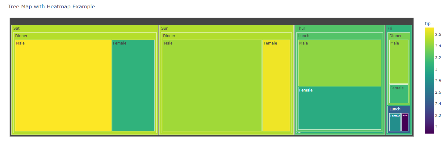
11. Tree Maps With Heatmaps
Tree maps visualize hierarchical data by nesting rectangles within larger rectangles, with each rectangle representing a category or element. The addition of heatmaps to tree maps provides a way to encode additional information within each rectangle's color.
import plotly.express as px

data = px.data.tips()
fig = px.treemap(
    data, path=['day', 'time', 'sex'], values='total_bill',
    color='tip', hover_data=['tip'], color_continuous_scale='Viridis'
)
fig.update_layout(title_text="Tree Map with Heatmap Example")
fig.show()
Conclusion
In conclusion, data visualization is a powerful tool for data exploration, analysis, and communication. Through this article, we've explored 11 advanced Python visualization techniques, each serving unique purposes in uncovering insights from data. From scatter matrix plots to interactive time series visualizations, these methods empower data professionals to gain deeper insights, communicate findings effectively, and make informed decisions.
Data visualization is not only about creating aesthetically pleasing graphics but also about transforming raw data into actionable insights, making it an indispensable part of the data analysis toolkit. Embracing these visualization techniques can greatly enhance your ability to understand and convey complex data, ultimately driving better outcomes in various fields.
Do you have any questions related to this article? Leave a comment and ask your question, and I will do my best to answer it.
Thanks for reading!
Opinions expressed by DZone contributors are their own.
Comments