Comprehensive Guide to Data Analysis and Visualization With Pandas and Matplotlib
Covering data preparation, descriptive statistics, profit margin calculations, and various types of plots such as bar charts, pie charts, and scatter plots.
Join the DZone community and get the full member experience.
Join For FreeData analysis and visualization are fundamental skills in the realm of data science. Python, a versatile programming language, offers robust libraries like Pandas and Matplotlib to facilitate these tasks. Pandas provides powerful data manipulation capabilities, while Matplotlib is excellent for creating a wide range of visualizations. This tutorial will walk you through the process of analyzing a dataset and creating insightful visualizations using these libraries. By the end of this tutorial, you will be equipped with the knowledge to handle data more effectively and present your findings visually.
Data Preparation
The first step in any data analysis project is to prepare the data. Data preparation involves collecting, cleaning, and organizing data into a structured format. We'll start by importing the necessary libraries and creating a sample dataset that includes information on various products, their sales, and profit figures.
python
import pandas as pd

# Sample dataset
data = {
    'Product': ['A', 'B', 'C', 'D', 'E'],
    'Sales': [150, 200, 300, 250, 100],
    'Profit': [50, 70, 120, 100, 40]
}

# Create DataFrame
df = pd.DataFrame(data)
print(df)
In this snippet, we initialize a DataFrame with product data. The `Product` column contains product names, while `Sales` and `Profit` columns hold numerical data. This structured format allows for easy manipulation and analysis.
Data Analysis
Once the data is prepared, we can proceed with the analysis. This involves calculating basic statistics and exploring relationships within the data. Analyzing data helps us understand underlying patterns and trends, which can inform decision-making.
Descriptive Statistics
The distribution of the dataset's form, dispersion, and central tendency are all summarized by descriptive statistics. Pandas can be used to get this done with ease.
# Summary statistics
summary = df.describe()
print(summary)
The `describe` method provides a summary that includes the mean, standard deviation, and quartiles for the numerical columns in the DataFrame. These statistics give us a quick overview of the dataset's characteristics.
Sales and Profit Analysis
To gain deeper insights, we can calculate the profit margin for each product. The profit margin is a measure of profitability and is calculated as the profit divided by sales, expressed as a percentage.
# Calculate profit margin
df['Prft_mrgn'] = (df['Profit'] / df['Sales']) * 100
print(df[['Product', 'Prft_mrgn']])
This calculation adds a new column, `Prft_mrgn`, to the DataFrame, allowing us to compare the profitability of different products. Understanding profit margins helps in evaluating which products are more financially viable.
Data Visualization
Visualizing data helps to convey insights more effectively. Matplotlib is a comprehensive library for creating various types of plots. Visualization is crucial for interpreting data and communicating findings to a broader audience.
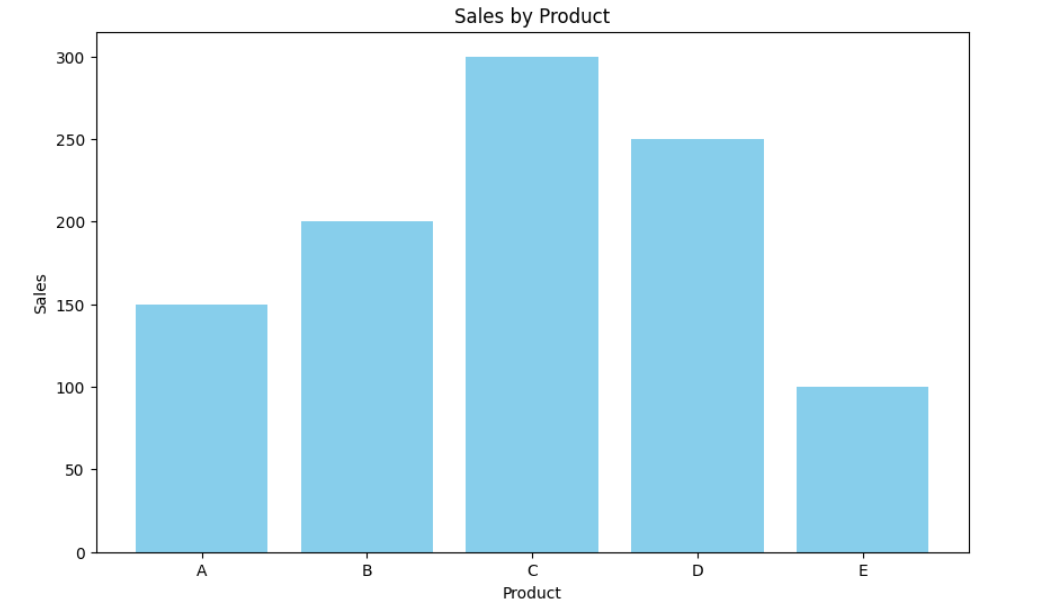
Bar Chart
A bar chart is ideal for comparing the sales of different products. It provides a clear visual representation of how each product performs in terms of sales.
import matplotlib.pyplot as pyplt

# Bar chart for sales
pyplt.figure(figsize=(10, 6))
pyplt.bar(df['Product'], df['Sales'], color='skyblue')
pyplt.xlabel('Product')
pyplt.ylabel('Sales')
pyplt.title('Sales by Product')
pyplt.show()
This code generates a bar chart, with product names along the x-axis and sales figures along the y-axis. The color and size of the chart can be customized to enhance readability. Bar charts are effective for displaying categorical data.
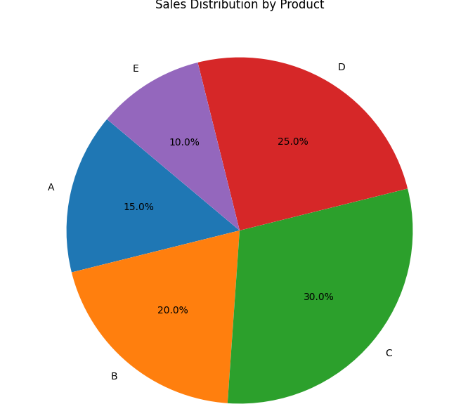
Pie Chart
A pie chart is useful for showing the proportion of total sales contributed by each product. It visually demonstrates how each product's sales compare to the whole.
# Pie chart for sales distribution
pyplt.figure(figsize=(8, 8))
pyplt.pie(df['Sales'], labels=df['Product'], autopct='%1.1f%%', startangle=140)
pyplt.title('Sales Distribution by Product')
pyplt.show()
The pie chart segments are labeled with product names and their corresponding sales percentages, providing a clear picture of each product's contribution to total sales. Pie charts are excellent for showing parts of a whole.
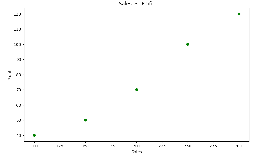
Scatter Plot
Scatter plots are effective for examining the relationship between two numerical variables. We use a scatter plot to show the relationship between sales and profit.
# Scatter plot for sales vs. profit
pyplt.figure(figsize=(10, 6))
pyplt.scatter(df['Sales'], df['Profit'], color='green')
pyplt.xlabel('Sales')
pyplt.ylabel('Profit')
pyplt.title('Sales vs. Profit')
pyplt.show()
In this scatter plot, each point represents a product. The x-axis shows sales figures, while the y-axis represents profit. This plot helps identify trends or patterns, such as whether higher sales correlate with higher profit. Scatter plots are useful for detecting relationships between variables.
Conclusion
In this tutorial, I demonstrate how to perform basic data analysis and visualization using Pandas and Matplotlib. I started by preparing the data and then moved on to calculating descriptive statistics and profit margins. Finally, create various plots to visualize the data, including bar charts, pie charts, and scatter plots. Mastering these tools will enable you to analyze data effectively and communicate your findings through compelling visualizations. By leveraging the power of Pandas and Matplotlib, you can transform raw data into meaningful insights.
Opinions expressed by DZone contributors are their own.
Comments