Want to Make Data Visualization a Major Feature of Your Next App?
Data visualization adoption is set to gather pace in the next few years and become an indispensable part of managing our everyday lives in this digital age.
Join the DZone community and get the full member experience.
Join For FreeWant to make data visualization the core feature of your next app? Then you are on the right track because data visualization improves user engagement and increases conversion rates. However, in the mobile age, data visualization must appear simple, be powerful, and have nuance.
Rather than peering at details, data visualization lets us comprehend the substance of our data, and we're smarter because of it. In this article, we'll walk you through the best practices. By the end of it, you'll have a better understanding of the dos and don'ts when it comes to data visualization for mobile apps.
The 2 Worlds of Data Visualization: PCs and Smartphones
Before the emergence of smartphones, data visualization's home was the PC, usually delivered through browsers and thick client applications. But, when viewed on smart devices, data visualizations in PC-specific apps are difficult to read, navigate, and use.
So, what does this mean for designers who are considering implementing data visualization? Creating data visualization that works well within the constraints of mobile devices — screen size, resolution, and lighting conditions — requires thought and trialing. While multiform device compatibility can be a very challenging task for designers, we've accumulated enough experience now to cope with it. This article takes a mobile-first approach and explores the best practices for the design of data visualizations in mobile apps — and flags up the most common pitfalls.

Why Is Data Visualization Important?
Knowledge of data visualization software and programming libraries has become arequirement for many design and development jobs today. Websites and mobile apps alike complement their blogs and stories with infographic and multimedia content that follow the best design standards. All this suggests that web and mobile data visualization are becoming increasingly important for contemporary apps. Why is this so?
We have noted that good data visualization comes with some benefits in terms of user engagement, better information processing, and interactivity. Let's put this into context.
Data visualization enables users to quickly recognize patterns in data and draw actionable insights that would otherwise go unnoticed.
Data presented in its raw form (i.e. plain text) is often harder for users to understand because of the mental effort needed to compare multiple disconnected data points. The task becomes even harder if users have to dig into large volumes of historical data. Data visualization solves this by making key trends and patterns in data directly observable. For example, looking at a stock prices plot or a balance graph in an investment or banking app (see the image below). The user gets an immediate understanding of fluctuations and trends.
Figure 1: Investment portfolio simulation
Data Visualization Is More Comprehensible Than Raw Data
Modern data visualization libraries, like D3.js created by Mike Bostock, are widely used to deliver the infographics of online media and enable sophisticated user interaction with plots and graphs. For example, hovering over a state on a map of the US, the user may see voting results, crime rates, or other information that's of interest.
Interactive features allow thousands of data points to be condensed into simple representations while making the overall dynamics available to the user as an experience.
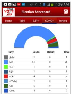 Figure 2: Election results app
In the age of social media and Web 2.0, users are more attracted to multimedia data.
Plain text and limited interactivity were the hallmarks of the Internet in its early years. However, with the advent of Web 2.0, users got used to multimedia communication rich with images, GIFs, streaming videos, and audio. Visual content has already become the central tool of communication insocial media via sharing photos, memes, GIFs, etc. Therefore, web and mobile users more than ever expect to consume information in the visual form (see the image below).
Figure 3: Data visualization app for tablets
Data Visualization Simplifies Application Management and Control
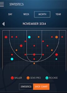 Figure 4: The dashboard of the IoT app that visualizes data about shots made by basketball players.
With the development of IoT (Internet of Things) and online trading, mobile apps are turning into important tools for controlling upscale systems, remote services, and infrastructures. Whether it's stock price performance or the sensors on an athlete, good data visualization helps monitor operations, optimize processes, and make quick, well-informed decisions. In these use cases, data visualization is not only an option but a necessity within mobile apps.
Data Visualization Best Practices
Designing appealing and usable dashboards, graphs, plots, and figures for mobile use is not a trivial task. Aside from following the general standards for visual representation and making sense of data — in a mobile context — designers also need to be aware of a whole series of possibilities and constraints characteristic of mobile technology. Below, we present a list of the best practices for mobile data visualization.
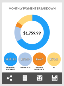 Figure 5: Minimalist mobile data visualization example.
Clear User Interface and Easy-to-Understand Data
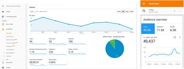
Figure 6: Google Analytics mobile and desktop apps
Users of mobile apps typically see data visualization in a context that reflects the app's navigation. For example, it's clear to the user that if they visit a bank account balance page, the data displayed relates to income and outgoings. For that reason, it's good practice to simplify graphs to the bare essentials, omitting elements such as graph titles, axis labels, and other support components that might be expected in a PC or web app.
Leverage Mobile Device Capabilities
 Figure 7: Data visualization from the app created using ZoomCharts interactive data visualization library.
Depending on the screen orientation (portrait vs. landscape), designers should display different graphs to users. For example, a bar chart with a few data points may be more suitable for the portrait mode, whereas line charts would be preferable for the landscape mode. Also, as mentioned before, to fit mobile data visualization into smaller screen dimensions, graph designers can hide information from the user, making it accessible when they hover or click on the graph element. These features make mobile devices a great place for interactive data visualization. For example, zooming on a line graph can show the user changes in data over specific periods of time, allowing for a finer-grained look at the data over the last hour, for example. Isolating a data point from a graph does not only offer access to more detailed information but may be used to include specific actions and features like sharing data via social media or email. In the images above, we can see how these best practices are implemented in Google Analytics mobile and desktop apps. The data visualization for "Audience" in the mobile app is simpler and more condensed than the desktop app's rendition. It includes only the most relevant information and hides additional details about the number of new users, sessions, and page views — unlike the desktop app, which manages to present all this data on one page.
User Controls for Touchscreens
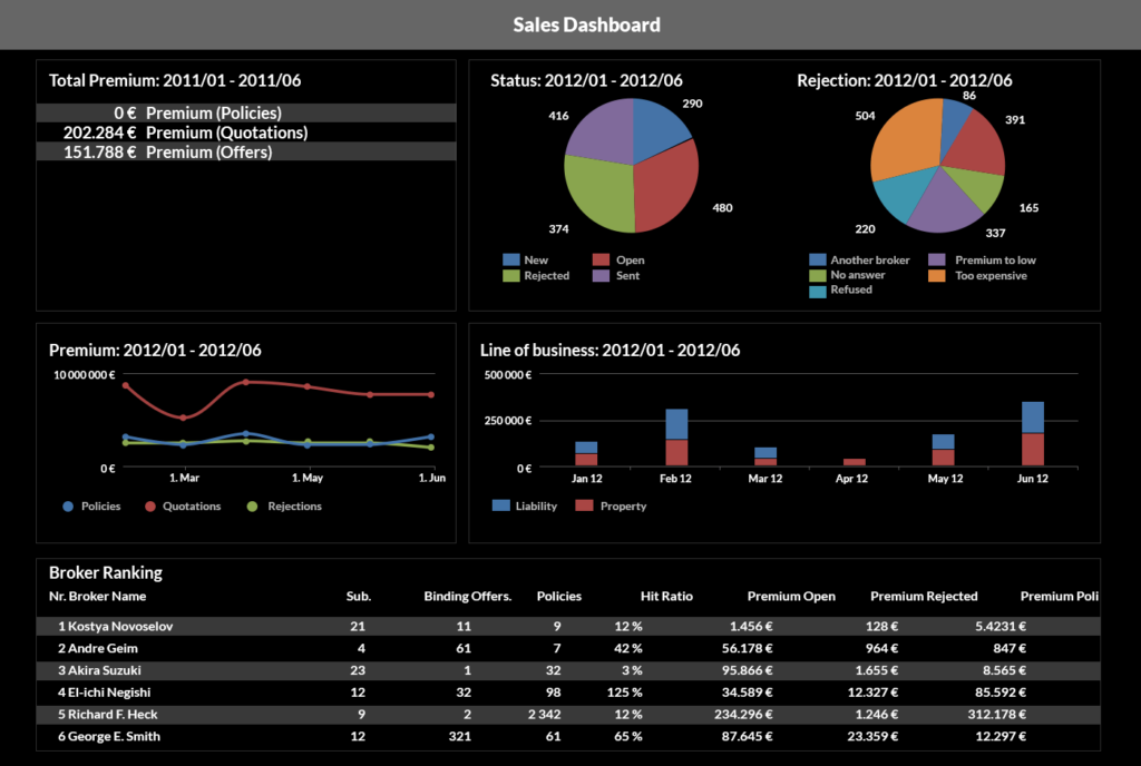 Figure 8: Sales dashboard with multiple visualizations.
Using touchscreen controls, you can incorporate highly interactive elements into a mobile data visualization. For example, the user can touch the chart's elements to see additional information, swipe graphs sideways to see its continuation, and zoom in to see the individual data points. All these features make it possible to create very interactive experiences — and this is still a fertile space for more design innovation and experimentation.
Address UX Concerns of Mobile Users
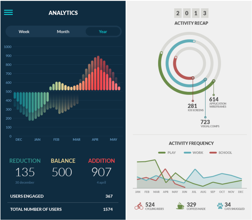
Figure 9: Two examples of simple mobile data viz without textual and visual clutter.
Effective data visualization in mobile apps is adaptable tothe different conditions in which people use their mobile devices. For example, people using their apps in bright daylight and when using night shift (and equivalents) will prefer seeing graphs presented with more contrast. This is even more relevant for apps containing multiple datasets (e.g. charts with more than one line). If ambient light is not optimal and the designer did not use sufficient contrast, the users won't be able to distinguish separate lines with a similar hue.
Resolving Different Mobile OS Versions and Varying Screen Resolutions
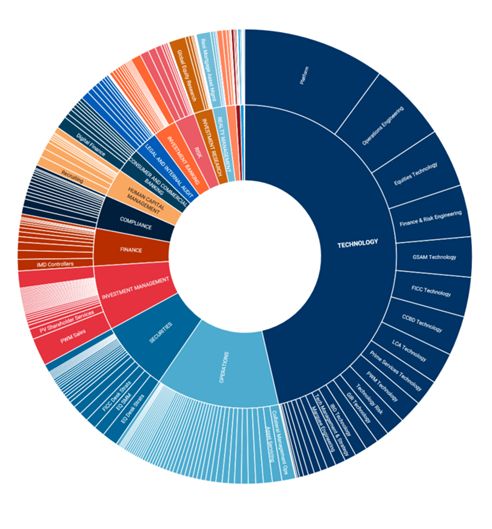 Figure 10: Example of poorly designed data visualization (too many blank sectors for some open jobs categories).
  Figure 11: Another example of the poorly designed mobile data visualization (percentage data does not match the graph, the key depicts two colors for two lines but the graph has only one).
To ensure that users of all Android and iOS devices see your graphs clearly, pick a well-tested data visualization library that abstracts the difference between various versions of the mobile systems, browsers, and hardware. Developers should choose mobile frameworks carefully, especially if they want to release cross-platform. Frameworks geared more toward one platform may disappoint the users of the other platform when it comes to the platform's inherent differences in navigation and browsing. Also, mobile data visualizations profit from an adaptive and responsive layout design. Sizes of graphs, plots, and their additional details should change depending on the screen dimension and resolution. More graph details can be displayed on devices with bigger screens, while a simple display works better on smaller screens.
Hopefully, the tips above give you some simple best practices for data visualizations on mobile. To achieve an effective mobile data visualization, you should also be aware of the main things to avoid.
Common Mistakes
As previously mentioned, the key to effective data visualization on mobile is to make visualizations work and look great on small screen devices. The main design pitfalls, which may obstruct this outcome, are presented below.
Lack of Typography Standards
One of the most common mistakes is the failure to apply a typography standard where information hierarchy is matched by appropriate font choices. Likewise, avoid text crowding as shown in an exaggerated form in the image above. Here, the designer adds too much text labeling; details that would be better presented in a condensed form. This graph would also be harder to make interactive on mobile because the circle's sections are too small to be used as clickable or tappable areas.
Failure to Control the Effect of Other UI Elements on Graphs
If not designed properly, models, and popups used along with graphs may adversely affect the user's ability to see and extract meaningful information from the visualization. To avoid this problem, test your data visualization UI carefully to see what elements may hinder user comprehension of your graphs.
Varying Device Forms Make Graphs Hard to Read
Mobile devices have different screen dimensions and resolutions. If the designer fails to make the graphs responsive using appropriate rules to resize, shrink, hide, and move the content, users of some devices might not see the information properly. To avoid this, once created, the responsive design should be tested on different mobile devices, using solutions like the free Google Mobile Test or tools that emulate different mobile devices and screen sizes such as BrowseEmAll.
Benefits of Good Data Visualization
If you get your data visualization designed following the broad advice above, you can expect to see healthy growth of your app's popularity and its monetization. Good data visualization helps bring significant benefits to your app business, including the following.
Better User Engagement
Good data visualization can enable mobile app users to see connections in their data more efficiently improving their understanding and helping them to effectively manage their own needs. Data visualization in banking and investment apps, for example, can help users identify problems with their account, spending patterns, and identify areas for improvement. Even simpler, good graphs generate higher levels of satisfaction all of which stimulates increased user engagement with the app and its features.
Less Churn
A high rate of churn indicates your business is not serving its customers adequately. They may be willing to stop using the product because of its poor performance, bad UX, or the lack of useful features. Reversing a high customer churn rate can be accomplished by better data visualization, providing customers with actionable insights directly relevant to your product. Consumers will be encouraged to stick to your app if your data visualization creates positive outcomes, practically and emotionally.
Summary
Without a doubt, data visualization has become an essential tool in the current data-focused world. That said, designers should strap in for the ride as even faster technological advancements, driven by the evolving needs of users, will increase demands on data visualization apps and their creators! Ultimately, data visualization adoption is set to gather pace in the next few years and become an indispensable part of managing our everyday lives in this digital age.
Published at DZone with permission of Magdalena Brych. See the original article here.
Opinions expressed by DZone contributors are their own.
Comments