Interactive Data Visualization in Ionic 5
In a step-by-step tutorial, learn how to create an interactive mobile reporting solution with Ionic 5 and a JavaScript pivot table library.
Join the DZone community and get the full member experience.
Join For FreeHi everyone!
In this tutorial, I'd like to show you how to create a simple yet powerful reporting app with a native look and feel using Ionic 5 and Flexmonster Pivot Table & Charts — a JavaScript pivot table component that integrates with React, Angular, and Vue.
But first, let me do a quick reminder of what Ionic is and what benefits it can bring to web development.
If you are a seasoned pro in Ionic, skip this section and jump straight to the tutorial.
What Is Ionic Used for?
Ionic is a framework that provides a toolkit for creating production-ready mobile apps and progressive web apps.
All you need is to use web technologies you got used to.
Using a single codebase, you can create and run an app on any platform. Besides, Ionic is framework-agnostic, meaning you can integrate it with any front-end framework. Most popular are React, Angular, and Vue (official integration is coming soon).
Another plus is that you can access native device features with just a little bit of JavaScript.
Besides, you can always rely on the community's help - there are lots of plugins, starters, templates, and themes to help you keep moving forward. Using them in your projects is time-saving - no need to build every piece of functionality from scratch.
Creating a Reporting App in Ionic
What will you get as a result?
After the tutorial completion, you'll get an analytics reporting app running. You can deliver it to end-users as a tool for in-depth data analysis. The layout and design of the app will depend on your specific case. You can treat this tutorial as a general approach to building reporting software.
Here's a brief overview of features your project will be empowered with:
Composing reports with drag & drop
Aggregating, grouping, filtering, and sorting data interactively
Highlighting what matters most with formatting
Saving & exporting reports with a few clicks
And more!
Prerequisites
Node.js and npm on your machine
And a desire to create an awesome app!
Starting an Ionic Project
We're going to use React as a front-end framework for the Ionic app. If you'd like to repeat the process in Angular, check out the links in the reference below.
Following the steps from the official guide, create a basic Ionic app. Skip this step if you already have an app.
Next, add the Flexmonster React module:
xxxxxxxxxx
yarn add react-flexmonster --dev
Open index.tsx and import the styles of a pivot table control:
import 'flexmonster/flexmonster.css';
Open src/App.tsx and include the FlexmonsterReact package here:
import * as FlexmonsterReact from 'react-flexmonster';
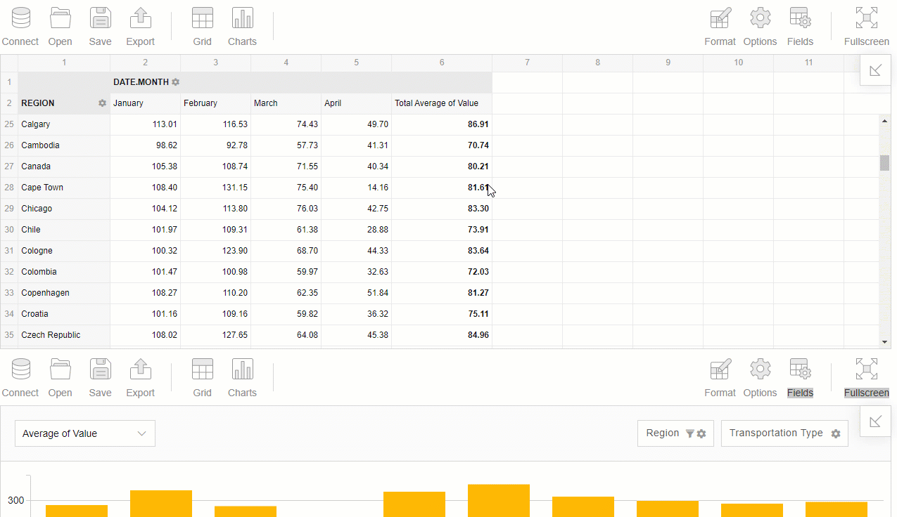
Right there, create a report based on your data. I took the "Apple mobility trends" dataset from Kaggle and put the CSV file to the public/assets folder. Our report will show the average mobility values by months in different regions.
xxxxxxxxxx
onReady(): void {
var pivotObject = this.flexmonsterRef.current as FlexmonsterReact.Pivot;
var report = {
dataSource: {
type: "csv",
filename: "./assets/data.csv",
mapping: {
geo_type: {
type: "string",
caption: "Geo Type",
},
region: {
type: "string",
caption: "Region",
},
transportation_type: {
type: "string",
caption: "Transportation Type",
},
date: {
type: "date",
caption: "Date",
},
value: {
type: "number",
caption: "Value",
},
},
},
slice: {
rows: [
{
uniqueName: "region",
},
],
columns: [
{
uniqueName: "date.Month",
},
{
uniqueName: "[Measures]",
},
],
measures: [
{
uniqueName: "value",
aggregation: "average"
},
],
}
};
pivotObject.flexmonster.setReport(report);
}
Here, the mapping object is defined to prettify the captions of the fields and set their data types explicitly.
Next, embed the pivot table component and set the previously defined report:
xxxxxxxxxx
render = () => {
return (
<IonApp>
<FlexmonsterReact.Pivot
ref={this.flexmonsterRef}
toolbar={true}
width="100%"
ready={() => this.onReady()}
/>
</IonApp>
);
};
Run the app:
npm run start
Creating a Dashboard
Now you have a pivot table that shows the summarized data in your Ionic app. But what if you want to add more visualization elements to the web page?
Here's where the concept of dashboard comes in handy. A dashboard usually consists of different data visualization components that show data from multiple angles and help answer the question that a data analyst is posing.
Let's create an interactive dashboard by adding one more element to the page - Pivot Charts.
It can be done in the same way as for the pivot table. The only difference is that you need to turn on the chart mode using options.
Here we composed a slightly different report that highlights other aspects of data:
xxxxxxxxxx
var report = {
"dataSource": {
"type": "csv",
"filename": "./assets/data.csv"
},
"slice": {
"rows": [
{
"uniqueName": "region",
"filter": {
"measure": {
"uniqueName": "value",
"aggregation": "average"
},
"query": {
"top": 10
}
}
}
],
"columns": [
{
"uniqueName": "[Measures]"
}
],
"measures": [
{
"uniqueName": "value",
"aggregation": "average"
}
],
"sorting": {
"column": {
"type": "desc",
"tuple": [],
"measure": {
"uniqueName": "value",
"aggregation": "average"
}
}
}
},
"options": {
"viewType": "charts",
"chart": {
"type": "bar_h"
}
}
}
Result
You're all set!
Deploying Mobile
The next step is to deploy the app on a mobile platform of your choice. Check out recommendations and guidelines on deployment on the official Ionic website.
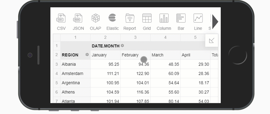
Once you are done, let's test the app on a mobile device using a device emulator of Android Studio or Xcode.
Here's how your mobile dashboard looks on iPhone 5/SE:
To style up the app, you can use the beautiful Ionic UI components.
Useful Links
Opinions expressed by DZone contributors are their own.
Comments