Visualizing Your Time Series Data From InfluxDB With Rickshaw
Learn how to pull your time series data from InfluxDB and visualize it on the Rickshaw library, which is built on d3.js.
Join the DZone community and get the full member experience.
Join For FreeRecently, we took a look at visualizing our time series data from InfluxDB using the graphing library plotly.js (see post here), which offers over 20 different charting types. It packages everything neatly so that it is easy for users to reproduce graphs of their own style and choosing. Today, we'll take a look at pulling our data from InfluxDB and displaying it with the Rickshaw library, which, like plotly.js, is built on d3.js. The Rickshaw toolkit offers users the ability to create custom interactive time series graphs, giving users access to a broad array of styles and a score of different elements-renderers, legends, hovers, and range selectors-with which to construct their graphs.
Before we get started, of course, you'll need to ensure you have an instance of InfluxDB up and running on your local machine. Here's a great site to getting the TICK Stack all set up and doing things on your machine — the aptly named Getting Started guide on the InfluxData site supplies documentation that will walk you through installing and running all four packages of the stack. You can also try experimenting in sandbox mode.
We Need Data!
In order to visualize our data, you'll first need to get some. For this scenario, I'll be querying InfluxDB via the Node-influx client library for stats that Telegraf is already collecting about my machine. You can do the same for your own machine or, if the mood strikes, you could hook up and start monitoring any number of applications of your own. Telegraf has a number of plugins that can handle the translation of your data into line protocol (the text-based format for writing points to InfluxDB) and send your data right into the database.
For this example, I'll be using Node/Express to set up my server file and query InfluxDB for data on average CPU usage. If you have the full TICK Stack installed and running, you should be able to do the same. After you install and require the appropriate dependencies, you'll connect to your local instance of InfluxDB and the specific database you'd like to query. Here's what my server file looks like:
const Influx = require('influx');
const express = require('express');
const path = require('path');
const os = require('os');
const bodyParser = require('body-parser');
const app = express();
const influx = new Influx.InfluxDB('http://127.0.0.1:8086/telegraf');

app.use(bodyParser.json());
app.use(bodyParser.urlencoded({
  extended: true
}));
app.use(express.static(path.join(__dirname, 'public')));
app.set('port', 3000);

influx.getMeasurements()
  .then(names => console.log('My measurement names are: ' + names.join(', ')))
  .then(() => {
    app.listen(app.get('port'), () => {
      console.log(`Listening on ${app.get('port')}.`);
    });
  })
  .catch(error => console.log({ error }));

app.get('/api/v1/usage', (request, response) => {
  influx.query(`
    select mean("usage_user") as "mean_usage_user",
    mean("usage_system") as "mean_usage_system" from cpu
    where time > now() - 1h and
    host = ${Influx.escape.stringLit(os.hostname())}
    group by time(10s)
    limit 100
    `)
    .then(result => response.status(200).json(result))
    .catch(error => response.status(500).json({ error }));
});
You'll notice the last section of code has an endpoint which queries the database for the mean CPU user usage.
Visualizing Your Data
You'll need to set up your HTML, CSS, and script file structure so that you have somewhere to display your data in the browser. You'll also need to either install Rickshaw and d3 as npm packages or add the minified versions to your document head. Check out Rickshaw's GitHub README for more information. For some of the more ornate graphs, Rickshaw requires jQuery and jQueryUI, but we'll keep it simple for today. Take a look at this index.html file:
<!DOCTYPE html>
<html>
  <head>
    <meta charset="utf-8">
    <meta name="viewport" content="width=device-width, initial-scale=1.0">
    <meta http-equiv="X-UA-Compatible" content="ie=edge">
    <link type="text/css" rel="stylesheet" type="text/css" href="styles.css">
    <link type="text/css" rel="stylesheet" href="rickshaw.min.css">
    <script src="d3.layout.min.js"></script>
    <script src="d3.min.js"></script>
    <script src="rickshaw.min.js"></script>
    <title>Visualizing Data from InfluxDB with Rickshaw</title>
  </head>
  <body>
    <header>
      <h1 class="title">Visualizing Your Time Series Data from InfluxDB with Rickshaw</h1>
    </header>
    <main>
      <div id="chart-container">
        <div class="chart-box">
          <div id="y-axis"></div>
          <div id="chart"></div>
        </div>
        <div class="legend-box">
          <div id="legend"></div>
          <form id="offset-form" class="toggler">
            <input type="radio" name="offset" id="lines" value="lines" checked>
            <label class="lines" for="lines">lines</label><br>
            <input type="radio" name="offset" id="stack" value="zero">
            <label class="stack" for="stack">stack</label>
          </form>
        </div>
      </div>
    </main>
    <script type="text/javascript" src="scripts.js"></script>
  </body>
</html>
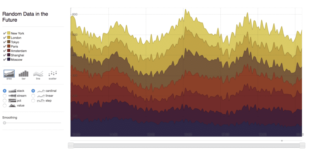
As you can see, you'll need to define separate containers for your chart, y-axis, and legend, along with an optional toggle capability to render the graph in different formats. The separation of all these components allows users to create custom formatting and unique visualizations, but it can also be a bit tricky to set everything up as a newbie to the graphing game. I, for instance, tried to reproduce a version of the following example straight away and realized all too quickly that it would probably be better to start at the beginning first with Rickshaw's tutorials.

Gotta walk before you run!
I digress, however. Let's move onto the script file where we can add all the functionality to paint our InfluxDB time series data in a graph. Copy and paste (or type it out for muscle memory development!) the following:
const loadData = () => {
  fetch('/api/v1/usage')
    .then( response => {
      if (response.status !== 200) {
        console.log(response);
      }
      return response;
    })
    .then(response => response.json())
    .then(parsedResponse => {
      const unpackData = (array, key) => {
        return array.map(obj => Object.assign({}, { x: Date.parse(obj['time']), y: obj[key] }))
      };

      const palette = new Rickshaw.Color.Palette({ scheme: 'colorwheel' });
      const graph = new Rickshaw.Graph({
        element: document.querySelector('#chart'),
        width: 1200,
        height: 640,
        renderer: 'line',
        series: [
          {
            name: 'Mean User Usage',
            data: unpackData(parsedResponse, 'mean_usage_user'),
            color: palette.color()
          },
          {
            name: 'Mean System Usage',
            data: unpackData(parsedResponse, 'mean_usage_system'),
            color: palette.color()
          },
        ]
      });

      const xAxis = new Rickshaw.Graph.Axis.Time({
        graph: graph,
        ticksTreatment: 'glow'
      });

      const yAxis = new Rickshaw.Graph.Axis.Y({
        element: document.getElementById('y-axis'),
        graph: graph,
        orientation: 'left',
        tickFormat: Rickshaw.Fixtures.Number.formatKMBT,
      });
      const legend = new Rickshaw.Graph.Legend( {
        element: document.getElementById('legend'),
        graph: graph
      });
      const offsetForm = document.getElementById('offset-form');
      offsetForm.addEventListener('change', function(e) {
        const offsetMode = e.target.value;

        if (offsetMode == 'lines') {
                graph.setRenderer('line');
                graph.offset = 'zero';
        } else {
                graph.setRenderer('stack');
                graph.offset = offsetMode;
        }
        graph.render();
      }, false);

      return graph.render();
    })
    .catch( error => console.log(error) );
}

document.addEventListener('DOMContentLoaded', loadData);
Aside from the fact that my loadData function is far too long and not at all single-responsibility, there is definitely a lot going on here. Let's dig in, shall we?
We first make a fetch call to grab the data out of InfluxDB and hopefully — if our call is successful — we can then parse and mutate (unpack) our data to fit the format that Rickshaw requires. Rickshaw has several color schemes one can choose from, so after setting our color palette to colorwheel, we can then instantiate a new Rickshaw graph and insert the formatted data accordingly.
What follows is the creation of the x-axis and y-axis, a legend to denote what data we are looking at, and the toggler functionality to switch the graph format between a line graph or a stacked graph (Rickshaw has quite a few more formats as well). These optional add-ons are in my opinion where things get tricky. Particularly in regards to the x-axis and y-axis, as this is a time series graph, it makes most sense to me for those to be present by default, and not something that has to be added on as an afterthought (and then styled and positioned on top of that!). For a list of the possible extensions, I would head over to Rickshaw's GitHub page and spend some time experimenting.
The Final Product
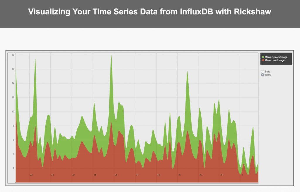
If you restart your server at this point and navigate to port 3000, you should hopefully see a graph of particular beauty and form. If it doesn't look as awesome as the one below, don't forget to add a bit of CSS flair to liven it up and make things pop!

The graphing possibilities!
Thanks for reading. Feel free to check out the source code on GitHub or ping me an email at margo@influxdb.com if you have any questions. Happy graphing!
Published at DZone with permission of Margo Schaedel, DZone MVB. See the original article here.
Opinions expressed by DZone contributors are their own.

Comments