Working With Auto-Generated Columns in the Ignite UI for Angular Grid
A developer gives a quick tutorial on how to use Ignite UI and Angular Grid together to create grid systems to display web application data and UIs.
Join the DZone community and get the full member experience.
Join For FreeIgnite UI for Angular Grid is the fastest data grid available. It not only helps to run applications faster but also allows you as a developer to write applications faster. To see it in action, assume that you have a data source as shown in the code listing below:
this.products = [
    { Id: '1', Title: 'Book', ExpiryDate: new Date(), Price: 35, Rating: 3.5 },
    { Id: '2', Title: 'Pen', ExpiryDate: new Date(), Price: 25, Rating: 4.0 },
    { Id: '3', Title: 'Pencil', ExpiryDate: new Date(), Price: 20, Rating: 3.2 },
    { Id: '4', Title: 'Bat', ExpiryDate: new Date(), Price: 135, Rating: 4.0 },
    { Id: '5', Title: 'Ball', ExpiryDate: new Date(), Price: 65, Rating: 3.8 },
];
You can render the above data in igxGrid by simply defining an instance of the igxGrid in the component's template and binding the data property to the product array. It is straightforward to add as shown in the below code listing:
<igx-grid [data]="products"
           [autoGenerate]="true"
           width="960px">
 </igx-grid>
By setting only data and autoGenerate properties, you should get data rendered in igxGrid as shown below:
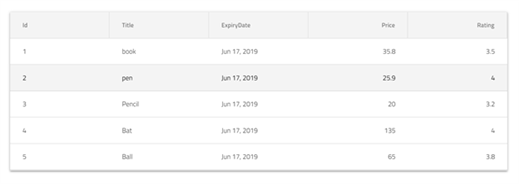
Since the autoGenerate property is set to true, Ignite UI will generate columns with default properties configured. However, Ignite UI for Angular Grid has a ton of features such as:
- Filtering
- Paging
- Sorting
- Column pinning
- Column hiding
- Column templates
- Header templates
As a developer, you may want to configure these features depending on your business requirements. There are two ways to do this:
- Set the
autoGenerateproperty to false and configure columns manually. Learn more about it here. - If columns are generated automatically, configure the above features at run time in the component class.
We can configure essential features at run time when columns are initialized. Ignite UI for Angular igxGridComponent provides you an event called onColumInit.

At the time of column initialization, the onColumnInit event is executed. Any business logic you wish to execute at this time, you should write inside this event. For example, we can write code to enable various features as shown in the below image:
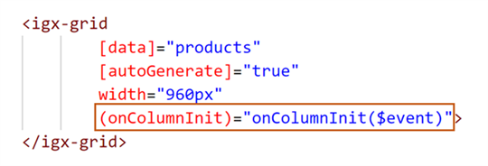
You can handle the event in the component class, as shown in the code listing below:

If you want to pin a particular column in a particular location, you can do that as follows
public onColumnInit(column: IgxColumnComponent) {
    if (column.field === 'Title') {
        column.pin();
    }
}
You will find the Title column pinned to the left side as shown below:

You can hide a column at runtime while initializing by setting the hidden property value to true:
public onColumnInit(column: IgxColumnComponent) {
    if (column.field === 'Id') {
        column.hidden = true;
    }
}
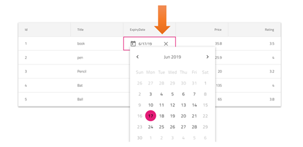
You can also make a column editable by setting the editable property to true:
 public onColumnInit(column: IgxColumnComponent) {
    if (column.field === 'ExpiryDate') {
        column.editable = true;
    }
}
When igxGrid renders, the ExpiryDate column should be editable as shown in below image. You might also notice that in editing mode, Ignite UI gives you the option to edit the date type column in igxCalandar
As you can see, it's very easy to configure various fetaures in auto generated columns. Besides configuring features, you can also format column data to a specfied output. In Angular, pipes do that. So for auto generated columns, you apply pipes using the formatter function.
Let us say that you want to
- display ExpiryDate in specific date format.
- display Title in upper case.
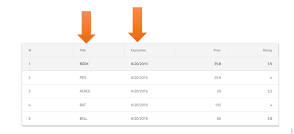
For that, you can use the formatter function in theonColumnInit event as shown in the below image. Here we are using toLocaleDateString to convert date output to local date format and toUpperCase to display output in uppercase.
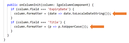
After applying above formatter, you will find data in Title column is formatted in uppercase and data of ExpiryDate column is formatted in the local date string format.
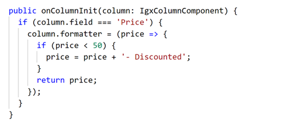
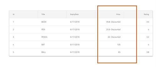
You can use formatter for complex business logic as well. You can pass multiple statements as logic using the formatter arrow function. For example, for Price column, if price data is less than 50, you need to add a text 'Discounted' next to the price data. You can very quickly do that, as shown in the image below:
You will get Ignite UI for Angular Grid rendered with applied formatter as shown in the image below:
As discussed earlier, not only format the column data but also you can utilize other features also. Very smoothly, you can perform various other operations such as:
- Setting a summary.
- Setting filters.
- Setting formatters.
- Setting width.
- Setting header value.
- Setting header template.
- Setting movable properties.
- Setting hidden attributes.
We will cover the above features individually in other blog posts. However, it's important that you understand how to configure features when Ignite UI for Angular Grid columns are being initialized, as discussed in this blog. You can download a 30-day trial of Ignite UI for Angular from here. I hope you find this post useful.
Published at DZone with permission of Dhananjay Kumar, DZone MVB. See the original article here.
Opinions expressed by DZone contributors are their own.

Comments