

Bootstrap Responsive Grid for Desktop and Mobile

Join the DZone community and get the full member experience.
Join For Free 
the bootstrap grid layout system is simple to use, it provides style classes that can be used to create different kinds of grid layout, ranging from one to twelve columns and with support for responsive layouts (where the layout of the grid changes based on the width of the screen, allowing the same content to be laid out on mobile and desktop devices). with the new bootstrap 3 version, it design with the “mobile first” approach so you don’t need to include a separate css to support mobile instead mobile first styles can be found throughout the entire library.
to ensure proper rendering and touch zooming, add the viewport meta tag to your <head>.
<meta name="viewport" content="width=device-width, initial-scale=1">
you can disable zooming capabilities on mobile devices by adding user-scalable=no to the viewport meta tag.
<meta name="viewport" content="width=device-width, initial-scale=1, maximum-scale=1, user-scalable=no">
creating responsive grids
the main use for responsive grids is to allow mobile devices and desktops to display the same content, taking advantage of whatever screen space is available. to create a responsive grid, use the col-* class on individual cells with one of the classes shown in table below.

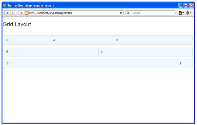
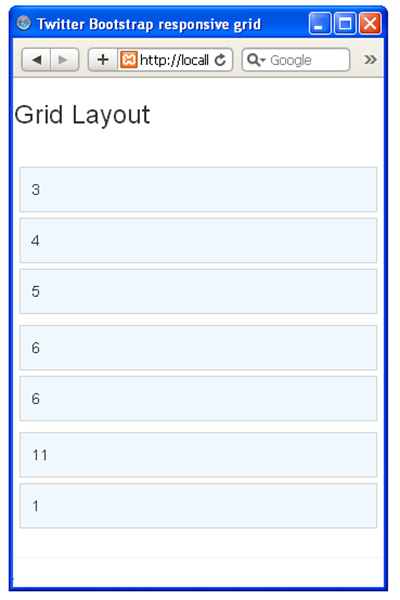
when the width of the screen is less than the class supports, the cells in the grid row are placed vertically rather than horizontally. following is a html code to demonstrate the responsive grid.
<!doctype html public "-//w3c//dtd xhtml 1.0 transitional//en" "http://www.w3.org/tr/xhtml1/dtd/xhtml1-transitional.dtd">
<html xmlns="http://www.w3.org/1999/xhtml">
<head>
<meta http-equiv="content-type" content="text/html; charset=iso-8859-1" />
<title>twitter bootstrap responsive grid</title>
<meta name="viewport" content="width=device-width, initial-scale=1">
<link href="css/bootstrap.css" rel="stylesheet" />
<link href="css/bootstrap-theme.css" rel="stylesheet" />
<style>
	#gridcontainer { padding: 20px; }
	.grid-row > div {
		border: 1px solid lightgrey;
		padding: 10px;
		background-color: aliceblue;
		margin: 5px 0;
	}
</style>
</head>
<body>

<div class="panel">
	<h3 class="panel-header">grid layout</h3>
	<div id="gridcontainer">
		<div class="row grid-row">
			<div class="col-sm-3">3</div>
			<div class="col-sm-4">4</div>
			<div class="col-sm-5">5</div>
		</div>
		<div class="row grid-row">
			<div class="col-sm-6">6</div>
			<div class="col-sm-6">6</div>
		</div>
		<div class="row grid-row">
			<div class="col-sm-11">11</div>
			<div class="col-sm-1">1</div>
		</div>
	</div>
</div>

</body>
</html>
output:
desktop version
mobile version
Opinions expressed by DZone contributors are their own.
Comments