A Comparison of Data Visualization Tools
In this article, we separate several different data visualization tools into five categories that correspond to job function.
Join the DZone community and get the full member experience.
Join For FreeIntroduction
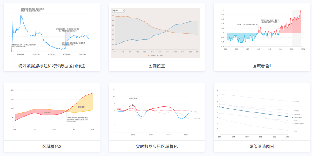
Which data visualization tool do you recommend? Well, that’s a tricky question to answer, because there are so many data visualization tools. Take the following picture as an example:
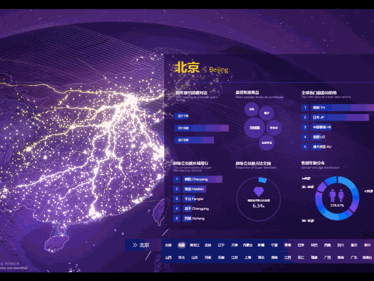
From FineReport
You can use PS + AI to complete it. I often turn to designers to help me with designing drafts, and then I will realize the effects with Echarts or BI tools referring to the style and layout. Generally speaking, the method is usually used for news reports and magazine typesetting. But, for information visualization, we should pay more attention to the conclusion that many people do data analysis by Excel.
With a plethora of chart plug-ins like Echarts, Highcharts, AntV, D3, etc., learning some program is very important, and the common language is JavaScript, often used in designing front-end web pages. When you are developing a product, these open-source visual plug-ins may be integrated (Highcharts is not open source).
Ready-Made Charts and BI Tools
If you can make your visualizations with Excel, you can just use Excel. Or you can use BI tools such as Tableau, FineBI, and DOMO directly.
Data Mining Programming Languages
The two biggest are R and Python. There are visualization packages, but you have to learn these two languages which can be a bit difficult. If you want to learn data analysis and data mining, these two languages are necessary for you.
Keeping it Simple
BI tools are the easiest. But, before choosing a BI too\l, you’d better think more deeply about your use scenarios.
Let’s talk about the use of these tools and their respective advantages in details.
1. Pure Visualization Chart Generator/Chart Plugin — Better for Developers and Data Engineers
Echarts
Echarts is a pure JavaScript data visualization library which belongs to Baidu. It is often used in software development or statistics chart modules on the web. You can design visualization charts on the client-side as you like. There are many types of charts and dynamic visualization effects. Also, there are all kinds of charts that are completely open source and free. It can handle large amounts of data and 3D graphics which are very cool and amazing. It is said that it will do a better job when you use it together with Baidu Map.
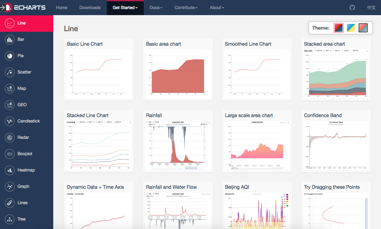
From Echarts
Echarts is often used in some development scenarios, but it also offers a zero-code chart generator — ‘Baidu Tushuo.’ I have tried it. I just need to select the icon, copy the data, generate the chart, and then save it as a figure or embed the code.
AntV
AntV is a set of data visualization grammars from Ant Financial (Ali), which seems to be the first visualization library in China that uses the theory called 'the grammar of graphics.' Antv comes with a series of data processing APIs. Because of its ability to classify and analyze simple data, it is used by many large companies as the underlying tools of their BI platform.
From AntV
Highcharts
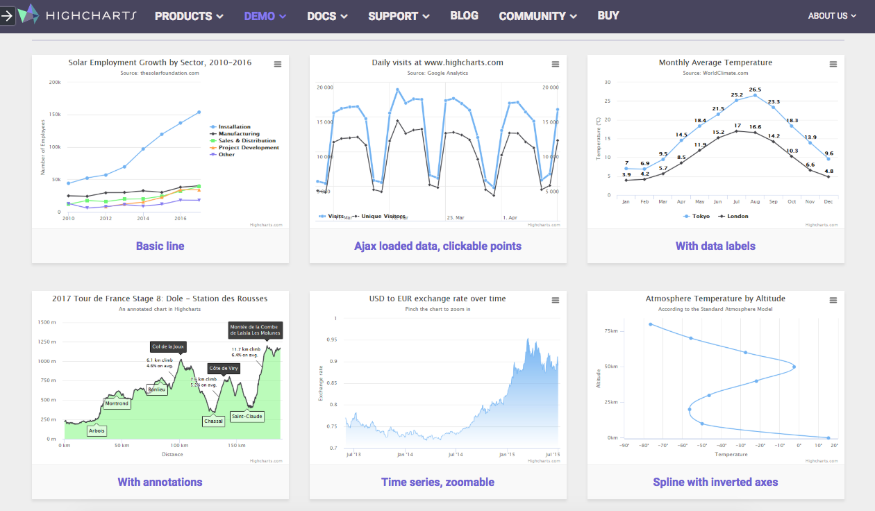
When we talk about Echarts, we will usually compare it with Highcharts. The relationship between them is a bit like the relationship between WPS and Office.
Highcharts is also a visualization library which you have to pay for it if you are going to use it. It has many advantages, for example, its documents and tutorials, JS scripts, and CSS are very detailed. It saves time and allows you to pay more attention to learning and developing. What’s more, it is very stable.
2. Visualization Reports — Better for Report Developers and BI Engineers
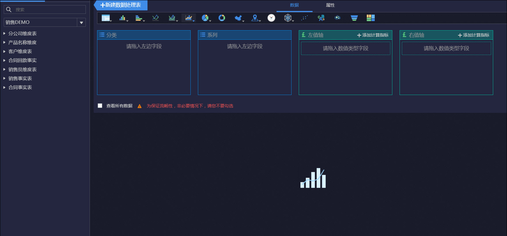
FineReport
FineReport is a reporting software and enterprise-class application that's used for developing business reports and data analysis reports. It can also be integrated with OA, ERP, CRM, and other application systems to build data report modules.
The two core functions of FineReport are filling in the report and data display. But I think the more amazing thing is that it has lots of built-in charts and visualization effects. In particular, the visualization effects are very rich which are not old-fashioned at all. You can make a variety of dashboards, even visualization large screens with FineReport.
I used to work with FineReport. What impressed me most is that it saves me much time to develop reports. Before using FineReport, we made 10 Excel tables for 10 stores, which was very troublesome. But with FineReport, we just needed to use the parameter query in one template, and then create a batch export.
So there is a saying: Work with Microsoft, operate with FineReport.

From FineReport
3. Business Intelligence Analysis —Bbetter for BI Engineers and Data Analysts
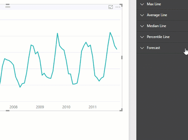
Tableau
Almost every data analyst will mention Tableau. It has common built-in analysis charts and some data analysis models. You can quickly do the data analysis, explore the value of the data, and produce data analysis reports.
Because it is business intelligence, it is better for business analysis. With Tableau, you can quickly make dynamic, interactive diagrams — the charts and the color schemes are very amazing.

From Tableau
FineBI
FineBI is a self-service BI tool and a mature product for data analysis. It has rich built-in charts. You can drag and drop directly without using code to call the charts. FineBI can be used for rapid analysis of business data, making a dashboard, or building a large screen.
Different from Tableau, it is more apt for enterprises. From the built-in ETL function and the method of data processing, we can find that it focuses on the rapid analysis and visualization display of business data. It can be integrated with big data platforms and various multi-dimensional databases, so it is widely used in enterprises. The good news is that it is totally free for personal use.
From FineReport
From FineReport
PowerBI
A Microsof product, PowerBI can be seamlessly connected to Excel to create personalized data dashboards.
From PowerBI
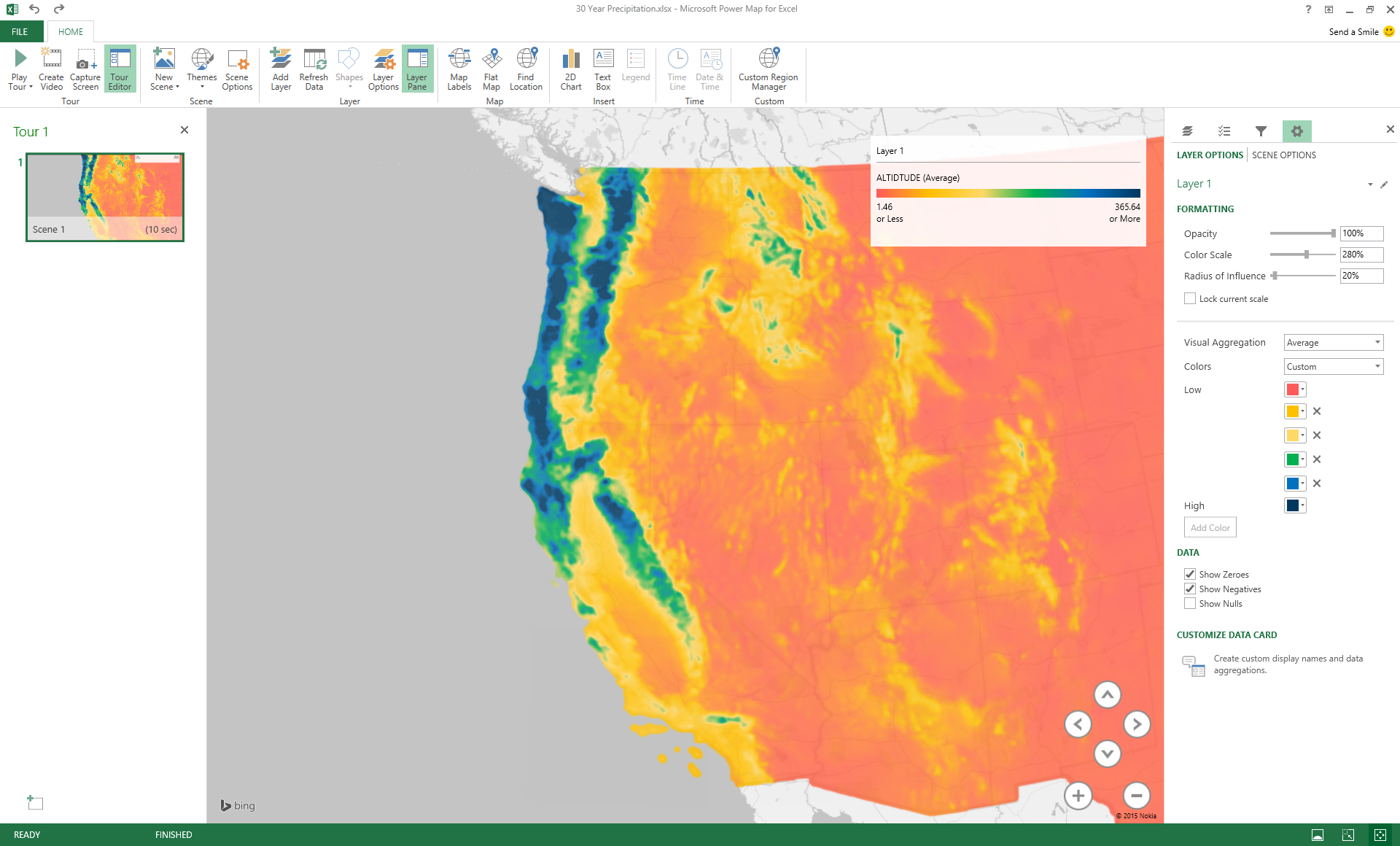
4. Data Maps
Many of the tools mentioned above, such as Echarts, Finereport, and Tableau, have data maps.
I strongly recommend Power Map 2016. I highly suggest you give it a try, it’s very amazing.
There is also another product called Ditu Hui, which can quickly help you get what you want.
The built-in map is Baidu Map. You just need to take 3 steps, select a template, upload data, and save the map.
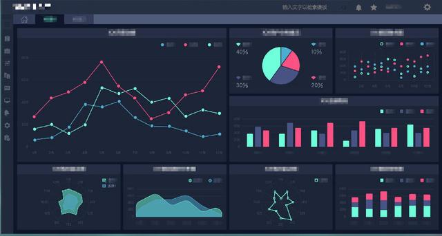
5. Visualization Large Screen
Ali DataV
The large screens of Tmall’s Double Eleven Gala are made with DataV. It is a drag-and-drop visualization tool from Alibaba Cloud, which is mainly used for big data visualization of business data combined with geographic information. You can often see them in the places like exhibition centers and enterprise control centers.
You do not have to program, and you can generate a visualization large screen or dashboard with a simple drag and drop.
From Ali DataV
FineReport
As mentioned above, this tool can also make visualizations for large screens.
It can connect to business data in real-time and display the business data of the enterprise since the backend is usually connected to business system data. FineReport is usually used in places like the exhibition center and BOSS dashboard, as well as the city traffic control center, trading floor, and so on.
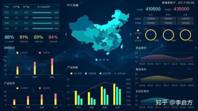
From FineReport
Digital Hail
I don’t know much about the technology of this product, and I just saw it in person at an event.
Digital Hail focuses on Data Imaging, 3D Processing, Data Analysis, and other related services. You can visualize and display data analysis results, which is more used in Smart Cities and Industrial Monitoring.
It’s commercial, and there are a lot of big screen designs on the official website that can inspire you.
From Digital Hail
Published at DZone with permission of Luke Mei. See the original article here.
Opinions expressed by DZone contributors are their own.
Comments